
Contents
- Lesson Aims
- Lesson Structure
- Scalable Reading, a Gateway for Newcomers to Digital Methods
- The Scalable Reading
- Data and Prerequisites
- Step 1: Chronological exploration of a Dataset
- Step 2: Exploring a dataset by creating binary-analytical categories
- Step 3: Reproducible and Systematic Selection of datapoints for Close Reading
- Example of reproducible and systematic selection for close reading: Twitter data
- Creating a new dataset of the top 20 most liked tweets (verified and non-verfied accounts)
- Inspecting our new dafaframe
- Exporting the new dataset as a JSON file
- Creating a new dataset of the top 20 most liked tweets (only non-verified accounts)
- Inspecting our new dataframe (only non-verified)
- Exporting the new dataset as a JSON file
- Example of reproducible and systematic selection for close reading: Twitter data
- Conclusion: moving on with close reading
- Tips for working with Twitter Data
- References
Lesson Aims
This lesson will enable readers to:
- Set up a workflow where exploratory, distant reading is used as a context to guide the selection of individual data points for close reading
- Employ exploratory analyses to find patterns in structured data
- Apply and combine basic filtering and arranging functions in R (if you have no or little knowledge of R, we recommend looking at the lesson R Basics with Tabular Data)
Lesson Structure
In this lesson, we introduce a workflow for scalable reading of structured data, combining close interpretation of individual data points and statistical analysis of the entire dataset. The lesson is structured in two parallel tracks:
- A general track, suggesting a way to work analytically with structured data where distant reading of a large dataset is used as context for a close reading of distinctive datapoints.
- An example track, in which we use simple functions in the programming language R to analyze Twitter data. Combining these two tracks, we show how scalable reading can be used to analyze a wide variety of structured data. Our suggested scalable reading workflow includes two distant reading approaches that will help researchers to explore and analyze overall features in large data sets (chronologically and in relation to binary structures), plus a way of using distant reading to select individual data points for close reading in a systematic and reproducible manner.
Scalable Reading, a Gateway for Newcomers to Digital Methods
The combination of close and distant reading introduced in this lesson, is intended to provide a gateway into digital methods for students and academics who are new to incorporating computational thinking in their work. When connecting distant reading of large datasets to close reading of single data points, you create a bridge between computational methods and hand-curated methods commonly used in humanities subjects. In our experience, scalable reading —where the analysis of the entire dataset represents a range of contexts for close reading— eases the difficulties newcomers might experience when asking questions of their material which can be explored and answered using computational thinking. The reproducible way of selecting individual cases for closer inspection speaks, for instance, directly to central questions within the discipline of history and sociology regarding the relationship between a general context and a case study, but can also be used in other humanities disciplines that operate with similar analytical frameworks.
The Scalable Reading
We originally used the workflow presented below to analyze the remembrance of the American children’s television program Sesame Street on Twitter. We used a combination of close and distant reading to find out how certain events generated discussion of Sesame Street’s history, which Twitter-users dominated the discourse about Sesame Street’s history, and which parts of the show’s history they emphasised. Our example below also uses a small dataset related to tweets about Sesame Street. However, the same analytical framework can also be used to analyze many other kinds of structured data. To demonstrate the applicability of the workflow to other kinds of data, we discuss how it could be applied to a set of structured data from the digitized collections held by the National Gallery of Denmark. The data from the National Gallery is very different from the Twitter data used in the lesson’s example track, but the general idea of using distant reading to contextualize close reading works equally well.
The workflow for scalable reading of structured data we suggest below has three steps:
-
Chronological exploration of a dataset.
In the Twitter dataset, we explore how a specific phenomenon gains traction on the platform during a certain period of time. In the case of the National Gallery data, we could have analyzed the timely distribution of their collections e.g., according to acquisition year or when artworks were made. -
Exploring a dataset by creating binary-analytical categories.
This step suggests using a dataset’s existing metadata categories to create questions of a binary nature, in other words questions which can be answered with a yes/no or true/false logic. We use this creation of a binary-analytical structure as a way to analyze some of the dataset’s overall trends. In the Twitter dataset, we explore the use of hashtags (versus lack of use); the distribution of tweets from verified versus non-verified accounts; and the interaction level between these two types of accounts. In the case of the National Gallery data we could have used the registered meta-data on artwork type, gender and nationality to explore the collection’s representation of Danish versus international artists; paintings versus non-paintings; or artists registered as female and unknown versus artists registered as male, etc. -
Systematic selection of single datapoints for close reading
This step suggests a systematic and reproducible way of selecting single datapoints for close reading. In the Twitter dataset, we selected the 20 most commonly liked tweets for close reading. In the case of the National Gallery data it could, for instance, be the top 20 most exhibited, borrowed, or annotated items.
Below, the three steps are explained in general terms as well as specifically using our Twitter example.
Data and Prerequisites
If you want to reproduce the analysis we present below, using not only the overall conceptual framework but also the code, we assume that you already have a dataset containing Twitter data in a JSON format. If you don’t have a dataset you can acquire one in the following ways:
- Using one of Twitter’s APIs, e.g., their freely available so-called “Essential” API which we used to retrieve the dataset used in the example (see more about APIs this section to the Introduction to Populating a Website with API Data). This link will take you to Twitter’s API options. You can use the ‘rtweet’ package, with your own Twitter account to access the Twitter API through R as described below.
- Using the Beginner’s Guide to Twitter Data from the Programming Historian. But rather than choosing a CSV output, choose a JSON.
In R, you work with packages, each adding numerous functionalities to the core functions of R. Packages are often community-created code, made available for reuse. When using packages you are standing on the shoulders of other coders. In this example the relevant packages are the following: rtweet, tidyverse, lubridate and jsonlite. To install packages in R see this section of lesson Basic Text Processing in R. To use the packages in R they have to be loaded with the library() function as below:
library(rtweet)
library(tidyverse)
library(lubridate)
library(jsonlite)
To follow the coding examples, make sure you have installed and loaded the following packages in R:
tidyverse
The package “tidyverse” is an umbrella package loading several libraries that are all handy in terms of working with data. For further information on learning to use tidyverse see https://www.tidyverse.org.1
lubridate
The package “lubridate“ is used for handling different date formats in R and doing operations on them. This package was created by the group behind the package “tidyverse”, but is not a core package in the “tidyverse”.2
jsonlite
The package “jsonlite” is for handling the dataformat JavaScript Object Notation (JSON), which is a format used for exchanging data on the internet. For more information on the jsonlite package see https://cran.r-project.org/web/packages/jsonlite/index.html3
If you already have a JSON file containing your Twitter data, you can use the fromJSON-function in the “jsonlite”-package to upload the data into your R environment.
Acquiring a small test dataset on the go
rtweet
The package “rtweet” is an implementation of calls designed to collect and organize Twitter data via Twitter’s REST and stream Application Program Interfaces (API), which can be found at the following URL: https://developer.twitter.com/en/docs.4
If you have not already acquired some Twitter data and wish to follow the coding examples step-by-step, you can use your Twitter account and the search_tweets() function from the “rtweet” package to import Twitter data into your R environment. This will return up to 18000 tweets from the past nine days. 18000 is chosen as an arbitrary high number to ensure that we get all the tweets available. The data will be structured in the form of a “dataframe”. Much like a spreadsheet, a dataframe organizes your data into a two-dimensional table of rows and columns. By copying the chunk of code below, you will be able to generate a dataframe based on a free-text search of the term “sesamestreet” to follow our example. The q parameter represents your query. This is where you type the content you are interested in retrieving. The n parameter determines how many tweets will be returned.
sesamestreet_data <- search_tweets(q = "sesamestreet", n = 18000)
Step 1: Chronological exploration of a Dataset
Exploring a dataset’s chronological dimensions can facilitate the first analytical review of your data. If you are studying a single phenomenon’s evolution over time (as was the case in our study of specific events that spurred discussions around Sesame Street), understanding how this phenomenon gained traction and/or how interest dwindled can be revealing as to its significance. It can be the first step in understanding how all of the data collected relates to the phenomenon over time. Analysis of timely dispersion could relate not only to a single event but also to a dataset’s total distribution based on a range of categories. For instance, if you were working on data from the National Gallery, you might want to explore the distribution of its collections across different art historical periods, in order to establish which periods are better represented in the dataset. Knowledge of the timely dispersion of the overall dataset can help contextualize the individual datapoints selected for close reading in Step 3, because it will give you an idea of how a specific datapoint relates to the chronology of the entire dataset.
Example of a dataset’s timely dispersion: Twitter data
In this example, you will find out how much Sesame Street was talked about on Twitter during a given period of time. You will also see how many tweets used the official hashtag “#sesamestreet” during that period.
In the following operation, you begin with some data processing before moving on to produce a visualisation. You are asking the data a two-part question:
- First of all, you want to know the dispersal of the tweets over time.
- Secondly, you want to know how many of these tweets contain a the hashtag “#sesamestreet”.
The second question, in particular, requires some data wrangling before it is possible to answer.
sesamestreet_data %>%
  mutate(has_sesame_ht = str_detect(text, regex("#sesamestreet", ignore_case = TRUE))) %>%
  mutate(date = date(created_at)) %>%
  count(date, has_sesame_ht)
## # A tibble: 20 x 3
##    date       has_sesame_ht     n
##    <date>     <lgl>         <int>
##  1 2021-12-04 FALSE            99
##  2 2021-12-04 TRUE             17
##  3 2021-12-05 FALSE           165
##  4 2021-12-05 TRUE             53
##  5 2021-12-06 FALSE           373
##  6 2021-12-06 TRUE             62
##  7 2021-12-07 FALSE           265
##  8 2021-12-07 TRUE             86
##  9 2021-12-08 FALSE           187
## 10 2021-12-08 TRUE             93
## 11 2021-12-09 FALSE           150
## 12 2021-12-09 TRUE             55
## 13 2021-12-10 FALSE           142
## 14 2021-12-10 TRUE             59
## 15 2021-12-11 FALSE           196
## 16 2021-12-11 TRUE             41
## 17 2021-12-12 FALSE           255
## 18 2021-12-12 TRUE             44
## 19 2021-12-13 FALSE            55
## 20 2021-12-13 TRUE             35
The process demonstrated here creates a new column which has the value TRUE if the tweet contains the specified hashtag and FALSE if not. This is done with the mutate() function, which creates a new column called “has_sesame_ht”. To put the TRUE/FALSE values in this column you use the str_detect() function. This function is told that it is detecting on the column “text”, which contains the tweet. Next it is told what it is detecting. Here you use the regex() function within str_detect() and by doing that you can specify that you are interested in all variants of the hashtag (e.g. #SesameStreet, #Sesamestreet, #sesamestreet, #SESAMESTREET, etc.). This is achieved by setting “ignore_case = TRUE” in the regex() function which applies a regular expression to your data. Regular expressions can be seen as an extendend search-and-replace function. If you want to explore regular expressions further, you can read the article Understanding Regular Expressions.
The next step is another mutate() function, where you create a new column headed “date”. This column will simply contain the date of tweets rather than the entire timestamp from Twitter that not only contains the date, but also the hour, minute and second of posting. This is obtained using the date() function from the “lubridate” packages, which is instructed to extract the date from the “created_at” column. Lastly you use the count function from the “tidyverse” package to count TRUE/FALSE values in the “has_sesame_ht” column occurring per day in the data set. The pipe function (%>%) is used to chain code commands together and is explained later in this section.
Please be aware that your data will look slightly different to ours, as it was not collected on the same date. The conversations about Sesame Street represented in your dataset will vary from those taking place just prior to 13th December when we collected the data for our example.
sesamestreet_data%>%
  mutate(has_sesame_ht = str_detect(text, regex("#sesamestreet", ignore_case = TRUE))) %>%
  mutate(date = date(created_at)) %>%
  count(date, has_sesame_ht) %>%
  ggplot(aes(date, n)) +
  geom_line(aes(linetype=has_sesame_ht)) +
  scale_linetype(labels = c("No #sesamestreet", "#sesamestreet")) +
  scale_x_date(date_breaks = "1 day", date_labels = "%b %d") +
  scale_y_continuous(breaks = seq(0, 400, by = 50)) +
  theme(axis.text.x=element_text(angle=40, hjust=1)) +
  labs(y="Number of Tweets", x="Date", caption = "Total number of tweets: 2432") +
  guides(linetype = guide_legend(title = "Whether or not the\ntweet contains \n#sesamestreet"))
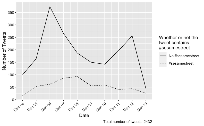
Figure 1: Daily tweets in the period from 4 December 2021 until 13 December 2021 dispersed on whether or not they contain ‘#sesamestreet’. The tweets from this period were collected by a freetext search on ‘sesamestreet’ without the hashtag. The total number of tweets returned was 2432.
You are now going to visualise your results. Using the code ggplot(aes(date, n)) +, you are creating a visualisation of the four preceding lines (which transformed the data to help us explore the chronology of tweets with and without the official hashtag “#sesamestreet”). To pick up where you left off in the previous code chunk, continue with the ggplot() function, which is “tidyverse”’s graphics package. This function is told to label the x-axis “Date” and the y-axis “Number of Tweets” based on TRUE/FALSE values. The next function needed to generate the visualisation is geom_line(), where you specify linetype=has\_sesame\_ht, which plots two lines in the visualisation, one representing TRUE and one representing FALSE.
The lines of code following the geom_line() argument tweaks the aesthetics of the visualisation. In this context, aesthetics describes the visual representation of data in your visualisation. scale_linetype() tells R what the lines should be labeled as. scale_x_date() and scale_y_continuous()
changes the appearance of the x- and y-axis, respectively. Lastly, the labs() and guides() arguments are used to create descriptive text on the visualisation.
Remember to change the descriptive text within labs() to match your specific dataset. If you want to hard-code titles into your plot, you can add title = and subtitle = alongside the other labels.
You should now have a graph depicting the timely dispersion of tweets in your dataset. This graph shows the distribution of tweets collected during the period under investigation. With the Sesame Street tweets, our graph shows that most tweets were tweeted without the #sesamestreet hashtag. Furthermore, two spikes can be located in the graph. There is a peak on the 6th of December and another on the 12th of December. This tells you that there has been more activity towards Sesame Street on Twitter during those two dates than during the other harvested dates. We will now proceed with the binary exploration of some of your dataset’s distinctive features. We will now proceed with the binary exploration of some of your dataset’s distinctive features.
Step 2: Exploring a dataset by creating binary-analytical categories
Using a binary logic to explore a dataset can be a first and, compared to other digital methods, relatively simple way to get at important relations in your dataset. Binary relations are easy to count using computer code and can reveal systematic and defining structures in your data. In our case, we were interested in the power relations on Twitter and in the public sphere more generally. We, therefore, explored the differences between so-called verified and non-verified accounts – verified accounts are those marked with a badge to indicate that the user is notable and authentic, due to their public status outside of the platform. However, you might be interested something else for example, how many tweets were retweets or originals. In both cases you can use the existing metadata registered for the dataset to create a question that can be answered using a binary logic (does the tweet come from a verified account, yes or no?; is the tweet a retweet, yes or no?). Or, suppose you were working with data from the National Gallery. In that case, you might want to explore gender bias in the collections by finding out whether the institution has favoured acquiring artworks by people who are registered as male in their catalogue. To do this, you could arrange your dataset to count male artists (is this artist registered as male, yes or no?). Or, if you were interest in the collections distribution of Danish versus international artists, the data could be arranged in a binary structure allowing you to answer the question: is this artist registered as Danish, yes or no?
The binary relations can form a context for your close reading of datapoints selected in Step 3. Knowing the distribution of data in two categories will also enable you to establish a single datapoint’s representativity vis-à-vis this category’s distribution in the entire dataset. For instance, if in Step 3 you choose to work on the 20 most commonly ‘liked’ tweets, you may notice that even if there are many tweets from verified accounts among this select pool, these accounts may not be well-represented in the overall dataset. Thus, the 20 most ‘liked’ tweets you have selected are not representative of the tweets from the majority of accounts in your dataset, rather they represent a small, but much ‘liked’ percentage. Or, if you choose to work on the 20 most frequently displayed artworks in a dataset from the National Gallery, a binary exploration of Danish versus non-Danish artists might enable you to see that even if those works were all painted by international artists, these artists were otherwise poorly represented in the National Gallery’s collections overall.
Example of a binary exploration: Twitter data
In this example, we demonstrate the workflow you’d use if you are interested in exploring the distribution of verified versus non-verified accounts tweeting about Sesame Street.
We suggest processing your data step by step, following the logic of the pipe (%>%) in R. Once you get a hold of this idea, the remainder of the data processing will be easier to read and understand. The overall goal of this section is to explain how the tweets collected were dispersed between non-verified and verified accounts, and to demonstrate how we visualized the result.
sesamestreet_data %>%
  count(verified)
## # A tibble: 2 x 2
##   verified     n
## * <lgl>    <int>
## 1 FALSE     2368
## 2 TRUE        64
Using the pipe %>% you pass the data on downwards — the data is flowing through the pipe like water! Here you ‘pour’ the data to the count function and ask it to count values in the column “verified”. The value will be “TRUE” if the account is verified, or “FALSE” if it is non-verified.
So now you have counted the values, but it might make more sense to have these figures as percentages. Therefore, our next step will be to add another pipe and a snippet of code to create a new column containing the total number of tweets in our dataset — this will be necessary for calculating the percentages later.
sesamestreet_data %>%
  count(verified) %>%
  mutate(total = nrow(sesamestreet_data))
## # A tibble: 2 x 3
##   verified     n total
## * <lgl>    <int> <int>
## 1 FALSE     2368  2432
## 2 TRUE        64  2432
You can find the total number of tweets by using the nrow() function, which returns the number of rows from a dataframe. In this dataset, one row equals one tweet.
Using another pipe, you now create a new column called “percentage” where you calculate and store the dispersion percentage between verified and non-verified tweets:
sesamestreet_data %>%
  count(verified) %>%
  mutate(total = nrow(sesamestreet_data)) %>%
  mutate(pct = (n / total) * 100)
## # A tibble: 2 x 4
##   verified     n total   pct
## * <lgl>    <int> <int> <dbl>
## 1 FALSE     2368  2432 97.4
## 2 TRUE        64  2432  2.63
The next step is to visualize this result. Here you use the “ggplot2” package to create a column chart:
sesamestreet_data %>%
  count(verified) %>%
  mutate(total = nrow(sesamestreet_data)) %>%
  mutate(pct = (n / total) * 100) %>%
  ggplot(aes(x = verified, y = pct)) +
  geom_col() +
  scale_x_discrete(labels=c("FALSE" = "Not Verified", "TRUE" = "Verified"))+
      labs(x = "Verified status",
      y = "Percentage",
      caption = "Total number of tweets: 2432") +
  theme(axis.text.y = element_text(angle = 14, hjust = 1))
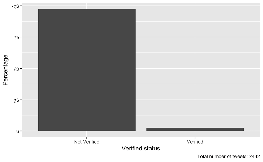
Figure 2: Percentage of tweets posted by verified and non-verified accounts in the sesamestreet dataset during the period from 4 December 2021 to 13 December 2021. The total number of tweets was 2432.
In contrast to the earlier visualisations, which plotted tweets over time, you now use the geom_col function in order to create columns. Notice that when you start working in ggplot the pipe(%>%) is replaced by a +. This figure illustrates that most tweets about Sesame Street are created by non-verified users. This insight could illustrate that Sesame Street is a popular, politicised and public topic on Twitter that people without verified accounts are involved with.
Interaction with verified versus non-verified accounts
In this part of the example, we demonstrate the workflow we used to investigate how much people interacted with tweets from verified accounts versus tweets from non-verified accounts. We chose to count ‘likes’ as a way to measure interaction. Contrasting the interaction level of these two account types will help you estimate whether fewer verified accounts hold greater power despite their low representation overall, because people interact a lot more with verified users’ tweets than the tweets from non-verified accounts.
sesamestreet_data %>%
  group_by(verified) %>%
  summarise(mean = mean(favorite_count))
## # A tibble: 2 x 2
##   verified     mean
## * <lgl>      <dbl>
## 1 FALSE      0.892
## 2 TRUE     114.
Using the code above, you group the dataset based on each tweet’s status: verified = TRUE and non-verified = FALSE. After using the grouping function, all operations afterward will be done group-wide. In other words, all the tweets posted by non- verified accounts will be treated as one group, and all the tweets posted by verified accounts will be treated as another. The next step is to use the summarise function to calculate the mean of “favorite_count” for within tweets from non-verified and verified accounts (“favorite” is the dataset’s term for “like”).
In this next step you add the result of the calculation above to a dataframe. Use a new column headed “interaction” to specify that it is “favorite_count”.
interactions <- sesamestreet_data %>%
  group_by(verified) %>%
  summarise(gns = mean(favorite_count)) %>%
  mutate(interaction = "favorite_count")
In the next step you calculate the mean for retweets following the same method as you did with the favorite count:
interactions %>%
  add_row(
    sesamestreet_data %>%
    group_by(verified) %>%
    summarise(gns = mean(retweet_count), .groups = "drop") %>%
    mutate(interaction = "retweet_count")) -> interactions
This way you get a dataframe with the means of the different interactions which makes it possible to pass it on to the ggplot-package for visualisation, which is done below. The visualisation looks a lot like the previous bar charts, but the difference here is facet_wrap, which creates three bar charts for each type of interaction:
interactions  %>%
  ggplot(aes(x = verified, y = mean)) +
  geom_col() +
  facet_wrap(~interaction, nrow = 1) +
  labs(caption = "Total number of tweets: 2411",
       x = "Verified status",
       y = "Average of engagements counts") +
  scale_x_discrete(labels=c("FALSE" = "Not Verified", "TRUE" = "Verified"))
The visualisation looks a lot like the previous bar charts, but the difference here is facet_wrap, which creates two bar charts for each type of interaction. The graph illustrates that tweets from verified accounts get more attention than tweets from non-verified accounts.
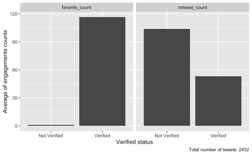
Figure 3: Means of different interaction count dispersed on verified status in the period from 4 December 2021 until 13 December 2021. The total number of tweets was 2432.
Step 3: Reproducible and Systematic Selection of datapoints for Close Reading
One of the great advantages of combining close and distant reading is the possibility for making a systematic and reproducible selection of datapoints for close reading. When you have explored your dataset using two different methods of distant reading in Steps 1 and 2, you can use these insights to systematically select specific datapoints for a closer reading. A close reading will enable you to explore interesting trends in your data, and further unpack chosen phenomena to investigate in depth.
How many datapoints you choose to close-read will depend on what phenomena you are researching, how much time you have, and how complex the data is. For instance, analysing individual artworks might be more time-consuming than reading individual tweets but, of course, this will vary according to your purpose. It is, therefore, important that you are systematic in your selection of datapoints to ensure compliance with your research questions. In our case, we wanted to know more about how the most liked tweets represented Sesame Street: how did they talk about the show and its history?, did the tweets link to other media?, and how was the show represented visually (by pictures, links to videos, memes, etc.)? Considering the interesting relationship we observed between the low-representation, but high-interaction tweets from verified accounts, we wanted to do a close reading of the 20 most-liked tweets overall (verified and non-verified), and also of the 20 most-liked tweets posted by non-verified accounts only — to see if these were different in the way they talked about the show and its history. We chose the top 20 because this seemed like a manageable task within the time we had at our disposal.
If you were working on data from the National Gallery, you might want to select the top 5 or 10 most often displayed or most frequently borrowed artworks by Danish and international artists. This would enable you to investigate their differences or commonalities and lead you onwards to a close reading of particular artists, type of artwork, motive, content, size, a period in art history, etc.
Example of reproducible and systematic selection for close reading: Twitter data
In this example we are interested in selecting the top 20 most liked tweets overall. We can predict that many of these tweets are likely to be posted by verified accounts, but we will also need to select the top 20 most liked tweets from non-verified accounts to be able to compare and contrast the two categories.
To examine original tweets only, start by filtering out all the tweets that are “retweets.”
At the top right corner of R Studio’s interface, you will find your R “Global Environment” containing the dataframe sesamestreet_data. By clicking the dataframe, you will be able to view the rows and columns containing your Twitter data. Looking to the column “is_retweet”, you will see that this column indicates whether a tweet is a retweet by the values TRUE or FALSE.
Going back to your R Code after closing the dataframe view, you are now able to use the filter function to keep original tweets only (i.e., keep rows where the retweet value is FALSE). R-markdown is a fileformat which supports R code and text. You can then arrange the remaining tweets according to the number of ‘likes’ each has received. This number is found in the “favorite_count” column.
Both the filter function and the arrange function come from the dplyr package which is part of tidyverse.
sesamestreet_data %>%
  filter(is_retweet == FALSE) %>%
  arrange(desc(favorite_count))
(Output removed because of privacy reasons)
As you can see in the Global Environment, the data sesamestreet_data comprises a total of 2435 observations (the number will vary depending on when you collected your data). By running the code above, you will be able to calculate how many original tweets your dataset contains. The figure will be given in your returned dataframe. Our example data included 852 original tweets, but remember yours will vary.
Looking at the column “favorite_count”, you can now observe the number of likes in your top-20. In our example the top-20 had a count above 50. These numbers are variables that will change when you choose to reproduce this example by yourself. Be sure to check these numbers.
Creating a new dataset of the top 20 most liked tweets (verified and non-verfied accounts)
As you now know that the minimum “favorite_count” value is 50, you add a second filter function to our previous code chunk which retains all rows with a “favorite_count” value over 50.
As you have now captured the top 20 most liked tweets, you can now create a new dataset called sesamestreet_data_favorite_count_over_50.
sesamestreet_data %>%
  filter(is_retweet == FALSE) %>%
  filter(favorite_count > 50) %>%
  arrange(desc(favorite_count)) -> sesamestreet_data_favorite_count_over_50
Inspecting our new dafaframe
To create a quick overview of your new dataset, you use the select function from the dplyr package to isolate the variables you wish to inspect. In this case, you wish to isolate the columns favorite_count, screen_name, verified and text.
sesamestreet_data_favorite_count_over_50 %>%
  select(favorite_count, screen_name, verified, text) %>%
  arrange(desc(favorite_count))
(Output removed because of privacy reasons)
You then arrange them after their “favorite_count” value by using the arrange function.
This code chunk returns a dataframe containing the values for the variables you wanted to isolate: favorite\_count, screen\_name, verified and text. It is therefore much easier to inspect, than looking though the whole dataset sesamestreet_data_favorite_count_over_50 in our Global Environment.
Exporting the new dataset as a JSON file
To export your new dataset out of our R environment and save it as a JSON file, you use the toJSON function from the jsonlite-package. The JSON file format is chosen because our Twitter data is rather complex and includes lists within rows, for example several hashtags are listed within a row. This situation is difficult to handle in popular rectangular data formats such as CSV, which is why we chose the JSON format.
To make sure your data is as manageable and well-structured as possible, annotate all of your close reading data files with the same information:
- How many tweets/observations does the dataset contain?
- Which variables is the data arranged after?
- Are the tweets posted from all types of accounts or just verified accounts?
- What year was the data produced?
Top_20_liked_tweets <- jsonlite::toJSON(sesamestreet_data_favorite_count_over_50)
After converting your data to a JSON file format, you are able to use the write function from base R to export the data and save it on your machine.
write(Top_20_liked_tweets, "Top_20_liked_tweets.json")
Creating a new dataset of the top 20 most liked tweets (only non-verified accounts)
You now wish to see the top 20 most liked tweets by non-verified accounts.
sesamestreet_data %>%
  filter(is_retweet == FALSE) %>%
  filter(verified == FALSE) %>%
  arrange(desc(favorite_count))
(Output removed because of privacy reasons)
To do this, you follow the same workflow as before, but in our first code chunk, you include an extra filter function from the “dplyr” package which retains all rows with the value FALSE in the verified column, thereby removing all tweets from our data which have been produced by verified accounts.
Here you can observe how many of the total 2435 tweets that were not retweets and were created by non-verified accounts. In our example the count was 809. However, this number will not be the same in your case.
Looking again at the “favorite_count” column, you now have to look for number 20 on the list of likes (the 20th most liked tweet). Observe how many likes this tweet has and set the “favorite_count” to that value. In our example the top-20 tweets from non-verified accounts had a count above 15. This time, two tweets share the 20th and 21st place. In this case you therefore get the top 21 most liked tweets for this analysis.
sesamestreet_data %>%
  filter(is_retweet == FALSE) %>%
  filter(verified == FALSE) %>%
  filter(favorite_count > 15) %>%
  arrange(desc(favorite_count)) -> sesamestreet_data_favorite_count_over_15_non_verified
You can now filter tweets that have been liked more than 15 times, arrange them from the most liked to the least, and create a new dataset in our Global Environment called sesamestreet_data_favorite_count_over_15_non_verified.
Inspecting our new dataframe (only non-verified)
You can once again create a quick overview of your new dataset by using the select and arrange function as before, and inspect your chosen
values in the returned dataframe.
sesamestreet_data_favorite_count_over_15_non_verified %>%
  select(favorite_count, screen_name, verified, text) %>%
  arrange(desc(favorite_count))
(Output removed because of privacy reasons)
Exporting the new dataset as a JSON file
Once again you use the toJSON function to export your data into a local JSON file.
Top_21_liked_tweets_non_verified <- jsonlite::toJSON(sesamestreet_data_favorite_count_over_15_non_verified)

write(Top_21_liked_tweets_non_verified, "Top_21_liked_tweets_non_verified.json")
You should now have two JSON files stored in your designated directory, ready to be loaded into another R Markdown for a close reading analysis. Or, if your prefer, you can inspect the text column of the datasets in your current R Global Environment.
You are now ready to copy the URLs from the dataframe and inspect the individual tweets on Twitter. Remember to closely observe Twitter’s “Terms of Service” and act accordingly. The terms, for instance, stipulate that you are not allowed to share your dataset with others, aside from as a list of tweet-ids. It also states that off-Twitter matching (that is, the association of accounts and content with individuals) must follow very strict rules and remain within specific limits; and further that you are restricted in various ways if you want to publish your data or cite tweets, etc.
Conclusion: moving on with close reading
When you have selected the individual data points you want to close read (Step 3) the initial exploratory distant reading methods (detailed in Step 1 and Step 2) can be used in combination as a highly qualified context for your in-depth analysis. Going back to the chronological exploration (Step 1), you will be able to identify where the data points you have selected for individual analysis are located in relation to the overall dataset. With this knowledge, you can consider what difference it might make to your reading if they are located early or late compared to the overall data distribution, or what meaning could be drawn if your selected data points form part of a spike. With regards to the binary analysis (Step 2), distant reading can help to determine whether an individual data point is an outlier or representative of a larger trend in the data, as well as how large a portion of the dataset it represents in relation to a given feature. In the example using Twitter data, we have shown how a close reading of selected data points can be contextualized by distant reading. Chronological exploration can help determine where tweets selected for close reading are located in relation to an event you might be interested in. A tweet posted earlier than the majority, can be considered part of a ‘first take’ on a certain issue. While a later post, may be more reflective or retrospective. To determine this, you may have to close read and analyze the selected tweets using traditional ‘humanities’ methods, but the distant reading can help you qualify and contextualize your analysis. The same is true of the binary structures and the criteria used for selecting the top 20 most liked tweets. If you know whether a tweet came from a verified account or not, and if it was one of the most liked, then you can compare this to the overall trends for these parameters across the dataset when you do your close reading. This will help you to qualify your argument when it comes to in-depth analysis of any single data point, because you will know what it represents in relation to the overall event, discussion, or issue you are investigating.
Tips for working with Twitter Data
As mentioned in the beginning of this lesson, there are different ways of obtaining your data. This section of the lesson can help you apply the code from this lesson to data that have not been collected with the rtweet-package.
If you have collected your data by following the steps outlined in Beginner’s Guide to Twitter Data you will have discovered that the date of tweets is given in a format which is not compatible with the code provided in this lesson. To make our code compatible with data collected using the Beginner’s Guide to Twitter Data method, the date column will need to be manipulated using regular expressions. These are quite complex but, in short, tell your computer what part of the text in the column is to be understood as day, month, year and time of day:
df %>%
 mutate(date = str_replace(created_at, "^[A-Z][a-z]{2} ([A-Z][a-z]{2}) (\\d{2}) (\\d{2}:\\d{2}:\\d{2}) \\+0000 (\\d{4})",
                             "\\4-\\1-\\2 \\3")) %>%
 mutate(date = ymd_hms(date)) %>%
 select(date, created_at, everything())

df$Time <- format(as.POSIXct(df$date,format="%Y-%m-%d %H:%M:%S"),"%H:%M:%S")
df$date <- format(as.POSIXct(df$date,format="%Y.%m-%d %H:%M:%S"),"%Y-%m-%d")
Several other columns used in our example do not share the same name as those formulated for data extracted with the lesson Beginner’s Guide to Twitter Data. Our columns “verified” and “text” correspond to their columns “user.verified” and “full_text”. You have two options: either you change the code, so that everywhere “verified” or “text” occurs you write “user.verified” or “full_text” instead. Another approch is to change the column names in the dataframe, which can be done with the following code:
df %>%
 rename(verified = user.verified) %>%
 rename(text = full_text) -> df
References
-
Wickham et al., (2019). “Welcome to the Tidyverse”, Journal of Open Source Software, 4(43), https://doi.org/10.21105/joss.01686. ↩
-
Garrett Grolemund and Hadley Wickham (2011). “Dates and Times Made Easy with lubridate”, Journal of Statistical Software, 40(3), 1-25, https://doi.org/10.18637/jss.v040.i03. ↩
-
Jeroen Ooms (2014). “The jsonlite Package: A Practical and Consistent Mapping Between JSON Data and R Objects”, https://doi.org/10.48550/arXiv.1403.2805. ↩
-
Michael W.Kearney, (2019). “rtweet: Collecting and analyzing Twitter data”, Journal of Open Source Software, 4(42), 1829, 1-3. https://doi.org/10.21105/joss.01829. ↩