
Contents
- Introduction
- Data Collection
- Data Preparation
- Modeling
- Visualization and Analysis
- Conclusion
- Endnotes
Introduction
YouTube is the most popular web-based video sharing platform in the world, with billions of users uploading and viewing videos each month. This lesson will introduce readers to a method for conducting research on internet discourse by performing data analysis on comments posted under YouTube videos by viewers. This lesson is designed for readers with an intermediate familiarity with the R programming language, and an intermediate to advanced understanding of computational textual analysis methods.
In this lesson, you will learn how to download YouTube video comments and analyze their textual data using the natural language processing algorithm Wordfish. Designed for scaling textual data using unsupervised machine learning, Wordfish brings into relief the salient dimensions of latent meaning within a corpus. Since Wordfish is useful for measuring ideological polarity in a set of documents, for this lesson’s sample dataset, we’ve collected comments submitted by viewers of videos related to the polarizing Black Lives Matter movement. The sample dataset includes comments from videos posted to YouTube during 2020 in the United States by left and right-leaning news-related sources (according to allsides.com).
This lesson will guide you through three key phases of 1) data collection, 2) data preparation (cleaning and modeling), and 3) data analysis (including generating visualizations).
First, this lesson overviews the preparatory steps and considerations for gathering data, which include ethical issues related to downloading and analyzing YouTube data. The Querying YouTube’s API section explains how to access and query YouTube’s Application Programming Interface (API) with the open-source, user-friendly, third-party tool YouTube Data Tools,1. YouTube Data Tools enables researchers to search for and download video comments, then export the metadata as tabular data (.csv file) for further manual and computational analysis. In addition, this first section introduces the basics of installing R and RStudio.
Second, this lesson explores how to use R to pre-process and clean YouTube comment data, as well as its associated video metadata. YouTube user comments are ‘noisy’, often containing unusual content, such as numbers, emojis, and URLs, which can negatively impact computational text analyses.
Third, this lesson teaches you how to model YouTube comment data with the Wordfish algorithm, using Ken Benoit’s quanteda R package. The Visualization and Analysis section finally demonstrates how to analyze and interpret the comment data using Wordfish and R.
YouTube and Scholarly Research
Built into YouTube’s structure is a discussion space for comments and conversations that can play out over tens of thousands of replies. While YouTube comments often take the form of short responses to the video and replies to other comments, their content and purpose can vary widely. These comments frequently reveal ideological leanings, elicited by the commenter’s reaction to viewing a specific video (including its title and related metadata), or to reading another viewer’s response to the video. These comments can frame subsequent viewers’ encounters with the video content, influencing their thoughts, and prompting them to share their interpretations in a reply or new comment, even years after a video has been posted. Thus, while YouTube is usually associated with entertainment, it is also a virtual space where significant debates – explicit and implicit – about the significance of current events can play out between politically and socially diverse YouTube viewers. The multimedia platform houses a wealth of culturally-relevant data that researchers and academics have only begun to explore.
Scholarship on YouTube’s political dimensions has explored the complicated problem of untangling the effect of videos on viewer beliefs and perspectives.2 For example, qualitative sociological studies of YouTube users have explored whether users were radicalized through use of the platform.3 A growing field of scholarship has tackled the range of YouTube’s effects on political beliefs and engagement.4 While the dialogue between comments may represent an immediate back-and-forth between individuals, the comment section of any given YouTube video can also involve extended hiatus and reactivation of discussion between different groups of participants. For this reason, some researchers have focused specifically on the conversational interplay present in YouTube comments.5 Causation is certainly difficult to measure, but YouTube video comments represent a unique corpus of textual discourse useful for research on viewers’ perceptions and receptions of politically-charged messages in moving image media today.
For the purposes of this lesson, you’ll analyze a sample dataset to find broad discursive patterns and features within, exploring ideologically salient topics in a corpus, rather than the minutiae of individual interactions across time. Readers might consider additionally exploring the temporal dimensions of their own corpus when building upon the methodologies presented in this lesson.6
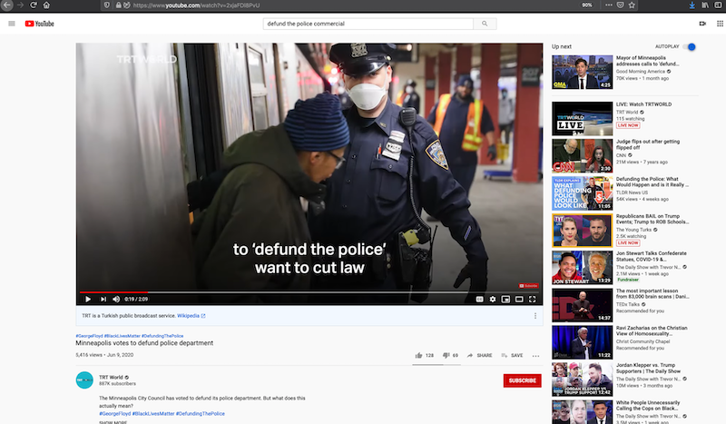
Figure 1. Screenshot of YouTube website featuring video about debates over defunding the police in the United States
Learning Outcomes
This lesson explains how to use the R programming language to analyze YouTube video comments and related video metadata. To acquire the YouTube comment data, academic researchers have the option to access the YouTube API directly through the YouTube Researcher Program. For this lesson, though, you will learn how to use a web-based, API-querying tool called YouTube Data Tools, which does not require a researcher account.
This lesson will show you how to use YouTube Data Tools to download video comments and metadata, then use R to sort and clean the comment data, before analyzing the data to search for underlying meaning and ideological positioning within. Textual data collected with YouTube Data Tools can be further analyzed manually or computationally in many additional ways.
To analyze and visualize YouTube comment data, this lesson will teach you how to use Wordfish. A text analysis algorithm frequently employed by researchers in political science and related fields, Wordfish can demonstrate how YouTube comment data can be analyzed computationally to reveal underlying discursive trends in a body of texts. For research purposes, Wordfish is well-suited to identifying political actors’ latent positions from texts that they produce, such as political speeches. When Wordfish analysis has been performed on documents whose primary dimension relates to political discourse with binary oppositions, scholars have successfully shown that results reflect the left-right scale of political ideology.7
Data Collection
Ethical Considerations for Social Media Analysis
Before conducting research on YouTube, it is important to consider the many ethical issues that arise in projects that collect and analyze social media data, as D’Ignazio and Klein argue in Data Feminism. Researchers should consider ethical questions at the start of their research.
One issue to consider is whether public social media data should be used for research without content creators’ permission. A user who comments on a number of related videos may not have understood that their patterns of communication would become the subject of scrutiny by political scientists or become evidence in public debates over the effects of social media. While general recommendations can be difficult to make for social media research, in this lesson we chose to psuedenomize user information when downloading comments, as described in the Downloading Comments and Metadata section.
How does researching a group of users with whom the researcher is less culturally familiar risk causing unintentional harm? Who speaks for communities being researched online? There are no clear answers to these challenging questions, but researchers should carefully consider their own cultural context and limitations when interpreting discourse from other cultures and contexts. Incorporating ethical thinking into the development of your research and code is essential to creating impactful public scholarship: not everything that could be mined, analyzed, published, and visualized from YouTube should be.
There are a variety of resources that can help you think through such ethical issues. The University of California at Berkeley hosted a conference on ethical and legal topics in June 2020, which is documented in the open access book Building Legal Literacies for Text Data Mining. You may also review the LLTDM website, as well as the Association of Internet Researcher’s Ethics page and Annette Markham’s Impact Model for Ethics: Notes from a Talk.
Video Selection
The most direct way to select videos for research is to visit the YouTube website, search for videos that are of interest, and capture a list of video IDs. Video IDs are the set of alphanumeric characters that appear in the video’s URL, immediately after watch?v=.
For example, see the video ID circled in red in the illustration below: q2l-8-rUM7s. These IDs are constant and do not change over time.
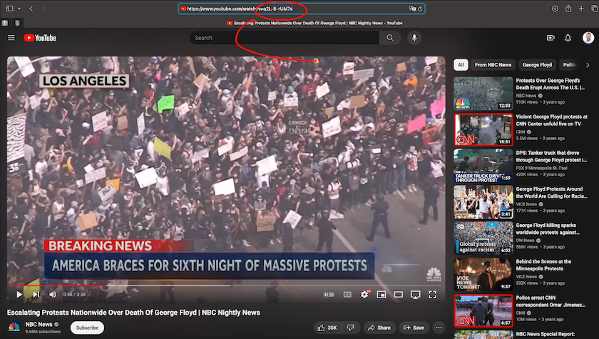
Figure 2. Screenshot of YouTube video with video ID in browser link circled in red
To prepare the example dataset for this lesson, we retrieved YouTube videos using the search terms ‘black lives matter george floyd’. Choosing multiple videos is often the best approach for the exploratory stages of research, because while YouTube makes available a wide range of metadata about each video (number of likes, title, description, tags and more), the YouTube API may not consistently return comprehensive comment data for every video searched.
Curating Data for WordFish
When gathering YouTube comment data to build a Wordfish model, some considerations around the size and shape of the corpus should be taken into consideration. Curating a dataset of YouTube comments for Wordfish requires finding videos with a sufficient amount of data (enough comments, but also enough words per comment) to conduct predictive modeling. Before building the corpus, you also need to select the video comments you want to include in the analysis based on relevant metadata, such as the video’s designated YouTube channel.
Wordfish modeling is typically performed on corpora with hundreds of documents, each containing hundreds or thousands of words. YouTube comments tend to be very short in length, but popular videos will often be accompanied by thousands of comments, more than enough to make up for their brevity. Ensuring the videos you select contain a substantial number of comments (~2000+) will minimize the skew that outlier comments can introduce. For the same reason, comments with fewer than ten words are worth removing from the corpus.
For politically salient topics, an ideal dataset for Wordfish will include a similar number of comments from videos representing opposing political perspectives.
Querying YouTube’s API
We recommend using YouTube Data Tools to query YouTube’s API. YouTube Data Tools is developed by Bernhard Rieder, Associate Professor in Media Studies at the University of Amsterdam, and supported by the Dutch Platform Digitale Infrastructuur Social Science and Humanities (PDI-SSH). Rieder maintains and regularly updates the tool to ensure its continuing compatibility with YouTube’s API (for additional info, see the YouTube Data Tools Github repository). We’ve found YouTube Data Tools to be the best open-source and user-friendly tool available for acquiring YouTube data, because it uses pre-set credentials to access YouTube’s API v3, saving you from registering your own Google account and keeping up to date on the newest API changes.
With YouTube Data Tools, you can use video IDs to pull video metadata and comments. You can also download other files, such as network diagrams of users, videos, and recommended videos. YouTube Data Tools outputs a neatly organized CSV spreadsheet of the downloaded comments, alongside metadata about the exact time the comment was posted, user information, and information about replies. Using this spreadsheet, a simple sort on the replyCount column can extract threaded conversations in order to focus on dialogue. The comments alone could also be concatenated into one large text file for topic modeling, vector space modeling, or other corpus analytics.
An alternative to using YouTube Data Tools is to obtain YouTube API authorization credentials from YouTube’s owner, Google, so that you can query the API directly. This is a multi-step and somewhat complicated process, because the workflow can change each time Google issues updates. If you wish to query the API in R, you can try the tuber package and register for a Google developer account. While a developer account allows you to incorporate YouTube functionality into your own website or app, it can also be used simply to search and download YouTube content (see YouTube’s API reference page for more information). If you wish to participate in YouTube’s researcher program, there is a separate application process.
Sample Dataset
To follow this lesson, however, you may find it easier to simply download our sample dataset and focus on the analysis stage. In this case, you can skip the next two sections and go directly to Setting Up your Coding Environment.
The sample dataset was gathered using YouTube Data Tools, with user information pseudonymized. We created it by choosing six videos that resulted from our YouTube search for ‘black lives matter george floyd.’ Our initial search returned numerous videos, some with many comments and some with very few, some uploaded by traditional, offline news sources, and some by online-only creators.
Ultimately, we focused the final selection on videos created by a mix of established news sources (for example, NBC News) and political commentators (for example, Ben Shapiro). To ensure relative parity in the number of comments across left-leaning and right-leaning sources, we further narrowed down the dataset to five channels: NBC News, New York Post, Fox News, the Daily Wire, and Ben Shapiro’s channel.
There are more right-leaning channels in the sample dataset because, on balance, there were fewer comments available on the right-leaning channel videos. Limiting the left-leaning videos to one channel (NBC News) allowed us to create a dataset with a relatively equal number of comments for right and left-leaning channels. Curating for comment number parity is a best practice for Wordfish modeling, as described in more detail in the Modeling section.
You can download the data yourself using YouTube Data Tools and inputting the same video IDs (following the steps below), but please note the data will likely differ based on when you capture the data.
Downloading Comments and Metadata
Equipped with the video IDs for the videos you selected in the Video Selection phase, navigate to the Video Comments tab on the YouTube Data Tools site.
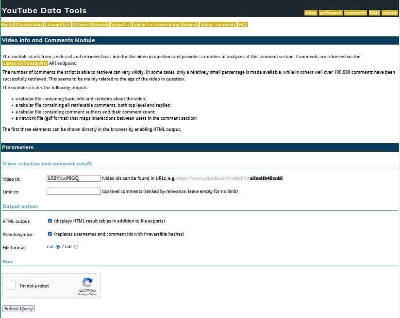
Figure 3. Screenshot of YouTube Data Tools webpage for downloading video comments
Enter the first video ID in the Video id field. You can only download comment data pertaining to one video ID at a time. We recommend leaving the Limit to field blank. Next, you must make three choices about your data’s output format:
1) HTML output: check the box if you’d like to generate HTML tables of your results in addition to file exports. This parameter gives you a preview of what you are downloading, which can be useful to monitor the downloading process.
2) Pseudonymize: check the box to add irreversible hashes to the comment usernames and ID numbers, rendering them anonymous for the purposes of privacy. We mentioned this in the Ethical Considerations section.
3) File Format: select csv.
Finally, press Submit.
Repeat this process for each video. More details on this download process can be found in Bernhard Reider’s instructional video.
YouTube Data Tools Output
Downloading data from the Video Comments tab on YouTube Data Tools will generate four files. Each automatically generated filename contains key pieces of information: the video ID, the download date, and a description of the file content. In this lesson, you’ll only need the files containing comments and basicinfo.
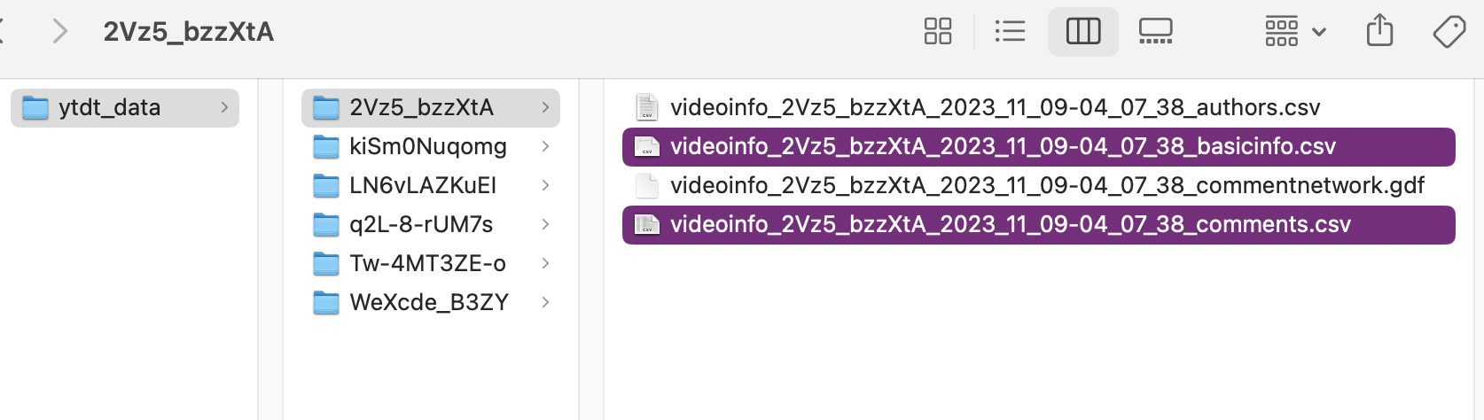
Figure 4. File structure of YouTube Data Tools output
The video ID and download date (the date the files were generated and downloaded, which immediately follows the video ID) in the filename are particularly important to retain, because new YouTube comments may continue to be uploaded after your data was collected. If you intend to publish findings related to the data you download, you will likely need to disclose your dates of collection.
You can discern each file’s contents by checking the end of the filename:
1) authors is a CSV file containing comment contributor names and their comment count for the selected video.
2) basicinfo is a CSV file containing basic metadata and statistics about the video.
3) commentnetwork is a GDF network file that maps interactions between users in the comment section, and can be opened with software like Gephi.
4) comments is a CSV file containing all retrievable comments, both top level and replies.
Save the four files associated with each video into their own folder, using the corresponding video ID as the folder’s name. (As mentioned above, you won’t need all four files for this lesson, but authors and commentnetwork contain additional information that could be useful for potential further research.)
Next, create a master directory titled ytdt_data and save each of these folders inside. You will be using the ytdt_data folder in the code in the sections below.
Setting Up your Coding Environment
Installing R and RStudio
Once you have collected your data (or downloaded the sample dataset directly), the next step to text mining YouTube comments is to prepare your R programming workspace on your computer.
R is an open-source coding language with more available statistical algorithms than most proprietary software. This lesson was written for R version 4.3.2 (but should work with newer versions).
You can download R from the Comprehensive R Archive Network. Make sure you select the installer corresponding to your computer’s operating system – if needed, you can refer to Taryn Dewar’s lesson R Basics with Tabular Data, which covers how to install R and write code to manipulate data.
RStudio Desktop is the recommended Integrated Development Environment (IDE) for writing and running R scripts. The free version is more than sufficient. You can download and install RStudio from Posit - again, make sure you select the installer appropriate to your computer’s operating system.8
The code used in this script includes packages and libraries from standard R as well as from the Tidyverse. Basic Text Processing in R by Taylor Arnold and Lauren Tilton provides an excellent overview of the knowledge of R required for text analysis. To learn more about the Tidyverse, there are many great sources online, including A Tidyverse Cookbook by Garrett Grolemund.
The rest of this lesson will walk you through the steps needed to create an R script from scratch, writing out each step of the code. The full R script for this lesson is also available to download. This lesson and the code can easily be adapted to alternative datasets downloaded through YouTube Data Tools.
Installing Your R Environment and Libraries
To begin from scratch, you’ll create a new R script and install a series of packages.
Before installing the packages to clean and process the YouTube comments, we recommend first installing the renv package to set up a virtual enviroment for controlling versioning and dependencies, and making R projects more reproducible.
Because programming libraries are periodically updated, there is a risk that your code may no longer function as intended when a new package version is released. The renv package helps prevent problems due to outdated code by storing information about the versions of the packages used in a coding project alongside the code, enabling others to use the same environment for which the code was originally written. Virtual environments are particularly necessary when the code already uses an older version of a package, as is the case with the quanteda.textmodels package for this lesson. More details on renv and it’s usefulness can be found in this blogpost by Jan Bronicki and the renv Github page.
To begin, install and then initialize renv. Initializing renv directs RStudio to save the precise versions of the other packages you install. We have found that version 0.9.6 of quanteda.textmodels, the package used to create the Wordfish model described later in the lesson, performs best. Use the renv::install function to install it here:
install.packages("renv")
renv::init()
renv::install("quanteda.textmodels@0.9.6")
As a best practice, you should note which package versions you use when creating your code and install those versions with renv::install, as illustrated above with the quanteda.textmodels package.
To install the rest of the necessary packages in R, you can use renv or use the standard installer. If a newer version of the package installed using install.packages causes an error, you should check if the problem is fixed by using renv::install(), which installs the originally-used version of that particular package:
install.packages(c("tidyverse", "quanteda", "quanteda.textplots"))
renv:
tidyverse 2.0.0(containing necessary packagesggplot2,purrr,dplyr, as well aslubridate 1.9.3)quanteda 3.3.1quanteda.texmodels 0.9.6quanteda.textplots 0.94.3
To load the packages needed for data cleaning and wrangling into your R coding environment, run the following code:
library(tidyverse); library(lubridate); library(ggplot2); library(purrr); library(stringr)
Note that additional packages will be loaded into your working environment later in this lesson as necessary.9
Data Preparation
Now you can begin to explore the data you’ve downloaded. To read in a CSV of previously-downloaded comments and metadata, you can use the code supplied below. Just make sure to navigate to your ytdt_data folder and set it as your R working directory.
The following code iteratively reads in all of the comment data from the comments.csv files nested in the ytdt_data folder using the read_csv function from the tidyverse package:
comment_files <- list.files(path = "ytdt_data/",
                            recursive = TRUE,
                            pattern = "\\comments.csv$",
                            full.names = TRUE)
comment_files

all_comments <- read_csv(comment_files, id = "videoId", col_select = c(
  commentId = id,
  authorName,
  commentText = text),
  show_col_types = FALSE) %>%
  suppressWarnings()

all_comments$videoId <- str_extract(
  all_comments$videoId, "(?<=ytdt_data\\/).+(?=\\/videoinfo)"
  )
all_comments
Next, read in the video metadata from the basicinfo.csv files:
video_files <- list.files(path = "ytdt_data/",
                            recursive = TRUE,
                            pattern = "basicinfo\\.csv$",
                            full.names = TRUE)
video_files
Then, pivot this data so it is organized by row, rather than column:
all_videos <- read_csv(video_files, col_names = FALSE, id = "videoId", show_col_types = FALSE) %>%
  mutate(videoId = str_extract(videoId, "(?<=ytdt_data\\/).+(?=\\/videoinfo)")) %>%
  pivot_wider(names_from = X1, values_from = X2) %>%
  select(videoId, videoChannelTitle = channelTitle, videoTitle = title, commentCount)
Finally, run the following code to join the video metadata and comment text, to create a single data frame:
all_data <- inner_join(all_comments, all_videos)
At this juncture, it is helpful to review the number of comments per video and check for relative parity, as we did when crafting this lesson’s sample dataset. To see the number of comments per channel, use the count function as follows:
count(all_data, sort(videoChannelTitle))
Alternatively to YouTube comment data, you could use any other corpus as the input data for this lesson’s analysis stages with Wordfish. However, you’ll first need to ensure your corpus is formatted the same way as described in this section, by reordering and re-naming metadata as applicable in your context.
Data Labeling
Now that you’ve imported and sorted your YouTube comment dataset, the next step is to classify the videos manually by adding a ‘partisan indicator’. This lesson’s case study investigates comment discourse across left and right-leaning video channels, so this partisan indicator allows us to visualize and compare which video comments originated from left or right-wing perspectives.
The code for creating a partisan indicator is straightforward. Simply create a new column, then specify which video channels should be associated with each indicator value:
all_data$partisan <- all_data$videoChannelTitle
all_data <- all_data |>
  mutate(partisan = as.factor(case_when(
    partisan %in% c("Ben Shapiro", "New York Post", "Fox News", "DailyWire+") ~ "right",
    partisan == "NBC News" ~ "left",
    TRUE ~ partisan))
  )
glimpse(all_data)
If you are using your own data, consider whether a partisan indicator could be useful to help you visualize differences between groups of documents - such as videos from specific channels, or other logical groupings of documents based on theme or perspective.
Pre-processing
Now that the data is labeled, it is ready for pre-processing and cleaning. This will make it suitable for text analysis with Wordfish.
As noted above, due to the unique nature of YouTube comments (including rare words, slang, multiple languages, special characters, and emojis), some initial data cleaning is necessary to ensure that each comment contains consistent and meaningful text data for Wordfish scaling. Comments with little or no relevant linguistic data need to be removed, because they will cause substantial skew in a Wordfish model: the model relies on scores given to words within semantically meaningful prose, and comments with fewer than 10 words are less likely to contain such meaning. The presence of such short comments, as well as comments with special characters, can impact the significance of results, and may cause the scaling process to fail entirely.
If you are using an alternative analytical model, you may choose to retain emojis, links, numbers, mentions, or other details.
Removing Stopwords and Punctuation
The first pre-processing step is to remove ‘stopwords’, which are common words that provide little to no semantically meaningful information about your research question. As Emil Hvitfeldt and Julia Silge explain, whether commonly excluded words would provide meaningful information to your project depends upon your analytical task. For this reason, researchers should think carefully about which words to remove from their dataset.
During exploratory modeling, we found that the words brostein, derrick and camry were outliers in this lesson’s dataset, as they were extremely rare in the overall corpus. The most meaningful words to analyze are often the relatively common and highly polarizing words on each side of the distribution across the left-right scale. Rare outlier words can often be a distraction; for this reason, you may also wish to remove outliers like these from the visualization.
The following code creates a custom stopword list that adds researcher-defined stopwords to the standard stopword list supplied in the quanteda text analysis package. To customize a stopword list, simply replace the words in the code-chunk below with your own. As you conduct preliminary Wordfish modeling and exploratory analysis, if you come across obvious outlier words, we recommend you add these to your stopwords list.
library(quanteda)

my_stopwords <- c(stopwords("en"), "brostein", "derrick", "camry")

all_data$text <- all_data$commentText %>%
  str_to_lower() %>%
  str_remove_all(str_c("\\b", my_stopwords, "\\b", collapse = "|"))
Using the stringr package from the tidyverse, the following code further cleans the text data. This additional pre-processing step performs a second round of cleaning, removing any remaining numeric digits, punctuation, emojis, links, mentions, as well as comments with fewer than 10 total words. In addition, the following code removes duplicate comments and places the cleaned data into a column titled uniqueWords:
all_data$text <- all_data$text %>%
str_remove_all("[:punct:]||'|[$]") %>%
str_remove_all("[@][\\w_-]+|[#][\\w_-]+|http\\S+\\s*|<a href|<U[+][:alnum:]+>|[:digit:]*|<U+FFFD>")
all_data <- all_data %>% unique()
print(paste(nrow(all_data), "comments remaining"))
all_data$uniqueWords <- sapply(str_split(all_data$text, " "), function(x) paste(unique(x), collapse = " "))
all_data <- all_data %>% mutate(
numbWords = str_count(all_data$uniqueWords, boundary("word"))) %>% filter(
numbWords >= 10)
print(paste(nrow(all_data), "comments remaining"))
Note you can also perform this de-duplicating step using the quanteda R package. We recommend stringr, especially if you want to export your cleaned data to a user-readable format and perform other analyses beyond the Wordfish modeling demonstrated in the second half of this lesson. For further guidance on using the quanteda package, see the University of Virginia Library’s useful overview of its functionalities, A Beginner’s Guide to Text Analysis with quanteda.
To export your cleaned data for preservation, curation, or other forms of analysis, use the write_csv function in R as follows:
write.csv(all_data, "cleaned_all_data.csv")
Now that the comment data is reduced to the essentials, you can transform the dataset into a format suited to Wordfish analysis.
Modeling
An increasingly wide range of text mining and machine learning algorithms are available for scholars looking to create models and visualizations of big data. Many of these algorithms are described in other Programming Historian lessons, for example, word frequency analysis and topic modeling. As noted above, the text mining algorithm central to this lesson is called Wordfish. For information on the machine learning algorithm itself and to explore Wordfish’s base code, visit the Wordfish website and the Wordfish Github repository.
Developed by and for political scientists, Wordfish was originally created as a method for extracting the ideological leaning of documents expected to contain latent political perspectives (such as party manifestos or politician speeches). For example, Wordfish can be a useful tool for identifying whether United States representatives’ speeches were made by Democrats or Republicans, as well as for measuring the extremity of the ideological leaning conveyed in those speeches.
Interpreting Wordfish
A Wordfish model uncovers two kinds of information, without the need for any prior pre-coding of documents or ‘supervision’.
First, Wordfish differentiates documents along a single dimensional scale. To do so, the model collects documents that are similar to each other from either end of the dimension, based on the frequencies of words appearing in the corpus. Documents at opposite ends of this scale, in particular types of discursive contexts, may be characterized by the inclusion of different sets of unique words, indicating a focus on different kinds of concepts.
Although Wordfish was initially developed by political scientists for researching political ideology, there is nothing inherently political about the dimension that it reveals: Wordfish can be used to extract latent dimensionality within any kind of corpus. There are many underlying factors that can drive the latent scaling dimension identified by a Wordfish model. If content is strongly motivated by the author’s political ideology, this dimension can separate texts from authors on opposing sides of a political issue. Wordfish brings into relief broad differences in content, based on the kinds of words used by each speaker. The interpretation of this latent dimension depends entirely on what happens to be the most salient content in a given corpus.
Second, Wordfish develops a scale to describe the polarization of words within the corpus, and arranges those words along an analogous dimension to the document scale. Although the document scale is often the desired output of a Wordfish model, the placement of words along this scale can be more informative of the scale’s overall meaning, because it gives a concrete sense of which words are crucial to each pole of the oppositional discourse.
Scaling documents is less inherently meaningful without additional information. Metadata about the source of documents (in this lesson’s case, the partisan indicator label assigned to the video channels) can be very helpful for determining whether the greatest differences exist within a given data source, or between data sources. For example, you might notice that comments from certain videos with shared perspectives are clustered together.
Document Feature Matrices (DFM)
Wordfish uses a Document Feature Matrix (DFM) to make its predictions about the placements of documents along this uni-dimensional scale.
A DFM is a tidy, structured format that stores data about the frequency of different words used in each document of a corpus. The quanteda documentation includes guidelines on creating DFMs. DFMs are structured as a two-dimensional matrix where each row designates a document, and each column designates a textual ‘feature’ (features are the words used across the vocabulary of the entire corpus). The cells in this matrix indicate whether that particular feature appears in each document or not.
The DFM approach is similar to the text mining method known as topic modeling: both Wordish and topic modeling are machine learning algorithms that use predictive modeling to identify prevalent themes and perspectives in a corpus. Furthermore, neither Wordfish nor unsupervised topic modeling approaches rely on the user manually pre-coding some portion of the data before computational modeling. Instead, these two algorithms both explore differences between documents, identifying natural groupings along a dimensional scale by comparing the frequencies of the same words contained in different documents. Both methods identify and weigh more heavily the words whose frequency varies most between documents, then use these patterns to cluster documents along a scale. When a Wordfish model is initialized, all of the parameters measured are just a ‘first best guess’ at the latent scaling of documents and words. Depending on the quality of the text data, these algorithms should then iteratively refine their initial predictions, gradually closing in on more statistically robust and insightful model structures.
Another important similarity between Wordfish and topic modeling is that both treat any given document as a ‘bag of words’. These algorithms only look at word frequency, while ignoring word order: it doesn’t matter where words occur in any given document, just which words occur in that document, and with what frequency. Bag-of-words modeling can be problematic for longer texts, where different sections of content (paragraphs, pages, chapters) might convey different types of meaning depending on their context. But YouTube video comments, and social media posts more generally, tend to be short and focused on a single topic or idea, so the bag-of-words approach is unlikely to miss as much information as would be lost for longer, more complex documents like essays or novels.
The key difference between Wordfish scaling and topic modeling, however, are the specific statistical approaches taken, and their most useful outputs. Whereas topic models can generate any number of topics in a corpus, Wordfish always scales on a single dimension and is thus limitied to two topics, or a single topic considered from two perspectives.
Creating a Corpus in R
The Wordfish algorithm was initially distributed as a stand-alone R package (still available on the Wordfish website), but it is now also available in the quanteda package. The quanteda Wordfish package has certain advantages, including that it enables seamless wrangling of YouTube comment data into a useful format to build the Wordfish model. Visit the docs and tutorials on the quanteda website for more background.
To run the Wordfish model in quanteda, you must create three types of text data objects: a corpus, tokens, and a DFM. For more detail on how these objects work together, refer to quanteda’s quick start page.
The corpus contains all of the documents that can be analyzed (in the case of YouTube video comments, each comment represents one document), as well as some metadata describing the documents’ attributes. For YouTube comments, this metadata includes the video channel title with which the comment was associated, as well as their partisan indicator added earlier in the Data Labeling section.
In quanteda, tokens are a list of character vectors linked back to the document from which they originated. This form allows the text to be further cleaned and pre-processed. Tokens can be stemmed or lemmatized, and additional stopwords can be removed. You already pre-processed the corpus in the Pre-processing section, but the approach offered by quanteda works slightly differently, so you might wish to test which works best for you and your data. There’s no harm in using both cleaning methods.
Note that when running the code to build your corpus, the processing step may take a few minutes, or even longer. If it does, that’s a good sign! It means your data is optimal for Wordfish modeling, and the model you produce will likely be insightful and accurate.
Building the Corpus Object
To build the corpus object and initiate the steps leading to creating the Wordfish model itself, first select the specific columns that you would like to include in your model.
The following code selects the comment text (the uniqueWords column), as well as the video channel title, the partisan indicator, and the unique commentId automatically generated by YouTube:
wfAll <- select(all_data, commentId, uniqueWords, videoChannelTitle, partisan, numbWords)
Now, execute the following code to build your corpus:
options(width = 110)

corp_all <- corpus(wfAll, docid_field = "commentId", text_field = "uniqueWords")
summary(docvars(corp_all))
Data Transformation
Next, you will tokenize the corpus in order to create the DFM. You can use quanteda’s token function to remove any remaining punctuation, symbols, numbers, URLs, and separators. After this pre-preoccessing step, you’ll create a DFM and feed it into the Wordfish model.
toks_all <- tokens(corp_all,
                        remove_punct = TRUE,
                        remove_symbols = TRUE,
                        remove_numbers = TRUE,
                        remove_url = TRUE,
                        remove_separators = TRUE)

dfmat_all <- dfm(toks_all)
print(paste("you created", "a dfm with", ndoc(dfmat_all), "documents and", nfeat(dfmat_all), "features"))
Data Optimization
In the next step, you will optimize the corpus to focus on the most meaningful words only. The following code removes words with fewer than four characters, as well as rare words (those that appear in less than 1% of documents, or that comprise less than 0.001% of the total corpus):
dfmat_all <- dfm_keep(dfmat_all, min_nchar = 4)
dfmat_all <- dfm_trim(dfmat_all, min_docfreq = 0.01, min_termfreq = 0.0001, termfreq_type = "prop")

print(dfmat_all)
You may choose to adjust these values to optimize the model for your own data. Consult the quanteda documentation on dfm_trim for additional optimization options.
Verification
After optimizing the corpus, it is helpful to manually review its 25 most frequently occurring words, to get a sense of the comments’ overall topic. If you notice words among the top 25 that have limited semantic meaning, consider adding them to your custom stopwords list, and running the code again to rebuild the corpus object without these words included.
The following lines of code print the 25 most frequent words for manual review:
topWords <- topfeatures(dfmat_all, 25, decreasing = TRUE) %>% names() %>% sort()
topWords
After fine-tuning the most 25 frequent words in the corpus, you can move on to creating the Wordfish model.
Building the Wordfish Model
To create a Wordfish model based on the corpus of unique comments you have assembled, run the following code, which imports the relevant package and builds the model:
library(quanteda.textmodels)

tmod_wf_all <- textmodel_wordfish(dfmat_all, dispersion = "poisson", sparse = TRUE, residual_floor = 0.5, dir=c(2,1))
summary(tmod_wf_all)
Some computers may take a while to process the data when building the Wordfish model, depending on the number of documents in your corpus, and the number of times the model iterates. Remember: more iterations are a good sign, so be patient.
Visualization and Analysis
Now that the model is built, you can visualize its output. Wordfish models are well-suited to generating two distinct kinds of visualizations: a a ‘word-level’ visualization and a ‘document-level’ visualization, both of which are scaled along horizontal and vertical axes.
Slapin and Proksch (2008) first proposed the Wordfish model as an advancement over previous text-scaling methodologies.10 They used Wordfish to estimate the ideological positions of German political parties around the turn of the century.
According to Slapin and Proksch, Wordfish assigns two parameters to each word (or ‘feature’) used in the corpus – beta and psi – and a similar two to each comment (or ‘document’) – theta and alpha. The convention is to assign ideological polarity along the horizontal axis using the variables beta (for features) and theta (for documents). The vertical axis reflects a ‘fixed effect’ - psi (for features) and alpha (for documents). In word-level visualizations, the fixed effect psi represents each word’s relative frequency, used to show dispersion across the corpus object. In document-level visualizations, the fixed effect alpha is a value representing the relative length of each document.
Very rare words and very short comments contain relatively little useful information, and their inclusion can be detrimental to the overall model. The pre-processing steps in this lesson eliminated very short comments. However, you will likely find, and can confidently eliminate, additional highly infrequent words (those with very negative psi values) following initial model results.
Word-level Visualizations
The code in this section will enable you to create word-level visualizations.
To produce custom visualizations, this lesson draws from Wordfish’s underlying statistics and uses ggplot2 to make the plots. You can use quanteda’s textplot_scale1d() function, setting the margin parameter to ‘features’. This function plays well with ggplot2, so you can use the ggplot2 + to add components to the base plot, and the labs() component to create a label for the plot.
Run the following code to produce a plot of all the unique words found within the YouTube comment corpus:
library(quanteda.textplots)

wf_feature_plot <- textplot_scale1d(tmod_wf_all, margin = "features") +
  labs(title = "Wordfish Model Visualization - Feature Scaling", x = "Estimated beta", y= "Estimated psi")
wf_feature_plot
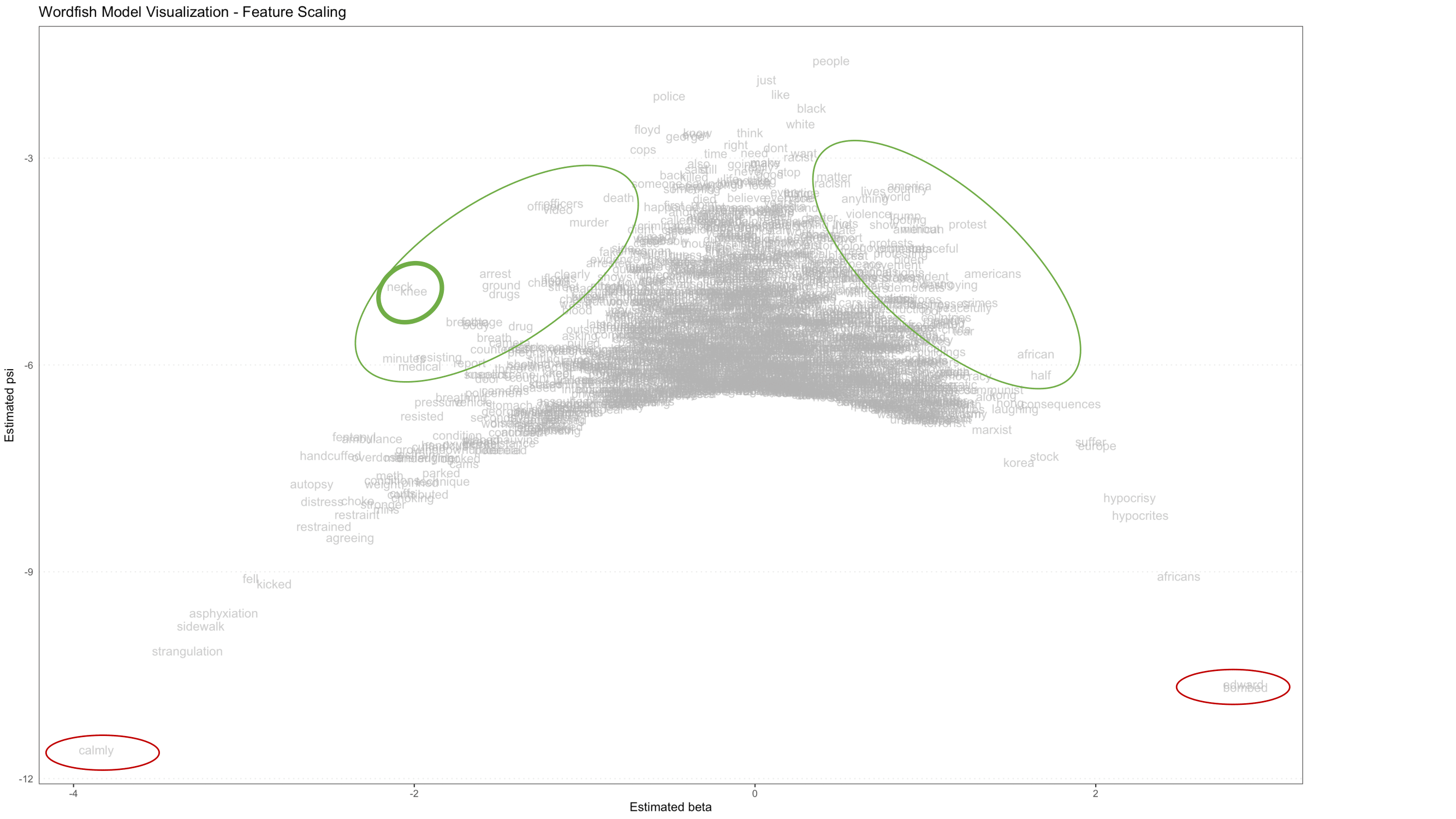
Figure 5. Visualization of Wordfish model showing relative placement of features (words) with significant words circled in green, and outliers circled in red
Figure 5 above is a Wordfish model visualization of the feature scaling components, which shows every word found in the YouTube comment corpus. The position of each feature on this visualization is determined by two model outputs, beta and psi. The horizontal axis (beta) represents how extreme the scaling of each feature is: features far to the left and far to the right drive the placement of documents on the document-level left-right scale (which you’ll discover in the Document-level Visualizations section below). Centrally located features have minimal impact. The vertical axis (psi) describes how common that feature is: more common features appear at the top of the model, while rarer ones appear at the bottom. The model makes beta and psi interact in such a way that the scaling impact of common features is reduced (they are pulled to the top center) and the scaling impact of rare features is enhanced (they are pushed to the bottom horizontal extremes).
The features which are of intermediate frequency (appearing in approximately the middle of the vertical axis), and which are highly polarizing (appearing further to the left or right than other features appearing with similar frequency), should most strongly guide the user’s interpretation of the model scale. The red circles in the far bottom corners of the visualization indicate features that are extremely rare, and likely don’t contribute much meaning to the model. These features can usually be safely removed, which will put more visual emphasis on the more central - and therefore meaningful - portions of the model.
Note how the word distribution is roughly symmetrical, with most words grouped in the middle, and additional words projected out along the sloping sides of the inverted parabola (these words are indicated by the large green ovals drawn midway down the sloping sides). These conspicuously displayed words are the strongest indicators of what each pole of the scaled dimension (along the horizontal axis) represents.
On the left, knee and neck are displayed almost on top of each other (indicated by the smaller, heavier weighted green circle in Figure 6 below). This indicates that those two words occur at very similar frequencies, and that both words are strongly and approximately equally predictive of a document being placed on the left side of the scaling dimension. Given the subject matter of this dataset (a police officer brutally pressing his knee on George Floyd’s neck), this is an expected - if stark - result.
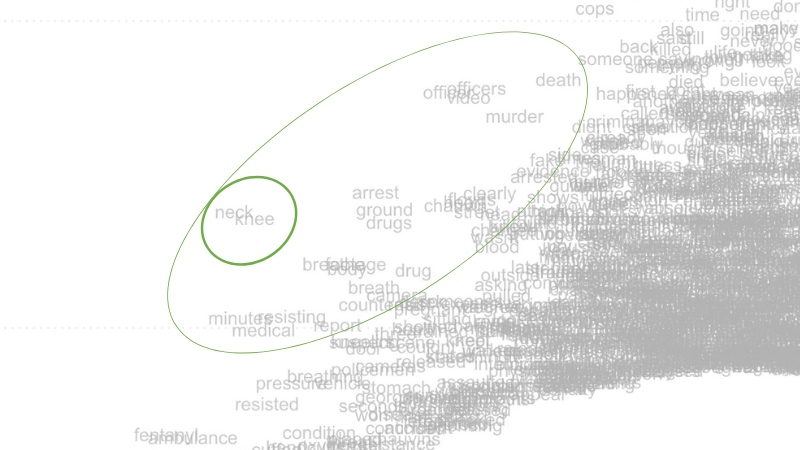
Figure 6. Close-up of left-hand portion of Wordfish feature-level visualization, displaying incident-related words that frequently co-occur, like ‘neck’ and ‘knee’.
Along the right slope, note words like americans, protest, african and, a little deeper in the field of text, violence (refer to Figure 7 below). These words are predictive of a document being placed on the right pole of the scaling axis.
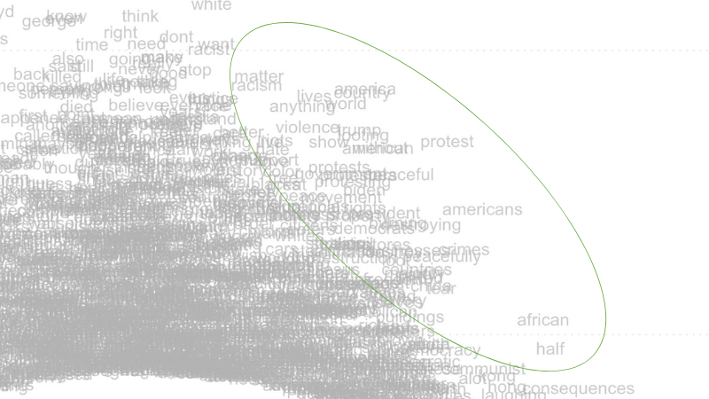
Figure 7. Close-up of right-hand portion of Wordfish feature-level visualization, displaying words that discuss the broader social context around George Floyd’s murder.
Words displayed on the left side of this data visualization refer more directly to the event of George Floyd’s murder itself, and may have been a stronger focal point for commenters identifying with the political left in the United States, which in 2020 was actively protesting against police brutality and racism. Words on the right refer more broadly to social forces, violence, consequences, and other international concerns. These may be more indicative of commenters approaching the issue from the political right - although we caution the researcher against reading too much into any single finding without replicating their study and performing additional, in-depth research.
Removing Outlier Words
While the first visualization produced from this particular YouTube comment dataset is pretty legible, some of the words at the bottom corners of the visualization (indicated by red ovals) are largely irrelevant to the analysis. You removed extreme outlier words from the dataset earlier, in the Removing Stopwords and Punctuation section. Still, even after cleaning your dataset, it is common for the process of Wordfish modeling to uncover additional outlier words that you may wish to remove from the visualization.
While the inclusion of these outlier words has little effect on the overall model’s structure, they distract from visualizing the more important words (especially like those enclosed by the red ovals in Figure 5). Unless the researcher has good reason to believe outlier words are meaningful to their analysis, it is better to remove them and maximize focus on the more densely populated parts of the visualization.
The code below removes additional outlier words (for this dataset, those circled in red in Figure 5), then re-runs the Wordfish model and produces a new word-level visualization:
more_stopwords <- c("edward", "bombed", "calmly")
dfmat_all <- dfm_remove(dfmat_all, pattern = more_stopwords)

tmod_wf_all <- textmodel_wordfish(dfmat_all, dispersion = "poisson", sparse = TRUE, residual_floor = 0.5, dir=c(2,1))
summary(tmod_wf_all)

wf_feature_plot_more_stopwords <- textplot_scale1d(tmod_wf_all, margin = "features") +
  labs(title = "Wordfish Model Visualization - Feature Scaling", x = "Estimated beta", y= "Estimated psi")
wf_feature_plot_more_stopwords
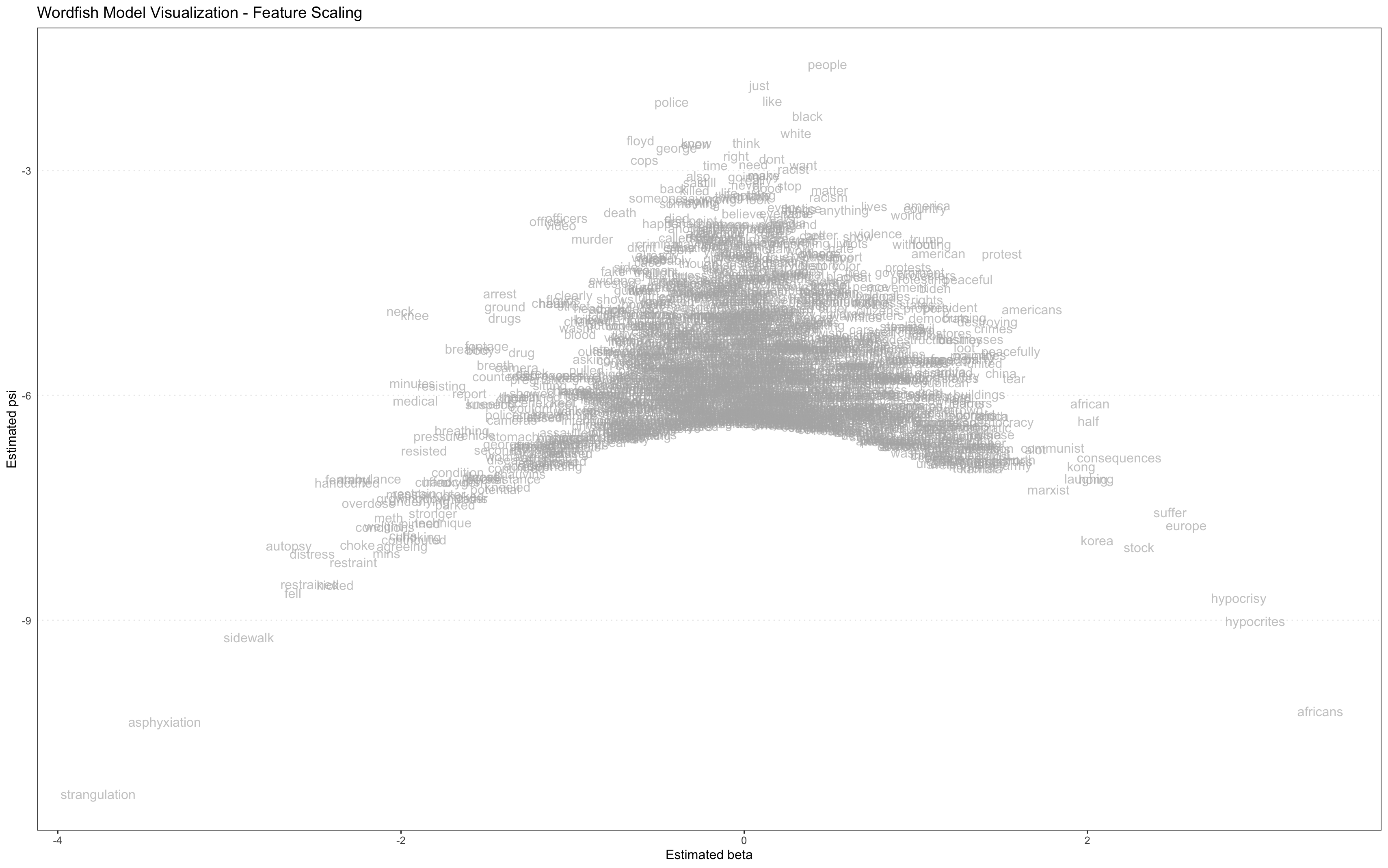
Figure 8. Visualization of Wordfish model showing relative placement of features (words) with outliers removed
For this lesson, we removed three additional stopwords, so that the center of the visualization is of greater interest. Again, it is the words that project off the sloping sides from the center of a balanced Wordfish visualization that are the most descriptive of the primary dimension. The words very far down on the vertical axis at each corner may be polarizing, but they are also very rare, and less likely to be representative of that dimension.
Saving a Visualization
You can export this word-level visualization as a JPEG image file by running the following line of code:
ggsave("Wordfish Model Visualization - Feature Scaling.jpg", plot=wf_feature_plot_more_stopwords)
Note that the image quality from ggsave isn’t always ideal. You may have better results using the Zoom button in RStudio to zoom in on your visualizations, and then manually saving them as JPEG image files by right clicking on the pop-up window, or by taking a screenshot.
Document-level Visualizations
Visualizing partisanship can be useful for discourse analysis of a corpus’s political polarity based on the most salient, opposing ideological stances.
The second method of visualization presented in this lesson displays data at the document level. This visualization highlights opposing sides of the corpus’ salient topic by coloring each document’s unique plot point, arrayed along the horizontal scale.
To create this document-level visualization with partisanship of video sources color-coded, run the following code:
wf_comment_df <- tibble(
  theta = tmod_wf_all[["theta"]],
  alpha = tmod_wf_all[["alpha"]],
  partisan = as.factor(tmod_wf_all[["x"]]@docvars$partisan)
)

wf_comment_plot <- ggplot(wf_comment_df) + geom_point(aes(x = theta, y = alpha, color = partisan), shape = 1) +
  scale_color_manual(values = c("blue", "red")) + labs(title = "Wordfish Model Visualization - Comment Scaling", x = "Estimated theta", y= "Estimated alpha")
wf_comment_plot
Based on the partisan indicators assigned to the data, blue plot points represent comments from left-leaning channels, and red plot points represent comments from right-leaning channels.
Note that in the following visualization the colors are not clearly grouped!
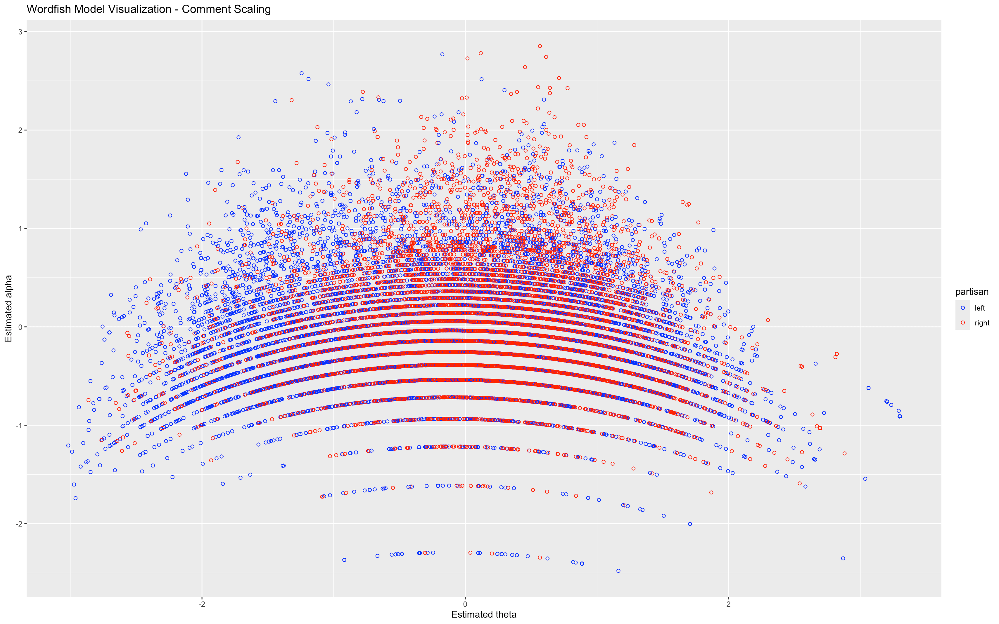
Figure 9. Visualization of WordFish model showing relative comment placement, color-coded by partisanship of video channel
Figure 9 shows the document scaling components of the model (where each document is a single comment). The position of each document is described by two model parameters, which are parallel to those in the word-level visualizations, although for documents these parameters are referred to as theta and alpha. The horizontal axis (theta) shows the scaling of documents, which is parallel to the horizontal scaling of features. The theta parameter describes how polarized each comment is, and in which direction. The vertical axis (alpha) reflects a fixed effect for document length - that is, how many features (words) remained in each comment (following pre-processing). As long as documents have ~10 or more features, they can be meaningfully modeled. This lesson removes documents below this threshold during pre-processing, though you may notice that there is clear length-based striation towards the bottom of the model where the shorter comments appear.
The roughly even distribution of red and blue plotting symbols throughout the visualization suggests that the latent (horizontal) dimension modeled by Wordfish does not position the content of comments from left-leaning sources against those from right-leaning sources. Instead, that dimension describes different aspects of the political debate, which suggests that users from a variety of ideological standpoints are contributing to comment threads on all the videos in this corpus. In other words, if comments posted on right-leaning videos were consistently and systematically different from comments on left-leaning videos, you would expect clear clustering and separation.
The fact that this divide does not manifest in the visualization suggests that left-leaning and right-leaning video channels are receiving comments from people spread across the political spectrum. Instead, the most apparent dimension is a divide between comments that focus on the concrete event of the police killing of George Floyd, in comparison with comments that discuss the broader social context. Within that dichotomy, there is a noticeable tendency for descriptions of the event to use language associated with a left-leaning perspective, whereas descriptions of the context seem to use language associated with right-leaning perspectives.
The small cluster of blue on the far righthand side of this visualization suggests that some of the most polarizing comments were added in response to videos from left-leaning channels. Otherwise, based on this visualization, the channel’s political affiliation does not seem to be a strong predictor of the commenters’ political positions.
Conclusion
In this lesson, you learned how to download a large corpus of YouTube video comments, process the text data, analyze the comments using the Wordfish algorithm, and produce several insightful visualizations. You can reuse the code in this lesson on your own YouTube comment dataset - we’ve made our R script available for download and re-use.
If you opted to use this lesson’s dataset, you will have learned from these visualizations that a broadly similar set of topics is discussed within the comment threads of both left-leaning and right-leaning YouTube videos focused on police brutality and police funding in the United States during 2020. You also learned how to interpret these visualizations to discover which words determined the scale created by the Wordfish model, and which videos contributed to each pole of that scale.
Further analysis of these visualizations, and more granular analyses of the underlying Wordfish model, will enable more complex interpretations of the corpus’ textual meaning. The fact that Wordfish can be useful for understanding the strange type of discourse that appears in YouTube comments is a fascinating revelation in itself.
Endnotes
-
Rieder, Bernhard. YouTube Data Tools. Version 1.42. Platform Digitale Infrastructuur SSH. https://ytdt.digitalmethods.net. ↩
-
Burgess, Jean, and Joshua Green. 2018. YouTube : Online Video and Participatory Culture. Cambridge: Polity Press. ↩
-
Here is a selected bibliography on this topic: 1) André, Virginie. “‘Neojihadism’ and YouTube: Patani Militant Propaganda Dissemination and Radicalization.” Asian Security 8, no. 1 (2012): 27–53. https://doi.org/10.1080/14799855.2012.669207; 2) Ledwich, Mark, and Anna Zaitsev. “Algorithmic Extremism: Examining YouTube’s Rabbit Hole of Radicalization.” arXiv preprint arXiv:1912.11211 (2019). https://arxiv.org/pdf/1912.11211; 3) Ribeiro, Manoel Horta, et al. “Auditing radicalization pathways on YouTube.” Proceedings of the 2020 conference on fairness, accountability, and transparency (2020). https://arxiv.org/pdf/1908.08313; 4) Markmann, S., and C. Grimme. “Is YouTube Still a Radicalizer? An Exploratory Study on Autoplay and Recommendation.” In: Bright, J., Giachanou, A., Spaiser, V., Spezzano, F., George, A., Pavliuc, A. (eds) Disinformation in Open Online Media. MISDOOM 2021. Lecture Notes in Computer Science, vol 12887. Springer, Cham (2021). https://doi.org/10.1007/978-3-030-87031-7_4; 5) Hosseinmardi, Homa, et al. “Examining the consumption of radical content on YouTube.” Proceedings of the National Academy of Sciences 118, no. 32 (2021): e2101967118. https://doi.org/10.1073/pnas.2101967118. ↩
-
Here is a selected bibliography on this topic: 1) Thorson, K., B. Ekdale, P. Borah, K. Namkoong, and C. Shah. “YouTube and Proposition 8: A Case Study in Video Activism.” Information, Communication & Society 13, no. 3 (2010): 325–349. https://doi.org/10.1080/13691180903497060; 2) Bowyer, Benjamin T., Joseph E. Kahne, and Ellen Middaugh. “Youth Comprehension of Political Messages in YouTube Videos.” New Media & Society 19, no. 4 (2017): 522–541. https://doi.org/10.1177/1461444815611593; 3) Spörlein, Christoph, and Elmar Schlueter. “Ethnic Insults in YouTube Comments: Social Contagion and Selection Effects during the German ‘Refugee Crisis’.” European Sociological Review 37, no. 3 (2021): 411–428. https://doi.org/10.1093/esr/jcaa053; 4) Zimmermann, D. et al. “Influencers on YouTube: A Quantitative Study on Young People’s Use and Perception of Videos about Political and Societal Topics.” Current Psychology 41 (2022): 6808–6824. https://doi.org/10.1007/s12144-020-01164-7. ↩
-
Here is a selected bibliography on this topic: 1) Murthy, Dhiraj, and Sanjay Sharma. “Visualizing YouTube’s comment space: Online hostility as a networked phenomena.” New media & society 21.1 (2019): 191-213. https://doi.org/10.1177/1461444818792393; 2) Yun, Gi Woong, Sasha Allgayer, and Sung-Yeon Park. “Mind your social media manners: Pseudonymity, imaginary audience, and incivility on Facebook vs. YouTube.” International Journal of Communication 14 (2020): 21. https://ijoc.org/index.php/ijoc/article/download/11034/3131; 3) Yang, Yu, Chanapa Noonark, and Chung Donghwa. “Do YouTubers Hate Asians? An Analysis of YouTube Users’ Anti-Asian Hatred on Major US News Channels during the COVID-19 Pandemic.” Global Media Journal-German Edition 11.1 (2021). https://doi.org/10.22032/dbt.49166. ↩
-
Related work on analyzing YouTube data developed through collaborations among graduate students at Temple University Libraries’ Loretta C. Duckworth Scholars Studio, which produced a series of relevant blog posts introducing a range of methods for retrieving and analyzing YouTube data. For more information, refer to: 1) the authors’ introductory blogpost on Temple University Libraries Scholars Studio blog, How to Scrape and Analyze YouTube Data: Prototyping a Digital Project on Immigration Discourse; 2) Nicole Lemire-Garlic’s blogpost To Code or Not to Code: Project Design for Webscraping YouTube; 3) Lemire-Garlic’s Computational Text Analysis of YouTube Video Transcripts; and 4) Ania Korsunska’s Network Analysis on YouTube: Visualizing Trends in Discourse and Recommendation Algorithms. ↩
-
It is not possible to fully cover the benefits and limitations of Wordfish in this lesson. For more detail, refer to Nanni, et al. (2019), as well as Luling Huang’s excellent blogpost on the Temple Libraries’ Scholars Studio blog, Use Wordfish for Ideological Scaling: Unsupervised Learning of Textual Data. ↩
-
Instead of installing R and RStudio on your computer, you have the option to use the cloud-hosted version of RStudio: Posit Cloud. This lesson will run on Posit Cloud. However, depending on how often you use the cloud version, you may require a paid subscription. ↩
-
For introductory information about installing R packages, refer to Datacamp’s guide to R-packages. ↩
-
Slapin, Jonathan and Sven-Oliver Proksch. 2008. “A Scaling Model for Estimating Time-Series Party Positions from Texts.” American Journal of Political Science 52(3): 705-772. https://doi.org/10.1111/j.1540-5907.2008.00338.x ↩