
Contents
- Introduction
- Preparatory Steps
- Building the Dashboard
- Deploying the Dashboard
- Further Practice: Second Example
- Conclusion
- Endnotes
The first example remains unaffected and works as described. [August 2025]
Introduction
To advance open scholarship in the humanities it is important to make research outputs more accessible, both to other scholars and the general public. Creating a web-based interactive dashboard to visualize data results has become a popular method to achieve this goal. There are a wide range of examples, such as the StanceXplore project led by a team at Lund University that tracks social media data, Stephanie Boddie and Amy Hillier’s study that recreates W. E. B. Du Bois’ study of black residents in Philadelphia, and Johannes Burgers’ project that visualizes the narrative structure in William Faulkner’s work.
Unlike static graphs, interactive dashboards allow readers to explore patterns in data based on their specific interests by filtering, sorting, or changing views. Features like hover-over tooltips can also provide additional information without cluttering the main display. This lesson will walk you through the process of creating interactive dashboards using the open-source Dash library in Python and publicly available datasets. Figure 1 shows a dashboard created by researcher Ann Marie Ward that illustrates the gender pay gap in Irish businesses and organizations1. On the left, the interactive features include a radio button to switch between 2023 and 2022, and a dropdown menu to select a company. The data and the bar graph in the main panel will change depending on the year and company chosen by the user. This lesson will show you how to use Dash to create an interactive data dashboard of this kind.
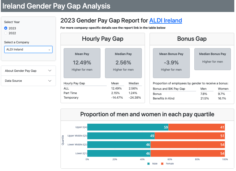
Figure 1. Example of interactive data visualization dashboard created with Dash.
For demonstration, this lesson centers a contemporary case study in the field of media and communication studies. To further demonstrate the range of applications available with web-based dashboards, this lesson also runs through a second case study, using an example with a historical focus.
The method taught by this lesson can be applied to a wide range of digital humanities projects. If your research involves retrieving data from a publicly available source, this lesson can help you to visualize your research outputs in an interactive manner. In addition, this lesson demonstrates how to deploy a dashboard via a free (freemium) web service, to make your dashboards widely and easily accessible. While this Programming Historian lesson uses Python, you may also be interested in Yann Ryan’s lesson Making an Interactive Web Application with R and Shiny.
Lesson Goals
In this lesson, you will learn how to use Python to:
- Retrieve data using an Application Programming Interface (API)
- Create the dashboard frontend (how it looks)
- Create the dashboard backend (how users interact with it)
- Deploy the dashboard onto the web for free
We’ll also work through other essential steps such as installing necessary libraries, setting up a virtual environment, and manipulating the downloaded data.
Case Study
This lesson takes a sample dataset of publicly available transcriptions from U.S. television news and investigates how various U.S. television stations have covered the current war between Russia and Ukraine. For example, using an interactive visualization, we could compare the frequency of Ukraine-related keywords to Russia-related keywords employed by different stations, or compare the amount of coverage of the war between certain stations.
Research in mass communication studies has traditionally followed Quantitative Content Analysis (CA) methods. However, algorithmic text analysis (ATA) has also recently grown in popularity, due to increased availability of large quantities of textual data.2 Both methods aim to infer meaning from text, either through classification or measurement. Whereas CA relies heavily on carefully crafted codebooks that are built around research questions, and verified by multiple human coders,3 4 ATA makes use of computational methods like statistics and machine learning. You might have heard of other, conceptually similar terms: text mining, or Natural Language Processing, for example.5
In our case study, we will aim to discover patterns within a large amount of data6 using an approach that is situated somewhere in between CA and ATA. On the one hand, our approach only conducts distant reading, relying less on human coders (as is often required in CA). On the other hand, this approach only measures the manifest features of text (in this case, frequency) and does not involve any other types of algorithmic classification often seen in ATA.
This intermediate approach offers several advantages: it allows for efficient analysis of large-scale datasets while requiring minimal human resources (since it relies on little manual coding), and at the same time avoiding the complexities which often come with using more sophisticated ATA algorithms. What’s more, by analysing only manifest features of text, it maintains a methodological transparency and reliability. This balance makes the approach particularly suitable for researchers who want to conduct systematic analyses of large text corpora while maintaining methodological practicality.
Dataset
This lesson uses a free and open database from the Internet Archive’s Television Explorer. This database tracks the amount of airtime that U.S. television stations give to certain keywords, based on the closed captioning text. The data-retrieval tool we’ll use is the 2.0 TV API made available by the Global Database of Events, Language and Tone (GDELT). We will retrieve the data for our dashboard via the 2.0 TV API then use it to prepare a dataset like the one below, on which we will build an interactive dashboard.
| date_col | Series | Value |
|---|---|---|
| 2022-01-01 | CNN | 4.7030 |
| 2022-01-02 | CNN | 5.0427 |
| 2022-01-03 | CNN | 4.9139 |
| 2022-01-04 | CNN | 3.1541 |
| 2022-01-05 | CNN | 1.7270 |
| … | … | … |
| 2022-12-27 | MSNBC | 2.5190 |
| 2022-12-28 | MSNBC | 3.0935 |
| 2022-12-29 | MSNBC | 3.1923 |
| 2022-12-30 | MSNBC | 3.3307 |
| 2022-12-31 | MSNBC | 3.0781 |
Why Dash in Python?
There are many alternative tools available for creating interactive dashboards – for example, those discussed in Yann Ryan’s lesson on Shiny in R. Some options do not even require any coding, such as the proprietary software Tableau or ArcGIS. The case for Python is that it is a widely used programming language. Python is also flexible and powerful enough to process a dataset in its full life cycle (from data collection, through data analysis, and to data visualization).
If you have already been using Python, the Dash library is a good option, as it is developed by Plotly, the go-to tool for creating static graphs in various programming languages including Python, R, and JavaScript (see for example Grace Di Méo’s lesson Creating Interactive Visualizations with Plotly). With Dash, you can design an interactive dashboard that allows users to filter the dataset and change the resulting graphs on the fly. You can also deploy your application on the web to make it available to a wider public. Essentially, while Plotly lets you create individual data graphs, Dash will let you incorporate them into a dashboard with features like drop-down menus, search boxes, checklists, or sliders. By publishing a dashboard rather than just a static graph, you let your readers explore the dataset themselves, instead of limiting them to seeing only the information you want to present. This is a powerful tool, especially in an academic context.
As an alternative to Dash, you could use both Plotly and Flask (the web application framework underlying Dash) directly, but this requires deep knowledge of JavaScript and HTML. If you want to focus on data visualization rather than the technical details of web development, Dash is highly recommended because it provides an efficicient workflow for publishing interactive visualizations.
Preparatory Steps
In this lesson, you will write code in a .py file stored in a folder on your local machine. You will then run this .py file in the command line to test your application (by running $python FILENAME.py). Lastly, you will need to use GitHub to deploy your application.
Prerequisites
- Python 3 (3.7.13 or later) (see Mac Installation, Windows Installation, or Linux Installation)
- Command line (see introduction for Windows or macOS/Linux)
- A text editor to write Python code (options include Atom, Notepad++, Visual Studio Code)
- A GitHub account
- Have git ready to use in command line, or use either of the following (not covered in this lesson):
Optional: Jupyter Notebook. If you prefer to run the code in Jupyter Notebook, you’ll need to install it (see this Programming Historian lesson for instructions).
Creating a Virtual Environment
To avoid conflicts between the different versions of libraries used in your Python projects, it is good practice to create a virtual environment for each project.
A virtual environment in Python is a self-contained directory that uses a specific version of Python and each of the libraries you are using. It allows you to manage dependencies for different projects separately, ensuring that changes in one project do not affect others. This is especially useful for maintaining consistent development environments and avoiding conflicts between package versions.
There are several ways to create a virtual environment. One way is to use conda (see Charlie Harper’s Programming Historian lesson for more details). This is a good option if you are already using Anaconda for more data-science-oriented projects. Assuming that you are starting fresh, it would be more appropriate to go for a more lightweight method by using virtualenv. To install, open a command line window and run $pip install virtualenv.
Next, create a folder in your preferred location and name it ph-dash. In your command line, navigate to the ph-dash directory. To create a virtual environment called venv, run $virtualenv venv. Then, you need to activate the virtual environment.
If you’re working in Windows, run:
$venv\Scripts\activate
If you’re wrorking in macOS or Linux, run:
$source venv/bin/activate
If this command is successfully executed, you will notice a pair of parentheses around venv, the name of the created virtual environment, at the start of the current line in your command line window.
Now, you are in an isolated development environment with a specific version of Python and a specific list of libraries with their specific versions. When you are done writing code for a project, and you want to exit the virtual environment, just run $deactivate.
Installing Libraries
Once you’ve set up your virtual environment, you are ready to install several third-party libraries needed for the lesson. With the virtual environment activated, run $pip install requests pandas dash dash_bootstrap_components.
- requests: used in data retrieval, for sending and receiving API queries
- pandas: used in data preparation, for manipulating data in tabular format
- dash: used for creating dashboards
- dash_bootstrap_components: used for frontend templates for dashboards
Alternatively, you can download the file called requirements.txt from the Programming Historian repository, save it to the ph-dash folder you created, and run $pip install -r requirements.txt. This will install the required packages.
Building the Dashboard
The next section will walk you through the major coding steps. You’ll need to save all the code below into a single .py file, which you can name as you wish (for example, app.py). The complete code is also available on the Programming Historian repository for convenience. If you want to execute the code blocks as you follow along, I have provided the Jupyter Notebook version of the code too.
Importing Libraries
import requests
import pandas as pd
from io import StringIO
import dash
from dash import dcc
from dash import html
from dash.dependencies import Input, Output
import dash_bootstrap_components as dbc
import plotly.express as px
The StringIO library is needed to treat a string object as a file-like object, which will be useful when you need to convert the output from an HTML request to a pandas dataframe. The plotly.express library is needed to draw basic graphs, such as a line graph.
dcc, html, Input, and Output are the specific modules within the dash library that will be needed at various points in the code below. dcc (Dash Core Components) provides a set of popular components like text-input boxes, sliders, and dropdowns; html contains components that represent standard HTML elements, allowing you to structure a layout using HTML tags; and Input/Output are used for defining the interactivity in a Dash app. They allow you to specify how changes in one component (Input) should affect another component (Output).
Retrieving Data Using an API
We are going to use an API query to retrieve data. First, let’s define a range of dates from which the API will retrieve data for our dataset. The goal is to create two string objects: start_day_str and last_day_str. Here, you are restricting the range to 365 days in 2022:
start_day_str = '20211228'
last_day_str = '20221231'
The two dates in the above will retrieve data from January 1, 2022 to December 31, 2022. Next, let’s create two string objects which we’ll use for our retrieval queries: one for Ukraine-related terms and one for Russia-related terms. The parameters to be specified include keywords, geographic market, output mode, output format, range of dates, and more:
query_url_ukr = f"https://api.gdeltproject.org/api/v2/tv/tv?query=(ukraine%20OR%20ukrainian%20OR%20zelenskyy%20OR%20zelensky%20OR%20kiev%20OR%20kyiv)%20market:%22National%22&mode=timelinevol&format=html&datanorm=perc&format=csv&timelinesmooth=5&datacomb=sep&timezoom=yes&STARTDATETIME={start_day_str}120000&ENDDATETIME={last_day_str}120000"
query_url_rus = f"https://api.gdeltproject.org/api/v2/tv/tv?query=(kremlin%20OR%20russia%20OR%20putin%20OR%20moscow%20OR%20russian)%20market:%22National%22&mode=timelinevol&format=html&datanorm=perc&format=csv&timelinesmooth=5&datacomb=sep&timezoom=yes&STARTDATETIME={start_day_str}120000&ENDDATETIME={last_day_str}120000"
The Ukraine-related keywords chosen for this lesson are Ukraine, Ukrainian, Zelenskyy, Zelensky, Kyiv, and Kiev; the Russia-related keywords are Russia, Russian, Putin, Kremlin, and Moscow. The chosen geographic market is ‘National’ (United States). The output mode is the normalized percentage of airtime (this will inform the y-axis of the line graph that we’ll create later in this lesson), while the output format is set to CSV (comma-separated values). We will specify the start and end dates using the corresponding object names start_day_str and last_day_str.
The encoding characters %20 and %22 represent space ( ) and double quotation mark ("), respectively. The GDELT Project documentation includes a complete description of each query parameter.
Preparing Data for Visualization
Once you have retrieved this data, you’ll need to prepare it for visualization. Our goal is to transform the data into the format shown in the table above.
def to_df(queryurl):
  response = requests.get(queryurl)
  content_text = StringIO(response.content.decode('utf-8'))
  df = pd.read_csv(content_text)
  return df
We’re using the requests library to execute our queries and transform the results into a pandas dataframe. To help with this, we create a function called to_df() to streamline the workflow. Once you have created the function, you can put it to work:
df_ukr = to_df(query_url_ukr)
df_rus = to_df(query_url_rus)
Optional: you can use the df.head() function to see the first five rows of the output dataframe generated by the action above.
If you are working in Jupyter Notebook, here is how to see the first five rows of the dataframe retrieved for Ukraine:
df_ukr.head()
If you’re executing a .py file in the command line (running $python app.py), add the print() function to see the first five rows:
print(df_ukr.head())
You can also use the shape() function to find out how many columns and rows there are in the dataframe. Give it a try!
Now, you have two dataframes: one for Ukraine and one for Russia. Both contain three columns: date (df_ukr/df_rus), station (Series), and relative frequency of keyword mentions (Value).
Cleaning Data for Further Use
Although this is not strictly required, let’s rename the first column to something shorter, for convenience:
df_ukr = df_ukr.rename(columns={df_ukr.columns[0]: "date_col"})
df_rus = df_rus.rename(columns={df_rus.columns[0]: "date_col"})
Next, because the date and time in the first column is a string, you want to tell Python to actually treat the data as date and time:
df_ukr['date_col'] = pd.to_datetime(df_ukr['date_col'])
df_rus['date_col'] = pd.to_datetime(df_rus['date_col'])
The following code selects three stations to compare: CNN, Fox News, and MSNBC:
df_rus = df_rus[[x in ['CNN', 'FOXNEWS', 'MSNBC'] for x in df_rus.Series]]
df_ukr = df_ukr[[x in ['CNN', 'FOXNEWS', 'MSNBC'] for x in df_ukr.Series]]
These three news channels provide a range of ideological perspectives, useful for the purposes of this lesson. CNN is generally presumed to represent an ideological middle ground, while Fox News is presumed to represent the ideological conservative, and MSNBC is presumed to represent the ideological liberal perspective.
Initiating a Dashboard Instance
The following code will initiate a dashboard instance:
app = dash.Dash(__name__, external_stylesheets=[dbc.themes.LITERA])
server = app.server
Let’s choose a template to define how our dashboard will look. Here, we’ll use the LITERA theme from Dash Bootstrap Components (dbc) – but you can choose any theme you prefer from their list.
Coding the Frontend
In this section of the lesson, we’ll create a dashboard comprising two line graphs, one showing the evolution of term frequency for Ukraine-related terms, the other showing Russia-related terms.
The y-axis of each line graph will indicate the percentage of airtime in which a certain keyword is mentioned, while the x-axes will indicate the date.
On both graphs, three lines will represent our three chosen television networks. We’ll also build a basic interactive component, allowing users to narrow their search by specifying a range of dates.
app.layout = dbc.Container(
    [   dbc.Row([ # row 1
        dbc.Col([html.H1('US National Television News Coverage of the War in Ukraine')],
        className="text-center mt-3 mb-1")
    ]
    ),
        dbc.Row([ # row 2
            dbc.Label("Select a date range:", className="fw-bold")
    ]),

     dbc.Row([ # row 3
              dcc.DatePickerRange(
                id='date-range',
                min_date_allowed=df_ukr['date_col'].min().date(),
                max_date_allowed=df_ukr['date_col'].max().date(),
                initial_visible_month=df_ukr['date_col'].min().date(),
                start_date=df_ukr['date_col'].min().date(),
                end_date=df_ukr['date_col'].max().date()
              )
    ]),

     dbc.Row([ # row 4
              dbc.Col(dcc.Graph(id='line-graph-ukr'),
                      )
     ]),

    dbc.Row([ # row 5
              dbc.Col(dcc.Graph(id='line-graph-rus'),
                      )
     ])

    ])
It can be helpful to think about the dashboard layout as a grid of rows and columns. In our dashboard, let’s imagine five rows, from top to bottom: title, instruction text for the date-range selector, data-range selector, the first line graph, and the second line graph.
Let’s break down the long code block above.
Row 1:
dbc.Col([html.H1('US National Television News Coverage of the War in Ukraine')], className="text-center mt-3 mb-1")
This code specifies that we only want one column in Row 1, and we use the H1 HTML element to enclose the dashboard’s title. className sets the CSS styling for the H1 HTML element, in this case the title will be centered, with margins set on top and bottom.
In Row 2, we’re creating a text box with a bold font which directs users to select a date range:
dbc.Row([ # row 2
            dbc.Label("Select a date range:", className="fw-bold")])
In Row 3, we define the key interactive feature of our dashboard: a date range picker, where a user can choose a start date and an end date (see Figure 2 below).
dbc.Row([ # row 3
          dcc.DatePickerRange(
              id='date-range',
              min_date_allowed=df_ukr['date_col'].min().date(),
              max_date_allowed=df_ukr['date_col'].max().date(),
              initial_visible_month=df_ukr['date_col'].min().date(),
              start_date=df_ukr['date_col'].min().date(),
              end_date=df_ukr['date_col'].max().date()
          )
    ])
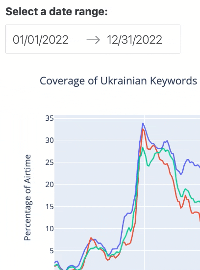
Figure 2. The interactive date range picker feature.
Using the code above, we have defined that when the dashboard is first loaded the date range will be set from the earliest possible to the latest possible date in the date_col column of the dataframe by default. Remember that those two dates are within a maximum range of 365 days apart.
You are now ready to put the two line graphs in place in Row 4 and Row 5, respectively:
dbc.Row([ # row 4
        dbc.Col(dcc.Graph(id='line-graph-ukr'), )
     ]),

dbc.Row([ # row 5
        dbc.Col(dcc.Graph(id='line-graph-rus'), )
     ])
You can see that the line graph for Ukraine is on Row 4, and the one for Russia is on Row 5.
If you want to add columns within a row, you can easily do so by nesting two dbc.Col components under the same dbc.Row component. The code example below shows how you would place the two line graphs side by side, on the same row:
dbc.Row([
          dbc.Col(dcc.Graph(id='line-graph-ukr'),
                  ),
          dbc.Col(dcc.Graph(id='line-graph-rus'),
                  )
  ])
Note that the frontend code above explicitly gives names to components that are involved in user interaction. In this case, there are three such components: the data-range picker date-range (as input) and the two line graphs line-graph-ukr and line-graph-rus (as output – that is, reacting to any update in the date range triggered by a user). These components’ names are defined using the id parameter, and they will be very important when you code the backend.
Coding the Backend
In the backend, the core concepts to consider are the ‘callback decorator’ and the ‘callback function’.
In the following code, @app.callback, the callback decorator, defines which input and output variables are involved in user interactions. For example, you’ll log the Ukraine line graph line-graph-ukr as one of the output variables. The figure parameter specifies which property of that specific component is updated when needed.
The callback function, update_output(), defines how the interaction occurs. Here, both line graphs are updated whenever the start date or the end date in the date-range picker is changed by a user. This is called ‘reactive programming’, and is similar to the server logic used in the R and Shiny lesson. The callback functions determine the dynamic nature of the dashboard.
# callback decorator
@app.callback(
    Output('line-graph-ukr', 'figure'),
    Output('line-graph-rus', 'figure'),
    Input('date-range', 'start_date'),
    Input('date-range', 'end_date')
)

# callback function
def update_output(start_date, end_date):
    # filter dataframes based on updated data range
    mask_ukr = (df_ukr['date_col'] >= start_date) & (df_ukr['date_col'] <= end_date)
    mask_rus = (df_rus['date_col'] >= start_date) & (df_rus['date_col'] <= end_date)
    df_ukr_filtered = df_ukr.loc[mask_ukr]
    df_rus_filtered = df_rus.loc[mask_rus]

    # create line graphs based on filtered dataframes
    line_fig_ukr = px.line(df_ukr_filtered, x="date_col", y="Value",
                     color='Series', title="Coverage of Ukrainian Keywords")
    line_fig_rus = px.line(df_rus_filtered, x='date_col', y='Value',
                     color='Series', title="Coverage of Russian Keywords")

    # set x-axis title and y-axis title in line graphs
    line_fig_ukr.update_layout(
                   xaxis_title='Date',
                   yaxis_title='Percentage of Airtime')
    line_fig_rus.update_layout(
                   xaxis_title='Date',
                   yaxis_title='Percentage of Airtime')

    # set label format on x-axis in line graphs
    line_fig_ukr.update_xaxes(tickformat="%b %d<br>%Y")
    line_fig_rus.update_xaxes(tickformat="%b %d<br>%Y")

    return line_fig_ukr, line_fig_rus
Let’s break down the update_output() function above.
We begin with two arguments: start_date and end_date. These represent the dates chosen by a user, which become the input for the update_output() function. The order matters - variables should mirror the order of the input variables specified in @app.callback. That is, start_date comes before end_date.
The actual task that the update_output() function performs is, first, to filter the two dataframes based on the updated data range:
mask_ukr = (df_ukr['date_col'] >= start_date) & (df_ukr['date_col'] <= end_date)

mask_rus = (df_rus['date_col'] >= start_date) & (df_rus['date_col'] <= end_date)

df_ukr_filtered = df_ukr.loc[mask_ukr]
df_rus_filtered = df_rus.loc[mask_rus]
The ‘mask’ (for example, mask_ukr) are the condition(s) under which a row in a dataframe is selected. df_ukr_filtered and df_rus_filtered are the filtered dataframes containing only the date range selected by the user.
The next step creates the two line graphs, based on the filtered dataframes:
line_fig_ukr = px.line(df_ukr_filtered, x="date_col", y="Value", color='Series', title="Coverage of Ukrainian Keywords")

line_fig_rus = px.line(df_rus_filtered, x='date_col', y='Value', color='Series', title="Coverage of Russian Keywords")
In each of the line graphs, the x-axis represents the dates from the dataframe’s date_col column; the y-axis represents the percentage of airtime found in the Value column. The lines are color-coded by channel based on the Series variable. The final argument sets the title of the graph.
The rest of the code simply applies a few cosmetic changes to the line graphs’ appearance. You set the axis titles like so:
line_fig_ukr.update_layout(
                   xaxis_title='Date',
                   yaxis_title='Percentage of Airtime')

line_fig_rus.update_layout(
                   xaxis_title='Date',
                   yaxis_title='Percentage of Airtime')
Because you are limited in space horizontally, it would look cleaner if the year could appear on a new line. Here is how you can format the label for the x-axis:
line_fig_ukr.update_xaxes(tickformat="%b %d<br>%Y")
line_fig_rus.update_xaxes(tickformat="%b %d<br>%Y")
%b represents the shorthand name of the month (e.g. Dec for December); %d is the day of the month (01 to 31); <br> is the newline element in HTML; and %Y is the four-digit year (e.g. 2024).
Finally, note that the two returned objects (line_fig_ukr and line_fig_rus) should again be ordered as they were in the callback decorator (so here, our Ukraine’s line graph goes first).
Testing the Dashboard
Now, you can use the following code to actually see and test your dashboard:
app.run(debug=True)
Debug mode is recommended to help you look into any errors you might encounter.
Make sure you’ve saved all the code written so far in your single .py file, then execute $python FILENAME.py in the command line. A server address will appear: copy and paste this address into a web browser to launch the dashboard. Do not close the command line program while the server is running.
To stop the server while in the command line, press CTRL+c on your keyboard.
If you are working in a Jupyter Notebook, you can also choose to review the dashboard as a cell output (again, please refer to the notebook version of the code).
The dashboard should look like this:
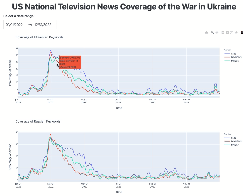
Figure 3. The TV airtime dashboard interface.
Deploying the Dashboard
Once you’ve created your dashboard, you’ll probably want to share it with the public, using a URL. This means that you’ll need to deploy your dashboard as a web application.
In this section, you will achieve this goal by using the free-tier web service provided by Render, that allows you to host a dynamic web application. In Render’s free plan, the RAM limit is 512 MB at the time of writing. Our demo app takes about 90 MB, so the allocated RAM should be sufficient.
If you need more computing power and greater RAM, for example if you are building a web application that will see heavy usage, or is based on a large dataset, you may need to pay Render a certain fee. At the time of writing, other options for hosting dynamic web applications (instead of static sites) include PythonAnywhere, Dash Enterprise, Heroku, Amazon Web Services, and Google App Engine.
If you want to host your own server, or someone at your institution can help you set up a dedicated server, the generally recommended approach is to find ways to deploy Flask apps (for example, via Apache2).
Setting up in GitHub
You will need to turn the ph-dash folder into a GitHub repository. You can do this in the command line by executing $git init or using GitHub Desktop (see Amanda Visconti’s Programming Historian lesson if you are new to Git or GitHub).
Then, install one more library for deployment by entering $pip install gunicorn. The gunicorn library allows Render to set up a web server for you.
In your repository, you will need two essential files: a .py file that contains all of your Python code, and a file called requirements.txt that lists all the required Python libraries. When you deploy the app, Render will read this file to install the required Python libraries. You can easily create this requirements file in the command line, using $pip freeze > requirements.txt. I have also provided a sample repository for your reference.
Setting up in Render
You can sign up to Render for free using an email address, and create a new ‘Web Service’. If your GitHub repository is public, you can copy and paste the repository’s HTTPS address into the ‘Public Git Repository’ address field. Otherwise, you can also link your GitHub account to Render, giving Render access to your private repository.
On the next screen, you will enter several pieces of information. In addition to giving your dashboard a name, you’ll need to configure two more settings (assuming all the populated default settings are correct).
First, change the Start Command input to gunicorn app:server. The server name after the colon should match the object name you set for your server in your Python script. The app name before the colon should match the .py filename in the repository.
Second, scroll down to find the section called Environment Variables. Click Add Environment Variable and input PYTHON_VERSION as the key, with the Python version that you use on your machine as the value (use $python -V in the command line to check your Python version). If you don’t explicitly specify the Python version this way, Render will use a default Python version, which may cause conflicts with the library versions you’ve specified in requirements.txt.
Third, click Create Web Service and wait for several minutes for the application to build. When finished, you’ll be able to see your dashboard via a URL, like this: https://ph-dash-demo.onrender.com/.
Further Practice: Second Example
To demonstrate the wide applicability of the approach used in the case study above, the following part of this lesson will demonstrate how to create another dashboard, using a different dataset. This second example explores a different research question: ‘What were the top 10 languages used by non-English U.S. newspapers by decade from the 1690s to today?’ We’ll design a dashboard to show the top ten languages in each decade dating back to the 1690s, highlighting any shifts in their rankings, and the emergence or decline of different languages over time.
Whereas non-English Native American newspapers serve as a crucial medium for preserving cultural values, teaching about the Euro-American society, and negotiating tribal sovereignty,7 8 non-English immigrant newspapers help newcomers track the latest events in their home countries, provide ways to learn about the local country, and facilitate the transition.9 Examining the top non-English U.S. newspapers helps to investigate Native American history, immigration history, the sociolinguistics and ideological landscapes in the U.S.,10 and various functions of ethnic media.11
Dataset
The dashboard for the second example also makes use of a publicly available dataset, this time from the Chronicling America project. Specifically, the data from the U.S. Newspaper Directory, 1690-Present. This dataset tracks the metadata of historic U.S newspapers, including what language they were written in.
The data-retrieval tool is Chronicling America’s API. You can use this API to retrieve the required data and prepare it for visualization in a tabular structure, like this:
| 1690 | 1700 | 1710 | 1720 | 1730 | 1740 | 1750 | 1760 | 1770 | 1780 | 1790 | 1800 | 1810 | 1820 | 1830 | |
|---|---|---|---|---|---|---|---|---|---|---|---|---|---|---|---|
| Albanian | 0 | 0 | 0 | 0 | 0 | 0 | 0 | 0 | 0 | 0 | 0 | 0 | 0 | 0 | 0 |
| Amharic | 0 | 0 | 0 | 0 | 0 | 0 | 0 | 0 | 0 | 0 | 0 | 0 | 0 | 0 | 0 |
| Arabic | 3 | 3 | 3 | 3 | 3 | 3 | 3 | 3 | 3 | 3 | 3 | 3 | 3 | 3 | 3 |
| Armenian | 1 | 1 | 1 | 1 | 1 | 1 | 1 | 1 | 1 | 1 | 1 | 1 | 1 | 1 | 1 |
| Asue Awyu | 0 | 0 | 0 | 0 | 0 | 0 | 0 | 0 | 0 | 0 | 0 | 0 | 0 | 0 | 0 |
| … | … | … | … | … | … | … | … | … | … | … | … | … | … | … | … |
In the table above, the rows represent different languages (sorted alphabetically), the columns represent decades (from the 1690s to the 2020s), and the cells represent newspaper counts.
You can use the cell values to calculate the proportion (percentage) of newspapers in a given language over a certain decade – relative to all non-English newspapers. The percentage is calculated by dividing the number of newspapers in a given language in a certain decade by the total number of non-English newspapers in that decade, and then multiplying by 100.
Our dashboard will visualize the top 10 non-English languages used by newspapers in a certain decade.
Planning the Dashboard
Let’s create two pie charts, side by side. Both pie charts will show the top 10 non-English languages with their percentage – users will be able to specify a certain decade for each pie chart using a dropdown menu, allowing them to compare the results for any two decades.
The following are the same as we’ve described in the TV airtime case study above:
- Prerequisites
- Creating a new virtual environment
- Python libraries
- Deploying the dashboard on Render
The differences will be in the data downloading procedure, as well as the specific code used to build the dashboard’s frontend and backend. However, the underlying logic remains the same: you start with data retrieval, prepare the data for visualization, code the dashboard frontend, then code the dashboard backend.
Downloading the Data
Downloading this dataset can take a long time, so I’ve prepared the downloaded data in a CSV file and for the purposes of this lesson we’ll focus on coding the dashboard.
If you’d prefer to download the data directly yourself, I have provided the necessary script to do so. The key step is to retry a query if the server returns an error: Chronicling America restricts the number of download requests which can be sent to the server over a given period.
No matter what your data demand is, always follow the rule set by the server and respect other users.
Building the Dashboard
This is the script for coding the dashboard.
If you have downloaded the data in CSV format, you can run the app-rq2.py script directly, without retrieving the data from Chronicling America. The final product should look like this:
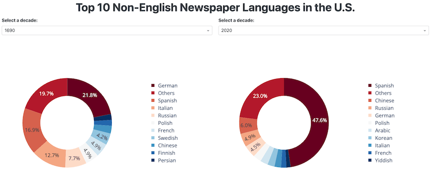
Figure 4. The non-English-newspaper dashboard interface.
Each pie chart shows the top 10 languages of non-English newspapers in a given decade. To deploy this dashboard online, you can follow the same procedure as for the TV airtime example.
Conclusion
Interactive visualization contributes to digital humanities by facilitating knowledge discovery and making research outputs more accessible to the public. In this lesson, we’ve demonstrated the key steps for creating and deploying an interactive dashboard, using the open-source library Dash in Python, and two examples from the field of media studies. As with the lesson using Shiny in R, this approach can be adapted to a wide range of research applications in the digital humanities.
You have learned:
- How to retrieve publicly available data using an API using the
requestslibrary
The data owner may have a restriction on the amount of data to be requested. You need to respect such a policy. As shown in the non-English newspaper case, something you could do is to time your requests (that is, resend your request after a certain time).
- How to create the frontend of a dashboard
The key is to understand the page layout as a grid that contains a certain number of rows and columns. We used a CSS framework called Bootstrap, which is user-friendly for non-web-developers. This can help you get off the ground quickly. We did not discuss the use of wireframe in the planning stage, but that could be useful to consider if you work in a team, or your dashboard has many features and outputs.
- How to create the backend of a dashboard
One takeaway regarding the backend: any changes in the user input will trigger changes in the output. There are two things to keep in mind. Firstly, the id you specify in the frontend component helps you to define the input and output variables in the callback decorator; and secondly, that the dataframe needs to be updated based on the changes in the input variables.
- How to deploy a dashboard for free
To achieve greatest impact, your dashboard needs to be seen by others. We used Render for the deployment, but that is only one of many options available at the time of writing. There are even more options if you are willing to pay a certain amount of money. The key is to find a platform that is reliable and sustainable over the long term.
The final message of this lesson is to encourage you to adapt the code provided for your own projects. There are also numerous free online resources for further study. To get started, all you need to do is open a command line tool, open a text editor, and try out the Python code yourself!
Endnotes
-
Ann Marie Ward. Ireland Gender Pay Gap Analysis (), https://genderpaygap.pythonanywhere.com/. ↩
-
Stephen Lacy et al., “Issues and Best Practices in Content Analysis,” Journalism & Mass Communication Quarterly 92, no. 4 (September 28, 2015): 791–802, https://doi.org/10.1177/1077699015607338. ↩
-
Matthew Lombard, Jennifer Snyder‐Duch, and Cheryl Campanella Bracken. “Content Analysis in Mass Communication: Assessment and Reporting of Intercoder Reliability,” Human Communication Research 28, no. 4 (2002): 587-604, https://doi.org/10.1111/j.1468-2958.2002.tb00826.x. ↩
-
Kimberly A. Neuendorf, The Content Analysis Guidebook (Thousand Oaks: Sage, 2017). ↩
-
Gross, Justin, and Dana Nestor. “Algorithmic Text Analysis: Toward More Careful Consideration of Qualitative Distinctions,” in Oxford Handbook of Engaged Methodological Pluralism in Political Science, eds. Janet M. Box-Steffensmeier, Dino P. Christenson, and Valeria Sinclair-Chapman (Oxford Academic, 2023). ↩
-
André Baltz, “What’s so Social about Facebook? Distant Reading of Swedish Local Government Facebook Pages, 2010-2017,” International Journal of Strategic Communication 17, no. 2 (February 15, 2023): 118, https://doi.org/10.1080/1553118x.2022.2144324. ↩
-
Sharon Murphy, “Neglected Pioneers: 19th Century Native American Newspapers,” Journalism History 4, no. 3 (1977): 79, https://doi.org/10.1080/00947679.1977.12066850. ↩
-
Patty Loew and Kelly Mella, “Black Ink and the New Red Power: Native American Newspapers and Tribal Sovereignty,” Journalism & Communication Monographs 7, no. 3 (2005): 101, https://doi.org/10.1080/00947679.1977.12066850. ↩
-
Hermann W. Haller, “Ethnic-Language Mass Media and Language Loyalty in the United States Today: The Case of French, German and Italian,” WORD 39, no. 3 (December 1988): 187, https://doi.org/10.1080/00437956.1988.11435789. ↩
-
Andrew Hartman, “Language as Oppression: The English‐only Movement in the United States,” Socialism and Democracy 17, no. 1 (January 2003): 187–208, https://doi.org/10.1080/08854300308428349. ↩
-
K. Viswanath and Pamela Arora, “Ethnic Media in the United States: An Essay on Their Role in Integration, Assimilation, and Social Control,” Mass Communication and Society 3, no. 1 (February 2000): 39–56, https://doi.org/10.1207/s15327825mcs0301_03. ↩