
Contents
Contents
- Contents
- Overview
- Getting Started
- The Basics of Bokeh
- Bokeh and Pandas: Exploring the WWII THOR Dataset
- Categorical Data and Bar Charts: Munitions Dropped by Country
- Stacked Bar Charts and Sub-sampling Data: Types of Munitions Dropped by Country
- Time-Series and Annotations: Bombing Operations over Time
- Spatial Data: Mapping Target Locations
- Bokeh as a Visualization Tool
- Further Resources
Overview
The ability to load raw data, sample it, and then visually explore and present it is a valuable skill across disciplines. In this tutorial, you will learn how to do this in Python by using the Bokeh and Pandas libraries. Specifically, we will work through visualizing and exploring aspects of WWII bombing runs conducted by Allied powers.
At the end of the lesson you will be able to:
- Load tabular CSV data
- Perform basic data manipulation, such as aggregating and sub-sampling raw data
- Visualize quantitative, categorical, and geographic data for web display
- Add varying types of interactivity to your visualizations
To reach these goals, we’ll work through a variety of visualization examples using THOR, a dataset that describes historical bombing operations.
The WWII THOR Dataset
The Theater History of Operations Reports (THOR) lists aerial bombing operations during World War I, World War II, the Korean War, and the Vietnam War undertaken by the United States and Allied Powers. The records were compiled from declassified documents by Lt. Col. Jenns Robertson. THOR is made publicly available through a partnership between the US Department of Defense and data.world.
Each row in the THOR dataset contains information on a single mission or bombing run. This information can include the mission date, takeoff and target locations, the target type, aircraft involved, and the types and weights of bombs dropped on the target. The THOR data dictionary provides detailed information on the structure of the dataset.
For this tutorial, we’ll use a modified version of the World War II THOR dataset. The original, full-version of the dataset consists of 62 columns of information digitized from the paper forms. To make this dataset more manageable for our purposes, this has been reduced to 19 columns that include core mission information and bombing data. These columns are discussed below when we first load the data.
The dataset used in this tutorial is contained in thor_wwii.csv. This file is required to complete most of the examples below.
We’ll use Bokeh and Pandas to address some of the following questions:
- What types and weights of munitions were dropped during World War II (WWII)? What patterns can we discern in the use of different types of munitions?
- How did the types and weights of munitions dropped change over the course of WWII? How do these changes correspond to major military events?
- What targets were munitions dropped on during the war? Were particular types of munitions limited to certain theaters of operations or targets?
Other Possible Datasets
If this dataset doesn’t fit your interests or if you’d like more practice after completing this tutorial, here are a few other interesting datasets that you might wish to use with Bokeh and Pandas:
-
Scottish Witchcraft Trials (
https://data.world/history/scottish-witchcraft): A multi-table set of data on over 4,000 people accused of witchcraft between 1536 and 1736. -
Civil Unrest Events (
https://data.world/history/civil-unrest-event-data): A single table cataloging over 60,000 events of civil unrest across the world since the end of World War II. -
Trans-Atlantic Slave Trade Database: Searchable and customizable tabular data on 36,000 slaving voyages that transported over 10 million slaves from the 16th to 19th centuries (this dataset is not a data.world dataset – you can download it directly from the slavevoyages site).
All three datasets contain comparable quantitative, qualitative, and temporal data to those found in the THOR dataset. The Civil Unrest Events and Trans-Atlantic Slave Trade datasets both contain spatial data, though this is lacking from the Scottish Witchcraft Trials data.
Getting Started
Prerequisites
This tutorial can be completed using any operating systems. It requires Python 3 and a web browser. You may use any text editor to write your code.
This tutorial assumes that you have a basic knowledge of the Python language and its associated data structures, particularly lists.
If you work in Python 2, you will need to create a virtual environment for Python 3, and even if you work in Python 3, creating a virtual environment for this tutorial is good practice.
Creating a Python 3 Virtual Environment
A Python virutal environment is an isolated environment in which you can install libraries and execute code. Many different virtual evironments can be created to work with different versions of Python and Python libraries. Virtual environments are useful because they ensure you have only the necessary libraries installed and that you do not encounter version conflicts. An additional benefit of virtual environments is that you can pass them to others so that you know your code will execute on another machine.
Miniconda is one easy way to create virtual environments that is simple to install across operating systems. You should download Miniconda and follow the instructions for Windows, Mac, or Linux as appropriate for your operating system.
Once you have downloaded and installed Miniconda for your operating system, you can check that it has installed correctly by opening a command line and typing:
conda info
If you see version information similar to the following, then Miniconda has installed correctly.
Current conda install:
               platform : linux-64
          conda version : 4.3.29
          ...
We’ll use Miniconda to create a Python 3 virtual environment named bokeh-env for this tutorial. In the command line type the following:
conda create --name bokeh-env python=3.6
Say ‘yes’ when you are prompted to install new packages.
To activate the bokeh-env virtual environment, the command differs slightly depending on your operating system.
source activate bokeh-env #For Linux/MacOS
activate bokeh-env #For Windows
Your command line should now show that you are in the bokeh-env virtual environment.
When you would like to leave the virtual environment, you can type the command appropriate for your operating system.
source deactivate #For Linux/MacOS
deactivate #For Windows
Installing Packages
In your activated bokeh-env virtual environment, issue the following command to install the python packages for this tutorial.
pip install pandas bokeh pyproj
To get the exact versions used to write this tutorial (note: these may not be the most recent versions of each python package) you can pass the following version numbers to pip.
pip install "pandas>=1.2.0,<1.2.3" "bokeh>=2.0.0,<2.3.0" "pyproj>=3.0,<3.0.1"
Running Code Examples
It is easiest first to create a single directory and save each code example as a .py within it. When you are ready to run the code file, navigate to this directory in your command prompt and make sure your virtual environment is activated. Remember that you can always activate the environment with the following command appropriate for your operating system.
source activate bokeh-env #For Linux/MacOS
activate bokeh-env #For Windows
Within the virtual environment, you can run your code by typing:
python filename.py
A Jupyter Notebook containing the code used in this tutorial is also available in case you prefer to work through the tutorial without installing a virtual environment. You can learn more about Jupyter Notebook here. If you have created a virtual environment using Miniconda, as discussed above, you can install Jupyter Notebook in the environment by typing conda install jupyter
The Basics of Bokeh
What is Bokeh?
Bokeh is a library for creating interactive data visualizations in a web browser. It offers a concise, human-readable syntax, which allows for rapidly presenting data in an aesthetically pleasing manner. If you’ve worked with visualization in Python before, it’s likely that you have used matplotlib. It’s worth briefly mentioning how Bokeh differs from matplotlib, and when one might be preferred to the other.
Matplotlib has existed since 2002 and has long been a standard of Python data visualization. Bokeh emerged in 2013. This difference in age means that Matplotlib matured long before Bokeh was released; however, in a short period of time, Bokeh has reached a high level of maturity.
The intended uses of matplotlib and Bokeh are quite different. Matplotlib creates static graphics that are useful for quick and simple visualizations, or for creating publication quality images. Bokeh creates visualizations for display on the web (whether locally or embedded in a webpage) and most importantly, the visualizations are meant to be highly interactive. Matplotlib does not offer either of these features.
If would you like to visually interact with your data in an exploratory manner or you would like to distribute interactive visual data to a web audience, Bokeh is the library for you! If your main interest is producing finalized visualizations for publication, matplotlib may be better, although Bokeh does offer a way to create static graphics.
With this differences in mind, as we work through the lesson, I’ll emphasize the interactive aspects that make Bokeh useful for exploring and disseminating historical data and that set it apart from other libraries like matplotlib.
Your First Plot
First, create a new file called my_first_plot.py in the same directory as wwii_thor.csv and then open it up in a text editor. We’ll be adding lines to this file to run.
#my_first_plot.py
from bokeh.plotting import figure, output_file, show
To implement and use Bokeh, we first import some basics that we need from the bokeh.plotting module.
figure is the core object that we will use to create plots. figure handles the styling of plots, including title, labels, axes, and grids, and it exposes methods for adding data to the plot. The output_file function defines how the visualization will be rendered (namely to an html file) and the show function will be invoked when the plot is ready for output. show tells Bokeh that all of the data has been added to the plot and it is time to render it.
output_file('my_first_graph.html')
Bokeh recommends that output_file, to which we pass a file name, be called at the start of your script, immediately after imports. An alternative output function to be aware of is output_notebook which is used to show plots in-line in a Jupyter Notebook. To learn more about installing and using Jupyter notebooks, see Jupyter’s documentation.
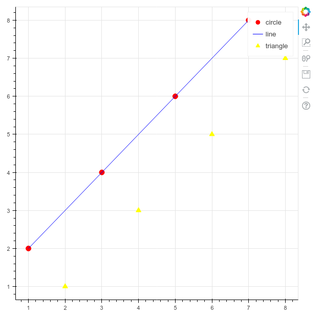
x = [1, 3, 5, 7]
y = [2, 4, 6, 8]
Next we’ll create some data to plot. Data in Bokeh can take on different forms, but at its simplest, data is just a list of values. We create one list for our x-axis and one for our y-axis.
With our output format and data fixed, we can instantiate a figure and add the data to it.
p = figure()

p.circle(x, y, size=10, color='red', legend='circle')
p.line(x, y, color='blue', legend='line')
p.triangle(y, x, color='gold', size=10, legend='triangle')
p is a common variable name for a figure object, since a figure is a type of plot.
After instantiating the figure, we call the circle , line, and triangle methods to plot our data. These types of methods are known as a glyph method. The term glyph in Bokeh refers to the lines, circles, bars, and other shapes that are added to plots to display data.
If we wanted, we could just keep adding glyphs to the plot! In addition to the circle, line, and triangle glyphs, there are many others, including: asterisk, circle_cross, circle_x, cross, diamond, diamond_cross, inverted_triangle, square, square_cross, square_x, and x.
When calling a glyph method, at a minimum, we must pass the data we would like to plot, but frequently we might add styling arguments. Here, we set a size, color, and legend name for each glyph.
p.legend.click_policy='hide'
We will also add our first piece of code that brings some interactivity to the plot. By setting a click_policy on our legend, a user can now click on each legend entry (e.g. circle, line, triangle) to show/hide that piece of data! The click_policy can also be set to mute instead of hide. This would mute the color of that data on clicking rather than hide it completely.
show(p)
Calling show and passing the instantiated figure will output the results to our html file. Now let’s run this code!
In your command line, make sure you’re in the directory where you’ve saved the file and then run the file with the python command.
python my_first_plot.py
Plotting a Single Glyph
A web browser will now appear showing the html file with your visualization. The red circles, blue line, and gold triangles are the result of our glyph method calls. Clicking the legend in the upper right corner will show/hide each glyph type. Note that Bokeh has automatically handled the creation of the grid-lines and tick labels.
Along the right-hand side, the default toolbar is also displayed. The tools include drag, box zoom, wheel zoom, save, reset, and help. Using these tools, a user can pan along the plot or zoom in on interesting portions of the data. Since this is a stand-alone HTML page, which includes a reference to BokehJS, it can be immediately passed to a co-worker for exploration or posted to the web.
Bokeh and Pandas: Exploring the WWII THOR Dataset
In the previous example, we manually created two short Python lists for our x and y data. What happens when you have real-world data with tens-of-thousands of rows and dozens of columns stored in an external format? Pandas, a widely-used data science library, is ideally suited to this type of data and integrates seamlessly with Bokeh to create interactive visualizations of data.
Pandas Overview
For the purposes of this tutorial, I will only touch on the basic functions of Pandas that are necessary to produce our visualizations. 10 Minutes to Pandas and Lessons for New Pandas Users are excellent introductions that I would recommend for expanding your knowledge beyond the very basics touched on here.
Pandas has quickly become the de facto Python library for data and data science workflows; integration with other major data science and machine learning libraries has only fueled a rise in popularity.1 Pandas provides functionality to quickly and efficiently read, write, and modify datasets for analysis. To accomplish this, Pandas provides data structures that hold different dimensionalities of data. The DataFrame holds 2-dimensional data in the manner of a spreadsheet with rows and columns. It’s through this object that we’ll interact with our WWII THOR dataset. Let’s first examine the Pandas DataFrame by loading our csv data into one.
Loading Data in Pandas
To begin with, create a new file called loading_data.py.
#loading_data.py
import pandas as pd

df = pd.read_csv('thor_wwii.csv')
print(df)
We start by importing the Pandas library and then calling read_csv() and passing a filename to it. Note that the Pandas library is aliased as pd. This alias is a convention followed in the Pandas official documentation and is widely used by the Pandas community. For this reason, I’ll use the pd alias throughout the tutorial.
In this code, read_csv creates a DataFrame that holds the rows/columns of our csv data. By convention, the variable name df is used to represent the loaded dataframe in tutorials and basic code examples. Many other methods exist for reading data formats other than csv in Pandas, such as JSON, SQL tables, Excel files, and HTML.
When running this code, print(df) will output an abridged representation of the loaded data.
MSNDATE      THEATER    COUNTRY_FLYING_MISSION    ...     TONS_IC TONS_FRAG TOTAL_TONS
03/30/1941          ETO          GREAT BRITAIN    ...         0.0       0.0        0.0
11/24/1940          ETO          GREAT BRITAIN    ...         0.0       0.0        0.0
12/04/1940          ETO          GREAT BRITAIN    ...         0.0       0.0        0.0
12/31/1940          ETO          GREAT BRITAIN    ...         0.0       0.0        0.0

[178281 rows x 19 columns]
This shows that we have 178,281 records of missions with 19 columns per record. To see what the 19 columns are in full, we can access the dataframe’s columns object by replacing print(df) in the above code with:
df.columns.tolist()
The output should look like:
['MSNDATE', 'THEATER', 'COUNTRY_FLYING_MISSION', 'NAF', 'UNIT_ID', 'AIRCRAFT_NAME', 'AC_ATTACKING', 'TAKEOFF_BASE', 'TAKEOFF_COUNTRY', 'TAKEOFF_LATITUDE', 'TAKEOFF_LONGITUDE', 'TGT_COUNTRY', 'TGT_LOCATION', 'TGT_LATITUDE', 'TGT_LONGITUDE', 'TONS_HE', 'TONS_IC', 'TONS_FRAG', 'TOTAL_TONS']
Some of these column names are self explanatory, but it’s worth pointing out the following: MSNDATE (mission date), NAF (numbered airforce responsible for mission), AC_ATTACKING (number of aircraft), TONS_HE (high-explosives), TONS_IC (incendiary devices), TONS_FRAG (fragmentation bombs).
When it comes to accessing data within a DataFrame, in this tutorial we use one basic approach: indexing. Here to access a single column we pass a string to our dataframe’s indexer: e.g. df['MSNDATE']. To access multiple columns, we pass a list of names to our dataframe’s indexer: e.g. df[['MSNDATE', 'THEATER']].
The Bokeh ColumnDataSource
Now that we’ve learned how to create a Bokeh plot and how to load tabular data into Pandas, it’s time to learn how to link Pandas’ DataFrame with Bokeh visualizations. The Bokeh object ColumnDataSource provides this integration.
The object’s constructor accepts a Pandas DataFrame as an argument. After it is created, the ColumnDataSource can then be passed to glyph methods via the source parameter and other parameters, such as our x and y data, can then reference column names within our source. Let’s go through an example of this.
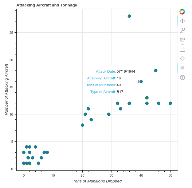
Using our THOR dataset, we’ll create a scatter plot of the number of attacking aircraft versus the tons of munitions dropped. We will use a new file called column_datasource.py to do this. We’ll also take this opportunity to learn about Bokeh’s interactive hover feature.
#column_datasource.py
import pandas as pd
from bokeh.plotting import figure, output_file, show
from bokeh.models import ColumnDataSource
from bokeh.models.tools import HoverTool

output_file('columndatasource_example.html')

df = pd.read_csv('thor_wwii.csv')
Here, we import Pandas, the figure object and basic functions from bokeh.plotting, and the ColumnDataSource object from bokeh.models. We’re also going to expand our knowledge of interactions in this example by adding a hover feature that is facilitated by the HoverTool
We then immediately set our output file following Bokeh’s recommended best practices. Finally, we call Pandas read_csv method to load our csv into a DataFrame.
sample = df.sample(50)
source = ColumnDataSource(sample)
Since we don’t want to plot all 170,000+ rows in our scatterplot (which would require a longer processing time to generate and would create a confusing plot due to the volume of overlapping data), we randomly sample 50 rows using the dataframe’s sample method. We then pass this sample to the ColumnDataSource constructor and store this in a variable called source.
p = figure()
p.circle(x='TOTAL_TONS', y='AC_ATTACKING',
         source=source,
         size=10, color='green')
Next, we create our figure object and call the circle glyph method to plot our data. This is where the source variable that holds our ColumnDataSource comes into play. It’s passed as our source argument to the glyph method and the column names holding the number of attacking aircraft (AC_ATTACKING) and tons of munitions dropped (TOTAL_TONS) are passed as our x and y arguments.
Interestingly, when we use a ColumnDataSource we’re not limited to just using column names for x and y parameters. We can also pass a column name for other parameters such as size, line_color, or fill_color. This allows styling options to be determined by columns in the datasource itself! If you’d like to see this in action, in the code above, change size=10 to size='TONS_HE'. The size of each dot will then reflect the tons of high explosives used.
Throughout the tutorial, I often pass arguments by name where they could more succinctly be passed by position. This is helpful, in my opinion, for the reader to keep track of what arguments are being passed
Next we add a title and label our axes.
p.title.text = 'Attacking Aircraft and Munitions Dropped'
p.xaxis.axis_label = 'Tons of Munitions Dropped'
p.yaxis.axis_label = 'Number of Attacking Aircraft'
We can also, at this stage, learn a bit more about the strong interactive, customizable nature of Bokeh plots. In our first Bokeh plot we saw the default Bokeh toolbar, but Bokeh allows us to customize our plot by adding new interactive tools to it.
hover = HoverTool()
hover.tooltips=[
    ('Attack Date', '@MSNDATE'),
    ('Attacking Aircraft', '@AC_ATTACKING'),
    ('Tons of Munitions', '@TOTAL_TONS'),
    ('Type of Aircraft', '@AIRCRAFT_NAME')
]

p.add_tools(hover)

show(p)
Bokeh supports many plotting tools, but I introduce HoverTool here because it’s particularly useful for data exploration and interaction. HoverTool allows you to set a tooltips property which takes a list of tuples. The first part of the tuple is a display name and the second is a column name from your ColumnDataSource prefaced with @. Once we’ve instantiated this tool, we add it to the plot using the add_tool method. We’ll see how this looks in a moment.
Finally, we make sure to add the line to show the plot. Now we can run column_datasource.py and interact with our data in the browser.
Plotting with the ColumnDataSource and More Styling Options
Note that because we are randomly sampling the data, our plot will look different each time we run the code.
At the top and along the axes of the plot, we see the labels that we added. There is also a new tool in the toolbar. This is the hover tool that we added. To see it in action, hover over any data point in the scatterplot. A window will pop up showing the columns we set in our tooltip property!
Before moving to the next section of the lesson, try returning to the example above and adding/removing other variables and changing display names.
Categorical Data and Bar Charts: Munitions Dropped by Country
In the preceding example, we plotted quantitative data. Frequently, though, we want to plot categorical data. Categorical data, in contrast to quantitative, is data that can be divided into groups, but that does not necessarily have a numerical aspect to it. For example, while your height is numerical, your hair color is categorical. From the perspective of our dataset, features like attacking country hold categorical data, while features like the weight of munitions hold quantitative data.
In this section, we’ll learn how to use categorical data as our x-axis values in Bokeh and how to use the vbar glyph method to create a vertical bar chart (an hbar glyph method functions similarly to create a horizontal bar chart). In addition, we’ll learn about preparing categorical data in Pandas by grouping data. Further, we’ll add to our knowledge of Bokeh styling and the hover tool.
To work through this information, we’ll create a bar chart that shows the total tons of munitions dropped by each country listed in our csv.
We start by creating a new file called munitions_by_country.py and adding some initial code.
#munitions_by_country.py
import pandas as pd
from bokeh.plotting import figure, output_file, show
from bokeh.models import ColumnDataSource
from bokeh.models.tools import HoverTool

from bokeh.palettes import Spectral5
from bokeh.transform import factor_cmap
output_file('munitions_by_country.html')

df = pd.read_csv('thor_wwii.csv')
First, we import the Pandas library and the basic elements from Bokeh (i.e. figure, output_file, show, and ColumnDataSource). We also make two new imports: Spectral5 is a pre-made five color pallette, one of Bokeh’s many pre-made color palettes, and factor_cmap is a helper method for mapping colors to bars in a bar-charts.
After the imports, we set our output_file and load the thor_wwii.csv file into a DataFrame.
We now need to get from the 170,000+ records of individual missions to one record per attacking country with the total munitions dropped.
grouped = df.groupby('COUNTRY_FLYING_MISSION')[['TOTAL_TONS', 'TONS_HE', 'TONS_IC', 'TONS_FRAG']].sum()
Pandas lets us do this in a single line of code by using the groupby dataframe method. This method accepts a column by which to group the data and one or more aggregating methods that tell Pandas how to group the data together. The output is a new dataframe.
Let’s take this one piece at a time. The groupby('COUNTRY_FLYING_MISSION') sets the column that we are grouping on. In other words, this says that we want the resulting dataframe to have one row per unique entry in the column COUNTRY_FLYING_MISSION. Since we don’t care about aggregating all 19 columns in the dataframe, we choose just the tons of munitions columns with the indexer, ['TOTAL_TONS', 'TONS_HE', 'TONS_IC', 'TONS_FRAG']. Finally, we use the sum method to let Pandas know how to aggregate all of the different rows. Other methods also exist for aggregating, such as count, mean, max, and min.
If you execute print(grouped), you’ll see that Pandas has grouped by the five unique countries in our dataset and summed the total tons dropped by each. You can also see the dataset has some problems: South Africa and New Zealand dropped more high explosives than the total tons column. Problems like this are typical of large, manually-created datasets and this is a great reminder why is so important to explore and visualize your data before creating research results.
                        TOTAL_TONS     TONS_HE     TONS_IC  TONS_FRAG
COUNTRY_FLYING_MISSION
AUSTRALIA                   479.89      453.90      13.600      18.64
GREAT BRITAIN           1112598.95   868277.23  209036.158    1208.00
NEW ZEALAND                2629.06     4263.70     166.500       0.00
SOUTH AFRICA                 11.69       15.00       0.000       0.00
USA                     1625487.68  1297955.65  205288.200  127655.98
To plot this data, let’s convert to kilotons by dividing by 1000.
grouped = grouped / 1000
This is a convenience that we’ll continue to use in future examples.
source = ColumnDataSource(grouped)
countries = source.data['COUNTRY_FLYING_MISSION'].tolist()
p = figure(x_range=countries)
Now, we need to make a ColumnDataSource from our grouped data and create a figure. Since our x-axis will list the five countries (rather than numerical data) we need to tell the figure how to handle the x-axis.
To do this, we create a list of countries from our source object, using source.data and the column name as key. The list of countries is then passed as the x_range to our figure constructor. Because this is a list of text data, the figure knows the x-axis is categorical and it also knows what possible values our x range can take (i.e. AUSTRALIA, GREAT BRITAIN, etc.).
color_map = factor_cmap(field_name='COUNTRY_FLYING_MISSION',
                    palette=Spectral5, factors=countries)

p.vbar(x='COUNTRY_FLYING_MISSION', top='TOTAL_TONS', source=source, width=0.70, color=color_map)

p.title.text ='Munitions Dropped by Allied Country'
p.xaxis.axis_label = 'Country'
p.yaxis.axis_label = 'Kilotons of Munitions'
Now we plot our data as individually colored bars and add basic labels. To color our bars we use the factor_cmap helper function. This creates a special color map that matches an individual color to each category (i.e. what Bokeh calls a factor). The color map is then passed as the color argument to our vbar glyph method.
For the data in our glyph method, we’re passing a source and again referencing column names. Instead of using a y parameter, however, the vbar method takes a top parameter. A bottom parameter can equally be specified, but if left out, its default value is 0.
hover = HoverTool()
hover.tooltips = [
    ("Totals", "@TONS_HE High Explosive / @TONS_IC Incendiary / @TONS_FRAG Fragmentation")]

hover.mode = 'vline'

p.add_tools(hover)

show(p)
We add a hover tool again, but now we see that we can use multiple data variables in a single line and add in our own text so the hover popup will list the kilotons of each type of explosive. The hover.mode is new. Three modes exist for the hover tool: mouse, vline, and hline. These tell the hover tool when to show the popup. mouse is the default value and shows a popup when directly over a glyph. vline and hline tell the popup to show when a vertical or horizontal line crosses a glyph. With vline set here, anytime your mouse passes through an imaginary vertical line extending from each bar, a popup will show.
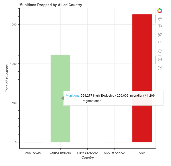
A Bar Chart with Categorical Data and Coloring
If you have a chance, it’s worth exploring Bokeh’s color palettes. In the above example, try rewriting the code to use something other than Spectral5, such as Inferno5 or RdGy5. To take it one step further, you can try your hand at using built-in palettes in any example that uses color.
Stacked Bar Charts and Sub-sampling Data: Types of Munitions Dropped by Country
Because the previous plot shows that the USA and Great Britain account for the overwhelming majority of bombings, we now focus on these two countries and learn how to make a stacked bar chart that shows the types of munitions each country used.
We’ll start a new file called munitions_by_country_stacked.py
#munitions_by_country_stacked.py
import pandas as pd
from bokeh.plotting import figure, output_file, show
from bokeh.models import ColumnDataSource
from bokeh.palettes import Spectral3
output_file('types_of_munitions.html')

df = pd.read_csv('thor_wwii.csv')
In addition to our standard imports, this time we use a three-color Spectral palette, one color for each type of explosive (High Explosive, Incendiary, and Fragmentation).
filter = df['COUNTRY_FLYING_MISSION'].isin(('USA','GREAT BRITAIN'))
df = df[filter]
Since the x-axis is again categorical, we’ll need to group and aggregate our data. This time, though, we need to exclude any records hat don’t have a COUNTRY_FLYING_MISSION with a value of GREAT BRITAIN or USA. To do that, we filter our dataframe.
For each row in df, the isin function checks whether COUNTRY_FLYING_MISSION has a value of USA or GREAT BRITAIN. If it does, the corresponding value in the variable filter is True and if not the value is False
When applied to our dataframe via df[filter], a new dataframe is created in which rows with a True value are kept and rows with a False value are discarded. After the filter has been applied here, executing df.shape shows that 125,526 rows remain of an original 178,281.
grouped = df.groupby('COUNTRY_FLYING_MISSION')['TONS_IC', 'TONS_FRAG', 'TONS_HE'].sum()

#convert tons to kilotons again
grouped = grouped / 1000
Now that we have reduced the dataframe to show only records for the USA and Great Britain, we group our data with groupby and aggregate the three columns that hold bomb types with sum.
source = ColumnDataSource(grouped)
countries = source.data['COUNTRY_FLYING_MISSION'].tolist()
p = figure(x_range=countries)
As in the previous example, we create a source object from our grouped data and make sure our figure uses categorical data for the x-axis by setting the x_range to the list of countries.
p.vbar_stack(stackers=['TONS_HE', 'TONS_FRAG', 'TONS_IC'],
             x='COUNTRY_FLYING_MISSION', source=source,
             legend = ['High Explosive', 'Fragmentation', 'Incendiary'],
             width=0.5, color=Spectral3)
To create the stacked bar chart, we call the vbar_stack glyph method. Rather than passing a single column name to a y parameter, we instead pass a list of column names as stackers. The order of this list determines the order that the columns will be stacked from bottom to top (after you’ve worked through this example, try switching the column order to see what happens). The legend argument supplies text for each stacker and the Spectral3 palette provides colors for each stacker.
p.title.text ='Types of Munitions Dropped by Allied Country'
p.legend.location = 'top_left'

p.xaxis.axis_label = 'Country'
p.xgrid.grid_line_color = None	#remove the x grid lines

p.yaxis.axis_label = 'Kilotons of Munitions'

show(p)
We add basic styling and labeling, and then output the plot.
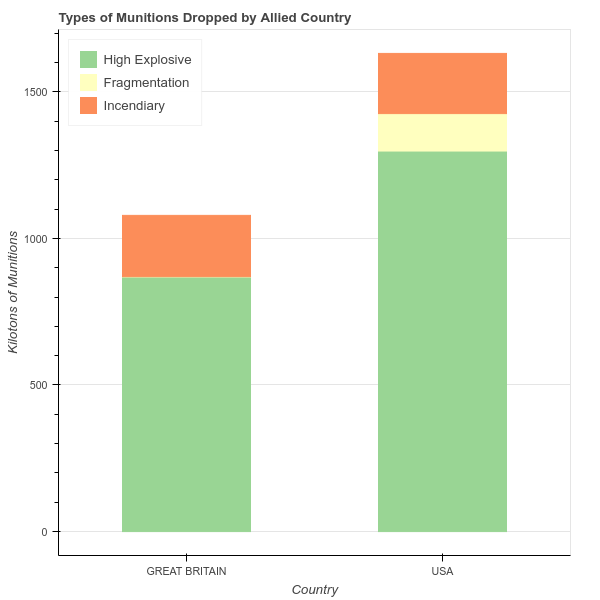
A Stacked Bar Chart with Categorical Data and Coloring
Time-Series and Annotations: Bombing Operations over Time
Let’s now explore the use of incendiary and fragmentation explosive a little more by seeing if there’s any trend in their use over time versus the total munitions dropped. As you have had some time to get used to Bokeh’s syntax, let’s dive right in with a full code example in a new file named my_first_timeseries.py.
#my_first_timeseries.py
import pandas as pd
from bokeh.plotting import figure, output_file, show
from bokeh.models import ColumnDataSource
from bokeh.palettes import Spectral3
output_file('simple_timeseries_plot.html')

df = pd.read_csv('thor_wwii.csv')

#make sure MSNDATE is a datetime format
df['MSNDATE'] = pd.to_datetime(df['MSNDATE'], format='%m/%d/%Y')

grouped = df.groupby('MSNDATE')['TOTAL_TONS', 'TONS_IC', 'TONS_FRAG'].sum()
grouped = grouped/1000

source = ColumnDataSource(grouped)

p = figure(x_axis_type='datetime')

p.line(x='MSNDATE', y='TOTAL_TONS', line_width=2, source=source, legend='All Munitions')
p.line(x='MSNDATE', y='TONS_FRAG', line_width=2, source=source, color=Spectral3[1], legend='Fragmentation')
p.line(x='MSNDATE', y='TONS_IC', line_width=2, source=source, color=Spectral3[2], legend='Incendiary')

p.yaxis.axis_label = 'Kilotons of Munitions Dropped'

show(p)
Take a minute to seriously look through this code and see what you recognize. Two items should stand out as new.
First, the statement df['MSNDATE'] = pd.to_datetime(df['MSNDATE'], format='%m/%d/%Y') makes sure our MSNDATE column is a datetime. This is important because often data loaded from a csv file will not be properly typed as datetime. Supplying the format argument is not required, but doing so significantly speeds up the process.
Second, we pass the argument x_axis_type='datetime' to our figure constructor to tell it that our x data will be datetimes. Otherwise, Bokeh works seamlessly with time data just like any other type of numerical data!
Looking at the output, though, you might notice a major issue.
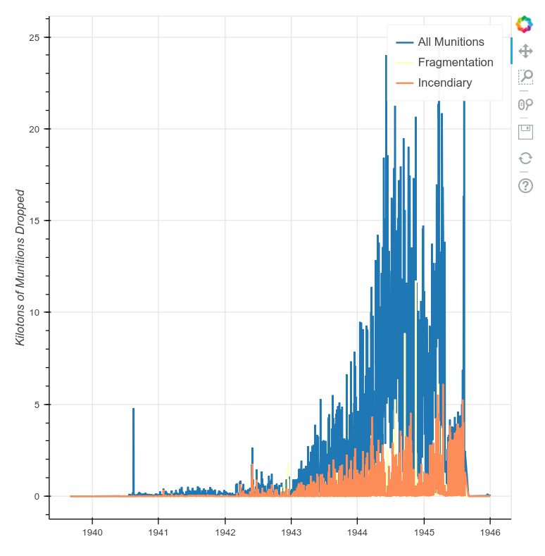
A Basic Time-Series Plot
This data is volatile and hard-to-read because it is too fine-grained for our needs. Having daily data over the course of five years is great, but plotting it as such obscures trends in the data. To successfully plot time-series data and look for long-term trends, we need a way to change the time-scale we’re looking at so that, for example, we can plot data summarized by weeks, months, or years.
Thankfully, Pandas offers a quick and easy way to do this. By modifying a single line of code in the above example, we can resample our time-series data to any valid unit of time.
Resampling Time-Series Data
Resampling time-series data can involve either upsampling (creating more records) or downsampling (creating fewer records). For example, a list of daily temperatures could be upsampled to a list of hourly temperatures or downsampled to a list of weekly temperatures. We’ll only be downsampling in this tutorial, but upsampling is very useful when you’re trying to match a sporadically-measured dataset with one that’s more periodically measured.
To resample our data, we use a Pandas Grouper object, to which we pass the column name holding our datetimes and a code representing the desired resampling frequency. In the case of our data, the statement pd.Grouper(key='MSNDATE', freq='M') will be used to resample our MSNDATE column by Month. We could equally resample by Week, Year, Hour, and so forth. These frequency designations can also be prefaced with numbers so that, for example, freq='2W' resamples at two week intervals!
To complete the process of resampling and plotting our data, we pass the above Grouper object to our groupby function in place of the raw column name. The groupby statement from the previous code example should now look like this:
grouped = df.groupby(pd.Grouper(key='MSNDATE', freq='M'))['TOTAL_TONS', 'TONS_IC', 'TONS_FRAG'].sum()
Rerunning the above code sample will produce a much cleaner plot with obvious trends. The plot now shows four points of interest:
- First, in both the Spring of 1944 and 1945, the scale of Allied bombing operations reached greater intensity.
- Second, there is a smaller spike in the summer of 1945 during the acceleration of bombings against the Japanese after Germany’s surrender.
- Third, four spikes in the use of incendiary weapons appear that could further explored.
-
Fourth and finally, there are a few small spikes in the use of fragmentation bombs, the use of which then effectively stops after the surrender of Germany.
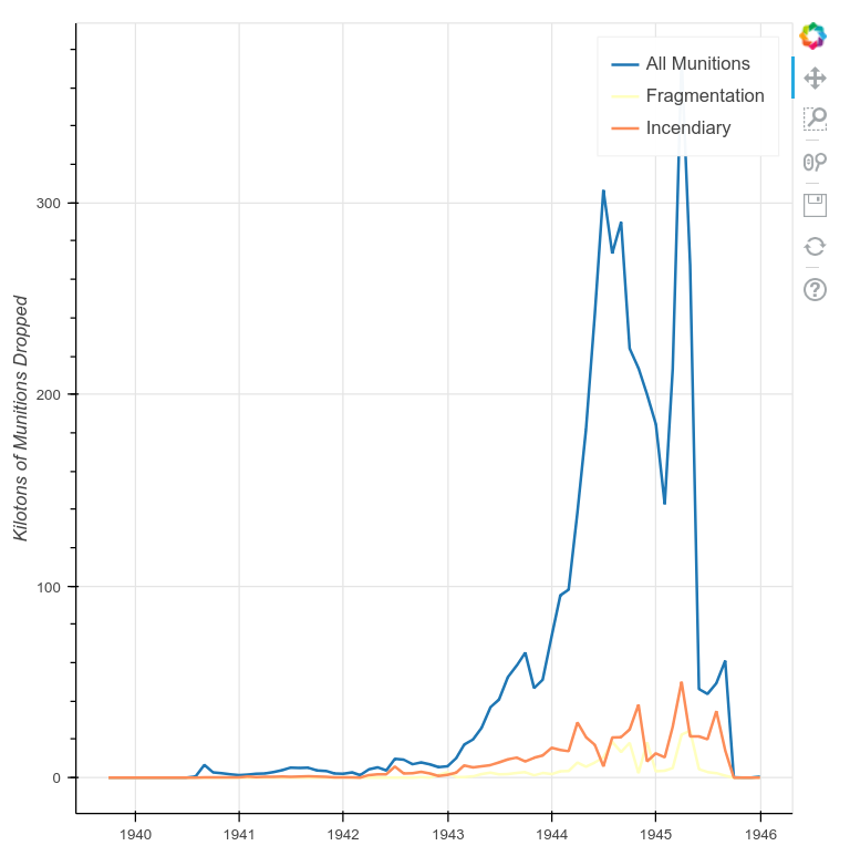
A Time-Series Plot with Data Resampled to Months
Annotating Trends in Plots
Let’s look more closely now at the bombings in Europe in 1944 and 1945 to see what trends there are with fragmentation and incendiary munitions. We will also point out some of these trends in our plot with annotations. To do this, we’ll filter our dataset so that we work only with bombings in the European Theater of Operations (ETO), resample the data at one-month intervals (freq='M'), and then plot the results in the same manner as before.
#annotating_trends.py
import pandas as pd
from bokeh.plotting import figure, output_file, show
from bokeh.models import ColumnDataSource
from datetime import datetime
from bokeh.palettes import Spectral3
output_file('eto_operations.html')

df = pd.read_csv('thor_wwii.csv')

#filter for the European Theater of Operations
filter = df['THEATER']=='ETO'
df = df[filter]

df['MSNDATE'] = pd.to_datetime(df['MSNDATE'], format='%m/%d/%Y')
group = df.groupby(pd.Grouper(key='MSNDATE', freq='M'))['TOTAL_TONS', 'TONS_IC', 'TONS_FRAG'].sum()
group = group / 1000

source = ColumnDataSource(group)

p = figure(x_axis_type="datetime")

p.line(x='MSNDATE', y='TOTAL_TONS', line_width=2, source=source, legend='All Munitions')
p.line(x='MSNDATE', y='TONS_FRAG', line_width=2, source=source, color=Spectral3[1], legend='Fragmentation')
p.line(x='MSNDATE', y='TONS_IC', line_width=2, source=source, color=Spectral3[2], legend='Incendiary')

p.title.text = 'European Theater of Operations'

p.yaxis.axis_label = 'Kilotons of Munitions Dropped'

show(p)
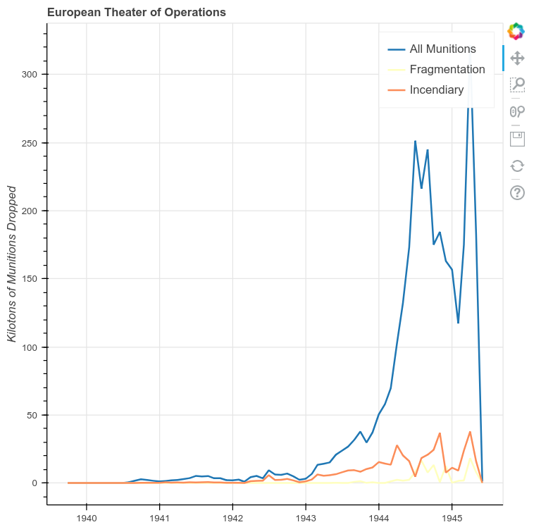
A Time-Series Plot of the ETO with Data Resampled to Months
A few patterns emerge in the ETO data. First we see a very clear escalation of overall bombings leading up to June 6, 1944 and a notable dip during the winter of 1944/1945. Incendiary munitions show three spikes and confirm that the fourth spike seen in the preceding example was directed at the bombing of Japan after Germany’s surrender. The pattern of fragmentation bombs is harder to read, but it’s now clear that they were only seriously used in the European Theater after D-Day.
Try your hand at resampling this data using any of Pandas’ time frequencies to see what other trends might emerge. Remember, you can preface these frequencies with numbers as well (e.g. if you were working with historical stock market data, 2Q would give you bi-quarterly data!)
Since we have established that 6 June 1944 and the winter of 1944/1945 mark changes to the bombing patterns in the ETO, let’s highlight these trends using Bokeh’s annotation features.
To do this, we’ll create a BoxAnnotation and then add these to our figure before showing it. First, we need to add an additional import statement to our code.
from bokeh.models import BoxAnnotation
To create the box, we first need to determine its coordinates. Coordinates for Bokeh annotations can be either absolute (i.e. positioned using screen units), meaning they always stay in one place, or they can be positioned in relation to data. Our annotations will all be positioned using data coordinates.
box_left = pd.to_datetime('6-6-1944')
box_right = pd.to_datetime('16-12-1944')
The left of the box will be 6 June 1944 (D-Day) and for the right of the box we’ll choose the first day of the Battle of the Bulge: 16 December 1944. In this case, the dates follow a month-day-year format, but to_datetime also works with day-first and year-first formats.
We pass these coordinates to the BoxAnnotation constructor along with some styling arguments. Then, we add it to the our figure using the add_layout() method.
box = BoxAnnotation(left=box_left, right=box_right,
                    line_width=1, line_color='black', line_dash='dashed',
                    fill_alpha=0.2, fill_color='orange')

p.add_layout(box)
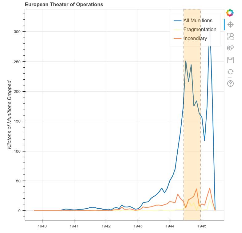
A Time-Series Plot of the ETO with Annotations Added
Try to create a similar plot for the Pacific Theater of Operations (PTO). Annotate the invasion of Iwo Jima (February 19, 1945) and Japan’s announcement of surrender (August 15, 1945).
Spatial Data: Mapping Target Locations
In this final part of the lesson we’ll look at the spatial components of fragmentation bombs.
Bokeh provides built-in tile providers that render base maps of the world. These are contained in the bokeh.tile_providers module. For this example, we’ll use the CartoDB Tile Service (CARTODBPOSITRON).
get_provider was deprecated as of Bokeh 3.0.0. The notes available on this reference page may support readers to adjust their code using add_tile instead.
We’ll also be using functions imported from the pyproj library. Since our coordinates are stored as latitude/longitude, we’ll define a custom function to convert them before mapping. Note that although Bokeh is coordinate-system neutral, it uses the Web Mercator projection for mapping, a standard found across web tile providers. The subject of coordinate systems and projections are outside the scope of this tutorial, but the interested reader will find many useful web resources on these topics.
If your own dataset has place names, but not latitude and longitude, don’t worry! You can find ways to easily get coordinates from place names in Programming Historian’s Geocoding Historical Data using QGIS or Web Mapping with Python and Leaflet.
# target_locations.py
import pandas as pd
from bokeh.plotting import figure, output_file, show
from bokeh.models import ColumnDataSource, Range1d
from bokeh.layouts import layout
from bokeh.palettes import Spectral3
from bokeh.tile_providers import get_provider
from pyproj import Transformer
output_file('mapping_targets.html')

# helper function to convert lat/long to easting/northing for mapping
# this relies on functions from the pyproj library


def LongLat_to_EN(long, lat):
    try:
        transformer = Transformer.from_crs('epsg:4326', 'epsg:3857')
        easting, northing = transformer.transform(long, lat)
        return easting, northing
    except:
        return None, None


df = pd.read_csv("thor_wwii.csv")


df['E'], df['N'] = zip(
    *df.apply(lambda x: LongLat_to_EN(x['TGT_LONGITUDE'], x['TGT_LATITUDE']), axis=1)))
The boilerplate imports and our conversion function are defined. Next, we load our data and apply our conversion function to create new E and N columns that store our Web Mercator easting and northing.
grouped = df.groupby(['E', 'N'])[['TONS_IC', 'TONS_FRAG']].sum().reset_index()

filter = grouped['TONS_FRAG'] != 0
grouped = grouped[filter]

source = ColumnDataSource(grouped)
Because a single target can appear in multiple records, we need to group the data by E and N to get unique target locations. Otherwise, we would map the same target every time it appears in a record.
The reset_index function applied after aggregating is new here. By default, when Pandas groups these two columns it will make E and N the index for each row in the new dataframe. Since we just want E and N to remain as normal columns for mapping, we call reset_index.
left = -2150000
right = 18000000
bottom = -5300000
top = 11000000

p = figure(x_range=Range1d(left, right), y_range=Range1d(bottom, top))
To set bounds for our map, we’ll set a minimum and maximum value for our plot’s x_range and y_range. We use the Range1D object, which represents bounded 1-dimensional data in Bokeh.
provider = get_provider('CARTODBPOSITRON')
p.add_tile(provider)

p.circle(x='E', y='N', source=source, line_color='grey', fill_color='yellow')

p.axis.visible = False

show(p)
Finally, we call add_tile and pass the tile provider we imported. Then, we use glyph methods just like in any other plot. Here, we call circle and pass the easting and northing columns as our x and y data.
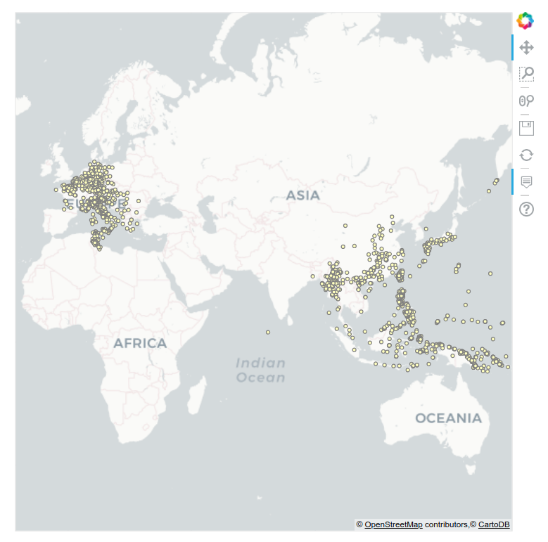
A Map of Target Locations
Having plotted which targets in Europe and Asia were bombed with fragmentation bombs, we can now start to examine patterns of destruction with greater detail. In the above code, we also summed incendiary bombs. Try to alter the code to create a map of these targets.
Bokeh as a Visualization Tool
Bokeh’s strength as a visualization tool lies in its ability to show differing types of data in an interactive and web-friendly manner. This tutorial has only scratched the surface of Bokeh’s capabilities and the reader is encourage to delve deeper into the library’s workings. A great place to start is the Bokeh gallery, where you can see a variety of visualizations and decide how you might apply these techniques to your own data. If you’re more inclined to dive right into further code examples, Bokeh’s online notebook is an excellent place to start!
Further Resources
-
David Robinson, ‘Why is Python Growing so Quickly?’, Stack Overflow Blog, 14 September 2017 https://stackoverflow.blog/2017/09/14/python-growing-quickly/ ↩