
Contents
- Introduction
- Background: from Words to Data
- Case Study: E-Theses Online
- Dimensionality Reduction
- Hierarchical Clustering
- Validation
- Summary
- Bibliography & Other Readings
- Notes
Introduction
As corpora are increasingly ‘born digital’ on hard drives as well as web and email servers, we are moving from being able to select or group documents using keyword or manual searches to needing to be able to automate this task at scale. Moreover, large-ish, unlabelled corpora of thousands or tens-of-thousands of documents are not particularly well-suited to topic modelling or TF/IDF analysis either. Since we don’t have a sense of what kinds of groups might exist, what kinds of topics might be covered, or what level of distinctiveness in vocabulary might matter, we need different, more flexible ways to visualise and extract structure from texts.
This lesson shows one way to achieve this: uncovering meaningful structure in a large corpus of about 9,000 documents through the use of two techniques — dimensionality reduction and hierarchical clustering — to find and group similar documents with minimal human guidance. Our approach to document classification is unsupervised: we do not use either keywords or human expertise — except to validate the results and provide a measure of ‘quality’ — relying instead on the information contained in the text itself.
To do this we take advantage of word and document embeddings; these lie at the root of recent advances in text-mining and Natural Language Processing, and they provide us with a numerical representation of a text that extends what’s possible with counts or TF/IDF representations of text. We take these embeddings and then apply our selected techniques to extract a hierarchical structure of relationships from the corpus. In this lesson, we’ll explore why documents on similar topics tend be closer in the (numerical) ‘space’ of the word and document embeddings than those that are on very different topics.
To help make sense of this multidimensional ‘space’, this lesson explicates the corpus through a range of data visualisations that (we hope) bring the process to life. Based on these visualizations, this lesson demonstrates how this approach can help with a range of practical applications: at the word- and document-level we can use similarity to suggest missing keywords or find documents on the same topic (even if they use a slightly different vocabulary to do so!); and at the corpus-level we can look at how topics have grown and changed over time, and identify core/peripheries of disciplines or knowledge domains.
For a fuller introduction to word embeddings and their use in Natural Language Processing, you may wish to read Barbara McGillivray’s How to use word embeddings for Natural Language Processing (see the King’s College London Institutional Repository for details; direct download). In addition, the details of how word and documents embeddings are created will be covered in future Programming Historian lessons. This lesson will also provide a brief overview of what embeddings do (and why they differ from, say, TF/IDF), using embeddings that we trained on a corpus composed of the title and abstract of completed doctoral research in the Arts and Humanities lodged with the British Library.
Learning Outcomes
- An appreciation of the ‘curse of dimensionality’ and why it is an important to text mining.
- The ability to use (nonlinear) dimensionality reduction to reveal structure in corpora.
- The ability to use hierarchical clustering to group similar documents within a corpus.
Prerequisites
This article can be seen as building on, and responding to, the Clustering with Scikit-Learn in Python tutorial already available on The Programming Historian. Like Thomas Jurczyk, we are interested in applying clustering algorithms with Python to textual data ‘in order to discover thematic groups’. Contrasting these two tutorials will allow you to develop a broader understanding of the Natural Language Processing (NLP) landscape.
The most important differences between these tutorials are:
- The use of word2vec instead of TF/IDF
- The use of UMAP instead of PCA for dimensionality reduction
- The use of hierarchical instead of k-means clustering
This lesson’s steps enable you to convert each document to a point that can be plotted on a graph and grouped together based on their proximity to other documents.
Background: from Words to Data
For computers to ‘make sense’ of large corpora, we ultimately need two things:
- a way to transform words into numerical data
- a way to make use of those numbers in order to find groups of ‘similar’ documents
Until quite recently, this process was fairly simple: assign each unique term in the corpus a number; create a kind of ‘latent fingerprint’ for each document using those numbers; and, finally, group documents together based on the similarity of their fingerprints.
In practical terms, we create a matrix in which each column is a term from the corpus, and each document is a row. In a corpus with thousands of documents this matrix can quickly become unwieldy: 50,000 documents ($m$ rows) and 25,000 terms ($n$ columns) implies a matrix of 1,250,000,000 elements ($m \times n$)! The number of columns in this matrix is also known as its dimensionality: a corpus of 25 terms is 25-dimensional, while a corpus with 25,000 unique words is… of high-dimensionality.
High-dimensional data are not just problematic because they’re computationally intractable (1.25 billion elements is a lot any way you look at it), but also because data in high-dimensional spaces don’t necessarily behave the same way that low-dimensional ones do! The core issue is sparsity: across those billions of elements many are zeroes (because most words contain only a small proportion of the terms in the corpus), and most term counts are also fairly low (once you’ve stripped out stopwords and other low-value terms). To put it another way: most rows contain a few ones, and lots of zeroes.
Collectively, these kinds of issues are known as ‘the curse of dimensionality’. For NLP applications, you end up in a situation where the majority of documents look disimilar to one another (from a computational standpoint) because of the sparsity of data. And that is an environment in which clustering algorithms perform very poorly. So to make this all work, we need a way to create a dense representation of the corpus and its contents, and that is where word embeddings and dimensionality reduction come into play.
Word Embeddings to the Rescue
We understand intuitively that documents on similar topics should have similar vocabularies, but simply assigning a unique number to each word doesn’t respect this intuition. For example, ‘apple’ may be assigned term id 1 and ‘aardvark’ is 2, while ‘pear’ is assigned id 23,472, even though we know that apples and pairs are more similar than apples and aardvarks. The issue is that we’ve thrown away the context! A child can spot the similarity between, say, “the King ruled for 20 years” and “the Queen ruled for 30 years”, but in a simple term-document matrix, this link is lost.
Word embeddings encode meaningful information about that context, so words used in similar sentences or phrases end up with similar embeddings. We also now represent each term not with a single number, but a whole row of numbers or a ‘vector’. Properly set up, vector embeddings allow us to do all sorts of interesting things — finding synonyms, working out mathematically that a Queen is like a King, or grouping documents without keywords — that aren’t possible with the simpler approaches.
Critically, whereas we used to need as many columns as there were words to represent a corpus’s vocabulary, now all words are represented within the space of the embedding’s dimensions. Table 1 shows the first three dimensions for some randomly-selected words from a corpus using 125-dimensional embeddings: notice that we’re now using decimals instead of whole numbers, and that while ‘transcript’ and ‘bilingualism’ might have similar loadings on the first dimension, they don’t on subsequent dimensions.
| Term | Dim 1 | Dim 2 | Dim 3 |
|---|---|---|---|
| transcript | 0.041880 | -0.353720 | 0.313199 |
| bilingualism | 0.042781 | -0.161887 | -0.437908 |
| externalism | 0.116406 | 0.085796 | 0.109329 |
These embeddings are also known as dense represetations because they can be understood as packing a corpus into a smaller ‘space’, which has computational and analytical benefits. However, before we get there, there are additional issues to consider:
- Data Cleaning: although this is not the focus of this tutorial, it’s important to consider how you process the raw texts before building the word embedding. In our case, text cleaning included: a) removal of HTML and other ‘markup’, accents, possessives, punctuation, and quote-marks; b) Named Entity Recognition and detection of acronyms using custom code applied before the text was converted to lower case; c) lemmatisation; d) automated detection of bigrams and trigrams; and e) removal of very high- and very low-frequency terms. These steps aren’t always necessary; it depends on what you want to do.
- Pre-training: the process of learning the word embeddings for a corpus can be both computationally- and data-intensive. People with neither a lot of time, nor a lot of text, often use pre-trained embeddings since these have been trained on enormous corpora to capture a wide range of variations in usage. Pre-trained embeddings are available for both generic and specific application domains. We would assume that embeddings generated from social media sources should outperform generic embeddings for Twitter or Facebook analyses; however, we think we’ll get better results here by training our own model because academic English differs from what you’ll find in most pre-trained embeddings.
- Windowing Choice: once we’ve made the decision to train our own embeddings, we need to specify the amount of ‘context’ that we want to consider by defining a ‘window’ across which the neural network learns. This window can be: a) asymmetric or symmetric (the former are commonly used for predictive or corrective applications); b) narrow or wide (the former are used to capture short-range patterns in text); and c) weighted or unweighted (the former used to give nearby terms greater importance than more distant ones). We employed a symmetric, weighted window of size 6.
- Minimum Frequency: ‘rare’ words may not occur often enough for a meaningful embedding to be learned, leading not only to additional computational effort, but also to unreliable embeddings that impact the overall quality of the vectors. In the context of corpus analysis we may also be more interested in terms that occur in some minimum proportion of all texts, in order to better-define relationships between them: a term that occurs in just three documents in a 25,000 document corpus is unlikely to be of much use for our purposes (of course, there might be other applications where this does matter!).
To be clear: ‘similar’ word embeddings implies words that can be found in similar contexts. So if we only had documents relating to Physics then the embedding for ‘accelerator’ would be ‘similar’ to the embeddings for CERN, beam, particle, and so forth. But if we included documents about automobiles then we might also find terms like ‘brake’ or ‘clutch’ having similar embeddings as well!
The fact that the same term is used in two quite different contexts — because: different meanings — is irrelevant to the more basic embedding algorithms (as we employ here) but can obviously have a significant effect on your results. We’re not particularly interested in how non-academics use the term ‘theory’ or ‘narrative’, so training our own embeddings helps us to filter out less useful associations from pre-trained embeddings. Newer algorithms can distinguish between multiple contexts but these are harder to train (i.e. require faster computers and more data).
From Words to Documents
If you’re still with us, then you’ll notice that we’re still talking about word embeddings and haven’t yet explained how these models will help us group documents together. The latter can be done by averaging together the individual word embeddings to produce a document vector. It might sound bizarre (shouldn’t that produce an ‘average’ word?), but this method works because common words are averaged out in their effects across the corpus, while less common ones affect the final position of a term relative to all other terms in the corpus. We have tried this method, and it does work surprisingly well.
However, a more sophisticated method is to adapt word2vec to recognise that the distribution of terms in a corpus is meaningful in ways beyond their immediate context. Doc2vec is this extension: it adds a ‘paragraph vector’ that represents the source text as a whole and which is trained in parallel with the word embeddings. In a sense, this implements the intuition which we also see in Latent Dirichlet Allocation (LDA) that a paragraph is about something — a topic — that subtly influences word choice and usage. In this tutorial we found that doc2vec delivered more readily interpretable results.
Case Study: E-Theses Online
This tutorial uses a bibliographic corpus managed by the British Library (BL) to enhance public access to doctoral research. E-Theses Online (EThOS, hereafter) provides metadata — which is to say, data about a PhD, not the data of the PhD—such as Author, Title, Abstract, Keywords, Dewey Decimal Classification (DDC), etc. Most users of EThOS will search this metadata using the BL’s web interface to find and retrieve individual documents (see Figure 1); however, in aggregate, the data also provides a unique perspective on U.K. Higher Education.
Figure 1. EThOS Web Interface for an Individual Metadata Record
In the terminology of the BL, EThOS is ‘living knowledge’ which is to say that not only is it constantly growing as students complete their research and become newly-minted PhDs, but it is also constantly evolving in terms of what fields are captured and how reliably they are filled in by librarians at the student’s host institution. The full data set currently stands at more than 500,000 documents and is available for download via DOI.
Selection
The Dewey Decimal Classification (or DDC) field is not normally included and we have therefore agreed with the BL to share a subset of ca. 8,000 records that includes this attribute. We used the DDC to select documents that might present challenges to automated text-analysis and classification (see Table 1). In this set of documents, two branches of History PhDs dominate (4,591 documents in all), while there is roughly equal representation from Linguistics and Philosophy.
Table 1. Selected Records from EThOS Dataset
| DDC1 Group (‘Class’) | DDC2 Group (‘Division’) | Count |
|---|---|---|
| History and Geography (900) | 4,591 | |
| History (900-909) | 2,277 | |
| History of ancient world (to c. 499) (930-939) | 2,314 | |
| Language (400) | 1,655 | |
| Linguistics (410-419) | 1,655 | |
| Philosophy and psychology (100) | 1,756 | |
| Philosophy (100-109) | 1,756 | |
| Total | 8,002 |
If the clustering that we do later in this lesson fails to reproduce any of the disciplinary distinctions shown in Table 1, then our findings would suggest it’s better to stick with simpler, more intuitive approaches, such as TF/IDF. But if, instead, we see that the computer is able to reproduce the finer-grained structure of the EThOS sample based on nothing more than a Title and Abstract, then that would suggest a useful improvement.
Similarity
We’ve already created the document embeddings that we’ll be using for this tutorial, but we think it’s helpful to briefly look at how the word embeddings upon which the results depend vary with the type of embedding employed. Table 2 shows three randomly-selected terms from the corpus together with the seven most similar terms for each based on 1) usage within the EThOS corpus alone, and 2) usage in the Gigaword corpus (a source of pre-trained embeddings).
Table 2. Illustration of embedding outputs and similarity for Doc2Vec
| Term | 7 Most Similar (EThOS Embeddings) |
7 Most Similar (Gigaword Embeddings) |
|---|---|---|
| transcript | transcribe, retrospective, session, observation_interview, transcription, interview_data, television_programme | transcripts, excerpts, videotape, taped, tape, snippets, excerpt |
| bilingualism | multilingualism, multilingual, language_choice, arabic_french, bilingual_education, linguistic_situation, write_texts | multilingualism, multiculturalism, biculturalism, post-secondary, monogamy, interlinear, lesbianism |
| externalism | internalism, externalist, internalist, desire_belief, semantic_content, disjunctivism, epistemic_status | fideism, chatroulette, lawfare, coherentism, educology, neuros, incommensurability |
So we get different ‘most similar’ words depending on the training corpus, which also nicely points towards the persistence of bias in Machine Learning (a topic beyond the scope of this lesson). These differences highlight the importance of considering the source of any embeddings when undertaking an analysis on a corpus. Even if the Gigaword embeddings are less than ideal for our use case, these types of word associations would be all the more invisible — or buried in the statistical noise — to LDA or TF/IDF approaches. The potency of customised embedding models was demonstrated by Tshitoyan et al. (2019), whose analysis of over 3 million materials science abstracts showed that they could help researchers to anticipate the discovery of new materials by a year or more! While such commercially valuable applications may be few and far between, as a marker of just how far we have come with our ability to mine patterns from texts, this is extraordinarily exciting.
Required Libraries
We have provided a Google Colab notebook that allows you to run all of the code in this tutorial without needing to install anything on your own computer.1 However, if you wish to run the code locally, in addition to the core ‘data science’ libraries of numpy, pandas, and seaborn, you will need to install several more specialised libraries:
- For the derivation of Word or Document Embeddings, you will need
gensim, but we have performed this step already - For the dimensionality reduction, you need
umap-learn - For the hierarchical clustering and visualisastion, you should use
scipy,scikit-learn,kneed, andwordcloud - The
tabulatelibrary is required to produce a table, but the relevant block of code that can be skipped without impacting the rest of the tutorial - The class-TF/IDF library developed by Maarten Grootendorst is used to implement class-based (i.e. cluster-based) TF/IDF plots. There is apparently no installer for this library, so you will need to download it and save it to the same directory
- The
pyarrowlibrary is required to read/write Parquet files. Parquet is a highly-compressed, column-oriented file format that allows you to work very quickly with very large data sets, and it preserves more complex data structures, such as lists, in a way that CSV files cannot.
We have provided a requirements.txt file that will install all of the libraries (except cTFIDF) needed to run the standalone Google Colab notebook.
Once the libraries are installed, import them as follows:
# Generally useful libs
import pandas as pd
import numpy as np
import pickle
import math
import os
import re

# For visualisation
%matplotlib inline # Assumes Jupyter notebook
import matplotlib.pyplot as plt
from matplotlib import cm
import seaborn as sns

# For word embeddings
#from gensim.models.word2vec import Word2Vec

# For parquet files
import pyarrow

# For dimensionality reduction
import umap

# For automating the 'knee method'
from kneed import KneeLocator

# For hierarchical clustering
from scipy.cluster.hierarchy import dendrogram, linkage, fcluster, centroid
from tabulate import tabulate

# For validation and visualisation
from sklearn.metrics import confusion_matrix, classification_report, silhouette_score
from sklearn.feature_extraction.text import TfidfVectorizer
from sklearn.feature_extraction.text import CountVectorizer
from ctfidf import CTFIDFVectorizer

from wordcloud import WordCloud
For the word clouds, we prefer to change the default Matplotlib font to one called “Liberation Sans Narrow”, because the narrow format of the letters is usually easier to read in crowded word clouds, but you are unlikely to have it installed locally unless you are using a Linux system! So here’s code to use Arial Narrow instead:
fname = 'Arial Narrow'
tfont = {'fontname':fname, 'fontsize':12} # title font attributes
afont = {'fontname':fname, 'fontsize':10} # axis font attributes
lfont = {'fontname':fname, 'fontsize':8}  # legend font attributes
You can find out what fonts are available to Matplotlib on your system using:
import matplotlib.font_manager
matplotlib.font_manager.findSystemFonts(fontpaths=None, fontext='ttf')
You can then experiment with different fonts by changing the value of fname to see what works for you. We also set two configuration parameters that are used for reproducibility and exploration:
# Random seed
rs = 43

# Which embeddings to use
src_embeddings = 'doc_vec'
Load the Data
With the libraries loaded you’re now ready to begin by downloading and saving the data file. The nice thing about using a Parquet file is that it contains nested data structures in a highly-compressed format, making it smaller to transfer and store. Note that this code includes a step to save a copy locally so that you can run this tutorial offline and spare the host the bandwidth costs.
# Adapted from https://stackoverflow.com/a/72503304
import os
import pandas as pd

dn = 'data'
fn = 'ph-tutorial-data-cleaned.parquet'

if not os.path.exists(os.path.join(dn,fn)):
    print(f"Couldn't find {os.path.join('data',fn)}, downloading...")
    from io import BytesIO
    from urllib.request import urlopen
    from zipfile import ZipFile

    # Where is the Zipfile stored on Zenodo?
    zipfile = 'clustering-visualizing-word-embeddings.zip'
    zipurl  = f'https://zenodo.org/records/7948908/files/{zipfile}?download=1'

    # Open the remote Zipfile and read it directly into Python
    with urlopen(zipurl) as zipresp:
        with ZipFile(BytesIO(zipresp.read())) as zf:
            for zfile in zf.namelist():
                if not zfile.startswith('__'): # Don't unpack hidden MacOSX junk
                    print(f"Extracting {zfile}") # Update the user
                    zf.extract(zfile,'.')
    print("  Downloaded.")
    # And rename the unzipped directory to 'data' --
    # IMPORTANT: Note that if 'data' already exists it will (probably) be silently overwritten.
    os.rename('clustering-visualizing-word-embeddings',dn)

print(f"Loading {fn}")
df = pd.read_parquet(os.path.join(dn,fn))
This loads the EThOS sample into a new pandas data frame called df.
Let’s begin!
Dimensionality Reduction
Using doc2vec we’ve managed to represent every document in the EThOS data set with 125 numbers, meaning that our matrix contains 1,000,250 elements ($8,002 \times 125$). However, from the standpoint of a clustering algorithm we are still working in a ‘high-dimensional’ space and many algorithms — traditional k-means is a good example — perform poorly on this many dimensions. One way to address this is to select a clustering algorithm designed for high-dimensional spaces — Spherical k-means would be one solution — but the more usual response is to further reduce the dimensionality of the data.
The standard tool for dimensionality reduction is Principal Components Analysis (PCA). If the Programming Historian tutorial on using PCW is not enough backgound, you can see this introduction and this review for further information. Up to a point, principal components are fairly easy to calculate even for large data sets, especially when their ‘meaning’ is already well-understood. But the output of PCA is both linear and results in a loss of information, because only a proportion of the observed variance in the data is retained. We keep the ‘highlights’, if you will, but potentially lose subtle but important differences at the finer scale because they look like ‘noise’.
In the 2nd case study from the Clustering with Scikit-Learn in Python tutorial we see exactly this issue; PCA is applied to TF/IDF-transformed abstracts from the Religion journal as a precursor to clustering articles. The tutorial correctly identifies issues with the suitability of the approach and suggests different clustering approaches and further experimentation with the input parameters to improve the results. However, our replication of that analysis shows that the first 10 principal components account for just 12% of the variance observed in the data. In other words, 88% of the variation in the data is being lost, so it’s not surprising that there is less explanatory power to the loosely-fitted clusters.
How it works
In contrast, manifold learning techniques such as UMAP (Uniform Manifold Approximation and Projection) embed the higher-dimensional space into a lower-dimensional one in its entirety. UMAP seeks to preserve both local and global structure — though this balance can be adjusted by playing with the parameters — making it more useful as a precursor to clustering. Figure 2 shows what the Religion data ‘looks like’ when UMAP is used to project the TF/IDF data down into just 2 dimensions. The colours show the clusters assigned by following the tutorial’s approach.
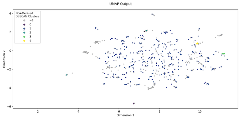
Figure 2. UMAP embedding of Religion journal abstracts
We should not imagine that what we see after UMAP projection is how the data actually is, because the data has been manipulated in a non-linear way, such that changing the parameters can alter the embedding space produced (unlike PCA). But what this UMAP projection allows us to see quite quickly is that, realistically, tweaking parameters for the clustering algorithm is unlikely to improve the original results: the data simply isn’t structured in a way that will permit a small number of natural clusters to emerge.
Configuring the process
UMAP offers several distance measures for performing dimensionality reduction. Common choices would be the Euclidean, cosine, and Manhattan distances.
Where there is wide variation in the number of terms in documents, the cosine distance might be a good choice because it is unaffected by magnitude; very long documents essentially get ‘more votes’, so that their averaged vectors often prove larger in magnitude than those of shorter documents. While our corpus has variation, fewer than 2% of the records might be considered ‘extreme’ in length so we’ve stuck with Euclidean distance.
dmeasure = 'euclidean' # distance metric
rdims    = 4 # r-dims == Reduced dimensionality
print(f"UMAP dimensionality reduction to {rdims} dimensions with '{dmeasure}' distance measure.")
We’ve selected four dimensions as the target manifold output: so we’re now going from 125 dimensions down to just 4!
Reducing dimensionality
Because the embeddings are stored in a list-type column, more wrangling is necessary to make these columns useable. You convert the doc_vec column into a data frame in its own right using x_from_df, which assumes that there is a list-type column col (default value of Embedding) in the DataFrame df. Each embedding dimension from the list becomes a new named column following the pattern E{dimension_number} (so E0…E124), and the index is set to the EThOS_ID, so that the results can be linked back to the data.
# Extract the embedding from a list-type column
# in the source data frame using this function
def x_from_df(df:pd.DataFrame, col:str='Embedding') -> pd.DataFrame:
    cols = ['E'+str(x) for x in np.arange(0,len(df[col].iloc[0]))]
    return pd.DataFrame(df[col].tolist(), columns=cols, index=df.index)

X = x_from_df(df, col=src_embedding)

# Create and apply a UMAP 'reducer'
reducer = umap.UMAP(
    n_neighbors=25,
    min_dist=0.01,
    n_components=rdims,
    random_state=rs)

X_embedded = reducer.fit_transform(X)

# Create a dictionary that is easily converted into a pandas df
embedded_dict = {}
for i in range(0,X_embedded.shape[1]):
    embedded_dict[f"Dim {i+1}"] = X_embedded[:,i] # D{dimension_num} (Dim 1...Dim n)

dfe = pd.DataFrame(embedded_dict, index=df.index)
del(embedded_dict)
UMAP uses a fit_transform syntax that is similar to Scikit-Learn’s, because it is intended to fill a gap in that library. The process will normally take less than 1 minute with this sample size. With just four dimensions most clustering algorithms will now perform well, and you can finish by merging the 4-dimensional data frame (dfe) with the original EThOS sample (df):
projected = df.join(dfe).sort_values(by=['ddc1','ddc2'])
print(projected.columns.tolist())
Visualising the results
The best way to get a sense of whether this was all worth it is to make a plot of the first two dimensions. Do we see any expected and important groupings in the data? And do the results look different if we opt for the Dewecy Deciaml Classification views (DDC1 or DDC2)? Here’s the code for a side-by-side comparison:
def tune_figure(ax, title:str='Title'):
    ax.axis('off')
    ax.set_title(title, **tfont)
    ax.get_legend().set_title("")
    ax.get_legend().prop.set_family(lfont['fontname'])
    ax.get_legend().prop.set_size(lfont['fontsize'])
    ax.get_legend().get_frame().set_linewidth(0.0)

f, axs = plt.subplots(1,2,figsize=(14,6))
axs = axs.flatten()

sns.scatterplot(data=projected, x='Dim 1', y='Dim 2', hue='ddc1', s=5, alpha=0.1, ax=axs[0]);
tune_figure(axs[0], 'DDC1 Group')

sns.scatterplot(data=projected, x='Dim 1', y='Dim 2', hue='ddc2', s=5, alpha=0.1, ax=axs[1]);
tune_figure(axs[1], 'DDC2 Group')

# If you want to save the output then uncomment the next line
#plt.savefig(os.path.join('data','DDC_Plot.png'), dpi=150)
plt.show()
Figure 3 therefore shows the ‘projected’ data coloured by the DDC1 and DDC2 groups respectively. It’s clear that the vocabularies of the selected disciplines differ significantly, though we should note that there are nearly 8,000 points on each plot. There is a significant risk of overplotting, so that some overlap is potentially hidden. In other words, two or more points from different DDCs occupy the same coordinates, which is why we’ve opted to include some transparency in the output.
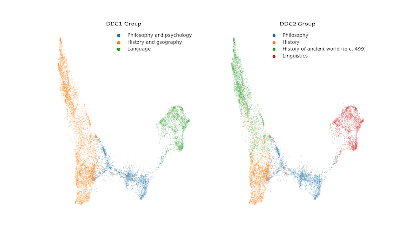
Figure 3. UMAP embedding of selected EThOS data coloured by assigned DDC
If we’re only going to look at the first two dimensions then why did we choose four above? Well, we’ve found that a (slightly) higher number of dimensions will allow more of the underlying variation in the data to be preserved, increasing the separability of clusters. Here we come to the trade-offs surrounding dimensionality; too many and we suffer the curse of dimensionality, too few and we lose the distinctiveness of the clusters! In practice, we have found four to eight dimensions to be a good range for avoiding the issues associated with too few, or too many, dimensions.
Of particular note in Figure 3 should be the areas where the DDC classification does not appear to align with the location of the thesis in the reduced corpus-space. Zooming in reveals a small number of Linguistics theses over by History of the Ancient World, and some History theses towards the ‘far’ side of the Philosophy grouping. We’ll take a slightly closer look at these later, but any way you look at it, this is a promising start. There are distinct groupings in the data that seem to map fairly well on to the classes assigned by experts. In short, it’s not a jumble of overlapping DDCs!
Hierarchical Clustering
We could stop here and say “Well clearly we’ve done something useful”, but it it would behoove us to cluster the data independently of its expert classification and compare the results in a more rigorous way. On both a practical and a philosophical level we feel that a hierarchical clustering approach is more appropriate: all PhDs are, in some sense, related to one another as they must build on (and distinguish themselves from) what has come before, but we hope that you will also agree on the existence of at least some high-level distinctions between, say, the interests of Historians and Linguists, especially when it comes to how they write about their work!
How it works
Hierarchical clustering takes a ‘bottom-up’ approach. Every document starts in its own cluster of size 1. Then you merge the two closest ‘clusters’ in the data set to create a cluster of size 2. You then look for the next closest pair of clusters; this search includes the centroid of the cluster of size 2 created in the preceding step. Next you progressively join documents to clusters and, ultimately, clusters to clusters, resulting in one mega-cluster containing the entire corpus. This generates a tree of relationships that you can ‘cut’ at different levels; delving down branches in order to investigate relations at a finer scale, but also able to see where and when clusters merged form larger groups.
Configuring the process
Hierarchical clustering has relatively few parameters; as with other approaches there is a choice of distance measures and, depending on the metric chosen, a ‘method’ or measure. Because we employed (by default) a Euclidean metric in dimensionality reduction, we don’t feel it’s appropriate to use a cosine-based approach here, though you can (and should) experiment with the parameters to see what’s best for your data. We therefore combine a Euclidean representation of the ‘semantic space’ with the widely-used Ward’s quality measure, which seeks to minimise within-cluster variance rather than within-cluster distance. Ward’s will tend to produce smaller, more compact clusters thanks to the sum-of-squares effect, which is to say that it attaches a much greater penalty to large distances between observations and the cluster centroid because these are squared. That said, this approach is very much a choice, and there are arguments dating back more than forty years (Milligan 1981) over which techniques are ‘best’ (and see Hashimoto et al. 2016 for an updated discussion relating to Word Embeddings).
Z = linkage(
      projected[[x for x in projected.columns if x.startswith('Dim ')]],
      method='ward', metric='euclidean')

# Save the output if you want to explore further later
pickle.dump(Z, open(os.path.join('data','Z.pickle'), 'wb'))
This takes under 2 minutes, but it is RAM-intensive. On Google Colab you may need to downsample the data (code for downsampling is included in the standalone Colab notebook). We use the prefix Dim to select columns out of the projected data frame; even if you change the number of dimensions, the clustering code need not change.
Visualising the results
Z is effectively a ‘tree’ that can be cut at any level. By comparing the output in Figure 4 — which shows the last 100 clusterings in the agglomeration process — with Figure 3’s plot of the ‘semantic space’ (above), you can develop insights about the clusters. On the y-axis is a distance measure indicating how far apart two clusters were when they merged (the horizontal bar on the plot); on the x-axis are the number of observations in each cluster (in parentheses); a number without parentheses would mean an original document’s index.
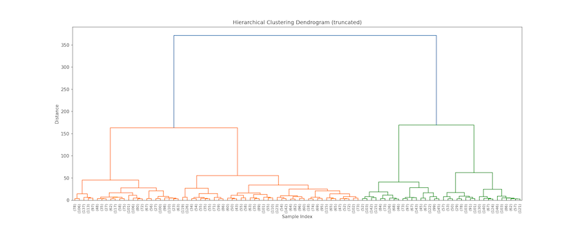
Figure 4. Top of EThOS dendrogram showing last 100 clusters
So this plot tells us that Linguistics and Philosophy (on the right side) are more dissimilar than the two classes of History (on the left) since they merge later (higher up the y-axis). Even though the top-level History class contains more records and covers a larger share of the semantic space, its constituent theses cluster (slightly) sooner, such that we don’t, for instance, find Philosophy merging with History first. You can also see that Philosophy theses will be the first to split when opting for five clusters, followed by History of the ancient world with six or seven clusters, then Linguistics, before, finally, non-ancient world History splits at nine clusters.
Here’s the code that enabled us to do this:
last_cls = 100 # The number of last clusters to show in the dendogram

plt.title(f'Hierarchical Clustering Dendrogram (truncated at {last_cls} clusters)', **tfont)
plt.xlabel('Sample Index (includes count of records in cluster)', **afont)
plt.ylabel('Distance', **afont)
fig = plt.gcf()
fig.set_size_inches(20,7)
fig.set_dpi(150)

dendrogram(
    Z,
    truncate_mode='lastp', # truncate dendrogram to the last p merged clusters
    p=last_cls,            # and set a value for last p merged clusters
    show_leaf_counts=True, # if parentheses then this is a count of observations, otherwise an id
    leaf_rotation=90.,
    leaf_font_size=8.,
    show_contracted=False, # to get a distribution impression in truncated branches
)
#plt.savefig(os.path.join('data',f'Dendogram-{c.dmeasure}-{last_cls}.png'))
plt.show()
The dendrogram is a top-down view, but recall that this is not how we clustered the data; you can peek inside the Z object to see what happened and when. Table 6 shows what happened on the first and final iterations of the algorithm as well when we were one-quarter, one-half and three-quarters done with the clustering. On the first iteration, observations 4,445 and 6,569 were merged into a cluster of size 2 ($\sum{c_{i}, c_{j}}$) because the distance ($d$) between them was close to 0.000. Iteration 6,002 is a merge of two clusters to form a larger cluster of five observations. We know this because $c_{i}$ and $c_{j}$ both have higher indices than there are data points in the sample. On the last iteration, clusters 16,000 and 16,001 were merged to create one cluster of 8,002 records. That is the ‘link’ shown at the very top of the dendrogram and it also has a very large $d_{ij}$ between clusters.
Table 3. Selections from hierarhical linkage object showing cluster merges at various iterations
| Iteration | $c_{i}$ | $c_{j}$ | $d_{ij}$ | $\sum{c_{i}, c_{j}} |
|---|---|---|---|---|
| 0 | 4,445 | 6,569 | 0.002 | 2 |
| 2,001 | 492 | 9,484 | 0.063 | 3 |
| 4,001 | 6,533 | 9,616 | 0.116 | 3 |
| 6,002 | 11,480 | 12,029 | 0.234 | 5 |
| 8,002 | 16,000 | 16,001 | 371.842 | 8,002 |
The output above was created by interrogating the Z clustering matrix:
table = []

# Take the 1st, the 25th, 50th and 75th 'percentiles', and the last
for i in [0, math.ceil(Z.shape[0]*0.25), math.ceil(Z.shape[0]*0.5), math.ceil(Z.shape[0]*0.75), -1]:
    r = list(Z[i])
    r.insert(0,(i if i >= 0 else len(Z)+i))
    table.append(r)
    table[-1][1] = int(table[-1][1])
    table[-1][2] = int(table[-1][2])
    table[-1][4] = int(table[-1][4])

display(
    tabulate(table,
             headers=["Iteration","$c_{i}$","$c_{j}$","$d_{ij}$","$\sum{c_{i},c_{j}}$"],
             floatfmt='0.3f', tablefmt='html'))
With luck, this will help the dendrogram to make more sense, and it also provides an intuition as to how you can work with Z to output any number of desired clusters, cutting the tree at 2, 24, … 5,000!
Validation
One of the challenges in text and document classification is having a suitable baseline. The gold standard for machine learning problems is one generated by human experts; if our automated analysis produces broadly the same categories as the experts then we would consider that a ‘good result’. The Dewey Decimal Classification, which is assigned by a librarian in the researcher’s institution at the point of submission, provides just such a standard.
In order to evaluate the performance of our approach we need two utility functions; these will label each cluster by finding the ‘dominant’ (modal) DDC class for that cluster. This is potentially a bit misleading (imagine a situation where 50.1% of a class was from one DDC and 49.9% from another) but it’s a good way to get a sense of how we’re doing. label_clusters is a kind of ‘wrapper’ meaning that it saves you have to call get_dominant_cat directly: you pass in a source data frame (src_df), a clustering result (clusterings), and a DDC level (ddc_level, which can be 1, 2, or 3 for consistency with the explanation above). The functions work out how many clusters there are and use this to specify the column labels in the returned data frame (e.g. Cluster_5 and Cluster_Name_5). Cluster_5 would contain the raw clustering result from clusterings, while Cluster_Name_5 contains the dominant DDC label for that cluster.
# Assumes a data frame, a clustering result, and a DDC level (1, 2 or 3)
# for mapping the clusters on to 'plain English' labels from the DDC
def label_clusters(src_df:pd.DataFrame, clusterings:np.ndarray, ddc_level:int=1):

    num_clusters = clusterings.max()

    # Create a new data frame holding only the
    # cluster results but indexed to the source
    tmp = pd.DataFrame({f'Cluster_{num_clusters}':clusterings}, index=src_df.index)

    joined_df = src_df.join(tmp, how='inner')

    labels = get_dominant_cat(joined_df, clusterings.max(), ddc_level)

    # Map the labels for each cluster value
    joined_df[f'Cluster_Name_{num_clusters}'] = joined_df[f'Cluster_{num_clusters}'].apply(lambda x: labels[x])

    return joined_df

# Find the dominant class for each cluster assuming a specified DDC level (1, 2 or 3)
def get_dominant_cat(clustered_df:pd.DataFrame, num_clusters:int, ddc_level:int=1):
    labels = {}
    struct = {}

    # First, work out the dominant group in each cluster
    # and note that together with the cluster number --
    # this gives us a dict with key==dominant group and
    # then one or more cluster numbers from the output above
    for cl in range(1,num_clusters+1):

        # Identify the dominant 'domain' (i.e. group by
        # DDC description) using the value counts result.
        dom     = clustered_df[clustered_df[f'Cluster_{num_clusters}']==cl][f'ddc{ddc_level}'].value_counts().index[0]
        print(f"Cluster {cl} dominated by {dom} theses.")

        if struct.get(dom) == None:
            struct[dom] = []

        struct[dom].append(cl)

    # Next, flip this around so that we create useful
    # cluster labels for each cluster. Since we can have
    # more than one cluster dominated by the same group
    # we have to increment them (e.g. History 1, History 2)
    for g in struct.keys():
        if len(struct[g])==1:
            labels[struct[g][0]]=g
            #print(f'{g} maps to Cluster {struct[g][0]}')
        else:
            for s in range(0,len(struct[g])):
                labels[struct[g][s]]=f'{g} {s+1}'
                #print(f'{g} {s+1} maps to Cluster {struct[g][s]}')
    return labels
3 Clusters
Let’s start at the DDC1 level: History forms a single category, while Linguistics and Philosophy are distinct. To evaluate how the clustering performed, the silhouette plot is a common method, but it is not always the most useful. There is the ‘confusion matrix’, with which you can directly compare the original ‘labels’ (the DDCs) to the predictions (the clusters), as well as calculate precision and recall measures.
Precision is essentially our correct prediction rate, calculated from the number of True Positives (TPs) divided by the sum of True Positives and False Positives (FPs), so $\frac{TP}{TP+FP}$. Recall measures something slightly different, involving evaluating the proportion of positives that were predicted correctly (ie. allowing for False Negatives), so $\frac{TP}{TP+FN}$. In turn, these underpin the F-score, which allows us to attach a measure of sensitivity to our predictions, though this will become a bit more problematic if the number of observations in each cluster become seriously unbalanced.
We have parameterised the code so that you can adjust the DDC level (ddc) and number of clusters (ncls) to make it easy to experiment with alternative ‘solutions’:
num_clusters = 3
ddc_level = 1
The hierarchical clsutering code makes use of functions (dendrogram, linkage, and fcluster) provided by the scipy library. These help cut the Z object into arbitrary numbers of clusters according to a specified objective (the criterion). We then use scikit-learn’s classification_report to understand how well the clustering performs in reproducing the expert knowledge embodied in DDC assignments. You could use the same library’s confusion_matrix function to generate a Confusion Matrix, but we have opted to produce our own using panda’s crosstab instead.
# Extract clustering based on Z object
clusterings  = fcluster(Z, num_clusters, criterion='maxclust')
clustered_df = label_clusters(projected, clusterings, ddc_level=ddc_level)

# Classification report gives a (statistical) sense of power (TP/TN/FP/FN)
print(classification_report(
        clustered_df[f'ddc{ddc_level}'],
        clustered_df[f'Cluster_Name_{num_clusters}'],
        zero_division=0))

# A confusion matrix is basically a cross-tab (without totals, which I think are nice)
pd.crosstab(columns=clustered_df[f'Cluster_Name_{num_clusters}'],
            index=clustered_df[f'ddc{ddc_level}'],
            margins=True, margins_name='Total')
Table 4 compares the top-level DDC assignments against the 3-cluster assignment: if the clustering has gone well, we’d expect to see the majority of the observations on the diagonal. Indeed, that’s exactly what we see, with just a small fraction of theses being assigned to the ‘wrong’ cluster. The overall precision and recall are both 93%, as is the F1 score. Notice, however, the lower recall on Philosophy and psychology: 308 (17%) were misclassified compared to less than 4% of History theses.
Table 4. Confusion Matrix for 3 Cluster Solution
| DDC | Cluster 1 | Cluster 2 | Cluster 3 | Total |
|---|---|---|---|---|
| History and geography | 4,426 | 43 | 122 | 4,591 |
| Language | 61 | 1,566 | 28 | 1,655 |
| Philosophy and psychology | 250 | 58 | 1,448 | 1,756 |
| Total | 4,737 | 1,667 | 1,598 | 8,002 |
4 Clusters
Repeating this analysis at the DDC2 level requires changing just one line of code:
num_clusters = 4
ddc_level = 2
In the interests of brevity, we’ll report only the precision, recall, and F-1 scores for this clustering:
| Precision | Recall | F-1 Score | Support | |
|---|---|---|---|---|
| History | 0.72 | 0.91 | 0.80 | 2,277 |
| History of ancient world (to c. 499) | 0.95 | 0.76 | 0.85 | 2,314 |
| Linguistics | 0.94 | 0.95 | 0.94 | 1,655 |
| Philosophy | 0.91 | 0.82 | 0.86 | 1,756 |
| Accuracy | 0.86 | 8,002 | ||
| Macro Average | 0.88 | 0.86 | 0.86 | 8,002 |
| Weighted Average | 0.87 | 0.86 | 0.86 | 8,002 |
Notice here that the two History classes differ in their precision and recall. We can understand this to be indicating that we’re ‘over-predicting’ the History class by ‘under-predicting’ the Ancient World class. The lower recall on Philosophy is consistent with what we saw in Table 4; a small, but significant, set of theses are being grouped with History theses. Nonetheless, our overall accuracy remains above 85% on an unsupervised classification!
Are the experts ‘wrong’?
Ordinarily, if an expert assigns label x to an observation then x is assumed to be ‘The Truth’. However, in the case of a PhD thesis it’s worth questioning this assumption for a moment; are time-pressured, resource-constrained librarians necessarily going to gloss an abstract and always select the most appropriate DDC? Will they never be influenced by ‘extraneous’ factors, such as the department in which the PhD student was enrolled or their knowledge of the history of DDCs assigned by the institution?
So while most approaches would treat ‘misclassifications’ as an error to be solved, you might reasonably ask whether every thesis has been correctly classified in the first place. To investigate this question further you can turn to the trusty word cloud, replacing the document-level view with a class-based TF/IDF in which you look at what is distinctive across a set of documents that were ‘misclustered’ when compared to their original DDC.
To do this we’ve made use of Maarten Grootendorst’s CTFIDF module (as developed in posts on topic modelling with BERT and class-based TF/IDF).
When creating titles for each plot, the line-length can become a bit of a problem. Here’s some simple code to split a title at some arbitrary target_len. We split on whitespace on the basis that this is roughly into word-like chunks, and then try to add a line break (\n) into the formatted title (fmt_title) right before a word that would take us over the target line length (target_len):
# Deal with long plot titles
def break_title(title:str, target_len:int=40):

    words = title.split(" ")

    fmt_title = ''

    lines     = 1

    for i in range(len(words)):
      	# If the additional word will put us past the target length
        # for a line then add a line break at this point
        if (len(fmt_title) + len(words[i]))/target_len > lines:
            fmt_title += "\n"
            lines += 1

        fmt_title += words[i] + " "
    return fmt_title
To actually produce the class-based TF/IDF we now run the same code we’ve seen before (in case you’ve experimented with/changed the parameters) and then produce one plot per DDC class. So this is just a for loop over the DDC names for the specified DDC level. However, to create a class-based TF/IDF plot we need to create one document for each class (aggregating all the individual documents together into one very long string) before calculating the TF/IDF scores. To make the results look ‘nice’, we then dynamically work out the number of plots (nplots) and number of columns to show (ncols). After that it’s a case of trying to tune the height and width of the image so that it looks correct for the dimensions of the output and the desired resolution. You’ll see this same code used below where ncols is set directly because we want to show the output from 11 clusters instead.
projected    = df.join(dfe).sort_values(by=['ddc1','ddc2'])

clusterings  = fcluster(Z, num_clusters, criterion='maxclust')
clustered_df = label_clusters(projected, clusterings, ddc_level=ddc_level)

fsize = (12,4)
dpi   = 150
nrows = 1

# For each of the named clusters...
for ddc_name in sorted(clustered_df[f'ddc{ddc_level}'].unique()):

    print(f"Processing {ddc_name} DDC...")

    # Here's the selected data sub-frame
    sdf = clustered_df[clustered_df[f'ddc{ddc_level}']==ddc_name]

    # Create one document per class
    docs = pd.DataFrame({'Document': sdf.tokens.apply(' '.join), 'Class': sdf[f'Cluster_Name_{num_clusters}']})
    docs_per_class = docs.groupby(['Class'], as_index=False).agg({'Document': ' '.join})

    # Do the class-based TF/IDF analysis
    cvec  = CountVectorizer().fit(docs_per_class.Document)
    count = cvec.transform(docs_per_class.Document)
    words = cvec.get_feature_names_out()

    ctfidf = CTFIDFVectorizer().fit_transform(count, n_samples=len(docs))

    # Now on to the plotting
    ncols  = len(sdf[f'Cluster_Name_{num_clusters}'].unique())
    nplots = nrows * ncols

    axwidth  = math.floor((fsize[0]/ncols)*dpi)
    axheight = math.floor(fsize[1]/nrows*dpi)

    print(f"Aiming for width x height of {axwidth} x {axheight}")

    # One image per DDC Category
    f,axes = plt.subplots(nrows, ncols, figsize=fsize)

    # Set up the word cloud
    Cloud = WordCloud(background_color=None, mode='RGBA',
                      max_words=50, relative_scaling=0.5, font_path=fp,
                      height=axheight, width=axwidth)

    # For each cluster...
    for i, cl in enumerate(sorted(sdf[f'Cluster_Name_{num_clusters}'].unique())):
        print(f"Processing {cl} cluster ({i+1} of {nplots})")

        try:
            ax = axes.flatten()[i]
        except AttributeError:
            ax = axes

        # Extract the relevant weights for each word
        # form the ctfidf array
        tmp = pd.DataFrame({'words':words, 'weights':ctfidf.toarray()[i]}).set_index('words')

        # If the DDC name and cluster name match then
        # we assume it's the 'dominant' class
        if ddc_name == cl:
            ax.set_title(break_title(f"{ddc_name} DDC Dominates Cluster ($n$={(sdf[f'Cluster_Name_{num_clusters}']==cl).sum():,})"), **tfont)
        else:
            ax.set_title(break_title(f"'Misclustered' into {cl} Cluster ($n$={(sdf[f'Cluster_Name_{num_clusters}']==cl).sum():,})", 35), **tfont)
        ax.imshow(Cloud.generate_from_frequencies({x:tmp.loc[x].weights for x in tmp.index.tolist()}))
        ax.axis("off")
        del(tmp)

    while i < len(axes.flatten())-1:
        i += 1
        axes.flatten()[i].axis('off')

    plt.tight_layout()

    #plt.savefig(os.path.join(c.outputs_dir,f'{c.which_embedding}-{c.embedding}-d{c.dimensions}-ddc{ddc}-c{num_clusters}-class_tfidf-{ddc_name}.png'), dpi=dpi)
    print("Done.")
With four DDCs and four clusters we have 16 plots in total. While the C-TF/IDF plots are not in and of themselves conclusive with respect to the assignment of any one thesis, they do help us to get to grips with the aggregate differences; for documents in each DDC2 class, we’re looking at how the vocabularies in the documents that were ‘misclustered’ with documents from another DDC2 differ from the vocabulary of the set that were ‘correctly’ clustered (which we define here as the modal cluster). This allows you to see how their contents (as viewed through the lens of TF/IDF) differ from the main cluster into which documents with their DDC were clustered.
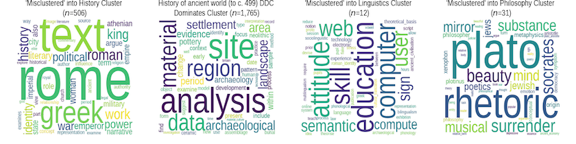
Figure 5. ‘Misclassified’ theses from the History of the Ancient World (to c.499) DDC
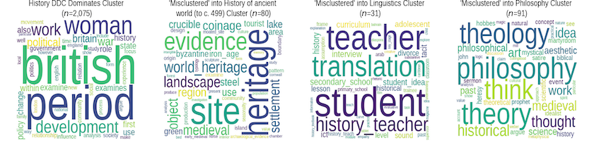
Figure 6. ‘Misclassified’ theses from the History DDC
For instance, from what we can see of the two History DDCs it’s reasonable to infer that this analysis is picking up on a difference in vocabulary between History as a discipline concerned with objects and sites, and as one more focussed on issues of power, work, politics and empire. We can also see that History theses clustered with Linguistics seem to have an educational component, while those clustered with Philosophy contain terms associated with Greek philosophy (History of the Ancient World (to c.499)) and with more seventeenth and eighteenth century topics (History).
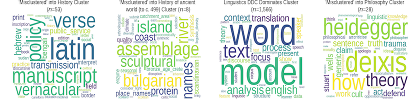
Figure 7. ‘Misclassified’ theses from the Linguistics DDC
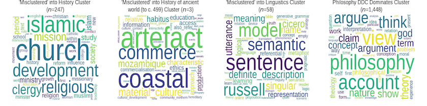
Figure 8. ‘Misclassified’ theses from the Philosophy DDC
It is easier to interpret these visualizations with the more ‘substantially’ misclustered Philosophy and Linguistics theses. Linguistics clustered with Philosophy shows a stress on terms and concepts that we might (naively, perhaps) associate with philosophical concerns, while the reverse process shows concern with semantics, grammars, and utterances. Both DDCs also have a significant number grouped under the History cluster, with the keywords suggesting strong links to theological/religious topics. Conversely, the small number of Philosphy and Linguistics theses clustered with the history DDCs indicate a strong separation between these topics and so the apparent ‘significance’ of words such as ‘bulgarian’ and ‘scandinavian’ (Linguistics), and ‘mozambique’ or ‘habitus’ (Philosophy) in the TF/IDF plot should be taken with a grain of salt as they’re not unlikely to be significant from a statistical standpoint.
Clearly, to make a determination as to whether any one thesis was assigned to the ‘wrong’ DDC would require deeper engagement with the content itself. Looking past the institution, department and key words, what does this thesis seem to be about? One way of thinking about these results is that they would enable (theoretically, at least) just such a level of effort to be allocated; having developed a classification scheme for documents (PhDs or otherwise), the position of a new document relative to other, already classified documents, could be assessed such that only those falling near the margins of a class are checked by a human, while those near the core are classed automatically by a NLP application.
As we drill further down into the DDCs classes (e.g. to the 3rd level), we would expect to encounter many more ‘misclassified’ theses — it’s not just that NLP-based clustering might struggle with the subtleties further down the hierarchy, but that the classification scheme itself becomes unstable. We would reasonably expect humans to struggle to allocate a new thesis on, say, ‘the history of U.S. trade policy towards formerly Spanish colonies in South America’ to one of these categories:
‘History of North America’, ‘Canada’, ‘Mexico, Central America, West Indies, Bermuda’, ‘United States’, ‘Northeastern United States (New England and Middle Atlantic states)’, ‘Southeastern United States (South Atlantic states)’, ‘South central United States’, ‘North central United States’, ‘Western United States’, ‘Great Basin and Pacific Slope region of United States’, ‘History of South America’, ‘Brazil’, ‘Argentina’, ‘Chile’, ‘Bolivia’, ‘Peru’, ‘Colombia and Ecuador’, ‘Venezuela’, ‘Guiana’, ‘Paraguay and Uruguay’
11 Clusters
Finally, you can also give the computational process greater importance, instead using the DDC as support for labelling the resulting clusters. To select an ‘optimal’ number of clusters you can use a scree plot (the code for this is available in GitHub), though expert opinion is just as defensible in such cases. The combination of the scree plot and kneed utility pointed to a clustering in the range of 10—15, so we opted for 11 clusters and assigned each cluster the name of its dominant DDC group.
num_clusters = 11
ddc_level = 3
Followed again by:
projected    = df.join(dfe).sort_values(by=['ddc1','ddc2'])
clusterings  = fcluster(Z, num_clusters, criterion='maxclust')
clustered_df = label_clusters(projected, clusterings, ddc_level=ddc_level)
In this case, this automated approach yields more than one cluster with the same dominant DDC, not least because none of these DDCs has much detail below the second level: History dominates in six clusters each, Linguistics in three, and Philosophy in two. The word clouds give a sense of how these clusters differ in terms of their content. The results are quite compelling, with each cluster seeming to relate to a thematically distinct area of research within the overarching discipline or domain.
Hierarchical clustering allows for unbalanced clusters to emerge more naturally from the data even where it’s difficult to see clear ‘breaks’ in the semantic space. History Cluster 6 is significantly larger than the other five clusters in that group, but it remains quite straightforward to conceive of how that cluster’s vocabulary differs from the others. In this light, the Hierarchical Clustering delivers improved results over more commonly-used techniques such as k-means, which performs especially poorly on data with non-linear structure.
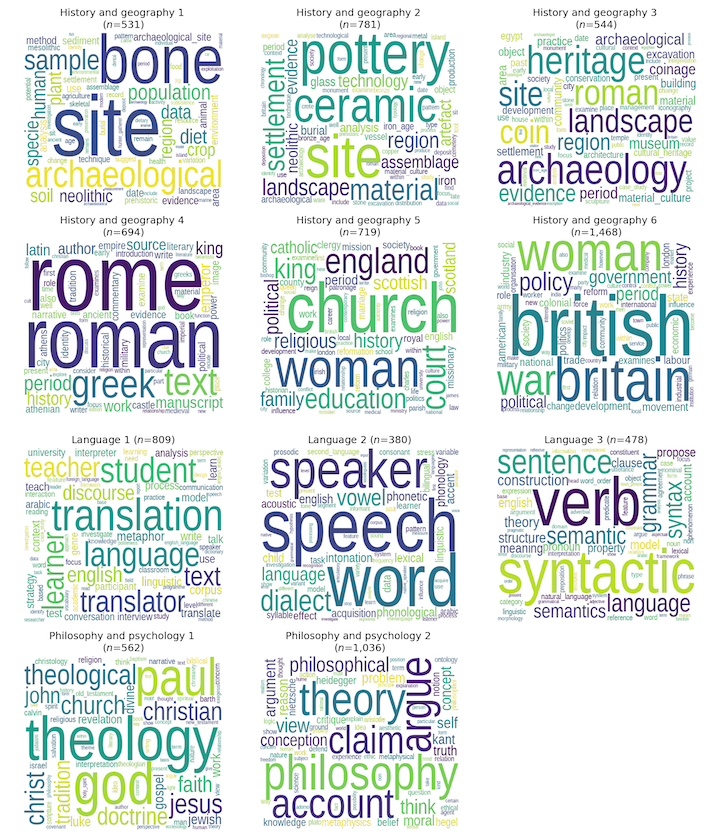
Figure 9. TF/IDF word clouds for 11-cluster classification (name from dominant DDC3 group)
The code for doing this word cloud flexibly is a bit more complicated since you need to know how many plots you’re going to produce, and then you have to allocate them to a grid of nrows by ncols:
nplots = len(clustered_df[f'Cluster_Name_{num_clusters}'].unique())
ncols  = 3
nrows  = math.ceil(nplots/ncols)
print(f"Expecting {nplots} plots on {nrows} x {ncols} layout.")
That specification then interacts with the dots-per-inch (dpi) and figure size to generate axis widths and heights for each plot:
dpi      = 150
fsize    = (12,14)
axwidth  = math.floor((fsize[0]/ncols)*dpi)
axheight = math.floor(fsize[1]/nrows*dpi)

print(f"Aiming for width x height of {axwidth} x {axheight}")
You are now ready to perform class-based TF/IDF analysis. This involves combining all of the terms (here: tokens) for each cluster into a single, very long list. So, one list for each cluster or class (docs_per_class), and we can then use a CounterVectorizer and the class-based TF/IDF Vectorizer to generate the output ctfidf.
docs = pd.DataFrame({'Document': clustered_df.tokens.apply(' '.join), 'Class': clustered_df[f'Cluster_Name_{num_clusters}']})
docs_per_class = docs.groupby(['Class'], as_index=False).agg({'Document': ' '.join})

cvec  = CountVectorizer().fit(docs_per_class.Document)
count = cvec.transform(docs_per_class.Document)
words = cvec.get_feature_names_out()

ctfidf = CTFIDFVectorizer().fit_transform(count, n_samples=len(docs))
ctfidf is a sparse array (i.e. many rows, potentially many columns, many containing zeroes) with one column per class, and one row per word. The cells represent the weight (or importance) of each word to that class. So if you want to compare how significant a word is across classes you can read across the columns, and if you want to know the most important words to a class you can sort the rows.
# Set up the figure and axes so that you have one
# word cloud per DDC Category
f,axes = plt.subplots(nrows, ncols, figsize=fsize)

# Set up the word cloud
Cloud = WordCloud(background_color=None, mode='RGBA',
                  max_words=75, relative_scaling=0.5, font_path=fp,
                  height=axheight, width=axwidth)

# For each cluster...
for i, cl in enumerate(sorted(clustered_df[f'Cluster_Name_{num_clusters}'].unique())):

    print(f"Processing {cl} cluster ({i+1} of {nplots})")

    # This deals with the risk that there's only one
    # cluster in the analysis...
    try:
        ax = axes.flatten()[i]
    except AttributeError:
        ax = axes

    # Extract the column (i.e. cluster) and associate it with
    # the source words from the CountVectorizer.
    tmp = pd.DataFrame({'words':words, 'weights':ctfidf.toarray()[i]}).set_index('words')

    # Format the title so that it's not so long that it
    # overlaps the titles of adjacent figures.
    ax.set_title(break_title(f"{cl} ($n$={(clustered_df[f'Cluster_Name_{num_clusters}']==cl).sum():,})", 30), **tfont)
    ax.imshow(Cloud.generate_from_frequencies({x:tmp.loc[x].weights for x in tmp.index.tolist()}))
    ax.axis("off")
    # Tidy up
    del(tmp)

# Deal with any 'leftover' or unused slots
# (e.g. you have 11 clusters on a 4*3 grid
# so 12 subplots were created)
while i < len(axes.flatten())-1:
    i += 1
    axes.flatten()[i].axis('off')

# Adjust the layout to minimise whitespace
plt.tight_layout()

#plt.savefig(os.path.join(c.outputs_dir,f'{c.which_embedding}-{c.embedding}-d{c.dimensions}-ddc{ddc}-c{num_clusters}-class_tfidf.png'), dpi=dpi)
print("Done.")
Comparing clustering algorithms
Of course, Hierarchical Clustering is just one technique amongst many, and it’s certain that other algorithmic approaches will perform better — or worse — depending on the context and application. We’ve advanced an analytical reason for using this technique, rooted in our conceptualisation of the ‘semantic space’ of doctoral research. If, for instance, you were seeking to identify disciplinary cores and to distinguish these from more peripheral/interdisciplinary work, then something like DBSCAN or OPTICS might be a better choice. It all depends on what you want to know!
Below are the results of four lightly-tuned clustering algorithms, the code for which can be found in the Notebook. While they all pick up the same cores (at a relatively low number of clusters), there are clear differences at the margins in terms of what is considered part of the cluster. These differences matter as you scale the size of the corpus and, fundamentally, this is the challenge posed by large corpora; the programming historian (or social scientist or linguist) needs to approach their problem with a sense of how different algorithms embody different conceptualisations of the analytical domain — this is seldom taught explicitly and often only learned when encountering a data set on which ‘tried and trusted’ approaches simply don’t work.
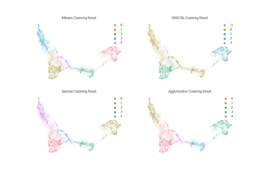
Figure 10. Comparison with Alternative Clustering Algorithms
Summary
We hope that this tutorial has illustrated some of the potential power of combining the word2vec algorithm with the UMAP dimensionality reduction approach. In our work with the British Library, we expect these outputs to advance both our own research and the mission of the BL in a few ways:
- Filling in missing metadata: because of the way the data was created, records in the BL’s EThOS data may lack both DDC values and keywords. The WE+UMAP approach allows us to suggest what those missing values might be! We can, for instance, use the dominant DDC from an unlabelled observation’s cluster to assign the DDC, and the class- or document-based TF/IDF, to suggest keywords.
- Suggesting similar works: the BL’s current search tool uses stemming and simple pattern matching to search for works matching the user’s query. While using singular terms to retrieve related documents is not as straightforward as one might imagine, asking the computer to find documents similar to a selected target (i.e. find me similar dissertations) would significantly enhance the utility of the resource to researchers in all disciplines.
- Examining the spread of knowledge: although we have not made use of the publication date and institutional fields in this lesson, we are exploring this metadata in conjunction with word2vec and other models to study links between how and where new ideas arise, and how and when they spread geographically within disciplines. Our expectation is that this research will show significant disciplinary and geographical variation — even within the U.K. — and we hope to start reporting our findings in the near future.
Bibliography & Other Readings
Other Relevant Tutorials
- Introduction to Jupyter Notebooks
- Installing Python Modules with
pip - Corpus Analysis with Antconc
- Analyzing Documents with TF-IDF
- Keywords in Context (Using n-grams) with Python
Bibliography
- British Library (2015), Living Knowledge, British Library https://www.bl.uk/britishlibrary/~/media/bl/global/projects/living-knowledge/documents/living-knowledge-the-british-library-2015-2023.pdf.
- Mikolov, T. and Yih, S. W. and Zweig, G. (2013), “Linguistic Regularities in Continuous Space Word Representations”, Proceedings of the 2013 Conference of the North American Chapter of the Association for Computational Linguistics: Human Language Technologies (NAACL-HLT-2013), https://www.microsoft.com/en-us/research/publication/linguistic-regularities-in-continuous-space-word-representations/.
- Milligan. G. W. (1981), “A Review Of Monte Carlo Tests Of Cluster Analysis”, Multivariate Behavioral Research, 16:3, 379-407.
- Tobler, W. R. (1970), “A computer movie simulating urban growth in the Detroit region”, Economic Geography, 46:234-240.
- Hashimoto, T. B. and Alvarez-Melis, D. and Jaakkola, T. S. (2016), “Word Embeddings as Metric Recovery in Semantic Spaces”, Transactions of the Association for Computational Linguistics, 4:273–286.
- Tshitoyan, V. and Dagdelen, J. and Weston, L. and Dunn, A. and Rong, Z. and Kononova, O. and Persson, K. A. and Ceder, G. and Jain, A. (2019), “Unsupervised word embeddings capture latent knowledge from materials science literature”, Nature 571:95-98.
Notes
-
A Docker image is also available and instructions for using it can be found on Jonathan Reades’s GitHub. ↩