
Contents
- Introduction
- Lesson Goals
- Our Data: Sister Cities in the European Union
- The Advantages of ggplot2
- Creating Your First Graph
- Other Geoms: Histograms, Distribution Plots and Box Plots
- Advanced Manipulations to Graphs’ Appearance
- Conclusion
- Additional Resources
Introduction
After World War II, European cities faced a monumental task: rebuilding not just their physical infrastructure but also their international relationships. One fascinating lens through which to examine this post-war reconstruction is sister cities. These formal partnerships were developed between cities in the post-war period to foster cross-border cooperation and understanding.
Sister-city relationships present historians with both an opportunity and a challenge. The opportunity lies in their potential to reveal patterns of post-war reconciliation and diplomacy. The challenge comes from their scale and complexity: there are many hundreds of European cities to analyze, and each one might have formed dozens of partnerships across multiple decades. By converting these complex networks of sister-city relationships into visual patterns, we can explore questions that are difficult to answer through traditional methods alone. For example, did cities of West Germany preferentially form partnerships with French cities immediately after the war? Did the Iron Curtain create distinct patterns of sister-city relationships between Eastern and Western Europe? How did city size and geographic distance influence diplomatic connections? This case is a good example of how useful data visualization can be for historical research.
The R package ggplot2 provides powerful tools for investigating such questions through data visualization. While spreadsheets and basic charts can obscure patterns, ggplot2’s sophisticated visualization capabilities allow historians to uncover hidden relationships in data. For example, scatter plots can reveal correlations between numerical variables like population sizes and geographic distances, bar charts can show the distribution of partnerships across different categories of cities, and histograms can expose patterns in demographic data that might otherwise remain invisible.
This lesson differs from standard ggplot2 guides by focusing specifically on the needs of urban historians. Rather than using generic datasets, we’ll work with historical data about sister-city relationships to demonstrate how visualization techniques can illuminate historical patterns and processes. Through this approach, you’ll learn to create visualizations that reveal complex partnerships and make historical findings more accessible to a broader audience.
Lesson Goals
By the end of this lesson, you should be able to do the following with the ggplot2 package:
- Create different types of plots to visualize urban and demographic data, including bar charts to show relationships between cities and scatter plots to explore relationships between different variables.
- Manipulate the appearance of plots, such as their color or size.
- Add meaningful labels to plots.
- Compare data across grids of plots.
- Enhance your plots with ggplot2 extensions.
This lesson assumes you have a rudimentary knowledge of R. We recommend familiarizing yourself with the Programming Historian lessons R Basics with Tabular Data and Data Wrangling and Management in R if you do not have this background.
Our Data: Sister Cities in the European Union
Urban and demographic data are fundamental to understanding the developments of human societies. Urban data allows us to reconstruct the complex network of relationships between cities. This encompasses everything from formal administrative connections, such as trade partnerships or political alliances, to informal relationships built through cultural exchange and population movement. Cities might be linked through trade routes, shared governance structures, or cultural institutions. The physical characteristics of cities also form an important part of urban data: their geographic location, proximity to other urban centers, and position within transportation networks influence how cities interact with one another.
Urban data also helps us understand the different roles that cities play within broader social and economic systems. Some cities serve as administrative capitals, others as major ports facilitating international trade, and still others as industrial centers driving economic growth. These roles often shift over time as cities adapt to changing political, economic, and technological circumstances.
Demographic data complements this urban analysis by revealing the human dimension of change. At its most basic level, demographic data tells us about population sizes and their fluctuations, but its true value lies in helping us understand the complex patterns of movement and settlement. Changes in population density reflect urbanization processes, economic opportunities, or responses to environmental challenges. Migration patterns can illuminate economic relationships between regions, as well as the impact of political policies. The social and economic characteristics of populations — their age distributions, occupational patterns, and social structures — also provide a crucial context for understanding urban development.
Historians can combine these data types to investigate urban development and population dynamics. As mentioned above, we will be analyzing sister cities – pairs of cities who have partnered to promote cultural and commercial ties. The modern concept of sister cities was conceived after World War II to foster friendship and understanding between different cultures and to promote trade and tourism. These partnerships often involve student exchanges, business relationships, and cultural events. By examining these partnerships, we can assess whether geographic proximity, shared language, or similar population size play a role in two cities establishing a relationship. We can also explore whether historical tensions or alliances (such as those between Germany, France, and Poland) or shared linguistic heritage (for example between Spanish-speaking cities in the Americas) shape these partnerships. In recent years, historians have started to investigate these kinds of interactions more closely.
The first question that arises is where to get data about sister cities. One possibility is to draw from one of the biggest repositories of data in the world: Wikidata. On Wikidata, every single town in the world has been assigned a unique identifier and its own page, containing a certain amount of information. For example, the page devoted to London shows, among other data, a list of its ‘twinned administrative bodies’ (in other words, its sister cities). Using the SPARQL Protocol And RDF Query Language, we can query this data and extract information about the towns associated with London. As always in historical research, it’s important to consider the accuracy of the data, an issue which has been analyzed several times in the case of Wikidata.
For the purposes of this lesson, we created different queries to extract data about towns in the European Union (EU) and their sister cities. Using this, we put together a dataset containing the following data: the name, country, population size, and geographical coordinates of both the ‘origin city’ and the ‘destination city’. We also calculated the distance between the two cities, and added a Boolean column indicating whether the destination city is in the EU or not (all origin cities are in the EU). You can download this dataset from Programming Historian’s repository.
Our approach will be largely exploratory, aiming to identify patterns, trends, and relationships in the data. We hope that we can uncover new insights and generate hypotheses for further research by doing so.
The Advantages of ggplot2
We have many reasons for chosing to use ggplot2 for this analysis. The package has a great number of advantages when compared to other options:
- It relies on a theoretical framework (detailed below) that ensures your graphs meaningfully convey information, which is particularly important when working with complex urban and demographic datasets.
- It is relatively simple to use while remaining powerful.
- It creates publication-ready graphs.
- It comes with community-developed extensions which further enhance its capabilities, such as additional functions, graphs, and themes.
- It is versatile, as it can handle various data structures, including:
- Numerical data (continuous and discrete)
- Categorical data (factors and character strings)
- Date and time data
- Geographic coordinates
- Text data
Creating graphics is a complicated issue, since it prompts us to consider various aspects of our data: the information we want to convey, the graph type we want to use to convey that information (scatter plot, box plot, histogram, and so on), the elements of the graph we wish to tweak (axes, variables, legends), and more. Based on a theoretical framework known as the grammar of graphics (hence the ‘gg’ in the name ggplot2) detailed by Leland Wilkinson, ggplot2 is a helpful tool for streamlining these choices. If all this sounds complicated at first, don’t panic! You only need to know a little bit about the grammar to make your first graph.
In the grammar of graphics, all plots are composed of a series of seven interrelated layers:
- Data: the material you will analyze in your visualization.
- Aesthetics: the ways in which visual properties map onto so-called ‘geoms’ (see Geometric Objects below). In most cases, this determines how you want to display your data (position, color, shape, fill, size).
- Scales: the mapping and normalization of data for visualization.
- Geometric Objects (or ‘geoms’ in ggplot2 jargon): how you want to represent your data. In most cases, this determines the type of graph you use, such as a bar chart, line graph, or histogram.
- Statistics: calculations you may want to run on your data before visualizing it.
- Facets: the ability to categorize and divide data into multiple sub-graphs.
- Coordinate Systems: how ggplot2 positions different geoms on the plot. The most common coordinate system is the Cartesian coordinate system, but ggplot2 can also plot polar coordinates and stereographic projections.
To begin using ggplot2, you need to install and load it. We recommend installing the tidyverse, a collection of R packages including ggplot2 which work together to provide a consistent and efficient workflow for data manipulation, exploration, and visualization. At the core of the tidyverse philosophy is the concept of ‘tidy data’, a standardized way of structuring data to make it easier to work with. In tidy data, each variable is a column, each observation is a row, and each type of observational unit is a table. This structure allows for a consistent and predictable way of working with data across different packages and functions within the tidyverse. For more details, see the book R for Data Science. Import, Tidy, Transform, Visualize and Model Data written by Hadley Wickam et al.
install.packages("tidyverse")
library("tidyverse")
Loading Data with readr
Before importing data, it is important to understand how it should be formatted. Common spreadsheet applications, such as Microsoft Excel or Apple Numbers, place data in a proprietary format. While there are packages that can read in Excel data, such as readxl, it is recommended to use open formats instead, such as .csv (comma-separated values) or .tsv (tab-separated values), as they are compatible with a wider range of software tools and more likely to remain readable in the future.
R has built-in commands for reading in these files, but we will use the package readr from the tidyverse ecosystem, which can read most common formats. For our analysis, we will be reading in a .csv file. Go ahead and download the dataset and place it in your project’s current working directory. Next, you can use read_csv() with the file path. (If you chose not to install the tidyverse earlier, you will need to manually load the readr library first.)
eudata<-read_csv("sistercities.csv")
Now, bring up the data as a tibble (13,081 x 15):
eudata
The tidyverse converts our data to a ‘tibble’ rather than a ‘data frame’. Tibbles are a part of the tidyverse universe that serve the same function as data frames, but make decisions on the backend about how to import and display the data with R. R is a relatively old programming language and, as a result, defaults that made sense during the original implementation are often less helpful now. Tibbles, unlike data frames, do not change variable names, convert the input type, or create row names. You can learn more about tibbles here. If this does not make sense, don’t worry! In most cases, we can treat tibbles like data frames and easily convert between the two. If you need to convert your data frame to a tibble, use the as_tibble() function with the data frame’s name as the parameter. Likewise, to convert back to a data frame, use the as.data.frame() function.
We will start by exploring the data for cities in six EU countries: Germany, France, Portugal, Poland, Hungary, and Bulgaria (three Western European countries and three Eastern European countries). The tibble you saw above called eudata contains this data in 12 variables and 13081 rows.
The tibble contains comprehensive information combining urban and demographic data about sister-city relationships. The urban data includes the name of both origin and destination cities (origincity, destinationcity), their respective countries (origincountry, destinationcountry), and their geographical coordinates (originlat, originlong, destinationlat, destinationlong). It also contains information about the distance between paired cities (dist) and each city’s administrative relationship status (eu). For demographic analysis, we have the population size of both origin and destination cities (originpopulation, destinationpopulation). This combination of data types should allow us to explore how city characteristics and population patterns influence partnerships.
Creating Your First Graph
Let’s begin by exploring an urban pattern that connects to broader questions about European integration and international relations: do EU cities tend to form stronger sister-city relationships with cities in the same country, in other EU countries, or outside the EU? Answering this question will help us understand not just sister-city relationships but also larger historical processes like post-war reconciliation, European identity development, and urban diplomacy’s changing nature. Similar visualization techniques could be used to study other international relationships, such as trade partnerships, cultural exchanges, or diplomatic missions.
Let’s start by counting how many destination cities are either domestic (same country as origin city), in a different EU country, or in a non-EU country. Paste the following code into ggplot2:
ggplot(eudata, aes(x = typecountry)) +
  geom_bar()

Figure 1. Bar graph showing the total count of destination cities that are domestic, EU, and non-EU.
The first parameter of the ggplot() function is the data (tibble or data frame) containing the information you are exploring, while the second parameter is the aesthetics of the graph. As you may recall from earlier, aesthetics define the variables in your data and how you want to map them to visual properties of the graph. These two are the basis of any plot.
The geom() layer tells ggplot2 what type of graph you want to produce. To create a bar plot, you need the geom_bar() layer, which you can quickly add using the + command as shown in the code above.
Understanding the ggplot() syntax can be tricky at first but, once it starts making sense, you will be able to see the power of the standardized framework that underpins ggplot2 (the grammar of graphics). One way to think of this grammar is to view creating plots like constructing a sentence. In this example, you told R: “Create a ggplot graph using the data in eudata, map the variable typecountry to x and add a layer called geom_bar(). This structure is relatively straightforward. aes() itself is not as self-explanatory, but the idea behind it is quite simple: it tells R to map certain variables in the data onto visual properties (aesthetics) of geoms in the graph. Again, do not panic if you do not understand it completely. We will go into more depth later.
You now have your first plot! You may notice that ggplot2 has made some decisions on its own: background color, font size of the labels, etc. The default settings are usually sufficient, but you can customize these aspects if you prefer.
Because ggplot2 works within a consistent syntax, you can easily modify your plots to look different, or display different data. For instance, say you wanted percentages rather than raw counts. Using the following code, you can create a new tibble that calculates the percentage and adds them under a new column named perc (again, see the lesson Data Wrangling and Managment in R about dplyr for details if this code does not make sense to you). Then, you only need to make a few changes to the code to aggregate the data per type of country, add a new column with percentages, and then display the new plot:
eudata.perc <- eudata %>%
  group_by(typecountry) %>%
  summarise(total = n()) %>%
  mutate(perc = total/sum(total))

ggplot(data = eudata.perc, aes(x = typecountry, y = perc)) +
  geom_bar(stat = "identity")
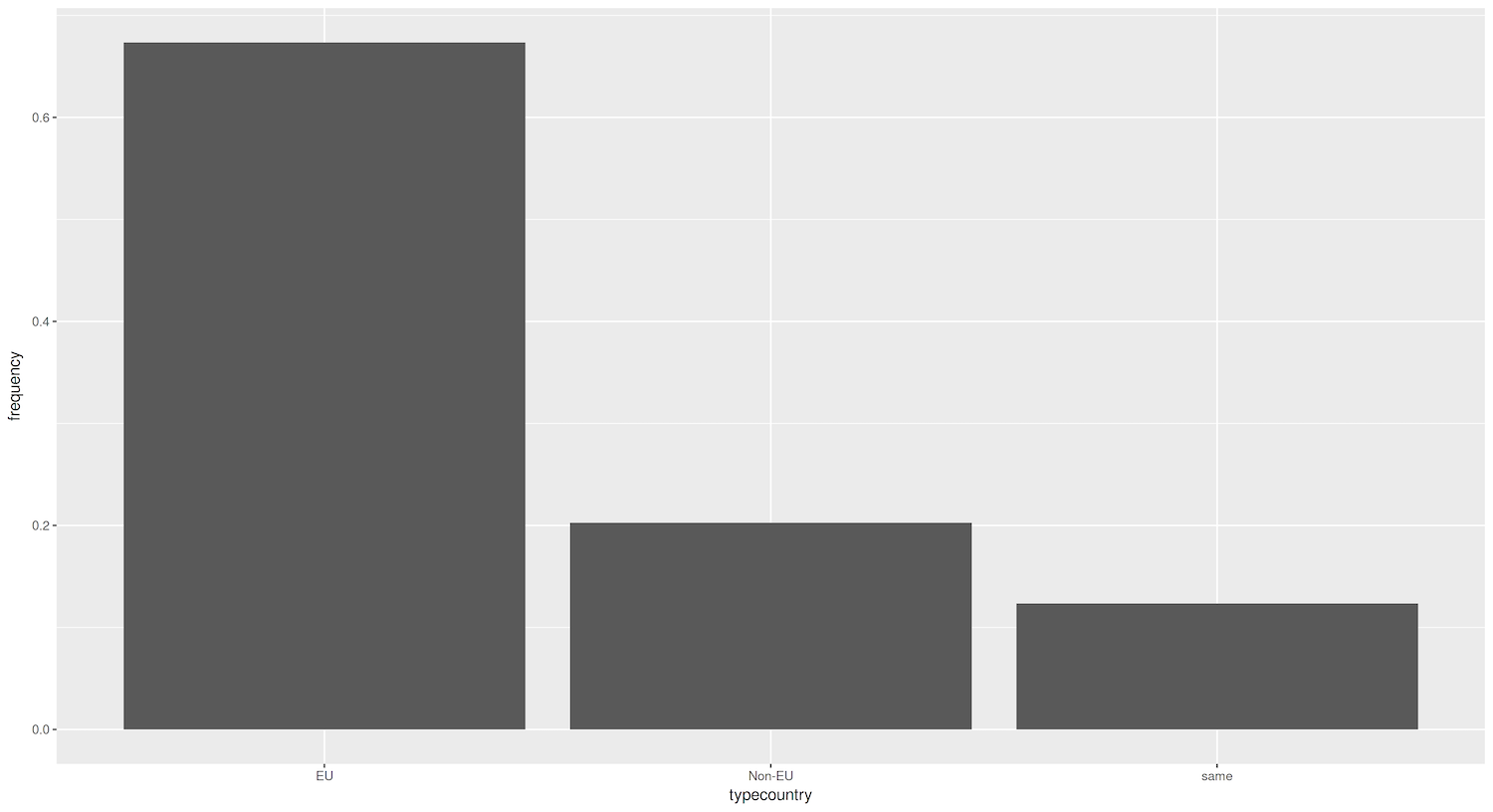
Figure 2. Bar graph showing percentage of destination cities that are domestic, EU, and non-EU.
There is an important difference between the first plot (Figure 1) and this one. In the previous plot, ggplot2 counted the number of cities in every group (domestic, EU, non-EU). In our new plot, the tibble already contained each bar’s numerical value, stored in the perc column. This is why we specify y = perc as a parameter of aes(). The tricky part is that by default, geom_bar() will use the parameter stat = "count". This means it will count how many times a value appears. In other words, it aggregates data for you. However, you can inform ggplot2 that you have already calculated your values by using the parameter stat = "identity".
Figure 2 shows that most sister cities are from a different country than the origin city, yet still within the EU (around 68%). This could be due to geographical proximity, cultural similarities, or economic ties within the European Union. you can get a more detailed look by adding in the name of each origin country to the visualization. You could decide to visualize this either by breaking down each bar into percentages by origin country (Figure 3), or by creating separate graphs for each origin country (this is called ‘facetting’ in ggplot2 lingo, which we cover below). Let’s try the first approach, aggregating the data per country and per type of country while adding a new column with percentages:
`eudata.perc.country` <- eudata %>%
  group_by(origincountry, typecountry) %>%
  summarise(total = n()) %>%
  mutate(perc = total/sum(total))

ggplot(data = `eudata.perc.country`, aes(x = typecountry, y = perc, fill = origincountry)) +
  geom_bar(stat = "identity", position="dodge")
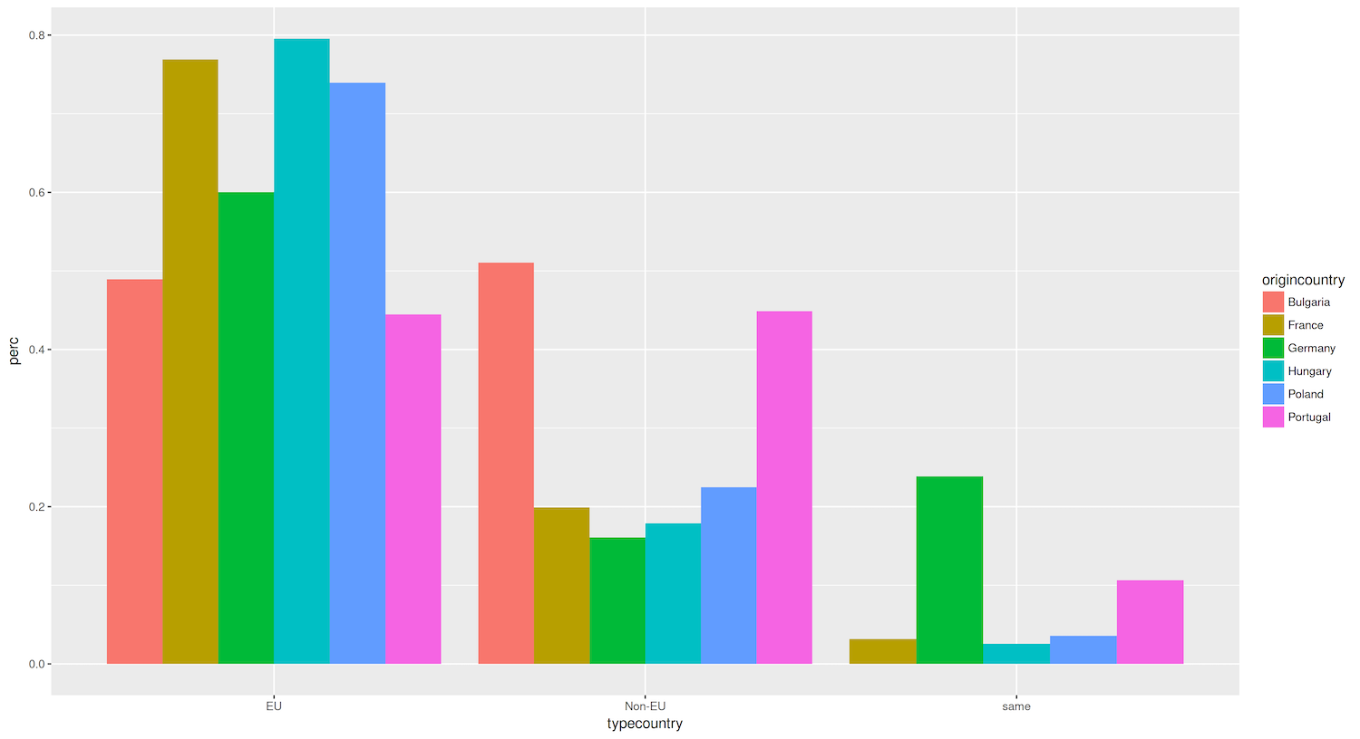
Figure 3. Bar graph showing the percentage of destination cities that are domestic, EU, and non-EU, aggregating data by country name and type.
For this plot (Figure 3), you created a tibble that aggregated data by origin country and destination country type (EU, non-EU, domestic). You mapped the origincountry to the fill aesthetic in the ggplot() command, which defines the color range of the bars. You also added the dodge position to geom_bar() so that the bars do not get stacked (which is the default), but are instead placed side by side.
Now that you have visualized urban relationships (partnerships between cities), let’s explore how these patterns interact with demographic characteristics such population size.
Figure 3 reveals that most countries in our analysis (Hungary, France, Poland and Germany) strongly prefer to establish sister-city relationships with other European Union countries, with approximately 60-80% of their partnerships in the EU. However, Bulgaria and Portugal differ from this trend: both of these countries seem to have a roughly equal proportion of sister city relationships with EU and non-EU countries. This suggests that Bulgaria and Portugal have a more balanced approach towards forming partnerships that involves actively engaging with cities outside the European Union.
In the case of Portugal, this more global outlook might be attributed to its extensive colonial history which may have fostered long-lasting cultural, linguistic, and economic ties with cities in its former colonies, such as those in Brazil, Angola, and Mozambique.
As for Bulgaria, we would need further investigation to uncover the factors contributing to its relatively high percentage of non-EU sister-city partnerships. Possible explanations include its geographic location at the edge of the European Union, its cultural and linguistic ties to countries in the Balkans and Eastern Europe, or its economic relationships with countries outside the EU.
While these initial observations provide a starting point for understanding relationship patterns, it is essential to delve deeper into each country’s historical, cultural, and political context to comprehend the underlying reasons for these trends.
Other Geoms: Histograms, Distribution Plots and Box Plots
So far, you have been introduced to the key syntax needed to operate ggplot2: creating layers and adding parameters. One of the most important layers is the geoms layer. Using it is quite straightforward, as every plot type has its associated geom:
geom_histogram()for histogramsgeom_boxplot()for box plotsgeom_violin()for violin plotsgeom_dotplot()for dot plotsgeom_point()for scatter plot
You can easily configure various aspects of each of these geom() types, such as their size and color.
To practice handling these geoms, let’s create a histogram to visualize an important urban characteristic of sister cities: the distance between them. This spatial aspect can help understand how geographic proximity influences city partnerships. Run the following short chunk of code to filter the data and visualize it. Remember to load tidyverse or dplyr first, to ensure the filter doesn’t throw an error.
eudata.filtered <- filter(eudata, dist < 5000)

ggplot(eudata.filtered, aes(x=dist)) +
  geom_histogram()
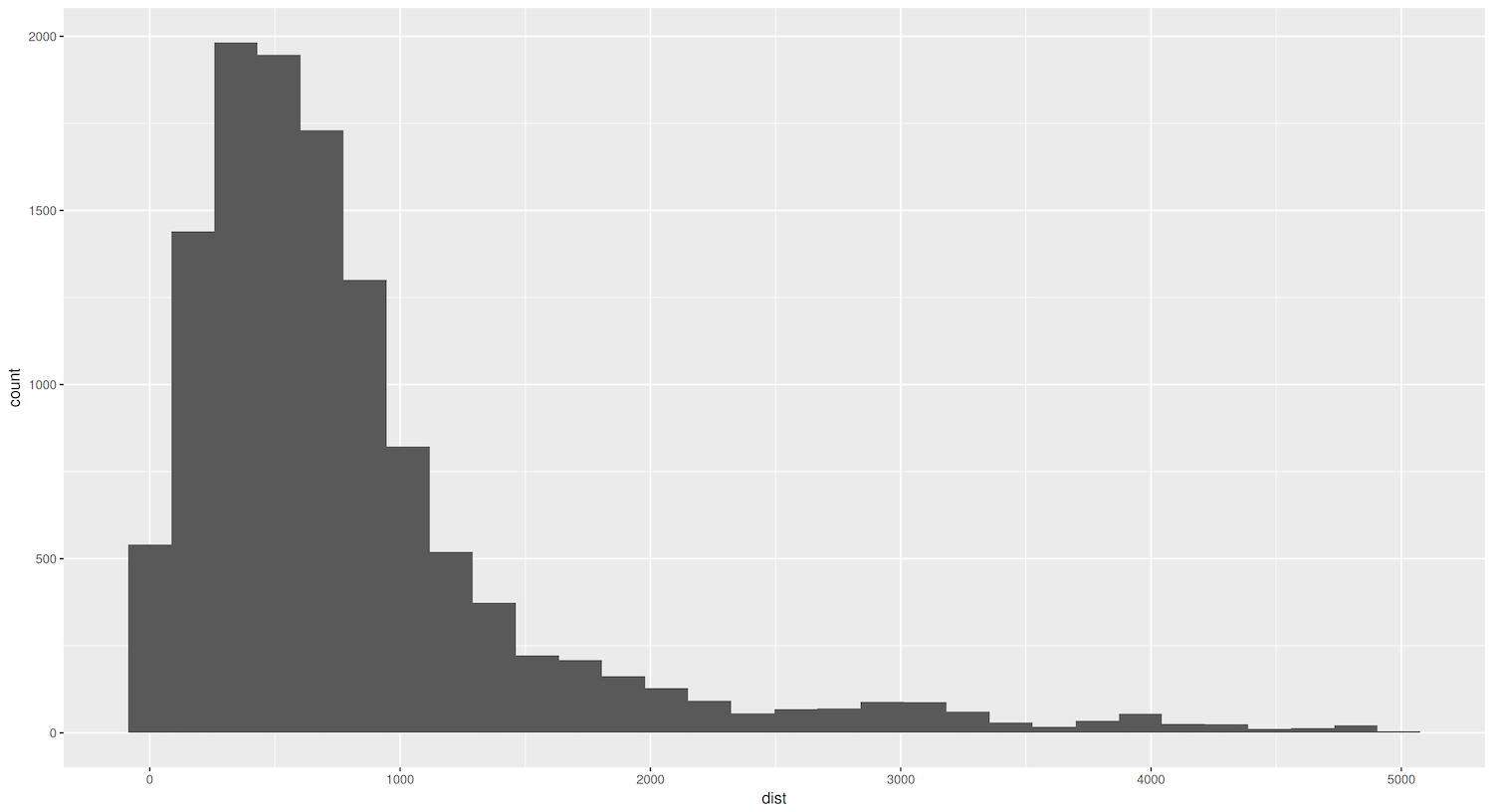
Figure 4. Histogram showing distances between sister cities.
As shown by the code above, you only needed to add geom_histogram() to create a histogram. However, making an effective histogram involves a bit more work. It is important, for example, to determine a bin size that makes sense for the data. The bin size, also known as the ‘interval’ or ‘bandwidth’, refers to the width of each bar, and determines how data is grouped and displayed along the x-axis. In the histogram created in Figure 4, ggplot2 defaulted to a binwidth of 30 (bins=30) – but a warning message recommends picking a better value. You can explore more configuration possibilities in the geom_histogram() documentation.
This simple graph shows a right-skewed distribution: the dist variable tells us that while the majority of sister cities tend to be geographically close, there are a few exceptions in which cities form partnerships with far-off counterparts.
You can use a cumulative distribution function (ECDF) using the unfiltered dataset to gain additional insights into this pattern and better understand the spatial distribution of sister-city relationships. Think of the ECDF like climbing a mountain: just as a mountain’s profile reveals its shape, the ECDF’s curve reveals the shape of the dist variable’s distribution. A right-skewed distribution would look like a mountain with a steep initial ascent (many cities with short distances) followed by a gentle slope toward the summit (fewer cities with longer distances). This would confirm that the skewness observed in the dist variable is a genuine feature of how cities form partnerships. Unlike a histogram, which can change shape depending on how you group the distances, the ECDF’s mountain profile remains consistent.
In ggplot2, you can create an ECDF by adding the stat_ecdf() layer to your plot. Here’s an example:
ggplot(eudata, aes(x=dist)) +
  stat_ecdf()
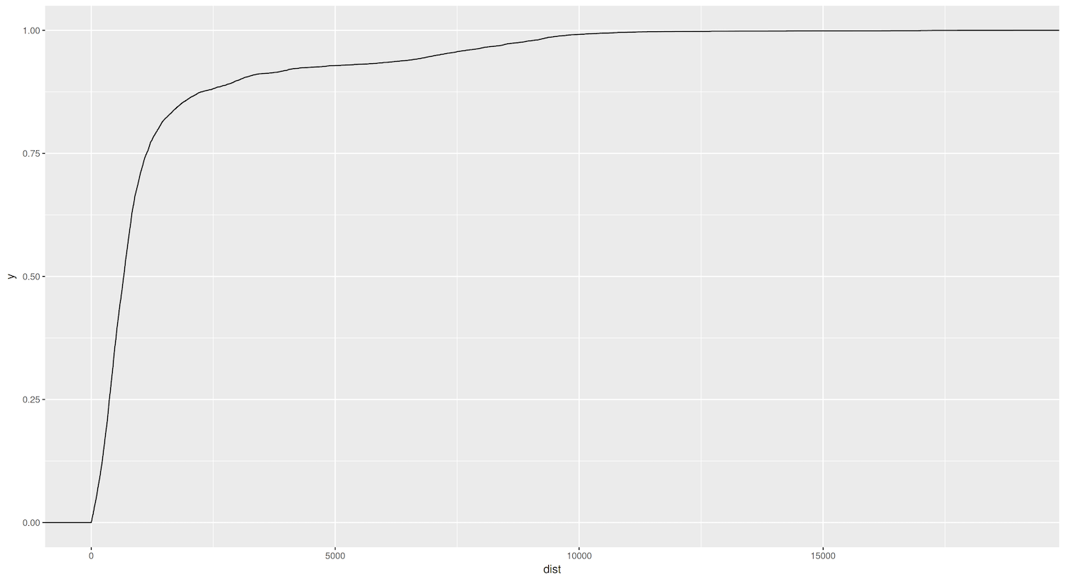
Figure 5. ECDF graph showing the distances between sister cities.
Let’s examine this ECDF plot created using the unfiltered eudata data frame: it confirms previous observations about the skewed distribution. Approximately 75% of cities have sister-city relationships within a radius of around 1000 kilometers. Even more intriguing is that roughly 50% of the cities are connected to sister cities no more than 500 kilometers away.
Lastly, you will create a box plot to compare how different countries structure their urban relationships across space. This visualization will help understand how certain countries tend to form more localized urban networks while others maintain broader geographic connections. By comparing the distribution of distances, you can identify national patterns in how cities build their international relationships.
ggplot(eudata.filtered, aes(x = origincountry, y = dist)) +
  geom_boxplot()
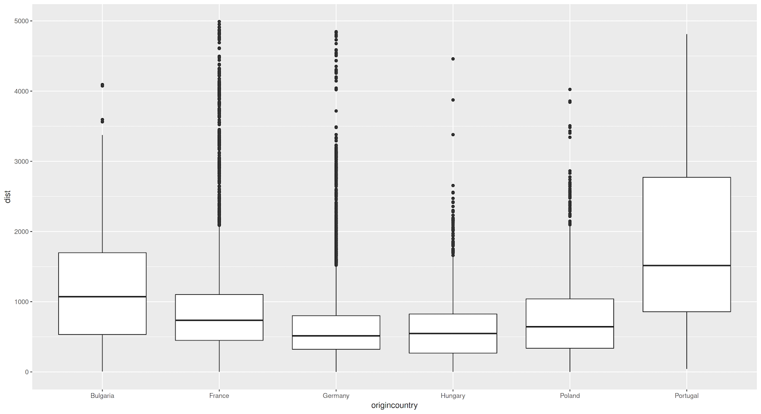
Figure 6. Box plots showing distances (in km) between sister cities, grouped by country.
Figure 6 reveals an interesting pattern for German cities especially: it shows that they tend to establish sister-city relationships with cities that are geographically closer, as indicated by the lower median distance and smaller spread of the box compared to other countries. This could reflect Germany’s position as a central and well-connected country within the EU, whose geographic location and strong economic ties with its neighbors could encourage the formation of regional partnerships within a smaller radius.
Advanced Manipulations to Graphs’ Appearance
So far, you have relied on ggplot2 to automatically decide your graphs’ appearance. However, you’ll certainly encounter various reasons to adapt these choices, for example to improve readability, highlight specific aspects of the data, or adhere to specific style guidelines. ggplot2 offers a wide range of customization options to fine-tune the appearance of its plots. To learn how to do this, you’ll start with a simple plot and build on it step by step.
Let’s explore how demographic characteristics influence urban relationships by examining the population size of sister cities. This analysis connects to broader historical questions about how city size affects international influence, how urban hierarchies develop, and how demographic patterns shape cultural and economic exchanges. Similar approaches could be used to study historical questions about urbanization patterns, the development of metropolitan regions, or the relationship between population size and economic development.
You will begin by creating a scatter plot connecting the population size of origin and destination cities. A scatter plot is a graph that uses dots or points to represent the intersecting values of two variables for each observation. In this case, each point on the scatterplot will represent a sister-city pair, with the x-coordinate indicating the population size of the origin city and the y-coordinate representing the population size of the destination city. If we observe a clear positive trend, with points clustering along a diagonal line from the bottom left to the top right of the plot, it will suggest that cities tend to form relationships with other cities of similar population size.
Since eudata contains 13081 entries, using them all would lead to overplotting. Therefore, in this example, you will select a random sample of 15% of the cities in the data, using the function slice_sample(). It’s also helpful to work with the natural logarithm of the population size to overcome skewness. Since you are using a random data selection, you must ‘set a seed’ to ensure reproducibility. This means that if you run the code again, ggplot2 will reselect the same random sample. You can do this with the set.seed() function:
set.seed(123)
Next extract a random sample of 15% of the cities:
eudata.sample <- slice_sample(eudata, prop = 0.15)
Then create a plot by running the following code:
ggplot(data = eudata.sample, aes(x = log(originpopulation), y = log(destinationpopulation))) +
  geom_point()
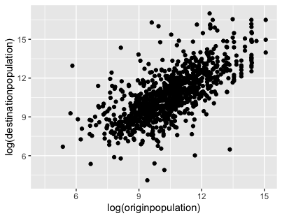
Figure 7. Scatter plot comparing the population size (in natual logarithm) of randomly selected sister-city pairs.
Now that you have created this basic plot, you can start playing with its appearance. Why not begin by applying a fixed size and color to the points? The code below changes the point color to a dark burgundy, using the hex code #4B0000:
ggplot(data = eudata.sample, aes(x = log(originpopulation), y = log(destinationpopulation))) +
  geom_point(size = 0.8, color = "#4B0000")
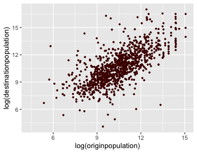
Figure 8. Changing the size and color of the points in the scatter plot.
To discover other available arguments, you can visit the geom_point() function’s documentation, or simply type ?geom_point in R.
You can keep improving the plot by adding axis labels and a title. Manipulating axes is usually done through the corresponding scales functions, which we will cover later on. But since changing the plot’s legends is a very common action, ggplot also provides the shorter function labs() (which stands for labels) for this specific purpose:
ggplot(data = eudata.sample, aes(x = log(originpopulation), y = log(destinationpopulation))) +
  geom_point(size = 0.8, color = "#4B0000") +
  labs(title = "Population size of origin and destination city", caption = "Data: [www.wikidata.org](http://www.wikidata.org)", x =     "Population of origin city (log)", y = "Population of destination city (log)")
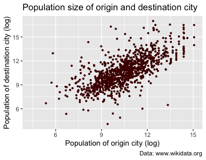
Figure 9. Adding axis labels and a title.
Once you are happy with your graph, you can save it:
ggsave("eudata.png")
To save it as a PDF, run the following command:
ggsave("eudata.pdf")
This will create a .png file of the last plot you constructed. The function ggsave() also comes with many adjustable parameters (dpi, height, width, format, and more).
You may sometimes want to enhance your graph by encoding additional information, using different colors or shapes. This is particularly useful if you want to represent categorical variables alongside the main variables of interest. In the scatter plot (Figure 8), you used static values to determine the size and color of the points. However, you could also map these aesthetic properties to specific columns in the data, in order to systematically visualize your different categories.
For instance, say you want to distinguish between the different sister-city relationships by highlighting the type of destination country in each pair. Our dataset’s typecountry variable is a categorical variable which indicates whether the destination city is in the same country as the origin city, in another EU country, or another non-EU country. To incorporate this information, you can map the typecountry variable to the color parameter by passing the aes() function to geom_point():
ggplot(data = eudata.sample, aes(x = log(originpopulation), y = log(destinationpopulation))) +
  geom_point(size = 0.8, alpha = 0.7, aes( color = typecountry )) +
  labs(title = "Population size of origin and destination city", caption = "Data: [www.wikidata.org](http://www.wikidata.org)", x =     "Population of origin city (log)", y = "Population of destination city (log)")
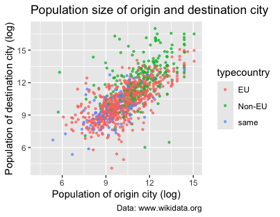
Figure 10. Using colors in scatter plots to visualize different country types.
The code above has two major changes. First, we modified geom_point() by adding the argument aes(color = typecountry). Second, since there are too many overlapping points, we added the alpha parameter to give them 70% transparency. Again, ggplot2 has selected default colors and legends for the graph.
Scales: Colors, Legends, and Axes
Next, you’ll explore ggplot2’s scales function. You can think of scales as a set of rules, or a mapping system. They take your raw data (like population numbers or country names) and define how those values should be represented visually – what color something should be, where it should be placed on the graph, how big it should appear, etc. Without scales, ggplot2 wouldn’t know how to translate your data into a meaningful picture.
Let’s use the sister-city data as an example. When you create a plot, scales work behind the scenes to transform your raw data into visual elements. They specify, for example, how country names convert into different colors (‘French cities should be shown in blue’), or how distance between cities translates into point size (‘cities with populations over one million should be shown as large points’). These rules ensure that every element of your data is displayed consistently throughout your visualization, making it easier for readers to understand the patterns and relationships you’re trying to show.
In ggplot2, scales follow a naming convention consisting of three parts separated by underscores:
- The prefix
scale. - The name of the scale being modified. As mentioned earlier, aesthetics define the visual properties of the plot that are mapped to data. Scales, on the other hand, control how those aesthetic mappings are translated into specific visual representations. This includes how data values are mapped to colors or shapes, and their position on the x and y axes.
- The type of scale being applied (continuous, discrete, brewer).
Before you start adding scales, it will be helpful to store your previous plot in a variable p1: this is a convenient way to create different versions of the same plot in order to vary only certain aspects of it.
p1 <- ggplot(data = eudata.sample, aes(x = log(originpopulation), y = log(destinationpopulation))) +
  geom_point(size = 0.8, alpha = 0.7, aes( color = typecountry )) +
  labs(title = "Population size of origin and destination city", caption = "Data: [www.wikidata.org](http://www.wikidata.org)", x =     "Population of origin city (log)", y = "Population of destination city (log)")
One common use of scales is to change the colors of a plot. To manually specify the colors you want, you can use the scale_color_manual() function and provide a vector of color values, using color names defined by R or their hexadecimal codes. scale_colour_manual() takes a compulsory argument (values =), namely a vector of the color names. In this way, you can create graphs with your chosen colors:
p1 +
  scale_colour_manual(values = c("red", "blue", "green"))
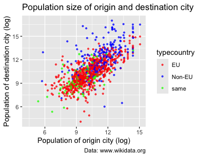
Figure 11. Using scale_colour_manual() to specify the colors of the scatter plot’s points.
However, you can also simply rely on predefined color scales, such as the color brewer palettes. It’s better to use these whenever possible, because choosing the right colors for visualizations is a very complicated issue (for instance, avoiding colors that are not distinguishable by people with impaired vision). Fortunately, ggplot2 comes with scale_colour_brewer() already integrated:
p1 +
  scale_colour_brewer(palette = "Dark2") # you can try others such as "Set1", "Accent", etc.
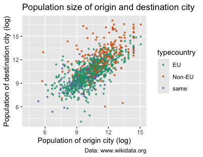
Figure 12. Using scale_colour_brewer() to change the colors of the scatter plot’s points.
In the scatter plot above, you learned how to represent a qualitative (or categorical) variable (typecountry) using three different colors. In the next scatter plot, let’s try to represent a continuous variable instead – for example, the distance between origin and destination cities, which we can show using varying intensities of color. You might try to simply map this color to the distance log(dist), which is the continuous variable in this case:
p2 <- ggplot(data = eudata.sample, aes(x = log(originpopulation),y = log(destinationpopulation))) +
  geom_point(size = 0.8, aes( color = log(dist) )) +
  labs(title = "Population size of origin and destination city", subtitle = "Colored by distance between cities",
    caption = "Data: [www.wikidata.org](http://www.wikidata.org)", x = "Population of origin city (log)", y = "Population of            destination city (log)")

p2
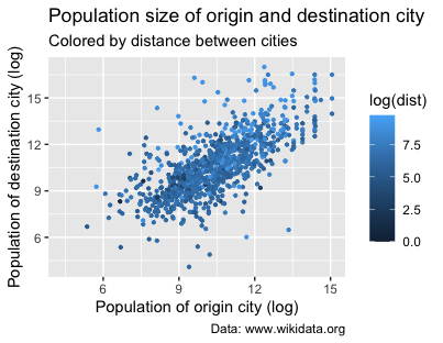
Figure 13. Mapping the plot colors to the distance between cities.
Immediately, you’ll notice that this code hasn’t produced the most intuitive visualization:
-
By default, ggplot2 uses a blue color gradient for continuous variables when no specific color is specified.
-
The default scale is also counterintuitive, because shorter distances are represented by a darker blue, not lighter (which we would expect).
In this example, again, using a scale will provide the tools to correct these defaults and create visualizations that more accurately and effectively communicate the underlying data. To represent a continuous variable, gradient – or ‘continuous’ – color scales assign colors to values based on a smooth transition between hues or shades. This allows for an accurate representation of the continuous variable, as the gradual color change corresponds to the change in the variable’s value. Using a gradient scale, you can visualize the distribution of values and identify patterns or trends in the data.
There are several methods for creating gradient scales in ggplot2. For our purpose, we will use the scale_colour_gradient() function. This allows you to assign specific colors to the minimum and maximum values of the continuous variable. ggplot2 then automatically interpolates the colors for the intermediate values based on the chosen gradient.
You can work with the p2 object created earlier and use the + operator to modify it. You’ve already mapped the dist variable (distance between cities) to the color aesthetic using color = dist inside the aes() function. Now, add the scale_colour_gradient() function to customize the color gradient. In the code below, you set the color for the lowest value of the dist variable to white and the highest value to the hex code for a dark burgundy (#4B0000). This means lighter shades of red will represent shorter distances, while darker shades represent longer distances.
p2 +
  scale_colour_gradient(low = "white", high = "red3")
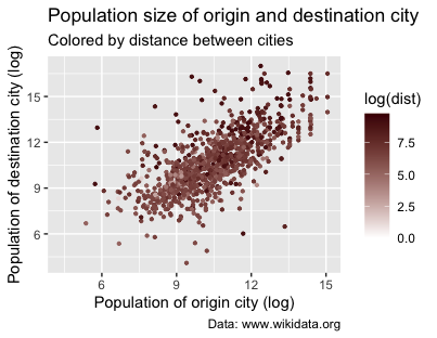
Figure 14. Population size of origin and destination city colored by distance between cities using scale_colour_gradient().
What can we learn from this graph? To a certain extent, it appears that smaller cities tend to establish relationships with cities that are closer. In the previous sections, you examined the distribution of distances between sister cities using a histogram and an ECDF plot. These visualizations revealed that most sister-city relationships are characterized by short distances, mostly within a radius of 500 to 1000 kilometers. Comparing findings across different visualizations can strengthen the depth of the observed patterns and highlight the importance of considering certain key variables.
Building upon these insights, let’s now modify the scatter plot’s legend. Customizing it will improve clarity, making it easier for readers to interpret and understand the conveyed information.
You can modify the legend by editing the guide parameter within the scale_colour_gradient() function. The guide parameter specifies the legend’s title, position, and orientation. Here, you will also use the guide_colorbar() function to create a color bar legend representing the range of distances between cities.
p2 <- p2 +
  scale_colour_gradient(low = "white", high = "red3", guide = guide_colorbar(title = "Distance in log(km)", direction =
    "horizontal", title.position = "top"))

p2
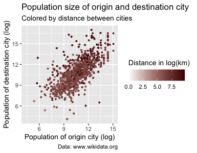
Figure 15. Modifying the title and adding a color bar.
Facetting a Graph
Another great feature of ggplot2 is that it allows you to split your data into different plots based on a certain variable. In ggplot2, this is called facetting. The simplest facetting function is facet_wrap(), but you can also check out the richer facet_grid() for more options.
Earlier in the lesson, you created a plot which highlighted whether destination cities were within the same country as the origin city, in a different EU or a non-EU country. Using the eudata.perc.country tibble, you could facet this graph by adding a facet_wrap() layer based on the different origin countries:
ggplot(`eudata.perc.country`, aes(x = typecountry, y = perc)) +
  geom_bar(stat = "identity") +
  facet_wrap(~origincountry)
The tilde (~) operator is commonly used in R formulas. Here, it indicates which variable ggplot2 should use to define the facetting structure. In other words, ~origincountry formula tells ggplot2 to split the data based on the value of the origincountry variable, then create a separate graph to represent each value (in this case, each country). The resulting plot will display the bar graphs in a grid layout:
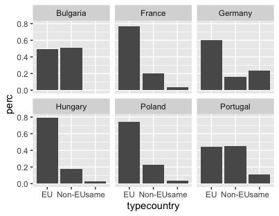
Figure 16. Facetting a graph with facet_wrap().
Themes: Changing Static Elements
Since the appearance of a graph is crucial for effectively communicating different insights, ggplot2 provides themes to help customize your visualizations further. These themes control the non-data elements of the plot, such as the background color and font styles.
Setting a theme is very simple: just apply it as a new layer using the + operator. Here’s a classic dark-on-light theme:
p3 <- ggplot(`eudata.perc.country`, aes(x = typecountry, y = perc)) +
  geom_bar(stat = "identity") +
  facet_wrap(~origincountry)

p3 +
  theme_bw()
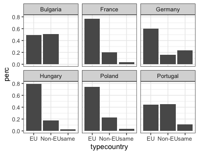
Figure 17. Changing static elements using theme_bw().
You can also install several packages which provide additional themes, such as ggthemes or ggtech. In these, you will find for example theme_excel (replicating the classic charts in Excel) and theme_wsj (based on the plots in The Wall Street Journal). The advantage of using ggplot2’s themes to replicate these recognizable styles is not only simplicity, but also the fact that ggplot2 automatically takes into account the grammar of graphics when mapping your data to elements of the graph.
For instance, to mimic graphs created by The Wall Street Journal, you can write the following:
install.packages("ggthemes")

library(ggthemes)

p3 +
  theme_wsj()
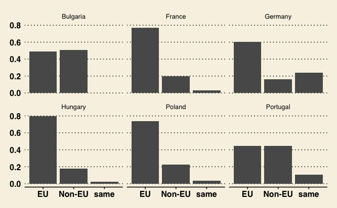
Figure 18. Changing static elements using The Wall Street Journal theme.
Extending ggplot2 with Other Packages
One of ggplot2’s strengths is its extensive collection of extensions that can help enhance your analysis with specialized visualizations like network graphs (useful for showing relationships between cities, for example), time series graphs (for tracking demographic changes over time), and ridgeline plots (for comparing population distributions across different urban areas).
Let’s explore an example showcasing a ggplot2 extension that creates more advanced and visually striking plots. In this case, we will create a ridgeline plot – also known as a ‘joyplot’ – designed to visualize changes in distributions over time, across different categories. Ridgeline plots are particularly effective for comparing multiple distributions in a compact and aesthetically pleasing manner.
To create a ridgeline plot, you’re going to use the ggridges package (one of many ggplot2 extensions). This adds a new layer called geom_density_ridges() and a new theme theme_ridges(), which expands R’s plotting possibilities.
This code is simple enough (again, using a log transformation due to the data’s skewness):
install.packages("ggridges")
library(ggridges)

ggplot(eudata, aes(x=log(originpopulation), y = origincountry)) +
  geom_density_ridges() +
  theme_ridges() +
  labs(title = "Population (log) of the origin cities", caption = "Data: [www.wikidata.org](http://www.wikidata.org)", x =
    "Population (log)", y = "Country")
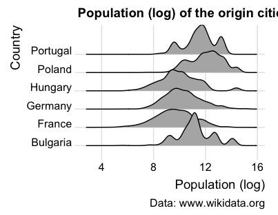
Figure 19. Extending ggplot2 with the ggridges package.
This visualization of population distributions shows how urban demographic patterns vary by country. For example, Poland, Portugal and Bulgaria show distinct demographic profiles, with their cities tending toward larger population sizes, as indicated by the peaks on the right side of their respective density curves.
Conclusion
Through the analysis of sister-city relationships in the European Union using ggplot2 and its extensions, we’ve demonstrated how different visualization techniques can reveal patterns in urban networks and demographic characteristics. The dataset allowed us to uncover several key insights: cities tend to form partnerships within a 500-1000 km radius, countries vary significantly in their preference for domestic versus international partnerships, and population size plays a role in partnership formation.
However, this is just the tip of the iceberg of ggplot2’s possibilities. With an extensive ecosystem of extensions and packages, ggplot2 offers endless opportunities for customization and adaptation to specific data visualization needs. Whether you’re working with time series data, network graphs, or geospatial information, there’s likely a ggplot2 extension that can help you create compelling and informative visualizations. As you continue to explore and work with ggplot2, remember that effective data visualization is an iterative process that requires experimentation, refinement, and a keen understanding of your audience and communication goals. By mastering the principles and techniques this tutorial covers, you will be well-equipped to create impactful visualizations that illuminate the stories hidden within your data.
Additional Resources
To gain a more thorough understanding of ggplot2, we recommend you explore some of the following sources:
-
Hadley Wickham’s books
ggplot2: Elegant Graphics for Data Analysis and R for Data Science. -
Hadley Wickham’s original paper on the grammar of graphics.
-
Leland Wilkson’s original book The Grammar of Graphics.
-
Selva Prabhakaran’s tutorial on r-statistics.co.
-
Data Science Dojo’s video Introduction to Data Visualization with ggplot2.
-
UC Business Analytics’ R Programming Guide.
-
The official ggplot2 extensions page and accompanying gallery.
-
R Project’s overview about extending ggplot2.
-
The Cookbook for R book (based on Winston Chang’s R Graphics Cookbook. Practical Recipes for Visualizing Data).
-
This official R cheatsheet.
-
The gradient scale documentation page.