Contents
Lesson Goals
In this lesson you will install QGIS software, download geospatial files like shapefiles and GeoTIFFs, and create a map out of a number of vector and raster layers. Quantum or QGIS is an open source alternative to the industry leader, ArcGIS from ESRI. QGIS is multiplatform, which means it runs on Windows, Macs, and Linux and it has many of the functions most commonly used by historians. ArcGIS is prohibitively expensive and only runs on Windows (though software can be purchased to allow it to run on Mac). However, many universities have site licenses, meaning students and employees have access to free copies of the software (try contacting your map librarian, computer services, or the geography department). QGIS is ideal for those without access to a free copy of Arc and it is also a good option for learning basic GIS skills and deciding if you want to install a copy of ArcGIS on your machine. Moreover, any work you do in QGIS can be exported to ArcGIS at a later date if you decide to upgrade. The authors tend to use both and are happy to run QGIS on Mac and Linux computers for basic tasks, but still return to ArcGIS for more advanced work. In many cases it is not lack of functions, but stability issues that bring us back to ArcGIS. For those who are learning Python with the Programming Historian, you will be glad to know that both QGIS and ArcGIS use Python as their main scripting language.
Installing QGIS
Navigate to the QGIS Download page. The procedure is a little different depending on your operating system. Click on the appropriate Operating System. Follow the instructions below.
Mac Instructions
- For most people it will be best to choose Master release (the one that has a single installer package). You will still need to install other software packages before installing QGIS. Under “Download for Mac OS X”, click on the link (KyngChaos Qgis download page) and download the file (see screen shot below): 1) QGIS 2.18.13-1 (under Download) for your respective Mac OS (this works with versions from Lion onwards). Then go to the left “software menu” and click on “Download Archive”. Under “GDAL Complete” download the file 2) GDAL complete 1.11 framework package (under Requirements). Install the framework package like any other Mac programs.
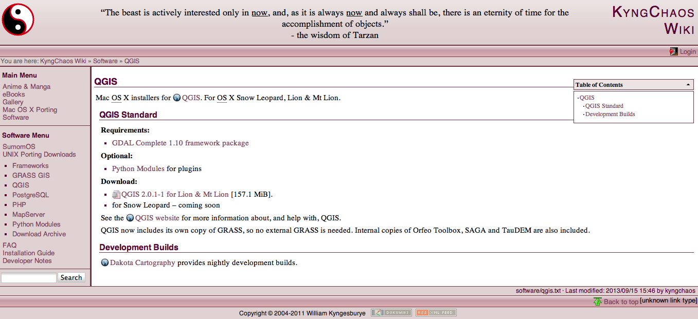
Figure 1
- once the frameworks are installed, download and install QGIS.
- as with any other Mac application you are using for the first time, you will have to go find the QGIS application in Applications
Windows Instructions
- under Standalone Installer, click on the link to Download QGIS
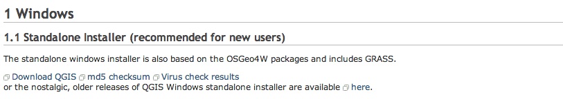
Figure 2
- double-click on the
.exefile to execute
QGIS is very simple to install in most versions of Linux. Follow the instructions on the download page.
Prince Edward Island Data
We will be using some government data from the Canadian province of Prince Edward Island. PEI is a great example because there is a lot of data for free online and because it is Canada’s smallest province, making the downloads quick!
- Download the following PEI shapefiles:
- coastline.SHP.zip
- lot_town.SHP.zip
- hydronetwork.SHP.zip
- http://www.gov.pe.ca/gis/download.php3?name=forest_35&file_format=SHP
- nat_parks.SHP.zip
- PEI Highways
- PEI Places
- After downloading all seven files, move them into a folder and unzip the zipped files. Take a look at the contents of the folders. You will notice four files with the same name, but different file types. When you navigate to these folders from GIS software, you will find that you only need to click on the .shp and that the other three formats support this file in the background. It is important when moving files on your computer to always move and keep all four files together. This is one reason Shapefiles are normally shared using zip compression. Remember the folder in which you save uncompressed shapefile folders, as you will need to find them from within QGIS in a few minutes.
Starting Your GIS Project
Open QGIS. The first thing we need to do is set up the Coordinate Reference System (CRS) correctly. The CRS is the map projection and projections are the various ways to represent real world places on two-dimensional maps. The default is WGS84 (it is increasingly common to use WGS 84 which is compatible with Google Earth type software), but since most of our data and examples are created by Canadian governments we recommend using NAD 83 (North American Datum, 1983). For more on NAD 83 and the Federal Government’s datum, see NRCan’s website. PEI has its own NAD 83 coordinate reference system which uses a Double Stereographic projection. Managing the CRS of different layers of information and making sure they are working correctly is one of the most complicated aspects of GIS for beginners. Nonetheless, if the software is setup correctly, it should convert the CRS and allow you to work with data imported from different sources. Select Project Properties
- Mac: Project–>Project Properties
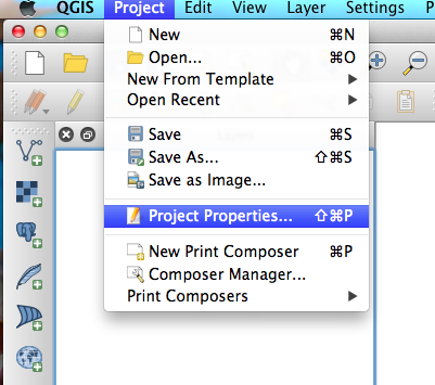
Figure 3
- Windows: Settings-> Project Properties
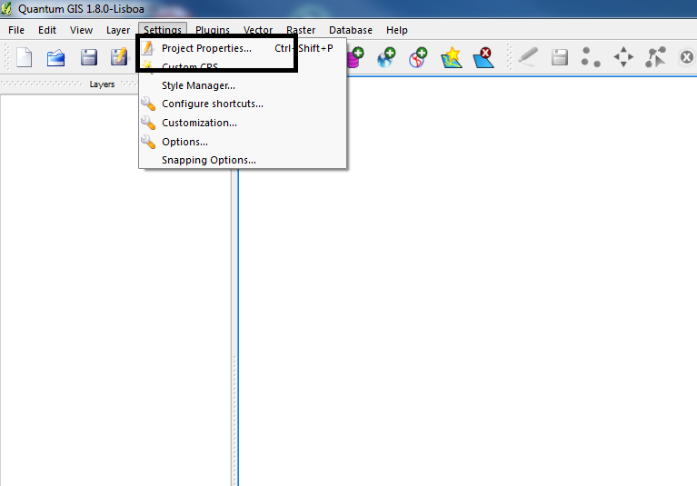
Figure 4
- In the left window pane select CRS (second from the top)
-
click Enable ‘on the fly’ CRS transformation button on top left
- in the Filter box enter ‘2291′ – this quickly navigates to the best Coordinate reference system for Prince Edward Island.
- under the box titled Coordinate reference systems of the world, select ‘NAD83(CSRS98) / Prince Edward Isl. (Stereographic)’ and hit OK
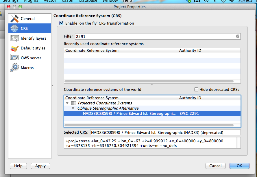
Figure 5
- notice the projection has changed in the bottom right corner of the QGIS window. Next to that you will see the geographic location of your mouse pointer in metres
- under Project menu, select Save Project (you should save your project after each step)
You are now set up to work on the tutorial project, but might have a few questions about what CRS to use for your own project. WGS83 might work in the short term, particularly if you are working on a fairly large scale, but it will be difficult to accurately work on local maps. One hint is to learn what CRS or Projections is used for paper maps of the region. If you are scanning a good quality paper map to use as the base layer it might be a good idea to use the same projection. You can also try searching the internet for the more common CRS for a particular region. For those of you working on North American projects identifying the correct NAD83 for your region will often be the best CRS. Here are a few links to other resources that will help you choose a CRS for your own project: Tutorial: Working with Projections in QGIS
Building a Base Map
Now that your computer is driving with the right directions, it’s time to add some information that makes sense to humans. Your project should start with a base map, or a selection of geospatial information that lets your readers recognize real world features on the map. For most users this will be comprised of several ‘layers’ of vector and raster data, which can be rearranged, coloured, and labeled in such a way that they make sense to your readers and your project’s objectives. A relatively new feature on many GIS programs is the availability of pre-fab base maps, but since this technology is under development for open source platforms like QGIS we will walk through the process of creating our own base map by adding vector and raster layers in this module. For those who would like to add pre-fab base maps to QGIS, you can try installing the ‘OpenLayers’ Plugin under Plugins->Manage and Install Plugins. Select “Get More” on the left. Click OpenLayers and then click Install plugin. Click OK and then click close. Once installed, you’ll find OpenLayers in the Plugins Menu. Try installing some of the different Google and OpenStreetMaps layers. At the time of writing this module, the OpenLayers plugin (v. 1.1.1) installs but fails to work properly on any Mac using OSX. It appears to work more consistently on QGIS running on Windows 7. Give it a try, as we expect it will only get better in the months ahead. Note, however, that the projection for some of these global maps do not correct on the fly, so the satellite images might not alway sync up with data projected in a different CRS.
Opening Vectors
Vectors defined: GIS uses points, lines, and polygons, also known as vector data. Its first order of work is to arrange these points, lines, and polygons and project them accurately on maps. Points may be towns or telephone poles; lines could represent rivers, roads, or railroads; and polygons could encompass a farmer’s lot or larger political boundaries. However, it is also possible to attach historical data to these geographical places and study how people interacted with and changed their physical environments. The population of towns changed, rivers moved their courses, lots were subdivided, and land was planted with various crops.
- under Layer on toolbar, choose Add Vector Layer (alternatively the same icon you see next to ‘Add Vector Layer’ can also be selected from the tool bar on the upper left side)

Figure 6
- click Browse, find your downloaded Prince Edward Island shapefiles in the folder
- open the coastline_polygon folder
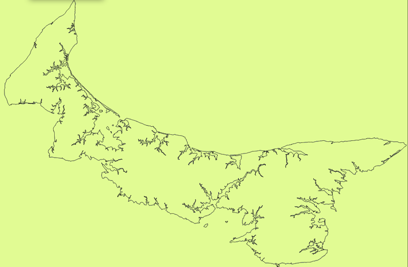
Figure 7
- select coastline_polygon.shp, then select ‘OK’, and you should see the island’s coastline on your screen. Sometimes QGIS adds a coloured background (see the image above). If you have a coloured background, follow the steps below. If not, skip down the page to the ***.
- right click the layer (coastline_polygon) in the Layers menu and choose Properties.\
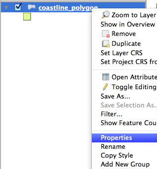
Figure 8
-
In the ensuing window, click Style in the left pane
-
There are a range of options, but we want to get rid of the background all together. Click Simple fill.
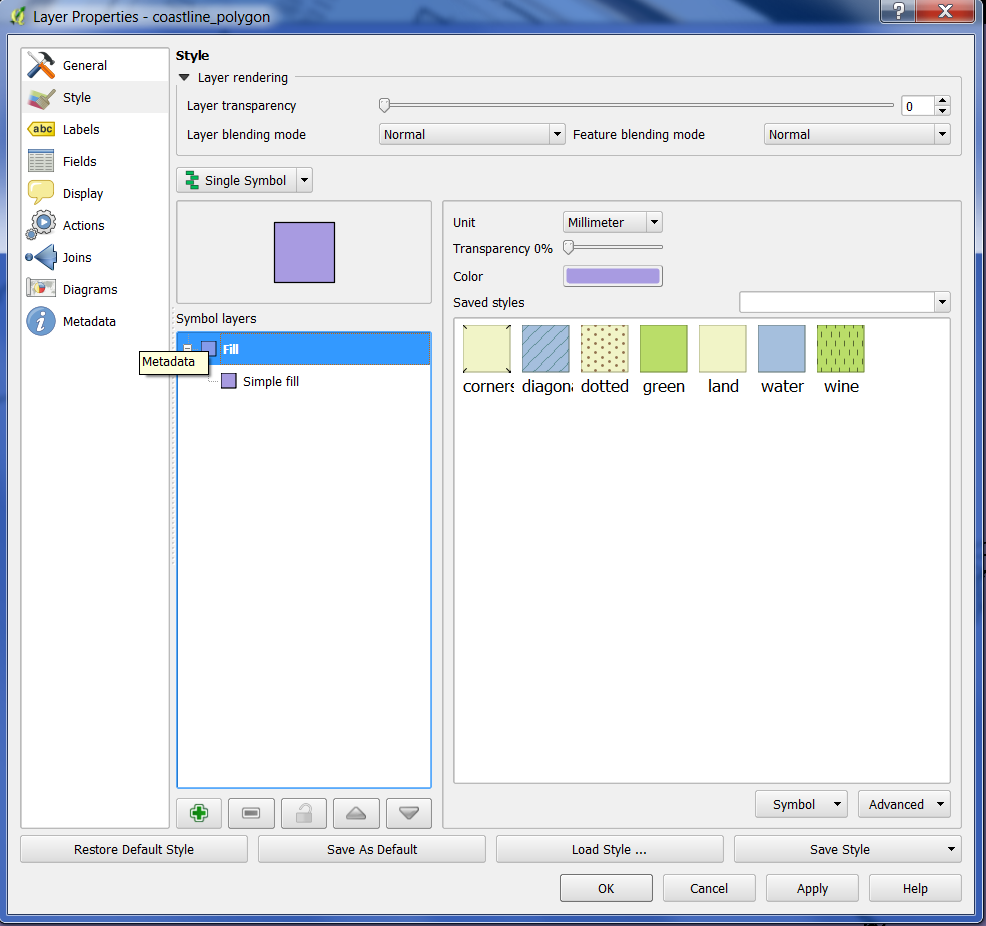
Figure 9
- Then choose ‘No Brush’ in the Fill style drop down menu. Click OK.
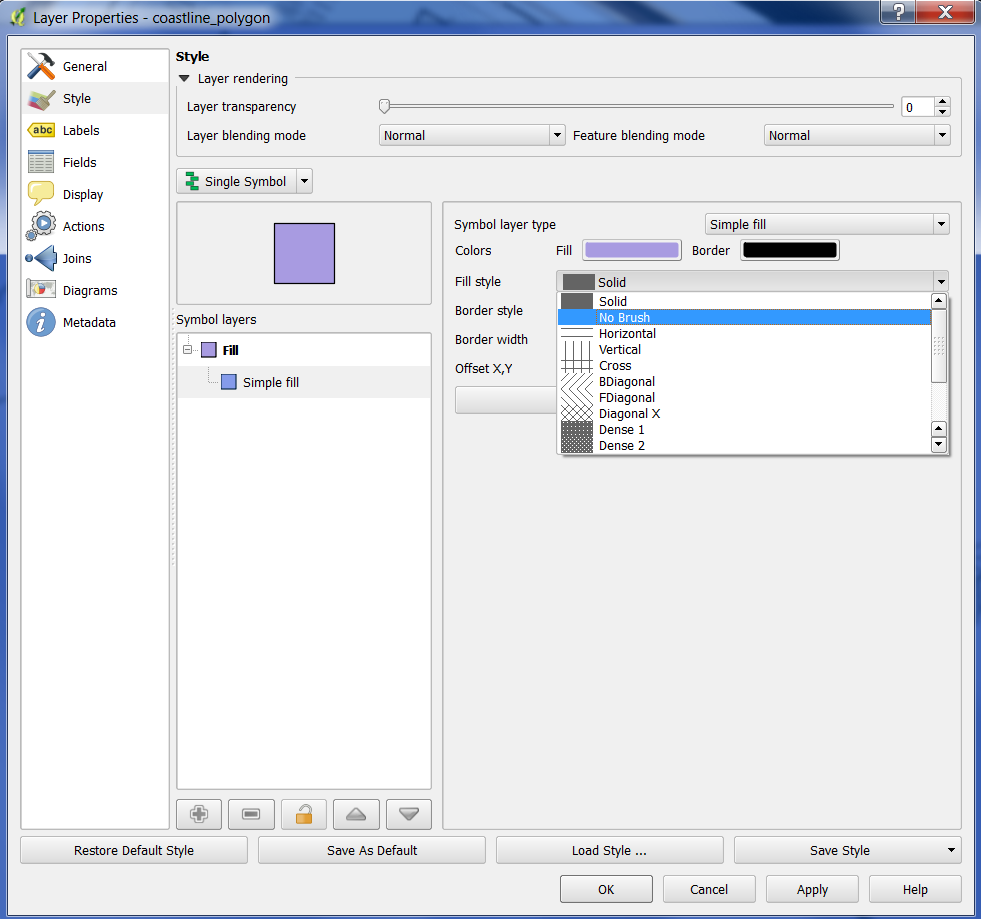
Figure 10
***
- Choose Add Vector Layer again.
- click Browse, find your downloaded Prince Edward Island shapefiles in the folder
- select ‘PEI_HYDRONETWORK’
- click on ‘PEI_HYDRONETWORK.shp’ and then hit ‘Open’
- right click the layer in the Layers menu and choose Properties.
- select Style tab, and choose an appropriate blue to color the hydronetwork and select ‘OK’ at the bottom right of the window
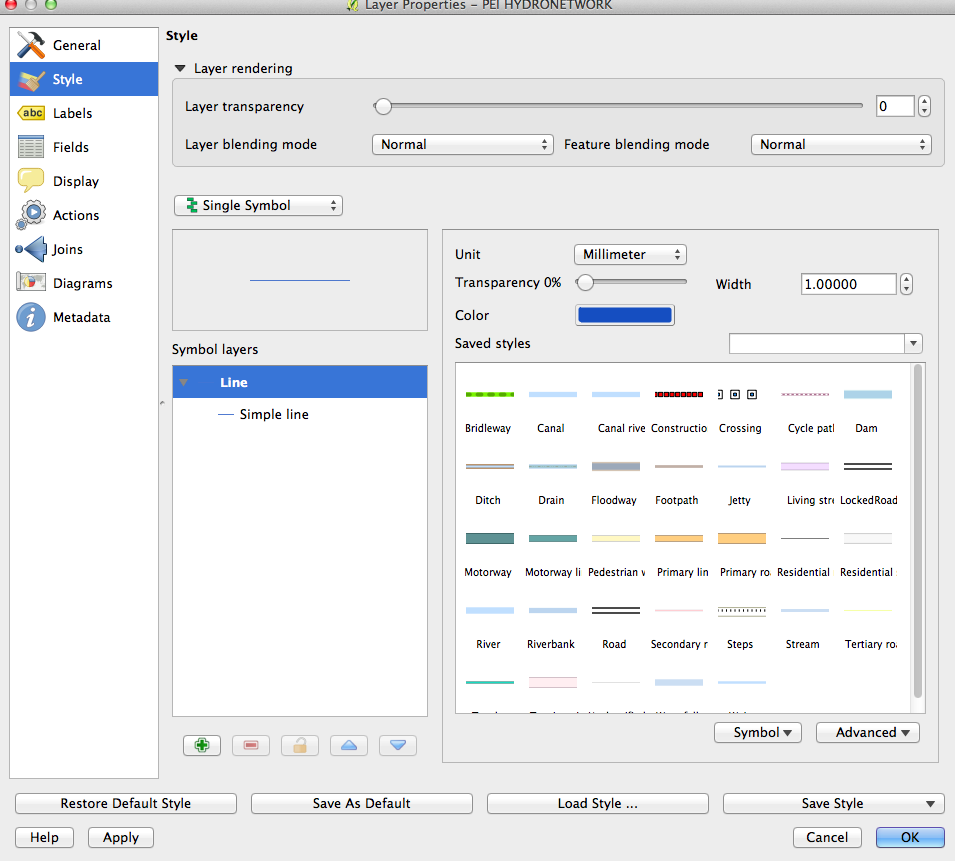
Figure 11
- Your map should now look like this:
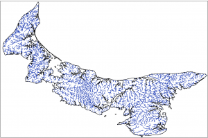
Figure 12: Click to see full-size image
- Choose Add Vector Layer again.
- click Browse, find your downloaded Prince Edward Island shapefiles in the folder
- double-click on ‘1935 inventory_region.shp’ and then hit ‘Open’
This will add a dense map showing the different forest cover in 1935. However, to see the different categories, you will need to change the symbology to represent the different categories of forest with different colours. We will need to know which column of the database tables includes the forest category information, so the first step is to open and inspect the attribute table.
- right click on the 1935_inventory_region layer in the Layers window on the left and click on Open Attribute Table
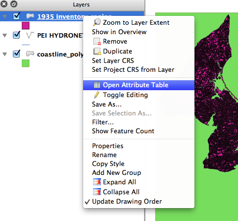
Figure 13
An Attribute Table will open. It has a number of categories and identifiers. Of particular interest is the LANDUSE category which provides information on the forest cover in 1935. We will now show you how to display these categories on the map.
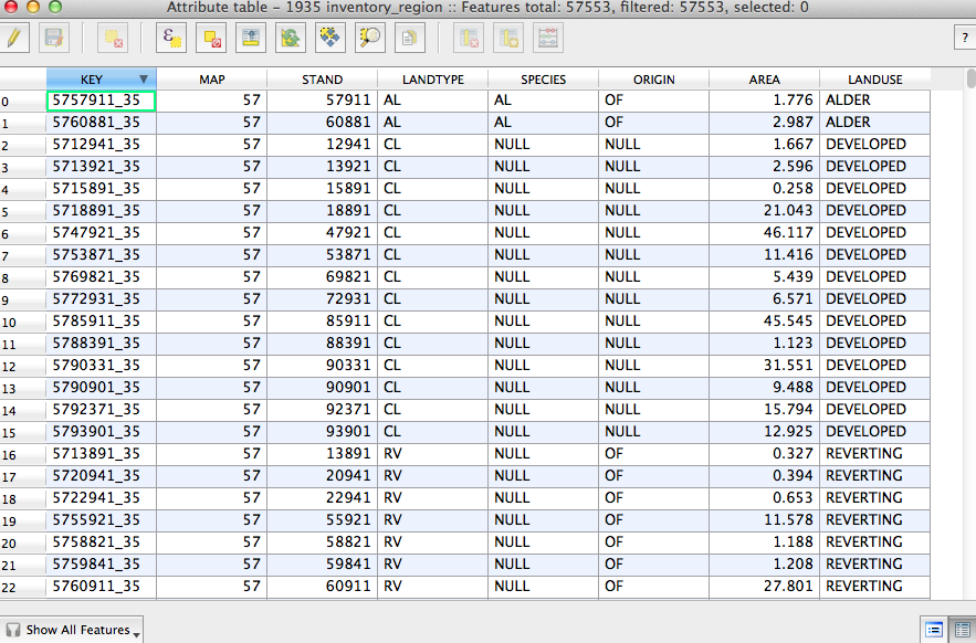
Figure 14
- Close the Attribute Table, and right click on the 1935_inventory_region layer again and this time choose Properties (alternatively, the shortcut is to double click on the 1935_inventory_region layer).
- click Style along the left
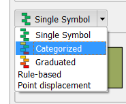
Figure 15
- on the menu bar that reads ‘Single Symbol’ select ‘Categorized’
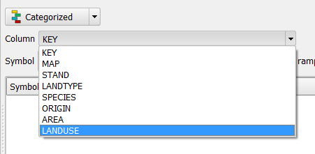
Figure 16
- beside Column choose ‘Landuse’
- under Color ramp choose Greens
- click ‘Classify’ below and to the left
- in Symbol Column, choose the furthest down dark green square (with no value beside it) and hit the ‘Delete’ button (to the right of Classify); also delete the Developed category, as we want to highlight forested areas. Click ‘OK’
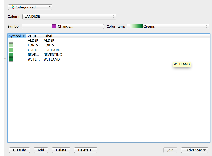
Figure 17
-
in Layers sidebar menu, click on the little arrow beside 1935_inventory_region to view the legend.
-
You can now see the extent of the forests in 1935. Try using the magnifying glass tool to zoom in and inspect the different landuses.
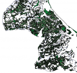
Figure 18: Click to see full-size image
- To get back to the full island, right click on any of the layers and choose ‘Zoom to Layer Extent.’
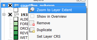
Figure 19
- Next, we will add a layer of roads.
- under Layer on toolbar, choose Add Vector Layer
- click Browse, find your downloaded Prince Edward Island shapefiles in the folder
- select ‘PEI_highway.shp’
- in the Layers menu on the left, double-click ‘PEI_highway_ship’ and select Style from the menu on the left (if it isn’t already selected)
- click on ‘Single Symbol’ on top left and select ‘Categorized’
- beside Column choose ‘TYPE’
- click Classify
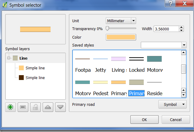
Figure 20
-
in the Symbol column, double-click beside ‘primary’ – in the ensuing window, there is a box with different symbols. Scroll down and find ‘primary road’.
-
You are back in the Style window. Repeat for the item that called ‘primary_link’ in the Label column.
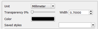
Figure 21
- click Symbol beside secondary and change color to black and width to 0.7
- repeat for secondary link
- click OK. You will now have the highways and other major roads represented on the map
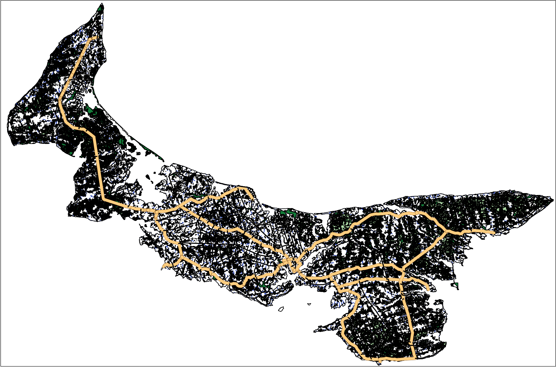
Figure 22: Click to see full-size image
- under Layer on toolbar, choose Add Vector Layer
- click Browse, find your downloaded Prince Edward Island shapefiles in the folder
- select ‘PEI_placenames_shp’
- double click on ‘PEI_placenames’ and select ‘Open’
- in the Layers window, double-click on the PEI_placenames layer. Choose Labels tab along the left (under Style). At the top, select the box beside ‘Label this layer with’ and in the dropdown box beside that select ‘Placename’
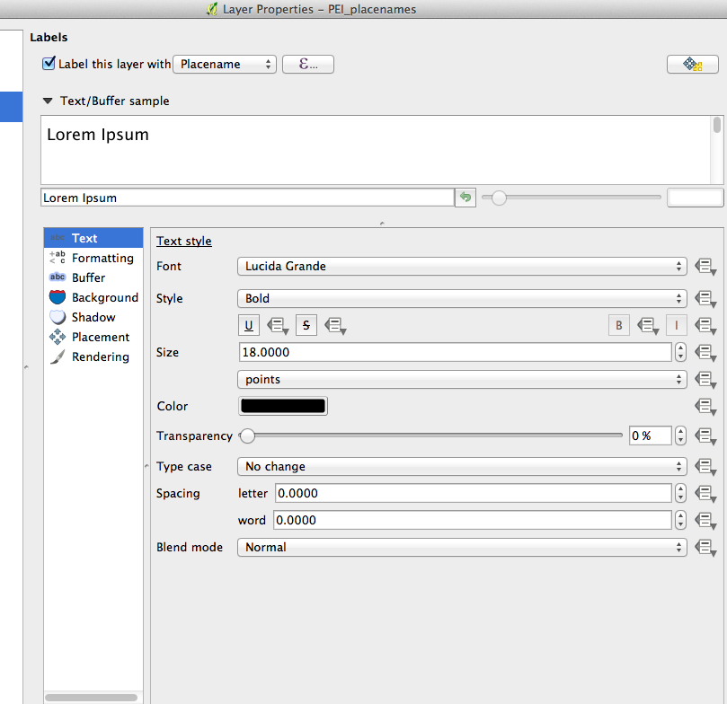
Figure 23
- Change Font size to ‘18′
- Click ‘OK’ and examine the results on the map
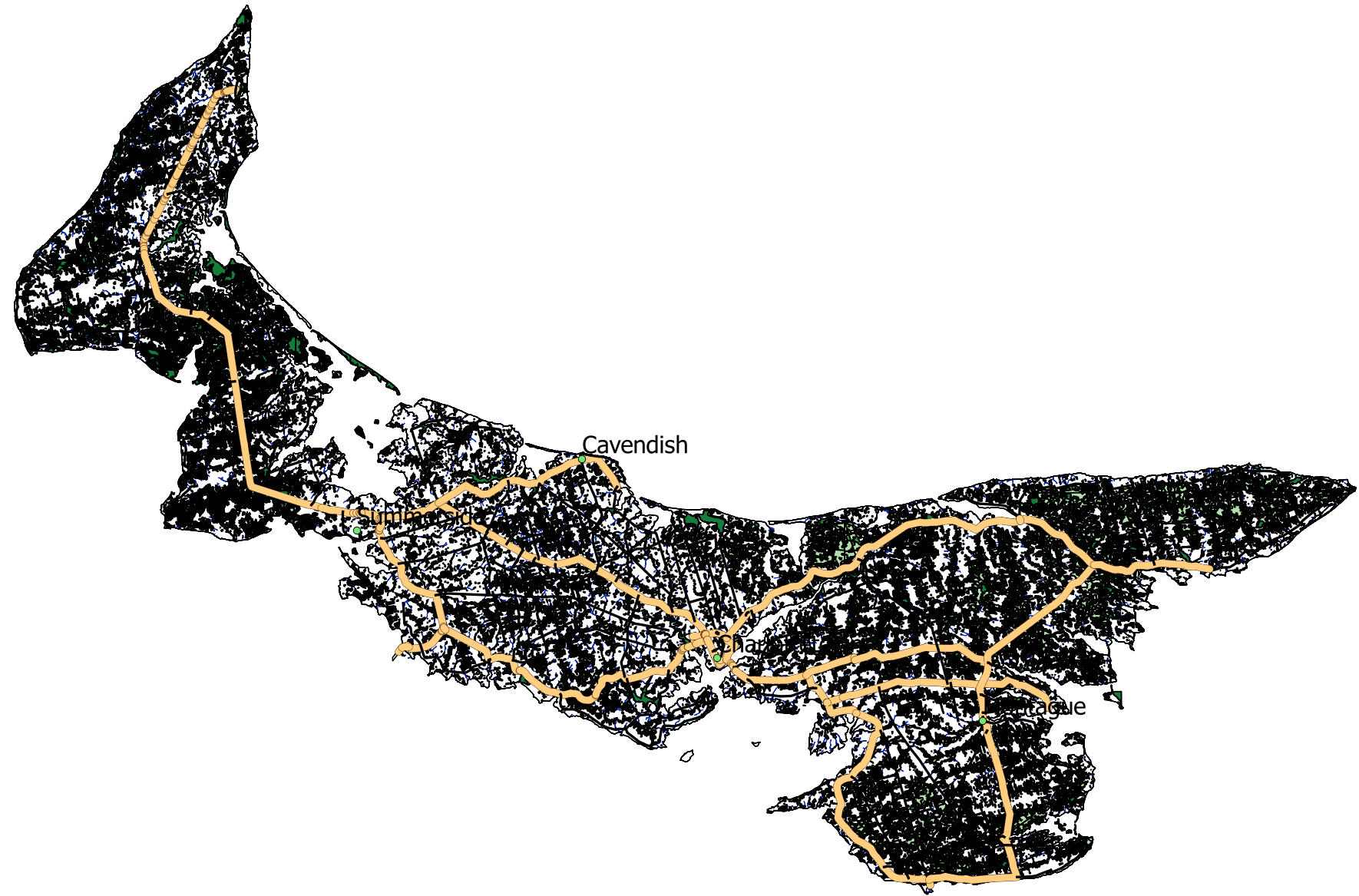
Figure 24: Click to see full-size image
- Labelling is where QGIS falls well short of real cartography – it will take tinkering to adjust settings to display the detail desired for a presentation. Try going back to the Labels tab and changing the different settings to see how symbols and displays change.
Note that in the Layers menu you can add and remove the various layers we’ve added to the map much the same way you did in Google Earth. Click on the check boxes to remove and add the various layers. Drag and drop layers to change the the order they appear. Dragging a layer to the top will place it above the rest of the layers and make it the most prominent. For example, if you drag ‘coastline_polygon’ to the top, you have a simplified outline of the province along with place names.
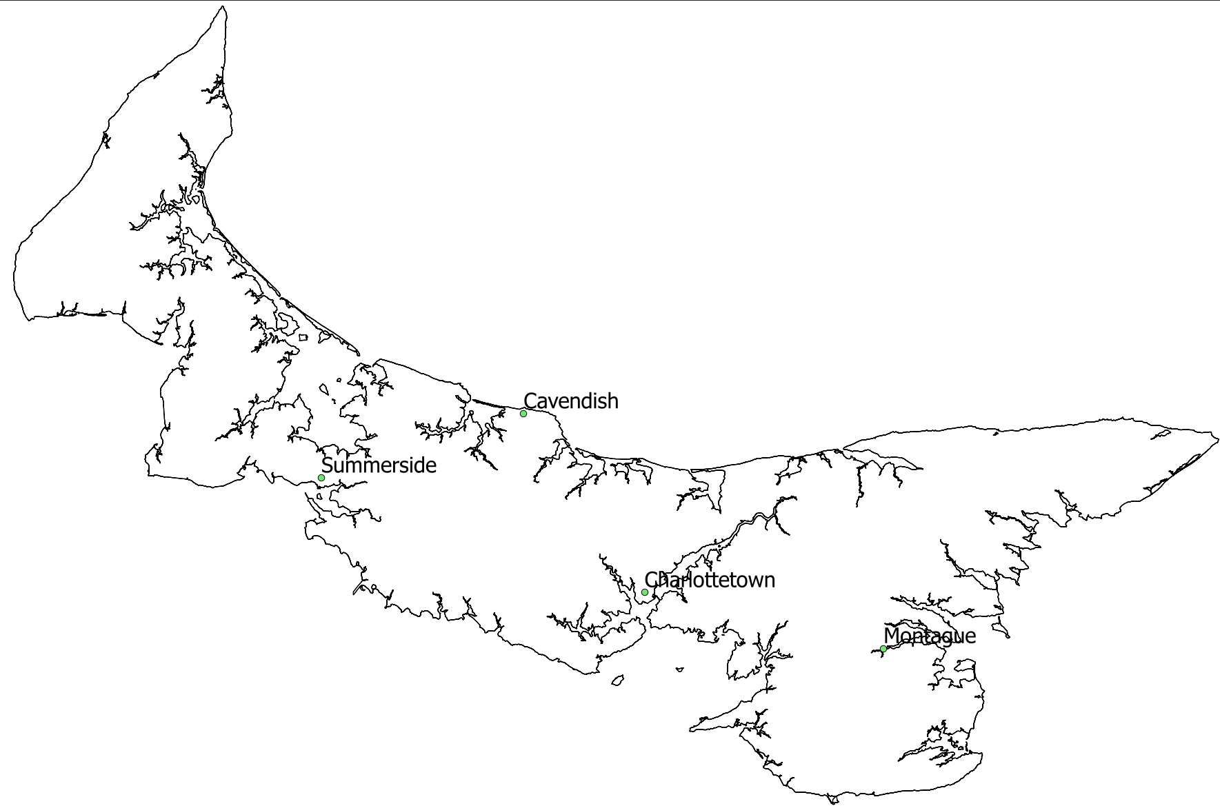
Figure 25: Click to see full-size image
- Along the toolbar on the top left of the main window are icons that allow you to explore the map. The hand symbol, for example, allows you to click on the map and move it around, while the magnifying glass symbols with plus and minus on them allow you to zoom in and out. Play with these and familiarize yourself with the various functions
Figure 26
- having created a map using vector layers, we will now add or use our first raster layer. This is a good time to save your work.
Opening Rasters: Raster data are digital images made up of grids. All remote sensing data such as satellite images or aerial photos are rasters, but usually you can’t see the grids in these images because they are made up of tiny pixels. Each pixel has its own value and when those values are symbolized in colour or greyscale they make up an image that is useful for display or topographical analysis. A scanned historical map is also brought into GIS in raster format.
- download: PEI_CumminsMap1927.tif to your project folder.
- under Layer on toolbar, choose Add Raster Layer (alternatively the same icon you see next to ‘Add Raster Layer’ can also be selected from the tool bar along the left side of the window)

Figure 27
- find the file you have downloaded titled ‘PEI_CumminsMap1927.tif’
- you will be prompted to define this layer’s coordinate system. In the Filter box search for ‘2291′, then in the box below select ‘NAD83(CSRS98) / Prince Edward Isl. (Stereographic)…’
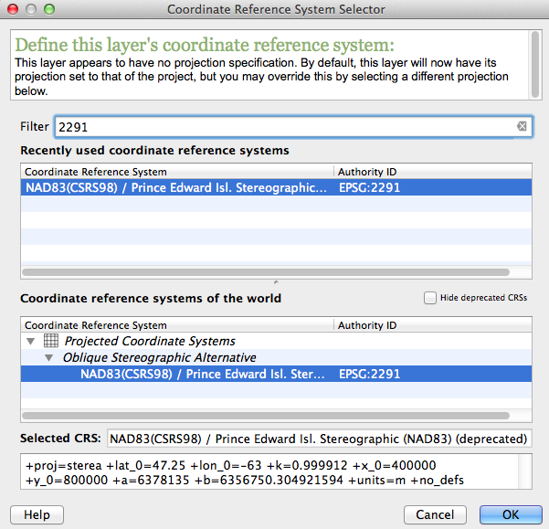
Figure 28
- If the program does not prompt you for the CRS you need to change it yourself. Double click the PEI_CummingMap1927_compLZW layer and choose ‘General’ from the menu on the left. Click ‘Specify…’ beside the box showing the incorrect Coordinate reference system. Then follow the instructions above (choose 2291).
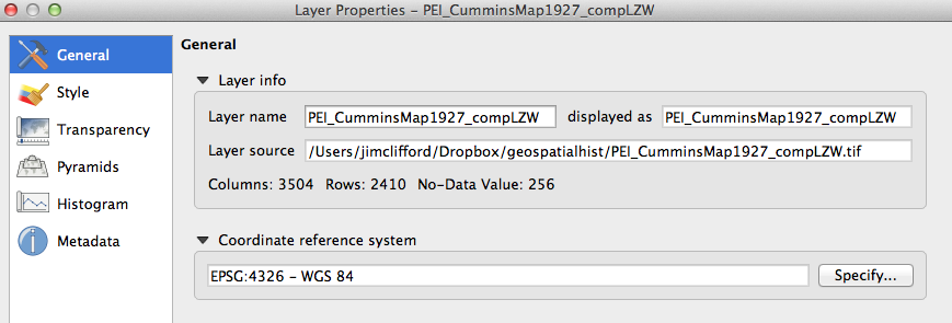
Figure 29
- In the Layers window, the map should appear below the vector data. Move it to the bottom of the menu if necessary:
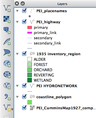
Figure 30
- Now we would like to make the coastline more visible, so double-click on ‘coastline_polygon’ and select ‘Style’ on the left. In the box under Symbol layers, select ‘Simple fill’ and options appear in the box to the right. Click on the menu next to ‘Border’ and make it red, and then beside Border width change it to 0.5, and click OK.
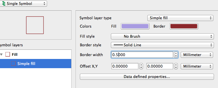
Figure 31
- You are now able to see the background raster map through the ‘coastline_polygon’ layer. Zoom in for closer inspection, and you should be able to see the coastline layer clearly. Notice that the alignment is relatively good, but not perfect. We will learn more in lesson 4 about the challenges of georeferencing historical maps to give them real world coordinates.
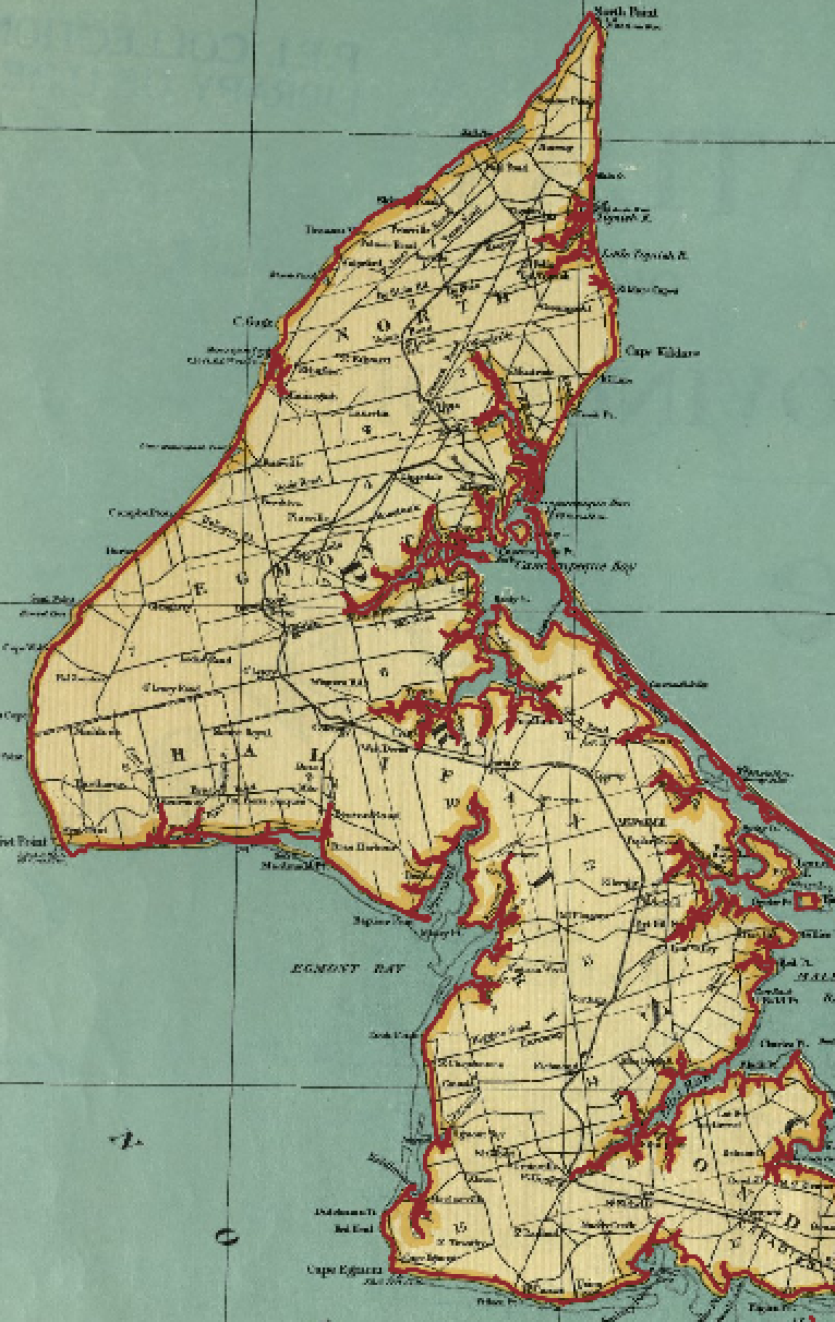
Figure 32
You have learned how to install QGIS and add layers. Make sure you save your work!
This lesson is part of the Geospatial Historian.