
Contents
- Lesson Overview
- Preparation
- Logistic Regression Procedure
- Step 1: Loading metadata
- Step 2: Preparing The Data and Creating Binary Gender Labels
- Step 3: Loading Term Frequency Data, Converting to Lists of Dictionaries
- Step 4: Converting data to a document-term matrix
- Step 5: TF-IDF Transformation, Feature Selection, and Splitting Data
- Step 6: Training the Model
- Step 7: Generate Predictions
- Step 8: Evaluating Performance
- Step 9: Model Validation
- Step 10: Examine Model Intercept and Coefficients
- Step 11: Make Predictions on Non-Binary Data
- Lesson Conclusion
- Alternatives to Anaconda
- End Notes
Lesson Overview
This lesson is the second of two that focus on an indispensable set of data analysis methods, logistic and linear regression. Linear regression represents how a quantitative measure (or multiple measures) relates to or predicts some other quantitative measure. A computational historian, for example, might use linear regression analysis to do the following:
-
Assess how access to rail transportation affected population density and urbanization in the American Midwest between 1850 and 18601
-
Interrogate the ostensible link between periods of drought and the stability of nomadic societies2
Logistic regression uses a similar approach to represent how a quantitative measure (or multiple measures) relates to or predicts a category. Depending on one’s home discipline, one might use logistic regression to do the following:
-
Explore the historical continuity of three fiction market genres by comparing the accuracy of three binary logistic regression models that predict, respectively, horror fiction vs. general fiction; science fiction vs. general fiction; and crime/mystery fiction vs. general fiction3
-
Analyze the degree to which the ideological leanings of U.S. Courts of Appeals predict panel decisions4
The first of these examples is a good example of how logistic regression classification tends to be used in cultural analytics (in this case literary history), and the second is more typical of how a quantitative historian or political scientist might use logistic regression.
Logistic and linear regression are perhaps the most widely used methods in quantitative analysis, including but not limited to computational history. They remain popular in part because:
- They are extremely versatile, as the above examples suggest
- Their performance can be evaluated with easy-to-understand metrics
- The underlying mechanics of model predictions are accessible to human interpretation (in contrast to many “black box” models)
The central goals of these two lessons are:
- To provide overviews of linear and logistic regression
- To describe how linear and logistic regression models make predictions
- To walk through running both algorithms in Python using the scikit-learn library
- To describe how to assess model performance
- To explain how linear and logistic regression models are validated
- To discuss interpreting the results of linear and logistic regression models
- To describe some common pitfalls to avoid when conducting regression analysis
Preparation
Before You Begin
See Linear Regression Analysis with Scikit-learn for a discussion of suggested prior skills, links to resources related to those skills, Python installation instructions, a list a required dependencies, and information about the lesson dataset.
Overview of Logistic Regression
As with linear regression, it is best to begin describing logistic regression by using an example with one continuous independent variable and one binary dependent variable. For example, we might attempt to use a continuous variable such as the relative frequency of a particular word to predict a binary such as “book review or not book review” or “author assumed to be male” vs “author assumed to be female.” Where raw counts of term frequencies would be considered discrete variables, relative frequencies are treated as continuous data because they can take on any value within an established range, in this case any decimal value between 0.0 and 1.0. Likewise, TF-IDF scores are weighted (in this case scaled), continuous variables.
Regarding the selection of a binary variable to predict, many humanists will be wary of the word binary from the outset, as post-structuralism and deconstruction are both based on the idea that conceptual binaries are rooted in linguistic conventions, inconsistent with human experience, and used in expressions of social control. I will return to this topic later in the lesson but, for now, I would offer the perspective that many variables which can be framed as binary for the purposes of logistic regression analysis, might otherwise be better regarded as ordinal, nominal, discrete or continuous data. As I state in my article for Cultural Analytics, “my work seeks to adopt a binary, temporarily, as a way to interrogate it.”5 Later in this lesson, I’ll go a step further than I did in that article by demonstrating what happens when you use a binary regression model to make predictions on non-binary data.
Consider the following plot visualizing the relationship between “presumed gender” and the relative frequency of the word she:
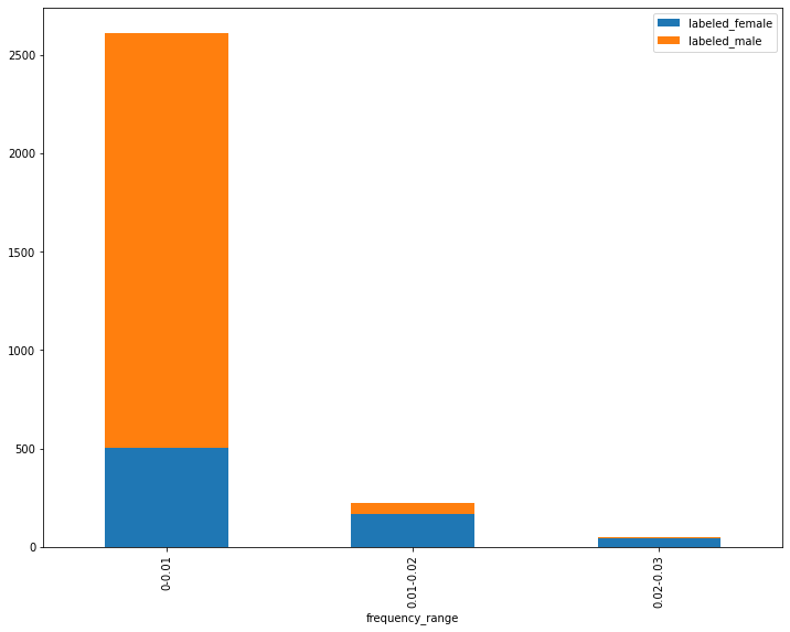
Bar plot of gender label split for frequency ranges of the word “she”
This stacked bar chart shows three ranges of frequency values for the term she. In the first range or bucket (farthest to the left), the lowest frequencies for the term she are represented. The second bucket (in the center) contains the middle range of values, and the third bucket (farthest to the right) contains the highest frequencies of the word she. The two colors in each bar represent the number of reviews labeled male and female respectively, such that the ratio of male labels to female labels is demonstrated for each frequency range. From this visualization, we can see that there are many more male-labeled reviews in the data than female-labeled reviews and that, in the mid-range and higher-range buckets, there are more female labels than male labels. In the lowest frequency range, the majority but not all of the reviews have male labels. In turn, most of the reviews with male labels are found in this range. It’s also the case that the majority of the reviews with female labels are found in this range. This apparent contradiction is made possible the overall ratio of male to female labels in the data.
Based on our data, a higher frequency of the term she seems to suggest a greater likelihood of a female label. A logistical regression function, however, doesn’t merely solve for “the conditional probabilities of an outcome” but rather generates a “mathematical transformation of those probabilities called logits.”6 The term logit itself is a shortened version of “logistic unit,” and a logistic regression model is sometimes called a logit model for short.
The math behind this function is more complicated than a linear regression, but the usage is quite similar. When a given predictor value is a supplied, a probability of a binary label is mathematically calculated. As with a linear regression, a logistic regression function requires an input variable (such as the frequency of she in our case), along with a coefficient and an intercept. The relationship of all possible values to their derived probabilities will form an S shape, or a sigmoid curve. As a result, a logistic regression model is a type of sigmoid function.
Our logit model can convert any real number input to a value between zero and one.7 The mathematical formula looks like this:
\[P(Yi = 1 \vert Xi = v) = \frac {e^{(a + bXi)}}{[1 + e^{(a + bXi)}]}\]In this equation, \(P(Yi = 1 \vert Xi = v)\) represents the given probability we wish to calculate. \(e\) represents the exponent (or inverse of the natural log), \(a\) represents the intercept, \(b\) represents the coefficient, and \(Xi\) represents the predictor variable’s value. Putting this all together, we get the following procedure:
- Multiply the variable’s coefficient (\(x\)) by the predictor value (\(b\)) and add the intercept (\(a\)) to that product
- Calculate the exponent of that product (\(e^{\left( a + bX_i \right)}\))
- Divide that exponent by the sum of that exponent and the number 1 (making sure that the sum is calculated before division occurs)
If you find all this math confusing, you’re not alone. Hopefully, you can see that the model allows you to start with a predictor value, apply an equation to that predictor, and derive a number between 0 and 1. That number represents the probability of a given class label.
Either way, you can still get a lot of utility out of a logit model without understanding all of its mathematical underpinnings. You can also train a model using the code below and come back to this math later to make sure the coefficients and intercepts produce the predictions you were expecting. For now, it’s important to understand that, as the value of the predictor variable increases, the probability of the binary response variable rises or falls. How much it rises or falls is based on the values of the intercept and the coefficient. It’s also important to understand that the coefficient and the predictor variable’s value are multiplied together, so their importance to the model is a combination of both. This way, if the variable has little or no predictive relationship with the binary response variable, the probability for each predictor value will either be the same as it is for every other value, or only slightly different. However, no matter how high or low the predictor goes, the derived probability will be somewhere between 0 and 1, which can also be expressed as a percentage.
Logistic Regression Procedure
Step 1: Loading metadata
As with linear regression, we can load our metadata from metadata.csv and meta_cluster.csv and join them together with a pd.concat() method. And don’t forget to import the pandas library using the shortened name pd!
import pandas as pd
df = pd.read_csv("metadata.csv")
df_cluster = pd.read_csv("meta_cluster.csv", dtype={'cluster_id': str})
df_all = pd.concat([df,df_cluster], axis=0, ignore_index=True, sort=True).fillna('none')
Step 2: Preparing The Data and Creating Binary Gender Labels
In this step, we will prepare DataFrames for logistic regression analysis.
df_binary = df_all.query("perceived_author_gender == 'm' or perceived_author_gender == 'f'").reset_index(drop=True)
df_non_binary = df_all.query("perceived_author_gender == 'none' or perceived_author_gender == 'dual'").reset_index(drop=True)
Using loc() statements to the filter the data, we set one DataFrame to consist of samples where the perceived_author_gender is labeled either m or f and then create a separate DataFrame for our non-binary gender labels, where perceived_author_gender is labeled either none or dual (meaning two or more authors with more than one gender label was used). In both cases, we use reset_index(drop=True) to renumber the DataFrame indices for our new samples.
For our binarized data, we also need to convert our m and f values to zeros and ones so scikit-learn can read them as labels. In this case, we set f to 0 and m to 1, but this is an arbitrary choice.
y_binary = list(df_binary['perceived_author_gender'])
y_binary = [0 if i == 'f' else 1 for i in y_binary]
We will use these labels later for training and testing our logistic regression model.
Step 3: Loading Term Frequency Data, Converting to Lists of Dictionaries
As with linear regression, we need to load our term frequency data from CSV files and convert our data to a list of dictionaries. This block of code is identical to the linear regression version, except for the fact that we run the iterrows() method on df_binary instead of df_all.
list_of_dictionaries_binary = []
for row in df_binary.iterrows():
    if row[1]['cluster_id'] == 'none':
        txt_file_name = ''.join(['term-frequency-tables/', row[1]['nyt_id'], '.csv'])
    else:
        txt_file_name = ''.join(['term-frequency-tables/', row[1]['nyt_id'], '-', row[1]['cluster_id'], '.csv'])

    df = pd.read_csv(txt_file_name).dropna().reset_index(drop=True).set_index('term')
    mydict = df['count'].to_dict()

    list_of_dictionaries_binary.append(mydict)

len(list_of_dictionaries_binary)
After this loop executes, the length of list_of_dictionaries_binary should be 2,888. This number represents the number of book reviews in the sample with either an m or f label.
Step 4: Converting data to a document-term matrix
As with our linear regression model, we need to instantiate a DictVectorizer object. To differentiate it from the linear model DictVectorizer, let’s call it v_binary.
from sklearn.feature_extraction import DictVectorizer
v_binary = DictVectorizer()
Step 5: TF-IDF Transformation, Feature Selection, and Splitting Data
Next, we will use the same two functions we used above to find our top 10,000 terms and cull our term frequency dictionaries.
from collections import Counter

def top_words(number, list_of_dicts):
    totals = {}
    for d in list_of_dicts:
        for k,v, in d.items():
            try:
                totals[k] += v
            except:
                totals[k] = v
    totals = Counter(totals)
    return [i[0] for i in totals.most_common(number)]

def cull_list_of_dicts(term_list, list_of_dicts):
    results = []
    for d in list_of_dicts:
        result = {}
        for term in term_list:
            try:
                result[term] = d[term]
            except:
                pass
        results.append(result)
    return results

top_term_list_binary = top_words(10000, list_of_dictionaries_binary)
new_list_of_dicts_binary = cull_list_of_dicts(top_term_list_binary, list_of_dictionaries_binary)
The top term list should be similar to the linear regression list, but it could differ since we’re using a different sample of book reviews. As a result, I have used the variable suffix _binary to create new versions of all the variables created in this code block.
Next, we can execute our TF-IDF transformation just like we did with linear regression:
from sklearn.feature_extraction.text import TfidfTransformer

X_binary = v_binary.fit_transform(new_list_of_dicts_binary)
tfidf_binary = TfidfTransformer()
Z_binary = tfidf_binary.fit_transform(X_binary)
If you’re noticing some repetition here, it’s not just you. I’ve written this part of the lesson to use as much code-in-common as possible so that you can see how convenient it can be to work with one well-documented library like scikit-learn. As above, I have added _binary to all the relevant variable names.
Next, we can adapt our SelectKBest code block to use a method that makes more sense for a binary classification task. Previously, we used the scikit-learn f_regression() scoring function to select the most promising 3,500 TF-IDF features out of the top 10,000 terms from the vocabulary, based on linear correlations. Here we will use the f_classif scoring function, which uses the variance between the means of two populations as its evaluation metric.
from sklearn.feature_selection import SelectKBest, f_classif
Z_new_binary = SelectKBest(f_classif, k=3500).fit_transform(Z_binary, y_binary)
Next, our train_test_split code block is basically identical to the linear regression example, except I have changed the variable names and the random_state value.
from sklearn.model_selection import train_test_split
X_train_binary_binary, X_test_binary, y_train_binary, y_test_binary = train_test_split(Z_new_binary, y_binary, test_size=0.33, random_state=11)
Step 6: Training the Model
When instantiating the LogisticRegression class, I have opted for the convention of adding the qualifier _binarybecause we have already used the abbreviation lr for our linear model instance.
lr_binary = LogisticRegression(class_weight={0:0.72, 1:0.28})
lr_binary.fit(X_train_binary, y_train_binary)
Unlike the linear regression model, this example sets the class_weight parameter with weights between 0 and 1 for the two labels, which we set to 0 and 1 earlier in the process. The idea behind class weighting is that we have training and test data with an unequal proportion of our two labels, so we want to adjust the model so that it accounts for this difference. In our case, label 0 (originally perceived_author_gender = ‘f’) receives a weight of 0.72 and label 1 (originally perceived_author_gender = ‘m’) receives a weight of 0.28.
Without class weighting, a well trained logistic regression model might just predict that all the test reviews were male, and thus achieve an overall accuracy of 70-75%, while providing no insight into the difference in classes. This is a very common error with classification models, and learning to avoid it is crucial. We can do so by setting the class_weight parameter, or by training a model with balanced classes, e.g., 50% of the observations are one label, and 50% are a second label. In our case, male-labeled-reviews are more frequent in the data, so it makes sense to use class balancing.
Step 7: Generate Predictions
results_binary = lr_binary.predict(X_test_binary)
probs_binary = lr_binary.predict_proba(X_test_binary)
As with our linear model, we use the predict() method to generate predictions on book reviews that our model has never seen before. We will evaluate the accuracy of these predictions in a moment but, first, we can also use the logit model to generate class probabilities for each review. In theory, the model should make more accurate predictions with reviews that have higher class probabilities, which is something we can check for to help validate our model.
Step 8: Evaluating Performance
Evaluating the performance of a logistic regression model is substantially different from a linear regression model. Our class predictions are either right or wrong, so there are no residuals to look at. Instead, we can start by calculating the ratio of correctly labeled observations to total observations, which is the overall accuracy of the model. Scikit-learn has a function called accuracy_score, and we can use it to obtain the score by supplying it with the test labels and the predictions, which are both list-like.
from sklearn.metrics import accuracy_score
accuracy_score(y_test_binary, results_binary)
The result of running this code should be about 88.26%. If we had an equal number of male-labeled and female-labeled reviews, this score would give an initial sense of the model’s performance, but what we really need to know in this case is whether the model is always, or almost always, guessing that a review has a male label. We can get a better sense of this by creating a visualization called a confusion matrix, and then looking directly at three more targeted performance statistics.
from sklearn.metrics import confusion_matrix
confusion_matrix(y_test_binary, results_binary)
If you’re following along, you should see Python output that looks something like this:
array([[181,  54],
       [ 58, 661]])
In information retrieval and machine learning, the classes are often described, respectively, as negative and positive. If you were looking for cancerous tumors, for example, you might treat patients with cancerous tumors as the positive class. This setup creates the distinction of ‘False Positives’, ‘False Negatives’, ‘True Positives’, and ‘True Negatives’, which can be useful for thinking about the different ways a machine learning model can succeed or fail.
In our case, either class could be viewed as the negative or positive class, but we have elected to treat f labels as our 0 value, so we adopt the term true positive for reviews that were predicted to be f and were labeled f. In turn, we can adopt the term true negative for reviews that were predicted to be m and were labeled m. The above confusion matrix result tells us that 181 reviews were predicted to be f and were labeled f (true positives); 54 reviews were predicted to be m but were labeled f (false negatives); 58 reviews were predicted to be m but were labeled f (false positives); and 661 reviews were correctly predicted to be m and were labeled m (true negatives).
A confusion matrix gives a nice snapshot of a classification model’s performance for each class, but we can quantify this performance further with several metrics, the most common being recall, precision, and f1 score. In some fields, it’s also typical to speak of sensitivity and specificity.
Recall is defined as the number of True Positives divided by the “selected elements” (the sum of True Positives and False Negatives). A value of 1 would mean that there are only True Positives, and a value of 0.5 would suggest that, each item correctly identified has one member of the class that the model failed to identify. Anything below 0.5 means the model is missing more members of the class than it is correctly identifying.
Precision is calculated by the number of True Positives divided by the “relevant elements” (the sum of True Positives and False Positives). As with recall, a value of 1 is optimal because it means that there are no False Positives. Similarly, a score of 0.5 means that for every correctly labeled member of the positive class, one member of the negative class has been falsely labeled.
To put these measures into perspective, let’s consider some well known examples of classification problems. We want to know how often our email client allows junk mail to slip through, and how often it labels non-spam (or “ham” emails) as spam. In that case, the consequences of a false positive (ham sent to the junk mail folder) might be much worse than a false negative (spam allowed into the inbox) so we would a model with the highest possible precision, not recall. In contrast, if we train a model to analyze tissues samples and identify potentially cancerous tumors, it’s probable ok if we have a model with more false positives, as long as there are fewer false negatives. In this example, we want to optimize for the recall rate.
In both cases, it’s not enough to know that our model is mostly accurate. If most of your email isn’t spam, a poorly designed spam detector could be 98% accurate but move one ham email to the junk folder for every piece of spam it correctly flags. Likewise, since cancerous tumors could be as rare as 1 in 100, a tumor detector could be 99% accurate but fail to identify a single cancerous tumor.
Sensitivity and specificity are the terms most often used when discussing a model like this hypothetical tumor detector. Sensitivity is the number of True Positives divided by the sum of True Positives and False Negatives, which is the same as recall. Specificity is the number of True Negatives divided by the sum of True Negatives and False Positives, which is actually also the same as recall if we were to invert which label we regard as the positive class.8
In the case of predicting the labeled gender of reviewed authors, we want to balance recall and precision. The f1 score is ideal for this use case because it is calculated by multiplying recall and precision, dividing that number by the sum of the recall and precision scores, and then multiplying that quotient by 2. If we work through this formula, we can see that a model with perfect recall and precision scores would have an f1 score of 1.0, and that a model with, say, 0.99 recall and 0.5 precision would have an f1 score of 0.63. The f1 score does not tell you which metric is low, but it will always be a value above the lower and below the higher of the two.
Scikit-learn has built-in functions for all of these metrics, and they are all coded to accept two parameters: a list-like object of correct labels, and a list-like object of equal length and order representing predictions for those observations. Using these functions, we can calculate separate recall, precision, and f1 scores for each of our labels by inverting which label we regard as the positive class.
f1_female = f1_score(y_test_binary, results_binary, pos_label=0, average='binary')
f1_male = f1_score(y_test_binary, results_binary, pos_label=1, average='binary')

precis_female = precision_score(y_test_binary, results_binary, pos_label=0, average='binary')
precis_male = precision_score(y_test_binary, results_binary, pos_label=1, average='binary')

recall_female = recall_score(y_test_binary, results_binary, pos_label=0, average='binary')
recall_male = recall_score(y_test_binary, results_binary, pos_label=1, average='binary')
In this code block, the pos_label parameter (which all these metrics functions have in common) tells the function which label belongs to the positive class, in this case 0 or 1. The parameter average='binary' tells the function that the labels should be evaluated as a binary choice between the positive and negative labels. These scoring functions also allow average to be set to 'micro', 'macro', 'weighted', and 'samples'. 9 If you are following along, the results of these metrics should looks something like this:
| Recall | Precision | F1 | |
|---|---|---|---|
| Female | 0.8766 | 0.671 | 0.7601 |
| Male | 0.8595 | 0.9551 | 0.9048 |
As we can see, the model still performs better with the m label than it does with the f label, but recall and precision are relatively well balanced for both classes. If you like, you can go back and try changing the class_weight parameter, then rerun all the code for calculating metrics. If you do, you will notice that female recall starts to drop as female precision increases, so the f1 score for the f label is fairly close to maximized for this sample.10
Step 9: Model Validation
Model validation with a logistic regression model is different from a linear regression model because the assumptions behind the models are different. We don’t need to worry about the distribution of the residuals because there are no residuals to compute. Likewise, we don’t have to worry about homoscedasticity, but multicollinearity is still a concern, and all the caveats from the linear regression lesson about interpreting the model’s coefficients are applicable here as well.
Next, we do want to establish that the labels predicted with higher probabilities are typically more accurate than the labels predicted with lower probabilities. We can get an initial sense of whether this is the case by creating buckets for our probability ranges and looking at their various accuracy rates. As we did with our linear regression example, let’s make a pandas DataFrame for our results and use it to make a bar chart of the accuracy rates for each bucket.
results_df_binary = pd.DataFrame()
results_df_binary['predicted'] = list(results_binary)
results_df_binary['actual'] = list(y_test_binary)
results_df_binary['probability_f'] = [i[0] for i in list(probs_binary)]
results_df_binary['probability_m'] = [i[1] for i in list(probs_binary)]
results_df_binary['highest_prob'] =results_df_binary[['probability_f', 'probability_m']].max(axis=1)
results_df_binary['correct'] = (results_df_binary['predicted'] == results_df_binary['actual']).astype(int)
results_df_binary
As with the linear regression DataFrame, we begin by creating an empty DataFrame and inserting two lists: our predicted values and our “ground truth” labels. We next want to add the logistic regression probabilities we stored in the variable probs_binary, but this is actually a NumPy array with the dimensions 954 x 2, with two probability scores for each observation: the class 0 probability followed by the class 1 probability, so the code chunk above uses list comprehensions to isolate the first or second elements, respectively, for each position in the array.
We can then add a third probability column, which stores whichever probability is higher. (This will come in handy in moment.) Lastly, we create a column called correct, which stores values of 0 and 1. (The addition of .astype(int) converts the values from True and False to 0 and 1.) This column represents if the prediction was correct, which is necessarily the case if the predicted and actual values in any particular row are the same as one another. If you have been following along, the start of output of the above code block should look something like this:
| predicted | actual | probability_f | probability_m | highest_prob | correct | |
|---|---|---|---|---|---|---|
| 0 | 1 | 1 | 0.338258 | 0.661742 | 0.661742 | 1 |
| 1 | 1 | 1 | 0.303751 | 0.696249 | 0.696249 | 1 |
| 2 | 1 | 1 | 0.310691 | 0.689309 | 0.689309 | 1 |
| 3 | 1 | 1 | 0.223170 | 0.776830 | 0.776830 | 1 |
| 4 | 1 | 1 | 0.194012 | 0.805988 | 0.805988 | 1 |
Next, we need to create bins for our data based on the value of the highest_prob column. These bins should all be about the same size as one another, and each bin should have enough rows in it so that the number of correct rows can be converted to an accuracy percentage (correct/total). The following code chunk uses the pd.qcut() function to create seven of these bins:
results_df_binary['bin'] = pd.qcut(results_df_binary['highest_prob'], q=7)
idx = pd.IntervalIndex(results_df_binary['bin'])
results_df_binary['low'] = idx.left
results_df_binary['high'] = idx.right
results_df_binary['prob range'] = results_df_binary['low'].round(2).astype(str) + "-" + results_df_binary['high'].round(2).astype(str)
df_bins_grouped = results_df_binary.groupby('prob range').mean().reset_index()
df_bins_grouped
The qcut function returns a pandas Series of Interval objects, which are a bit tricky to work with, but the next few lines of code convert these Interval objects into three new columns: the low value of the bucket to which each rows belongs, the high value of the bucket to which each rows belongs, and a label column showing the entire probability range for each row’s corresponding bucket. Lastly, the block uses a pandas groupby function to create a DataFrame with one row per bucket, and the mean of all the values in each bucket for each column in the original DataFrame. If you’ve been following along, the output should look something like this:
| prob range | predicted | actual | probability_f | probability_m | highest_prob | correct | low | high | |
|---|---|---|---|---|---|---|---|---|---|
| 0 | 0.5-0.6 | 0.510949 | 0.510949 | 0.495122 | 0.504878 | 0.547628 | 0.620438 | 0.499 | 0.595 |
| 1 | 0.6-0.66 | 0.713235 | 0.661765 | 0.443741 | 0.556259 | 0.627575 | 0.816176 | 0.595 | 0.657 |
| 2 | 0.66-0.7 | 0.794118 | 0.823529 | 0.393464 | 0.606536 | 0.679832 | 0.911765 | 0.657 | 0.701 |
| 3 | 0.7-0.73 | 0.882353 | 0.882353 | 0.333624 | 0.666376 | 0.717180 | 0.955882 | 0.701 | 0.732 |
| 4 | 0.73-0.76 | 0.897059 | 0.911765 | 0.303906 | 0.696094 | 0.746621 | 0.955882 | 0.732 | 0.760 |
| 5 | 0.76-0.79 | 0.845588 | 0.860294 | 0.309866 | 0.690134 | 0.775189 | 0.970588 | 0.760 | 0.791 |
| 6 | 0.79-0.96 | 0.605839 | 0.627737 | 0.453201 | 0.546799 | 0.833979 | 0.948905 | 0.791 | 0.955 |
In this DataFrame, we really only care about two columns: probability range and correct. Everything else is just something we used to generate these two values. Now we can use the matplotlib and seaborn libraries to make a bar chart of our accuracy rates for the seven data buckets we’ve calculated:
%matplotlib inline
import matplotlib.pyplot as plt
import seaborn as sns
plt.figure(figsize=(11,9))
plt.subplots_adjust(top=0.85)

ax = sns.barplot(x='prob range', y='correct', data=df_bins_grouped)
plt.title("Logistic Regression Accuracy by Probability Range")
plt.ylabel('Percent correct')
plt.xlabel('Probability range')
plt.show()
Note that, once again, %matplotlib inline is a cell magic for a Jupyter Notebook. If all goes well, your plot should look something like this:
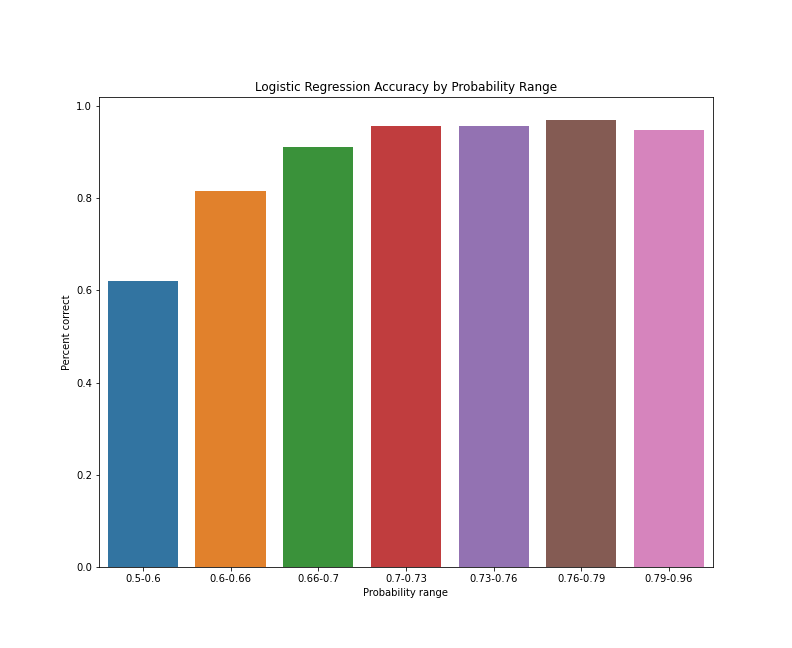
Logistic regression accuracy by probability range
As the bar chart suggests, the predictions between 0.5 and 0.6, on average, have the lowest accuracy of all predictions. Predictions with probabilities between 0.6 and 0.66 see a substantial bump in average accuracy, as do predictions with probabilities between 0.66 and 0.67. After that, average accuracy seems to level off and then drop slightly for predictions with probabilities between 0.79 and 0.96. This apparent drop-off could be a coincidence of the train/test split, or simply the result of a cluster of reviews that represent the exception to the rules our model has applied. To get a better sense of how consistent these results are, we can rerun our train/test split with different random seeds and aggregate the results, but this is enough of an initial indication that our model predictive accuracy improves as class probabilities increase.
The last assumption we need to validate with a logistic regression model is that there are linear associations between our independent variables and the log probability of one class or another. This is a subtle point, but it’s crucial. As a particular feature’s score goes up (in our case, a TF-IDF score for a term), the log probability of one class or the other should go up or down.11 The more consistently this relationship exists, the better the logistic regression will perform. In this sense, strong performance itself is validator of the linear association assumption, but we can go a bit further by looking more closely at one of our top coefficients.
To explain the logic of a logistic regression model above, I showed a bar chart of three term frequency ranges for the word she. Let’s write code to do something similar with the word her but, this time, let’s use actual TF-IDF weights and create a few more bins so we can see if the trend is consistent across the range of TF-IDF values. In a moment, we will write some code to display the actual term coefficients and their scores, but we can hypothesize that her will be a relatively strong predictor of a female-labeled-review, as it was in my article on gender dynamics in The New York Times Book Review.12 The methods in the article version differ slightly from this lesson, but I’m comfortable predicting that this feature will remain consistent.
Let’s put together a DataFrame of TF-IDF scores for the term her and gender labels for each review labeled m or f and see if the reviews with higher TF-IDF scores tend to be labeled f:
pos = features_df.loc[features_df['term'] == 'her'].index[0]
her_tfidf = [i[pos] for i in Z_new_binary.toarray()]
her_tfidf_df = pd.DataFrame()
her_tfidf_df['tf_idf'] = her_tfidf
her_tfidf_df['gender_label'] = y_binary
her_tfidf_df['bin'] = pd.qcut(her_tfidf_df['tf_idf'], q=11, duplicates='drop')
her_idx = pd.IntervalIndex(her_tfidf_df['bin'])
her_tfidf_df['low'] = her_idx.left
her_tfidf_df['high'] = her_idx.right
her_tfidf_df['tfidf range'] = her_tfidf_df['low'].round(2).astype(str) + "-" + her_tfidf_df['high'].round(2).astype(str)
her_tfidf_df
This code block should look a lot like the code we used to create probability buckets. Using the line of code features_df.loc[features_df['term'] == 'her'].index[0], we can extract the index number for the feature her and build up a list of the TF-IDF scores for that single feature from each book review. The variable her_tfidf represents that list, and has the same length and ordering as the gender labels in y_binary. This makes it easy to create an empty DataFrame and add columns for the TF-IDF scores and gender labels. We can then use a qcut function (as above) to bin our data, but this time we want to create bins based on the TF-IDF scores. We also need to add the duplicates='drop' parameter because there are enough rows with the same TF-IDF score that our bin edges are not unique.13 As before, we also need to create an IntervalIndex to access the lower and upper values of our bins and make our bin labels.
If you run this code in a Jupyter Notebook, your DataFrame should look something like this:
| tf_idf | gender_label | bin | low | high | tfidf range | |
|---|---|---|---|---|---|---|
| 0 | 0.021558 | 1 | (0.0175, 0.0308] | 0.0175 | 0.03080 | 0.02-0.03 |
| 1 | 0.065845 | 1 | (0.0518, 0.0869] | 0.0518 | 0.08690 | 0.05-0.09 |
| 2 | 0.077677 | 1 | (0.0518, 0.0869] | 0.0518 | 0.08690 | 0.05-0.09 |
| 3 | 0.000000 | 1 | (-0.001, 0.00748] | -0.0010 | 0.00748 | -0.0-0.01 |
| 4 | 0.239199 | 1 | (0.153, 0.488] | 0.1530 | 0.48800 | 0.15-0.49 |
As above, we now need to use a groupby statement to end up with one row per bin range, with the proportion of m and f labels for each TF-IDF range.
her_tfidf_df_grouped = her_tfidf_df.groupby('tfidf range').mean().reset_index()
her_tfidf_df_grouped['percent male'] = her_tfidf_df_grouped['gender_label']
her_tfidf_df_grouped['total'] = 1.0
her_tfidf_df_grouped['percent female'] = her_tfidf_df_grouped['total'] - her_tfidf_df_grouped['gender_label']
her_tfidf_df_grouped
This code block groups the data and add columns for the percent male and female (in decimal forms). The column total is one because percent male and percent female will add up to 1.0, and we will use that number when making our stacked bar chart in a moment. The output of this code block should look like this:
| tfidf range | tf_idf | gender_label | low | high | percent male | total | percent female | |
|---|---|---|---|---|---|---|---|---|
| 0 | -0.0-0.01 | 0.000498 | 0.964966 | -0.00100 | 0.00748 | 0.964966 | 1.0 | 0.035034 |
| 1 | 0.01-0.02 | 0.012120 | 0.927481 | 0.00748 | 0.01750 | 0.927481 | 1.0 | 0.072519 |
| 2 | 0.02-0.03 | 0.023136 | 0.779468 | 0.01750 | 0.03080 | 0.779468 | 1.0 | 0.220532 |
| 3 | 0.03-0.05 | 0.040464 | 0.652672 | 0.03080 | 0.05180 | 0.652672 | 1.0 | 0.347328 |
| 4 | 0.05-0.09 | 0.067615 | 0.528517 | 0.05180 | 0.08690 | 0.528517 | 1.0 | 0.471483 |
| 5 | 0.09-0.15 | 0.116141 | 0.320611 | 0.08690 | 0.15300 | 0.320611 | 1.0 | 0.679389 |
| 6 | 0.15-0.49 | 0.220138 | 0.243346 | 0.15300 | 0.48800 | 0.243346 | 1.0 | 0.756654 |
As you may notice if you are running the code on your computer, there are only seven bins here despite the code generating 11. If you recall, we added the duplicates='drop' parameter because our bin edges were not unique. Here, our groupby statement has grouped any bins with duplicate names together. This means that some of our bins represent more rows than others, but this shouldn’t affect our results. We can see that, in the lowest TF-IDF range for the word her, the split of labels is more than 96% m and about 3.5% f. As TF-IDF scores for her go up, the proportion of f labels also rises. In the bin with the highest TF-IDF scores for the word her, the split of labels is about 24% m and about 76% f.
To better appreciate this breakdown, let’s make a stacked bar chart of the proportion of m and f labels in each TF-IDF range.
%matplotlib inline
import matplotlib.pyplot as plt
import seaborn as sns

plt.figure(figsize=(11,9))
plt.subplots_adjust(top=0.85)

bar1 = sns.barplot(x='tfidf range', y='total', data=her_tfidf_df_grouped, color='lightblue')
bar2 = sns.barplot(x='tfidf range', y='percent female', data=her_tfidf_df_grouped, color='darkblue')

# add labels
plt.title("Proportions of Male and Female Labels for TF-IDF Ranges of the Word 'Her'")
plt.ylabel('Proportion Male/Female')
plt.xlabel('TFIDF Range')

# add legend
top_bar = mpatches.Patch(color='darkblue', label='Percent labeled female')
bottom_bar = mpatches.Patch(color='lightblue', label='Percent labeled male')
plt.legend(handles=[top_bar, bottom_bar])
plt.show()
This code chunk differs from the previous bar plot because here, we want to visualize the proportion of book reviews with m and f labels. We could do this is several ways, but a stacked bar chart with bars of equal height provides a strong basis for comparing the proportion, better than bars of unequal height or a pie chart. Because we want to emphasize the categories and not the bins, we set the colors by class label. If you are following along, your plot should look like this:
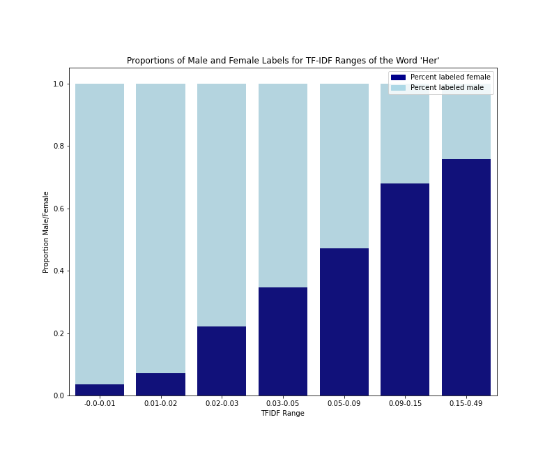
Gender Label split for TF-IDF value ranges of the word “her”
As we can see from the data table and the bar plot, the frequency (or probability) of an f label rises steadily as the TF-IDF scores rise, but the m/f split never goes lower than 76/24. This helps us confirm this assumption of linearity between one independent variable and the log odds of the female-labeled class. It also demonstrates that a very low TF-IDF score for she is a stronger indication of an m label than a very high TF-IDF score is for an f label.
This effect appears to be a combination of the fact that f-labeled reviews almost always use the pronoun her at least once (about 94% of the f-labeled reviews in our sample), and that it’s a fairly common occurrence for an m-labeled review to use the pronoun her at least once (almost 47% of the m-labeled reviews in our sample). What’s more, it’s not that rare for an m-labeled review to use the pronoun her 5 or 10 times (about 15% and 6% of m-labeled reviews in our sample respectively). What drives this trend? Perhaps it’s typical for reviewed books with presumed male authors to have female characters. Perhaps these characters get discussed disproportionately in reviews. To see if it’s also typical for reviewed books with presumed female authors to mention the pronoun his, we would have to look directly at that term, and that’s something we now know how to do!
Step 10: Examine Model Intercept and Coefficients
On that note, let’s look at the top term coefficients for both of our labels. In the following code block, we will take an approach almost identical to the linear regression example:
features_binary = SelectKBest(f_classif, k=3500).fit(Z_binary, y_binary)

selected_binary = features_binary.get_support()

features_df_binary = pd.DataFrame()
features_df_binary['term'] = v_binary.feature_names_
features_df_binary['selected'] = selected_binary
features_df_binary = features_df_binary.loc[features_df_binary['selected'] == True]
features_df_binary['coef'] = lr_binary.coef_[0]

coefficients_binary = features_df_binary.sort_values(by='coef', ascending=False).reset_index(drop=True)
As with linear regression coefficients, this block of code uses the fit() and get_support() methods to get the features selected by SelectKBest. It then creates an empty DataFrame and adds columns for term and selected, which indicates if SelectKBest selected that term. It then uses a loc() statement, identical to the linear regression example, to reduce the DataFrame to selected features. Finally, we add the coef column, sort by coef value in descending order, and reset the index. The only real difference between this version and the linear regression example is the use of features_df_binary['coef'] = lr_binary.coef_[0] instead of features_df_binary['coef'] = lr_binary.coef_. The linear regression model’s coef_ parameter is always a one-dimensional array with a length equal to the number of features, but the logistic regression model’s coef_ parameter can have the dimensions (1 x number of features) or (number of classes x number of features).
Looking at our top 25 positive coefficients is also the same as our linear regression version:
coefficients.iloc[0:25]
The results should look more or less like this:
| term | selected | coef | |
|---|---|---|---|
| 0 | he | True | 2.572227 |
| 1 | mr | True | 2.412406 |
| 2 | his | True | 2.059346 |
| 3 | the | True | 0.988710 |
| 4 | was | True | 0.668281 |
| 5 | of | True | 0.638194 |
| 6 | that | True | 0.510740 |
| 7 | dr | True | 0.508211 |
| 8 | on | True | 0.494741 |
| 9 | prof | True | 0.488638 |
| 10 | professor | True | 0.418418 |
| 11 | tile | True | 0.364163 |
| 12 | man | True | 0.349181 |
| 13 | himself | True | 0.348016 |
| 14 | british | True | 0.341043 |
| 15 | president | True | 0.331676 |
| 16 | law | True | 0.311623 |
| 17 | in | True | 0.295170 |
| 18 | science | True | 0.289051 |
| 19 | lie | True | 0.285332 |
| 20 | shakespeare | True | 0.285233 |
| 21 | political | True | 0.283920 |
| 22 | ship | True | 0.282800 |
| 23 | air | True | 0.274412 |
| 24 | adventures | True | 0.267063 |
Despite using different text processing and feature selection methods, these coefficients share many terms in common with the results I shared in my article on gender dynamics in The New York Times Book Review.14 Gendered pronouns such as he, him, and himself, as well as gendered honorifics like mr, dr, prof, and professor all make the list, as do some ostensible content words like science, political, law, and shakespeare.
Turning to the 25 coefficients with strongest indicators of an f label, we use another iloc() statement:
coefficients.iloc[-25:]
The results should look something like this:
| term | selected | coef | |
|---|---|---|---|
| 3475 | girl | True | -0.395204 |
| 3476 | letters | True | -0.402026 |
| 3477 | anna | True | -0.407688 |
| 3478 | child | True | -0.420118 |
| 3479 | mary | True | -0.421888 |
| 3480 | herself | True | -0.461949 |
| 3481 | story | True | -0.467393 |
| 3482 | love | True | -0.467837 |
| 3483 | children | True | -0.474891 |
| 3484 | garden | True | -0.476721 |
| 3485 | jane | True | -0.481835 |
| 3486 | life | True | -0.493846 |
| 3487 | wife | True | -0.499350 |
| 3488 | home | True | -0.501617 |
| 3489 | mother | True | -0.510301 |
| 3490 | family | True | -0.520028 |
| 3491 | their | True | -0.530106 |
| 3492 | lady | True | -0.592740 |
| 3493 | and | True | -0.789409 |
| 3494 | woman | True | -0.806953 |
| 3495 | women | True | -0.973704 |
| 3496 | miss | True | -2.211015 |
| 3497 | mrs | True | -2.578966 |
| 3498 | she | True | -4.585606 |
| 3499 | her | True | -5.372169 |
As predicted, her is a strong predictor of the f label (the strongest, in fact), along with she and herself, as well as mrs, miss, lady, woman, women, wife, mother, and children. Several gendered forenames appear on the list, and apparent content words like family, home, garden, letters, and story are reminiscent of the results from the article version of my analysis. 15
Step 11: Make Predictions on Non-Binary Data
Above, I mentioned the idea of using a binary classification model to make predictions with non-binary data. We also created a DataFrame called df_non_binary for single-work book reviews that were coded as either having no clear indication of presumed gender or indicators of male and female genders, as would be the case if a book were written by two authors, one presumed male and one presumed female. Adapting the code from above, we can use this DataFrame to load term frequency tables and fit the terms to our already trained logistic regression model.
# Load term frequency data, convert to list of dictionaries
dicts_non_binary = []
for row in df_non_binary.iterrows():
    if row[1]['cluster_id'] == 'none':
        txt_file_name = ''.join(['term-frequency-tables/', row[1]['nyt_id'], '.csv'])
    else:
        txt_file_name = ''.join(['term-frequency-tables/', row[1]['nyt_id'], '-',
        row[1]['cluster_id'], '.csv'])

    df = pd.read_csv(txt_file_name).dropna().reset_index(drop=True)
    mydict = dict(zip(list(df['term']), list(df['count'])))

    dicts_non_binary.append(mydict)

# Transform to document-term matrix
X_non_binary = v_binary.transform(dicts_non_binary)
# Transform to TF-IDF values
Z_non_binary = tfidf_binary.transform(X_non_binary)
# Apply feature selection model
Z_non_binary_selected = features_binary.transform(Z_non_binary)
# Make label predictions on new data
results_non_binary = lr_binary.predict(Z_non_binary_selected)
# Get probability scores for predictions
probs_non_binary = lr_binary.predict_proba(Z_non_binary_selected)
# Make results DataFrame
results_df_non_binary = pd.DataFrame()
results_df_non_binary['predicted'] = list(results_non_binary)
results_df_non_binary['prob_f'] = [i[0] for i in list(probs_non_binary)]
results_df_non_binary['prob_m'] = [i[1] for i in list(probs_non_binary)]
results_df_non_binary['highest_prob'] = results_df_non_binary[['prob_f', 'prob_m']].max(axis=1)
results_df_non_binary = results_df_non_binary.merge(df_non_binary, left_index=True, right_index=True)
results_df_non_binary = results_df_non_binary.sort_values(by='highest_prob', ascending=False).reset_index(drop=True)
This code chunk combines multiple steps from above into one set of operations. Since these steps are all familiar by now, I’ve used code comments to flag each step. You’ll notice new variable names like dicts_non_binary, X_non_binary, and Z_non_binary, but I’ve maintained consistency with the naming conventions of X, Y, Z, and others, this time adding the suffix _non_binary. Take note, as well, of the fact that this code block uses the scikit-learn method transform() instead of fit() or fit_transform. The transform() method is common to many directs the code scikit-learn classes, and works by fitting new data to an existing model, whether that model be TF-IDF features, features selected by a SelectKBest instance, or or actual regression model. The pandas merge() statement is also new here. We use that to merge results_df_non_binary and df_non_binary into one DataFrame. The parameters left_index=True and right_index=True tell the method to merge on the respective indices rather than any column values in either DataFrame.
Using the results DataFrame, we can look at some examples of what happens when we use a binary gender model to predict the gender of book reviews that don’t fit into the model. This line of code will display the URL for the pdf file of the book review with the highest probability score:
results_df_non_binary.iloc[0]['nyt_pdf_endpoint']
In this case, our model assigns this book review almost a 98% chance of having an f label. If we visit the review’s pdf endpoint (https://timesmachine.nytimes.com/timesmachine/1905/05/27/101758576.pdf), we can see that this review is for A Bookful of Girls by Anna Fuller (Putnam, 1905).16 In my original data, I labeled this book review none rather than f because the reviewer does not assign a gender to Fuller. The review begins with a mention of Fuller’s full name and switches quickly to a discussion of the book’s characters. Nevertheless, gender is central from the very first lines of the review:
Six of the very nicest girls one would ever care to meet are to be found in Anna Fuller’s ‘Bookful of Girls.’ They are such happy, wholesome, honest sort of young things, with such very charming ways about them, that they beguile even older readers into following their adventures in spite of the fact that he, or more properly speaking she, for this is distinctly a feminine book—knows all the time that they were never written for her, but rather for her daughter or younger sister.17
Here we encounter several of the top coefficients indicative of the f label, including she, her, girls, daughter, and sister, but there are several other f-leaning coefficients here as well. The most obvious is feminine but, according to our model, anna, wholesome, young and charming are all indicators leaning toward the f label, and so is the word written. More broadly, we see a review that’s deeply invested in binaristic notions of gender, which is a good reminder that the word binary, when used to describe a predictive model, is not synonymous with the idea of a binary as it used in poststructural and deconstructionist theory.
The non-binary book review with the most even split between the two class probabilities (i.e., closest to 50/50) is found in the last row of the results_df_non_binary DataFrame. We can access the URL for the pdf file for this book review with the following code:
results_df_non_binary.iloc[-1]['nyt_pdf_endpoint']
This review was originally labeled as having authors of more than one gender, and our binary model predicted it had a 49.95% chance of being labeled f and a 50.05% chance of being labeled m. The URL (https://timesmachine.nytimes.com/timesmachine/1905/11/18/101332714.pdf) leads to a review of Mrs. Brookfield and Her Circle by Charles and Frances Brookfield (Scribner’s, 1905).18 The book is a collection of “letter and anecdotes” about Jane Octavia Brookfield, a novelist who maintained a literary salon. She had been friends with William Makepeace Thackeray. Her husband William Henry Brookfield was an Anglican clergyman, who had become friends with Alfred Tennyson in college. The reviewed book was written by Charles Brookfield, the son of Jane and William, and Charles’s wife Frances. (Information on Frances appears hard to come by, but the review describes them as Mr. and Mrs. Brookfield.)
The fact that this book’s reviews are ambiguous in terms of gender is not especially surprising. The book’s authors are presented as husband and wife, and it is reviewed giving nearly equal weight to Jane Octavia Brookfield and William Henry Brookfield. Perhaps the significance here is that a book ostensibly focused on Jane Octavia Brookfield (as the title seems to indicate) frames Brookfield’s identity and importance in relation to the men in her life. What’s more, the review may amplify the extent to which the book engages in that rhetorical strategy.
To learn more about the terms that drive the predicted probability, we can multiply each of the TF-IDF scores for this book review by their respective coefficients and see which combinations have the highest products. In reality, this product is only part of the probability formula (see above), but calculating a groups of products can give us a good snapshot of where we stand.
one_review = pd.DataFrame()
one_review['term'] = v_binary.feature_names_
one_review['selected'] = selected_binary
one_review = one_review.loc[one_review['selected'] == True]
one_review.reset_index(drop=True)
one_review['coef'] = lr_binary.coef_[0]
original_review_index = df_non_binary.loc[df_non_binary['nyt_id'] == '4fc0532f45c1498b0d251a13'].index[0]
one_review['tfidf_score'] = Z_non_binary_selected[original_review_index].toarray()[0]
one_review['product'] = one_review['tfidf_score'] * one_review['coef']
In this code block, we create an empty DataFrame and add columns for the feature names and whether they were selected by SelectKBest, as previously. We then drop all unselected features and add a column for our coefficient scores, as we did above. We also need the TF-IDF scores for the book review we want to look at, so we use a loc statement to find that review’s index in df_non_binary. We then calculate the product of the tfidf_score column and the coefficient column and assign it to a new column called product. Now we can sort in either descending or ascending order to view the top negative or positive products.
one_review = one_review.sort_values(by='product', ascending=True)
one_review.iloc[0:10]
| term | selected | tfidf_score | coef | product | |
|---|---|---|---|---|---|
| 4195 | her | True | 0.079270 | -5.372169 | -0.425849 |
| 8068 | she | True | 0.063839 | -4.585606 | -0.292742 |
| 5882 | mrs | True | 0.085458 | -2.578966 | -0.220394 |
| 375 | and | True | 0.180745 | -0.789409 | -0.142682 |
| 5052 | lady | True | 0.077727 | -0.592740 | -0.046072 |
| 0 | a | True | 0.227537 | -0.140946 | -0.032070 |
| 4035 | had | True | 0.092804 | -0.316078 | -0.029333 |
| 9865 | with | True | 0.063842 | -0.343074 | -0.021903 |
| 9879 | woman | True | 0.024593 | -0.806953 | -0.019845 |
| 7758 | s | True | 0.080108 | -0.190876 | -0.015291 |
one_review = one_review.sort_values(by='product', ascending=False)
one_review.iloc[0:10]
| term | selected | tfidf_score | coef | product | |
|---|---|---|---|---|---|
| 4141 | he | True | 0.134595 | 2.572227 | 0.346209 |
| 8953 | the | True | 0.335669 | 0.988710 | 0.331880 |
| 4252 | his | True | 0.113851 | 2.059346 | 0.234460 |
| 6176 | of | True | 0.294356 | 0.638194 | 0.187856 |
| 9700 | was | True | 0.148996 | 0.668281 | 0.099571 |
| 5881 | mr | True | 0.034251 | 2.412406 | 0.082627 |
| 4532 | in | True | 0.180933 | 0.295170 | 0.053406 |
| 8951 | that | True | 0.085153 | 0.510740 | 0.043491 |
| 6212 | on | True | 0.052097 | 0.494741 | 0.025774 |
| 581 | as | True | 0.098149 | 0.223826 | 0.021968 |
For this review, the top negative and positive products of coefficients and TF-IDF scores are for seemingly insignificant but generally predictive terms. First we have words with obvious gendering, such as she, her, mrs, lady, woman, he, his, and mr, but the other terms with high products are function words with variance by gender. The terms and, a, and with are apparently feminized, whereas the, of, in, that, on, and as are associated with male labels. Their relatively high TF-IDF scores here make them significant in terms of the eventual prediction of a label for this review.
Lesson Conclusion
Taken together, this lesson and Linear Regression analysis with scikit-learn have covered some of the most important considerations that must be met when working with linear and logistic regression models. The first of these considerations is whether either model is a good fit for your task. Linear regression models use one or more quantitative variables (discrete or continuous) to predict one quantitative variable. Logistic regression models use one or more quantitative variables to predict a category (usually binary). Once you fit these aspects of your data to the right model, you can use either model to assess the following:
- How effectively do the independent variables predict the dependent variable?
- How linearly related are the independent variables to the dependent variable?
- If the model’s predictions are mostly accurate and the model’s performance is mostly consistent throughout the data, which independent variables best predict the dependent variable?
These questions are central to linear and logistic regression models. When implementing these models in Python with a library like scikit-learn, it’s also helpful to notice areas where one’s computational workflow can be repeated or repurposed with minor changes. The core elements of the workflow I have used are as follows:
- Load metadata and target labels from CSV file into a pandas DataFrame
- Load term frequency data from external CSVs (one CSV per row in the metadata)
- Convert term frequency data to a sparse matrix using one of scikit-learn vectorizers
- Use scikit-learn classes to perform feature selection, the TF-IDF transformation (for text data), and a train-test split
- Train the appropriate model on the training data and the training labels
- Make predictions on holdout data
- Evaluate performance by comparing the predictions to the holdout data “true” labels
- Validate by making sure the parametric assumptions of that model are satisfied
- If model performs well and has been validated, examine the model’s intercept and coefficients to formulate research questions, generate hypotheses, design future experiments, etc.
Each of these steps in the workflow that I have demonstrated can be customized as well. For example, metadata can be loaded from other sources such as XML files, JSON files, or an external database. Term or lemma frequencies can be derived from files containing documents’ full text.
Using scikit-learn, additional transformations beyond TF-IDF (e.g., z-scores, l1, and l2 transformations) can be applied to your training features. You can use scikit-learn to perform more advanced cross-validation methods beyond a simple train-test split, and you can train and evaluate a range of scikit-learn classifiers. As a result, getting started with linear and logistic regression in Python is an excellent way to branch out into the larger world of machine learning. I hope this lesson has helped you begin that journey.
Alternatives to Anaconda
If you are not using Anaconda, you will need to cover the following dependencies:
- Install Python 3 (preferably Python 3.7 or later)
- Recommended: install and run a virtual environment
- Install the scikit-learn library and its dependencies
- Install the Pandas library
- Install the matplotlib and seaborn libraries
- Install Jupyter Notebook and its dependencies
End Notes
-
Atack, Jeremy, Fred Bateman, Michael Haines, and Robert A. Margo. “Did railroads induce or follow economic growth?: Urbanization and population growth in the American Midwest, 1850–1860.” Social Science History 34, no. 2 (2010): 171-197. ↩
-
Cosmo, Nicola Di, et al. “Environmental Stress and Steppe Nomads: Rethinking the History of the Uyghur Empire (744–840) with Paleoclimate Data.” Journal of Interdisciplinary History 48, no. 4 (2018): 439-463. https://muse.jhu.edu/article/687538. ↩
-
Underwood, Ted. “The Life Cycles of Genres.” Journal of Cultural Analytics 2, no. 2 (May 23, 2016). https://doi.org/10.22148/16.005. ↩
-
Broscheid, A. (2011), Comparing Circuits: Are Some U.S. Courts of Appeals More Liberal or Conservative Than Others?. Law & Society Review, 45: 171-194. ↩
-
Lavin, Matthew. “Gender Dynamics and Critical Reception: A Study of Early 20th-Century Book Reviews from The New York Times.” Journal of Cultural Analytics, 5, no. 1 (January 30, 2020): https://doi.org/10.22148/001c.11831. Note that, as of January 2021, the New York Times has redesigned its APIs, and the
nyt_ids listed inmetadata.csvandmeta_cluster.csvno longer map to ids in the API. ↩ -
Ibid., 9. ↩
-
Jarausch, Konrad H., and Kenneth A. Hardy. Quantitative Methods for Historians: A Guide to Research, Data, and Statistics. 1991. UNC Press Books, 2016: 132. ↩
-
Ibid., 160. ↩
-
See, for example, Glaros, Alan G., and Rex B. Kline. “Understanding the Accuracy of Tests with Cutting Scores: The Sensitivity, Specificity, and Predictive Value Model.” Journal of Clinical Psychology 44, no. 6 (1988): 1013–23. https://doi.org/10.1002/1097-4679(198811)44:6<1013::AID-JCLP2270440627>3.0.CO;2-Z. ↩
-
See, for example, The Scikit-Learn Development Team. sklearn.metrics.precision_recall_fscore_support, https://scikit-learn.org/stable/modules/generated/sklearn.metrics.precision_recall_fscore_support.html. ↩
-
See The Scikit-Learn Development Team. sklearn.metrics.precision_recall_curve, https://scikit-learn.org/stable/modules/generated/sklearn.metrics.precision_recall_curve.html#sklearn.metrics.precision_recall_curve. ↩
-
For more on this topic, see ReStore National Centre for Research Methods, Using Statistical Regression Methods in Education Research https://www.restore.ac.uk/srme/www/fac/soc/wie/research-new/srme/modules/mod4/9/index.html. ↩
-
Lavin, 14. ↩
-
For more on
pd.qcut(), see The Pandas Development Team. pandas.qcut, https://pandas.pydata.org/pandas-docs/stable/reference/api/pandas.qcut.html ↩ -
See Lavin, 14-17. ↩
-
See Lavin, 19. ↩
-
“Six Girls,” The New York Times Book Review, 27 May 1905. 338. https://timesmachine.nytimes.com/timesmachine/1905/05/27/101758576.pdf ↩
-
“Six Girls,” 338. ↩