Contents
- Lesson Goals
- About Geocoding
- Lesson Structure
- Getting Started
- The Data
Lesson Goals
Many types of sources used by historians are inherently spatial. For example:
- Census, population or taxation data
- Imports and exports
- Routes and itineraries
In this tutorial, you will learn how to ‘geocode’ historial data containing placenames (towns, counties, countries, etc), thus making them mappable using QGIS, a digital mapping software suite. This will allow you to:
- Display your data as a map (whether it originated as a list, table, or prose)
- Analyse distances between locations in your data
- View and analyse geographical distribution within your data
This tutorial forms part of the Mapping and GIS series on Programming Historian, and builds upon skills you will have learned in earlier tutorials, especially Installing QGIS 2.0 and Adding Layers. It presumes that you have a set of shapefiles relevant to the region for which you intend to produce a map, and data that you would like to get into those shapefiles so that it can be visualised and analysed.
About Geocoding
Mapping data such as these involves rendering spatial information which humans can understand (such as names of towns or counties) into a format that can be understood by GIS (mapping) software. This is limited to some kind of geometry (a point, line or polygon in a vector representation) relating to the coordinates of this place in two dimensional space – these might be latitude and longitude expressed in degrees, or as is often the case in the UK, eastings and northings of the British National Grid. Geocoding always depends on the use of a gazetter, or list of places and coordinates.
There is often confusion between processes of geocoding and georeferencing.
- Georeferencing refers to placing visual elements, usually raster images such as satellite photographs, scans of old maps, or some types of vector image such as architectural or archaeological drawings, into geographical space. This involves specifying latitude, longitude coordinates, and scale.
- Geocoding is the process of resolving addresses (or some other kind of spatial description) which form part of a dataset into geometries on a map. This gives the ability to view, analyse and query that dataset spatially.
In many modern applications geocoding is completed automatically, often using the mapping tools and gazetters offered seamlessly as part of Google Maps or OpenStreetMap. When working with contemporary data, or data from relatively recent periods, and Western European or North American historical contexts, this is often sufficient. If you are using data containing place names that are consistent with the present day, you can use the QGIS web geocoder plugin detailed in the postscript to this tutorial, or the Edinburgh Geoparser.
Many historians will be working on contexts where the place names in their data do not match the present day. Remember that street names tend to change relatively frequently, either in terms of spelling or entirely. Administrative areas have changed relatively frequently and were sometimes used inconsistently in historical sources (e.g. was Bristol in Gloucestershire, Somerset, City of Bristol, Avon?) and indeed places have moved between countries, and countries have changed in name and extent. Even town names have changed and are subject to linguistic ambiguities (e.g. Lynn Episcopi, Bishop’s Lynn, Lynn, King’s Lynn, Kings Lynn). For these reasons it is often better to avoid using automated online geocoding tools and create a gazetteer to suit the historical context which you are researching. The processes described in this tutorial are manual, and can be modified and applied to almost any geographical or historical context.
Lesson Structure
This lesson is divided into two main sections:
- Part 1: Joining tables, which is a simple way of mapping simple summary data such as totals or averages
- Part 2: Geocoding full datasets, which maps each item of data to a location, allowing much more flexibility, detailed spatial analysis, and more interesting maps
At the end of the tutorial there is a note on using automated geocoding tools which are available to work with modern addresses, but these are of limited relevance to historians working on eras before the late nineteenth or twentieth centuries.
Getting Started
This tutorial assumes that you have installed QGIS version 2 or newer and have followed the Programming Historian tutorial Installing QGIS 2.0 and Adding Layers by Jim Clifford, Josh MacFadyen and Daniel Macfarlane. Or, at least that you are familiar with the process of adding vector layers in QGIS.
This tutorial was prepared using QGIS 2.14 ‘Essen’ on Mac OS X 10.11. Menus, windows, and options might appear slightly different on different platforms or versions, but it should not be difficult to translate any differences. At a few points in the tutorial reference is made to how these techniques could be applied using ArcGIS, which is the industry standard commercial GIS application, and is widely available at universities, but is not always superior to QGIS.
You will also need to use a relational database such as Microsoft Access or LibreOffice Base, or alternatively be very proficient with spreadsheets. The instructions in the tutorial are designed for use with LibreOffice Base, which is a free download as part of the LibreOffice suite.
NB LibreOffice requires a full installation of Java in order to use the Base application. This is achieved most easily by downloading and installing the Java 8 Development Kit for your operating system from Oracle. The Java 8 Runtime Environment does NOT work with LibreOffice on Mac OS X 10.11.
The tutorial will map the data extracted from Alumni Oxonienses in the Programming Historian lesson Using Gazetteers to Extract Sets of Keywords from Free-Flowing Texts using publically available maps of English and Welsh historic counties. If you complete that tutorial first it will help you to understand the nature of the data which is being mapped here. These data are provided as both a full dataset and also a separate file which is a summary of the numbers of Oxford alumni by their county of origin, created from the first file using an Excel PivotTable.
The Data
Part 1: Joining Tables and Maps
The simplest way to map historical data is to ‘join’ (connect) a table of data containing place names to a layer of map features with the same names. This technique is commonly used by historians to create a map depicting a set of descriptive statistics for a set of data, for instance the number of individuals within a group originating from each county, or the proportion of inhabitants of each county working in a certain industry.
However, joining tables to features in GIS only works on a one-to-one basis (or at least only one-to-one relationships can be used to define the appearance of the map). This means that each map feature can only have one value associated with each of its attributes. You can say there are 50 students from the county Essex in your data, and thus link that to the Essex polygon feature in your shapefile (Table 1). But you cannot store the data as 50 rows, each of which represents a single student that points to the Essex feature in your shapefile (Table 2). One shapefile feature, one value. For this reason, joins are best suited to representing the results of analysis completed in a spreadsheet or database (eg, when you have already calculated the sum of people from a particular area - or whatever value you want to map).
Table 1: This table would work for ‘joins’, as each shapefile has a calculated value.
| Shapefile | Number of Students |
|---|---|
| Essex | 50 |
| Norfolk | 28 |
| Middlesex | 81 |
Table 2: This table would not work for a ‘table join’.
| Student Name | Place of Origin |
|---|---|
| Joe Smith | Essex |
| Tom Jones | Essex |
| Matthew Rogers | Essex |
In this short tutorial we will map the total numbers of early modern University of Oxford alumni from each county. The file AlumniCounties.csv contains a summary of the full dataset which has already been created using a PivotTable in Microsoft Excel. Take a look at this file using your spreadsheet software to look at the column titles and the nature of the data contained in it.
NB: QGIS is very sensitive to correct formatting of Comma Separated Values (CSV) files, specifically the type of line breaks. If you have difficulties using a CSV file created using Microsoft Excel (especially Excel 2007 or 2011 for MacOS) try re-saving the CSV file using LibreOffice Calc or Excel 2016.
Tutorial: Joining Tables and Maps
- Open QGIS (on a Windows computer you will probably have many options within the QGIS Start Menu folder – choose the ‘QGIS Desktop’ option – not ‘QGIS Browser’ or ‘GRASS’)
- Set up a new Project file in QGIS and save it in your choice of location. (NB. QGIS defaults to saving ‘relative pathnames’ which means that as long as you save all of your project files in the same folder or its subfolders, you can move it to a different location, such as a USB stick. You can check this setting via the menu
Project>Project Propertiesand theGeneralside tab). - It is very important to set the Coordinate Reference System (CRS) to one that suits the data you will import, and the location you plan to map. Go to the menu
Project>Project Propertiesand select the ‘CRS’ tab at the side. First select ‘Enable on the fly CRS transformation’ at the top of this window then use the filter box to find and selectOSGB 1936 / the British National Gridwith the authority IDESPG:27700from under the projected coordinate systems heading.
There is an important distinction between Geographic Coordinate Systems, which simply define measurement units and the datum, and Projected Coordinate Systems, which also define the way in which the globe is ‘flattened’ onto a map. OSGB is available in both variants in QGIS, so choose the ‘projected’ version to get a map in which the United Kingdom appears the shape you would expect. For more details on projections in GIS, see the Working with Projections in QGIS Tutorial.
- Download a Shapefile containing polygons of the historic counties of England and Wales from http://www.county-borders.co.uk (choose the file
Definition A: SHP OSGB36 Simplifiedwhich is a version of the pre-1843 county boundaries of Great Britain projected on the OS National Grid, without detached portions of counties). Unzip the contents of the ZIP file in the same folder as your project file - Click the
Add Vector Layerbutton (looks like a line graph) from the Manage Layers toolbar and thenBrowseto select and add the ShapefileUKDefinitionA.shpfrom within the folder you’ve unzipped.
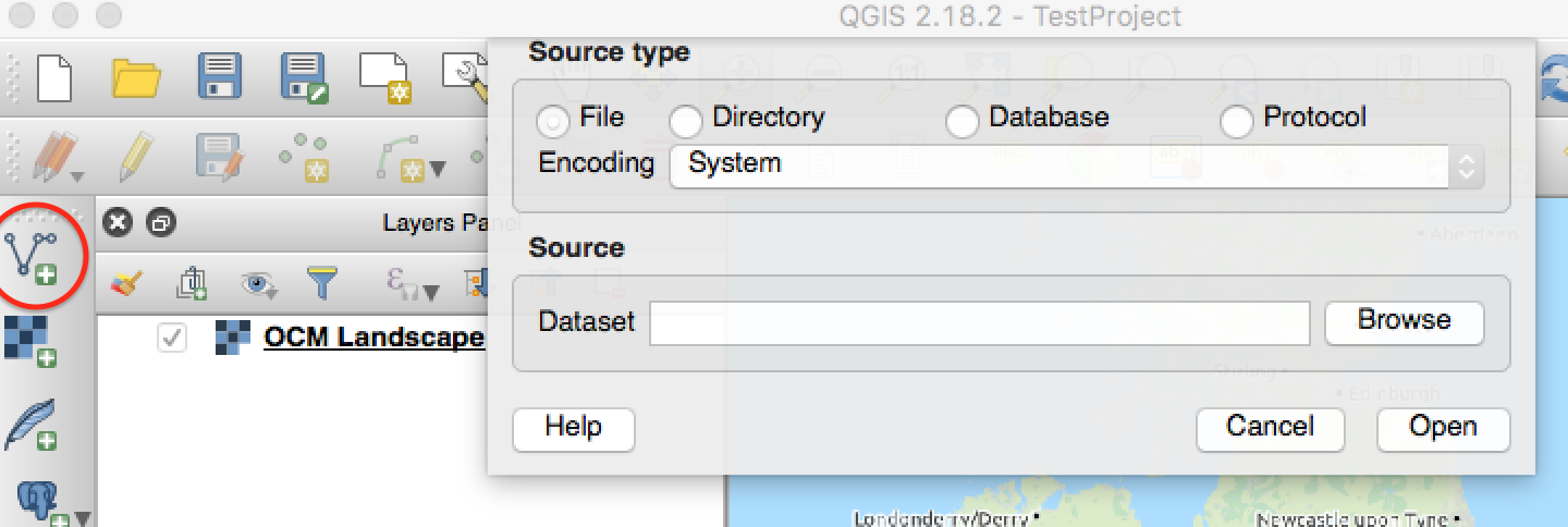
Figure 1: The QGIS Add Vector window on MacOS (the Add Vector button is circled on the left hand toolbar)
You should now see an outline map of British counties in a random colour. If you right-click on the name of this layer in the Layers Panel (shown by default on the bottom left) you can select Open Attribute Table to view the database properties already associated with each feature on the map. Notice that the name of each county is named in three different ways, the fullest of which is in the column called NAME, as well as two ID columns. We now need to join this to the alumni data that we want to map using the fact that the values in the NAME column are the same as those in one of the columns in our spreadsheet (they must be exactly the same for this to work).
The file AlumniCounties.csv contains a summary of the alumni dataset created using a PivotTable in Microsoft Excel. Two named columns contain county names (this column is called Row Labels) and simple totals of individuals originating in those places.
- In QGIS select the
Add Delimited Text Layerbutton from the Manage Layers toolbox (looks like a large comma symbol). Browse to locate the file and selectCSVas file format andNo geometry (attribute only table)underGeometry definition. The name for the new table is automatically specified in the fieldLayer Nameas the same as the name of the file you have imported (AlumniCounties) - In the Layers Panel right click on the map layer (called the same as the shapefile that you added:
UKDefinitionA) and selectProperties, and then choose theJoinstab on the left. Use the+button to create a join. - In the pop-up window select the new table you imported (
AlumniCounties) as theJoin layerand in theJoin fieldandTarget fieldchoose the columns in each which contain the same information (the county name). TheJoin fieldisRow Labelsin this case, and theTarget fieldis the field in the map layer’s attribute table which contains the corresponding information (in this caseNAME). - You can check that this join has worked by right-clicking on the shapefile layer and choosing
Open Attribute Table. Notice thatAlumniCounties_Count Place of Originhas now appeared as one of the columns in the counties shape layer, along with the various codes and ID numbers that are part of the shapefile we downloaded.
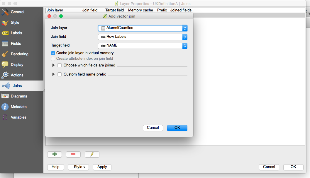
Figure 2: The join fields to vector dialogue
This data can now be shown as a choropleth map by changing the options in the the Style tab of layer properties. QGIS offers a very wide range of style options to convey the data associated with each map element in a graphical form. The style called Graduated allows you to create a choropleth map with a colour gradient repesenting the range of numerical values in your data, while Categorised allows you to assign colours or other visual styles to specific or text values in your tables. For data such as these, with many different values within a logical range, the graduated style of representation is appropriate; if there were just a limited range of potential values, these could be displayed more effectively using the categorized option.
- In the Layers Panel right click on the map layer (probably called the same as the shapefile that you added:
UKDefinitionA) and select Properties, and then choose the Style tab on the left. - From the top dropdown box select the
Graduatedstyle - Select the column
AlumniCounties_Count Place of Originin the second drop-down box. Clickclassifyto instruct QGIS to analyse the values in this column and create a series of ranges and colour ramp reflecting the range in the data. This is set toEqual Intervalclassification by default, but you may wish to experiment with this and select a different number of classes, or a different method, such as quantiles. Clicking OK will colour your map.
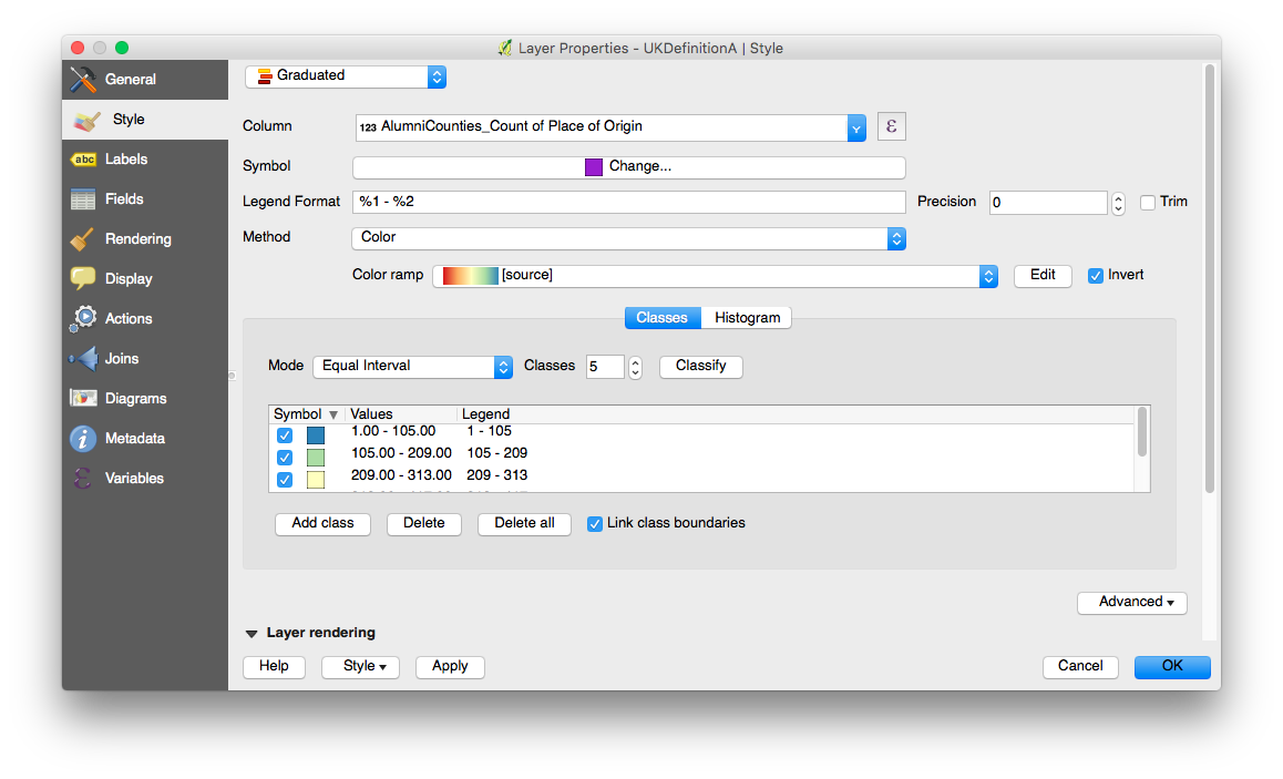
Figure 3: The vector layer Styles tab showing classified values based on the field joined from the table
For more information on choosing the correct classification method for your data, start by looking at this article on Classification in GIS. Examine the results of your map and think about what is actually being represented. Are the raw numbers of alumni, coloured according to the same classes, for very differently sized counties, helpful? Choropleth maps should normally display data that has been normalised in some way, for example showing population density, rather than raw population.
You may wish to experiment with the Expression Builder (accessed via the ∑ symbol next to Column in Properties>Style) to normalise these values using other columns and values that are available to you. Ideally we might normalise by population, but in the absence of this data, you might experiment by using the $area property, which is intrinsic to polygon shape layers in GIS. The very simple expression needed to create a map colour ramp on this would be (note that the field name contains spaces, so needs to be contained within double quotation marks):
"AlumniCounties_Count of Place of Origin" / $area
When you alter any of these settings within the graduated style page you will need to click Classify again to reassign colours to the numerical ranges in your data. If you don’t reclassify, you might find that the layer becomes invisible on your map.
Part 2: Geocoding Historical Data
Geocoding is a much more powerful technique than simple table joins because each and every line of your data remains visible and able to be analysed within the GIS software as an individual point on the map (as in table 2). Fundamentally the aim is to join each item of data to a pair of coordinates. Most historical data cannot be geocoded automatically using online tools or QGIS plugins. The geocoding process must therefore be carried out manually to match each data row with a location. This is a simple database operation joining (matching) your data with a gazetteer (a list of places with coordinates). Many gazetteers are available, but relatively few are suitable for use with historical data, for example, for England:
- Association of British Counties Gazetteer (data available to purchase)
- The Historical Gazetteer of England’s Place Names allows you to geocode individual locations online only, unfortunately the API service for accessing this data for use in automated geocoding, known as DEEP, part of Unlock, has now (late 2016) been withdrawn. A better browsing interface is available at the Survey of English Place-Names
If no gazetteer exists for the area or period that you are studying, you can make your own relatively simply from a vector map by creating a point layer containing the information that you require within QGIS (potentially by combining information from other existing layers) and exporting that complete with XY coordinates. For some parts of the world there are neither historical gazetters, nor vector maps suitable for historical periods, in these cases you will have to investigate creating your own vector and point layer; see the tutorial Creating New Vector Layers in QGIS 2.0.
Tutorial: Creating a Custom Gazetteer and Geocoding in Relational Database
If you have completed the first part, you can carry on and follow the steps below in the same project. If you did not, or you want to start a new clean project, follow the instructions from the first section to:
- Set up a new Project file in QGIS, and set the Coordinate Reference System to
OSGB 1936/the British National Gridwith the authority IDESPG:27700as a projected coordinate system usingProject>Project Properties>CRS - Download a Shapefile containing polygons of the historic counties of England and Wales from http://www.county-borders.co.uk/ (choose definition A and the OS National Grid).
Using your existing project, you can now start to add more layers to create your gazetteer:
- Use
Add Vector Layerto add a new copy of the Shapefile to your project. (GIS software allows you to add the same Shapefile to your project as many times as you like and each instance will appear as a separate layer). - Examine the data contained within the Shapefile by right-clicking on the name of the map in the Layers Panel and selecting
Open Attribute Table. Notice that columns include various codes, the names of the counties, and abbreviations, but not any coordinates. A polygon is comprised of a whole sequence of coordinates defining its boundary points (nodes) therefore they are hidden from you. - As we want to assign a single pair of coordinates to each row of our data, we need to generate suitable coordinates from our polygons by finding their centre points (centroids). It is easy to create a new layer of points from this polygon layer which will have a single pair of centroid coordinates for each county. Select
Vector>Geometry Tools>Polygon Centroids. Select a new name for the resulting Shapefile such asCountiesCentroidsand selectadd to canvas
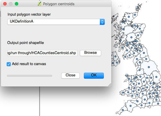
Figure 4: The Polygon Centroids dialogue and result
- Right click on the new centroids layer in the layers panel and select
Save Asto export, and click the first dropdown markedFormatand select the CSV (Comma separated values) format. Set the file name toCountiesXY.csv, in the same folder as the rest of your project - Ensure that you select the same CRS that has already been used in your project, and make a note of it.
-
Under
Layer Optionswithin theSave vector layer as…window ensure that Geometry is set toAS_XY– this will add extra columns to the beginning of the table containing the X and Y coordinates of each point.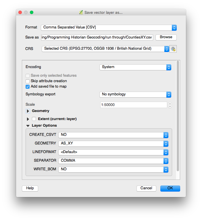
Figure 5: The save vector layer as dialog configured for CSV gazetteer export
This data can now be matched against your existing data to complete the geocoding process.
Geocoding your Data Table
We can now create a composite table of these locations and the data from our original table. This is created by matching the name of the county in the ‘place’ field of the alumni table with its equivalent in the new gazetteer using a relational database. This tutorial assumes that you have many hundreds or thousands or rows of data (as we do in this tutorial), requiring an automated method. If you only have a few rows, or you have difficulties using these methods, it is possible to do it manually - see ‘Geocoding your own Historical Data’ below.
In simple scenarios (such as this one where we are only matching a single ‘place’ attribute – i.e. only ‘county’) it is possible to code your data to a gazetteer using the VLOOKUP function in Microsoft Excel (or equivalent spreadsheets) or even using the MMQGIS plugin within QGIS. However, in most practical scenarios you will probably wish to match on several attributes simultaneously (for instance town, county and country – you would want to distinguish between Sudbury, Suffolk, England; Sudbury, Derbyshire, England; Sudbury, Middlesex, England; and Sudbury, Ontario, Canada). This can be achieved in a somewhat cumbersome way using the INDEX function in Excel, but is more practical, and extensible, in a relational database such as Microsoft Access or LibreOffice Base.
This tutorial uses LibreOffice, which is an Open Source alternative to Microsoft Office and is available for Windows, Mac OS X and all variants of Linux etc (NB it requires a full Java installation). It includes a relational database application on all platforms, unlike Microsoft Access which is available only in the Windows version of Office. However, it is quite restricted in its functionality. If you use Microsoft Access, or are a very proficient spreadsheet user, please feel free to replicate this process using your preferred software.
- Open LibreOffice Base and create and save a new database project using the default settings.
- Data can be imported into Base only by opening in LibreOffice Calc and copy-pasting the whole sheet. Open LibreOffice Calc and load the CSV file
CountiesXY.csv(which is the full output of the ‘Using Gazetteers to Extract Sets of Keywords from Free-Flowing Texts’ tutorial ) and clickCopy - Open LibreOffice Base and click
Paste. In the dialog that appears set a table name such asAlumniand chooseDefinition and dataanduse first line as column names, and finally clickCreate. - You will be prompted to create a primary key, which is a unique id number for each row, which you should accept. You may also get a warning about a value that is too long in one of the fields, which you can accept in this instance (but note that it means some records may get truncated).
- Repeat for the CSV file containing the historical data of Oxford University Alumni (
AlumniCounties.csv) -
Look at each to refresh yourself on the contents of the columns.
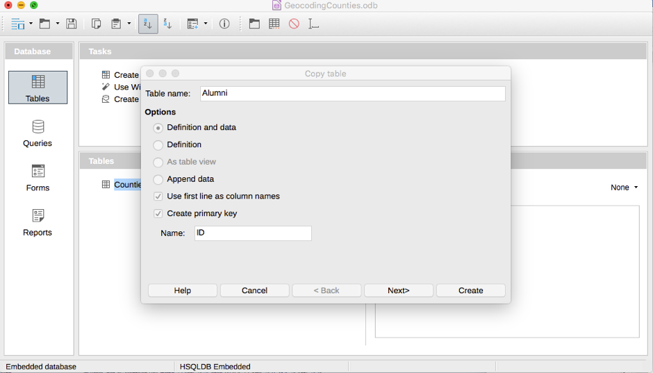
Figure 6: Copying a table into LibreOffice Base
- Go to the
Queriespane and selectCreate a Query using Design Viewand add both tables so that you see small windows appear with lists of the field names in each table. Link the ‘Place of origin’ field in the alumni table to theNamefield of the Counties table by dragging and dropping one field name onto the other. - Double click each field in the alumni table, which adds it to the list of fields below (which define the structure of the table that you will get as the result of the query).
-
Add the
xandyfields from the counties by double clicking them. This query now contains all of the data you need to be able to map your data.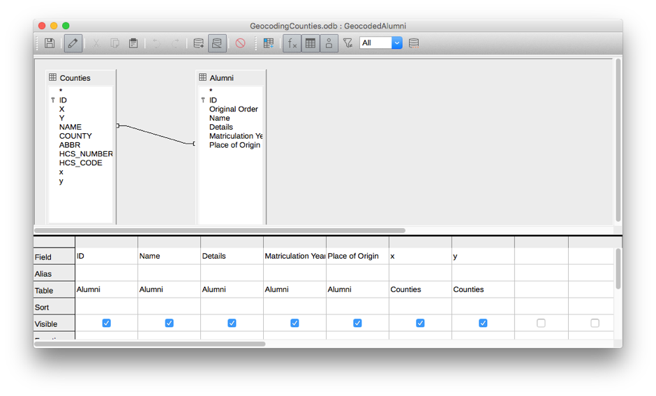
Figure 7: The query design completed in LibreOffice Base, showing the join between the tables and the grid detailing the fields that will show in the result
- Click
Saveand thenRun Query(cylinder icon with a plus symbol). Once you are happy with the results close the query window. - Export the results as a CSV file, in LibreOffice Base this is done by dragging the query itself onto the first cell of a new LibreOffice Calc spreadsheet. Then choosing
Save As, select the CSV format using theFile Typedrop down at the bottom of the Save window, and click save to create the file asGeocodedAlumni.csv.
NB While relational database queries such as this are very powerful in allowing you match multiple criteria simultaneously, they can also present misleading results if not checked carefully. Check the section Troubleshooting Database Gazetteer Joins at the end of this tutorial for hints on checking results of joins when working with your own data.
Adding Geocoded Data to QGIS
You can now return to QGIS and add the data back to your map, using the new X and Y columns to map the data onto the map.
- Use the
Add Delimited Text Layerbutton (large comma symbol) to add your new CSV file to your GIS project. - Notice that when you choose this CSV file the options
First record has field namesandGeometry definition: point coordinatesare automatically enabled, and the fieldsXandYare chosen in the drop-down fields for X and Y coordinates. - Once you click OK you will be prompted to select the Coordinate Reference System for these coordinates. This should be the same as that which you chose when originally creating your project and exporting the gazetteer information:
OSGB 1936 (EPSG:27700). - Click OK and your data should be instantly mapped onto your project.
When you add data that has been geocoded as points in this way, you only initially see a single point in each location. Because each row of data has been geocoded with exactly the same coordinates, they overlap and you can’t immediately see how many there are.
There are several ways to display this data in ways that are more meaningful, and in this regard QGIS has many advantages over the leading commercial software ArcGIS. The most basic way that this can be achieved by creating a new polygon layer containing a new column with a count of points contained within each polygon (this feature is equivalent to a spatial join in ArcGIS). The result of this method would be essentially the same as summarising your data externally (in a database or spreadsheet) and then performing a table join.
- Select the tool
Vector>Analysis Tools>Count Points in Polygon - In the Count Points in Polygon window select your counties layer (
UKDefinitionA) asPolygonsand the geocoded alumni layer that you imported (GeocodedAlumni) asPoints. The boxCount Field Namedefaults to ‘NUMPOINTS’ - this is the name of the extra column that will be added. The final boxCountspecifies what to do with the result of this action, leaving it set to default will create a new temporary (that is, not yet saved to a file) layer calledCount. You could click the...to specify a file name to save it straight away. - Click
Runand a new layer will be created - Right click the new layer in the Layers Panel (called
Countunless you specified otherwise) and choose theStyletab on the left. You can then change the drop down at the top from defaultSingle SymboltoGraduatedto display the results of the count in the form of a graduated colour scale fill of the polygons. - Click the next drop down
Columnto select the new columnNUMPOINTSas the basis for this. - Click the button
Classifytoward the bottom to create a colour scale based on the range of numbers here. By default this scale is created with equal intervals (based on the number of classes specified on the right), but you might want to experiment with changing theModedrop down to another method, such asStandard Deviation- the results can look very different. Finally click OK to see the results
A more useful way of depicting the geocoded data is to use QGIS’s advanced display styles such as Heatmap or Point Displacement (these features are laborious to replicate in ArcGIS, and involve creating ‘representations’ in parallel to layers). Point Displacement is probably the most appropriate way to explore this particular data. The advantage of displaying your data using styles, rather than mapping a summary created externally in a spreadsheet using a table join (as in part 1 of this tutorial), or creating a copy of your polygons containing a count of points that had been inside them using the previous steps, is that the layer remains dynamic.
- In the Layers Panel again right-click on the
GeocodedAlumnilayer and selectLayer propertiesthen theStyletab. In the top dropdown selectPoint Displacementand clickApply - Tweak the options to make a view that is clear and legible. Changing
Placement MethodfromRingstoConcentric Ringsprobably makes it clearer. Remember the sizes remain constant regardless of the zoom level, so zoom in to see the results more clearly. - The Heat Map style is another popular way of representing concentrations of points like this. Return to the
Layer propertiesthen theStyletab for theGeocodedAlumnilayer and change the top dropdownHeatmapand clickApply. - You can use the options here to change the colour scale, while the
Radiusoption controls the size of the ‘glow’ around each point - when this is set to a high figure, nearby concentrations of points merge together, creating a more organic appearance (but you should think carefully as to whether this presents an accurate impression of your data).
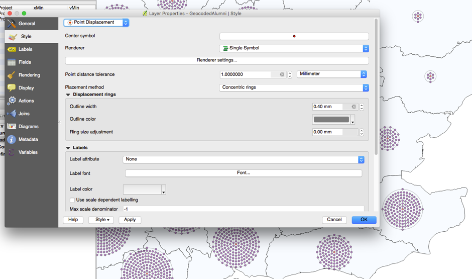
Figure 8: The layer properties Style tab, showing point displacement styles, depicting points that actually overlap at precisely the same location
You have now completed the geocoding process, and can enjoy the advantages of being able to analyse this inherently spatial historical data in a spatial way. In a real world scenario, you would probably only geocode data which is more precise than simple county level, giving a good deal more analytical potential and making maps plotted more meaningful. Where you have data which can be geocoded to a high – and crucially consistent – level of precision, it is possible to conduct a wide range of geographical analyses such as measures of clustering or distances.
For example, you can easily tweak and refine which records are mapped by changing the definition query in the properties of your geocoded layer (Right click on GeocodedAlumni in Layers Panel and select Layer Properties>General>Provider Feature Filter>Query Builder). You can use the less than or greater than operators to define years and see if trends change over time, or use the SQL LIKE statement to query the ‘details’ column to filter particular colleges – did they tend to attract students from particular counties? These queries use standard SQL language and can be combined with AND, NOT etc. This example would select only those students who had matriculated at Magdalen College:
"Details" LIKE '%Magdalen Hall%'
While the following would select only those who matriculated before 1612:
"Matriculation Year" < 1612
Geocoding your own Historical Data
The processes outlined here – matching using external queries – should be adaptable to a wide variety of scenarios wherever you can obtain or create a suitable gazetteer. Remember that your success will depend on the consistency and accuracy of your data. Ensure that the same conventions are followed in both your data and your gazetteer, especially with regard to punctuation (e.g. ‘Devon’ or ‘Devonshire’, ‘Hay-on-Wye’, or ‘Hay on Wye’ etc.) If you are lucky enough to have data which is presented in modern format (i.e. modern countries, streets or even postcodes), it is possible to use the much easier process of automated geocoding. See the section below.
If you only have a small number of rows in your data, or if you are having difficulty standardising your location information in one field so that it can be geocoded using the methods in this tutorial, you should remember that it is possible to do this process manually. Simply use one of many online geocoding tools to manually find the X and Y coordinates for each row of your data directly into X and Y columns in your spreadsheet or database. Remember to note the coordinate system used by the tool you use to find these coordinates though (probably WGS1984)! If you have manually geocoded data like this, simply follow the instructions above from ‘Adding Geocoded Data to QGIS’
Troubleshooting Database Gazetteer Joins
While relational database queries are very powerful tools for doing customised geocoding, by allowing you to match multiple criteria simultaneously, they can also present misleading results if not checked carefully. Any data that is not matched will usually be ignored ‘silently’ (i.e. you will not see an error message), so it is important to check whether the total number of lines in your results matches that in your original data.
If there are too few results, this means some values cannot be matched. In this table, for example, Place of origin includes values such as ‘London’ and ‘Germany’, which do not match any of the places in the gazetteer that we created. You could either conclude that the lower number of results is acceptable, or try to correct it by either altering places of origin, or adding locations to your gazetteer manually. Changing the properties of the join between the two tables from Inner Join to Right Join will ensure that ALL records from the alumni table are returned, whether or not there is matching data from the gazetteer counties table (presuming that the alumni table is on the right). This is a very useful diagnostic step.
If there are too many results, then each row in one table is matching multiple rows in the other. This is actually quite common with gazetteers, as there are likely to be duplicate points with the same, or very similar, place names in many datasets. This is especially true of very high resolution gazetteers which might have many neighbourhoods within a town individually located, but it is the ‘town’ column that you might want to match against. To guard against stray duplicates like this, you can use database functions to ensure only a single result is returned from your gazetteer. If you encounter this problem you should first create a query which uses the minimum or maximum functions (called sum functions in Access) on the ID field of your gazetteer, together with the group by function on the name field of your gazetteer, to isolate only a single occurence of each place name. You can then treat this as a subquery and add it to your existing query and join the now unique ID field to the existing gazetteer field using an Inner Join to ensure only one occurrence of each place name is matched.
Postscript: Geocoding Modern Addresses
If you have data which contains present-day addresses (such as postal addresses using contemporary street names, post or ZIP codes, or higher-level descriptions such as town or county names that follow modern conventions) then geocoding is very easy, using online tools or tools that use online APIs. Remember that online geocoding is unlikely to work if any of these elements of an address are not consistent with the present day.
Major online mapping providers such as Google, Bing, and OpenStreetMap all offer API (Application Programming Interface) connections to their highly sophisticated geocoding tools. These are the same tools that power the map search features of these websites, so are very effective at making ‘best guess’ decisions on ambiguous or incomplete addresses. It is worth noting that when accessed via an API, rather than their normal website, it will be necessary to provide country names as part of the address.
- Google provides a web-based tool called Google My Maps that allows direct use of their geocoding tools and cartography. Google My Maps allows users to upload spreadsheets containing address columns, which are automatically geocoded.
-
Within QGIS these APIs are available to geocode data via a number of dedicated plugins. Currently (February 2017) the most popular and well supported of these is MMQGIS.
- Install MMQGIS using the ‘Manage and Install Plugins’ tool
- Once installed, a new MMQGIS menu appears in the menu bar.
Geocodingis one of the menu options within this, andGeoCode CSV using Google Maps / Open Street Mapwithin that. - The
GeoCode CSV using Google Maps / Open Street Mapdialog allows you to load a data table from a CSV file and specify the columns that contain (street) address, city, state and country. These are then processed using the selected online service. Successful results are created as points in a new layer (in the specified shapefile). Rows from the table that are not matched are listed in a new CSV file that is also created.
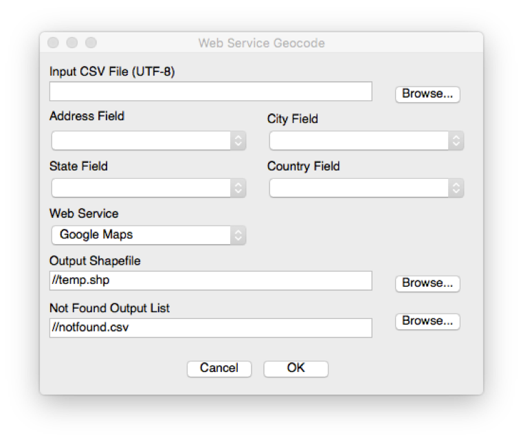
Figure 9: The ‘Web Service Geocode’ dialog from the MMQGIS plugin