
Contents
- Lesson Overview
- Preparation
- Linear Regression Procedure
- Running Linear Regression in Python 3
- Step 1: Loading metadata
- Step 2: Preparing The Data and Creating Date Labels
- Step 3: Loading Term Frequency Data, Converting to List of Dictionaries
- Step 4: Converting data to a document-term matrix
- Step 5: TF-IDF Transformation, Feature Selection, and Splitting Data
- Let’s Pause: A Look at the Training and Test Data
- Step 6: Training the Model
- Step 7: Generate Predictions
- Step 8: Evaluating Performance
- Step 9: Model Validation
- Some Brief Remarks on F-Statistics
- Step 10: Examine Model Intercept and Coefficients
- Running Linear Regression in Python 3
- End Notes
Lesson Overview
This lesson is the first of two that focus on an indispensable set of data analysis methods, linear and logistic regression. Linear regression represents how a quantitative measure (or multiple measures) relates to or predicts some other quantitative measure. A computational historian, for example, might use linear regression analysis to do the following:
-
Assess how access to rail transportation affected population density and urbanization in the American Midwest between 1850 and 18601
-
Interrogate the ostensible link between periods of drought and the stability of nomadic societies2
Logistic regression uses a similar approach to represent how a quantitative measure (or multiple measures) relates to or predicts a category. Depending on one’s home discipline, one might use logistic regression to do the following:
-
Explore the historical continuity of three fiction market genres by comparing the accuracy of three binary logistic regression models that predict, respectively, horror fiction vs. general fiction; science fiction vs. general fiction; and crime/mystery fiction vs. general fiction3
-
Analyze the degree to which the ideological leanings of U.S. Courts of Appeals predict panel decisions4
The first of these examples is a good example of how logistic regression classification tends to be used in cultural analytics (in this case literary history), and the second is more typical of how a quantitative historian or political scientist might use logistic regression.
Logistic and linear regression are perhaps the most widely used methods in quantitative analysis, including but not limited to computational history. They remain popular in part because:
- They are extremely versatile, as the above examples suggest
- Their performance can be evaluated with easy-to-understand metrics
- The underlying mechanics of model predictions are accessible to human interpretation (in contrast to many “black box” models)
The central goals of these two lessons are:
- To provide overviews of linear and logistic regression
- To describe how linear and logistic regression models make predictions
- To walk through running both algorithms in Python using the scikit-learn library
- To describe how to assess model performance
- To explain how linear and logistic regression models are validated
- To discuss interpreting the results of linear and logistic regression models
- To describe some common pitfalls to avoid when conducting regression analysis
Preparation
Suggested Prior Skills
- Prior familiarity with Python or a similar programming language. Code for this lesson is written in Python 3.7.3 on MacOS Catalina, but you can likely run regression analysis in many ways. The precise level of code literacy or familiarity recommended is hard to estimate, but you will want to be comfortable with basic Python types and operations (functions, loops, conditionals, etc.).
- This lesson uses term frequency tables as its primary dataset. Since the data is already pre-processed, you do not need to repeat these steps to complete the lesson. If you want to know more about each step, however, I have provided some links for you. To create term frequency tables, I used Python for normalization, tokenization, and converting tokens to document-term matrices.
- Tokenization involves using a computer program to recognize separations between terms. It is discussed in two existing Programming Historian lessons, Introduction to Stylometry with Python and Basic Text Processing in R. The first, uses Python so it’s more directly relevant to this lesson, while the second describes the logic of tokenization more thoroughly.
- A document-term matrix is a very common data structure in computational text analysis. To envision its properties, picture a spreadsheet in which each row is a document, each column is a term, and each value is a number representing the count or relative frequency of a particular term in a particular document. The lesson Understanding and Using Common Similarity Measures for Text Analysis demonstrates how to create document-term matrices using scikit-learn’s
CountVectorizer.
- This lesson also uses a Term Frequency - Inverse Document Frequency (TF-IDF) transformation to convert term counts into TF-IDF scores. The logic behind this transformation, and its applicability to machine learning, is described in Analyzing Documents with TF-IDF.
- For the Cultural Analytics article on which this lesson is based, I applied lemmatization after tokenizing the book reviews. Lemmatization is a process for grouping together different word forms/inflections, such that the verbs write and writes would both be tabulated under one label. I describe lemmatization and stemming (another way of grouping term variants) in my lesson Analyzing Documents with TF-IDF. I also point readers to descriptions of stemming and lemmatization from Christopher D. Manning, Prabhakar Raghavan and Hinrich Schütze’s Introduction to Information Retrieval. The subsequent pre-processing steps included converting lemma data to a document-lemma matrix (similar to a document-term matrix, but with lemma counts instead of term counts) and applying TF-IDF to lemma data (which would most accurately be abbreviated LF-IDF).
Before You Begin
- Install the Python 3 version of Anaconda. Installing Anaconda is covered in Text Mining in Python through the HTRC Feature Reader. This will install Python 3.7.3 (or higher), the Scikit-Learn library, the Pandas library, the matplotlib and seaborn libraries used to generate visualizations, and all the dependencies needed to run a Jupyter Notebook.
- It is possible to install all these dependencies without Anaconda (or with a lightweight alternative like Miniconda). For more information, see the section below titled Alternatives to Anaconda
Lesson Dataset
This lesson and its partner, Logistic Regression Analysis with Scikit-Learn, will demonstrate linear and logistic regression using a corpus of book reviews published in The New York Times between 1905 and 1925. Lesson files, including metadata and term-frequency CSV documents, can be downloaded from lesson-files.zip.
This corpus represents a sample of approximately 2,000 reviews, each of which focuses on a single published book. I prepared this dataset in conjunction with an article titled “Gender Dynamics and Critical Reception: A Study of Early 20th-century Book Reviews from The New York Times,” which was published in Cultural Analytics in January 2020.5 For that article, I tagged each book review with a label representing the presumed gender of the book’s author. I then trained a logistic regression model to classify the reviews as ‘presumed male’ or ‘presumed female’, based on the words that reviews with each label tended to use. After maximizing the performance of this model, I examined the terms most likely to predict a male or female label.
There are several good reasons to use a dataset like this one for lessons on linear and logistic regression, but also several drawbacks. Typically, to demonstrate linear regression, a much simpler dataset is used, such as the very well-known “Diabetes Dataset,” in which a range of variables (age, sex, BMI, etc.) can be used to predict diabetes disease progression one year after an established baseline.6 In scikit-learn, datasets like this one are termed “toy datasets” because they are “useful to quickly illustrate the behavior of the various algorithms implemented in scikit-learn” but are “often too small to be representative of real world machine learning tasks.”7 The dataset I have elected to use, in contrast, is taken from my published scholarship, which makes it more complex than a toy dataset but also demonstrative of the kind of data you might be working with in your own scholarship. The way I will use this dataset for a logistic regression model is in many ways typical of computational text analysis in digital humanities and cultural analytics. Running a linear regression on text features to predict dates is less typical in a digital humanities context, but using the dataset in this way still allows me to demonstrate the key principles of linear regression, and to walk through the steps of making sense of a regression model with many coefficients.
The text of each book review in this dataset has been pre-processed, tokenized, and converted to CSV files. Each of these CSV files represents one document. In any given CSV, each term from that document is represented as a value in the first column and each term count represented as a value in the second column. The CSV files are all stored in a folder called corpus, with each review named after its unique id from The New York Times Archive API, such as 4fc03a7d45c1498b0d1e2e6e.csv. Outside of the corpus folder, a file called reviews_meta.csv includes information about each review, including the corresponding id field from the Archive API. Metadata for the corpus includes fields retrieved from the Archive API as well as additional fields that were tagged by hand:
New York Times Data Fields
- nyt_id This is a unique alpha-numeric identifier used by the New York Times Archive API to identify each periodical article
- xml_id This is a unique numeric identifier used by the New York Times to align XML files with metadata. The alignments between
xml_idandnyt_idwere obtained, by request, from The New York Times - month Month of publication for the specific article
- day Day of publication for the specific article
- year Year of publication for the specific article
- nyt_pdf_endpoint A url linking the entry to its corresponding content on The New York Times’ Times Machine
Hand-coded Fields
The following fields were added by Dr. Matthew Lavin as part of his scholarly work on book reviews:
- cluster_id If the entry was created by splitting up a group of book reviews scanned as one article, this id maps the review to a corresponding text file for the individual review.
- perceived_author_gender This field describes the gender of the author assumed by the review/reviewer. If the review calls the author he or she, or Mr. of Mrs., or other gendered pronouns and/or honorifics, these were taken as evidence of a gender presumption. There are three possible values for this field:
- m: author described using male gendering terms such as Mr., Lord, Baron, he, and his
- f: author described using female gendering terms such as Mrs., Miss, madam, she, and her
- u: gender label is unclear, or maybe the reviewer avoided gender terms to remain neutral
Regression Definition and Background
To understand regression, it is first useful to review the concepts of independent and dependent variables. In statistical inference, an independent variable is “the condition of an experiment that is systematically manipulated by the investigator.”8 It is treated as the predictor or signal variable, or often the possible cause of some effect. In turn, the dependent variable is “expected to change as a result of an experimental manipulation of the independent variable or variables.”9 With regression, a model of best fit is trained from one or more independent variables in order to predict a dependent variable. The strength of a model can be assessed using the accuracy of the predictions it generates, as well as its statistical significance.
To understand the main difference between linear and logistic regression, likewise, it is helpful to review the concepts of continuous and nominal variables. Broadly speaking, data can be classified into two groups: Numerical (quantitative) and Categorical (qualitative). All numerical data have magnitude and units, but there are two types of numerical data: discrete and continuous. Discrete variables are often thought of as count values, such as the number of apples in a bowl, or the number of students in a classroom. Continuous variables differ from discrete variables, in that continuous variables can have a real number value between their minimum and maximum. A person’s height or body temperature are often used as examples of continuous variables because both can be expressed as decimal values, such as 162.35 cm or 36.06 degrees Celsius. Categorical data includes the subcategories of nominal and ordinal variables. Ordinals describe qualitative scales with defined order, such as a satisfaction score on a survey. Nominal data describe categories with no defined order, such as a book’s genre or its publisher.10 The following table summarizes these data types:
| Type | Subtype | Definition |
|---|---|---|
| Numerical | Discrete | Count values where whole numbers make sense but decimals don’t |
| Numerical | Continuous | Real number values where both whole numbers and decimals are meaningful |
| Categorical | Ordinal | Qualitative scales, such as satisfaction score 1-5 |
| Categorical | Nominal | Qualitative labels without distinct or defined order |
All this helps us to understand the difference between linear and logistic regression. Linear regression is used to predict a continuous, dependent variable from one or more independent variables, while logistic regression is used to predict a binary, nominal variable from one or more independent variables. There are other methods for discrete and ordinal data, but I won’t cover them in this lesson. Arguably, what’s most important when learning about linear and logistic regression is obtaining high level intuition for what’s happening when you fit a model and predict from it, and that’s what we’ll focus on here.
Overview of Linear Regression
Simple linear regression (a linear model with one continuous, independent variable and one continuous, dependent variable) is most often taught first because the math underlying it is the easiest to understand. The concepts you learn can then be extended to multiple linear regression, that is, a linear model with many independent variables and one dependent variable.
The goal with a simple linear regression model is to calculate a two-dimensional line of best fit for a sample of data and to evaluate how to close to the regression line a given set of data points are. A simplified example, using our book reviews data set, can help clarify what a line of best fit is, and how it is generated.
The following plot visualizes the relationship between the average length of single-work book reviews in the The New York Times and the year in which those reviews appeared. Later in this lesson, I will come back to how a plot like this is made in Python. What’s important now, is the idea that we could train a model to predict a book review’s year of publication by knowing only how long, on average, book reviews are for each year. We shouldn’t necessarily expect a strong relationship between average review length and date, unless book reviews were steadily getting shorter or longer over time.
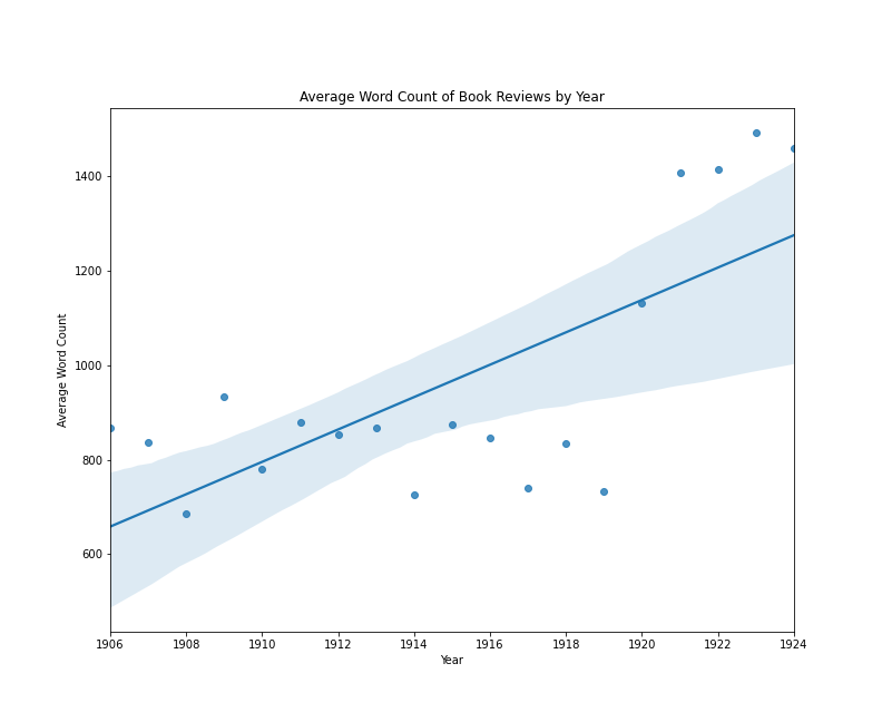
Book reviews by average word count per year
In this case, we do see an increase over time in this example, with an average difference of about 35 words per year. However, we can also see that the trend line would be very different if the years 1920-1924 were excluded.
If we were evaluating the results of this model, we might summarize that:
- The average length of book reviews published between 1905 and 1925 does change from year to year
- The change in averages does not look linear
- To the extent that the change over time is fitted to a linear model, the average length of book reviews published between 1914 and 1919 doesn’t fit the expected pattern
There could be various causes for this apparent relationship between average review length and date. However, this simplified example is useful for demonstrating several key concepts associated with linear (and by extension, logistic) regression models:
- A line-of-best-fit can be used to evaluate the relationships among variables
- Interpreting these relationships requires first assessing whether the model is showing a strong relationship
- In a linear regression context, variables may be related but not linearly related, which might suggest that some other model (such as a polynomial regression) would be more appropriate. (For more on this topic, take a look at my discussion of Homoscedasticity)
- Visualizing a line-of-best-fit among the points used to produce it can be provide an effective “gut check” of a model’s efficacy
The visualization above is a conventional scatter plot with average length on one axis, and year on the other. Through the two-dimensional data, a straight line has been drawn, and this line is drawn in such a way as to minimize the total distance of all points from the line. We can imagine that if we made the line shallower or steeper, or moved the entire line up or down without changing its angle, some points might be closer to the line, but other points would now be farther away. A line of best fit in this case, expresses the general idea that the line should work as well as possible for the greatest number of points, and the specific idea that that a line’s goodness-of-fit can be assessed by calculating the mean of the squared error. To clarify this idea of squared error, I have added some new labels to the same regression plot:
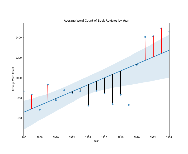
Book reviews by average word count per year with error lines
In this plot, a vertical line between each point and the regression line expresses the error for each data point. The squared error is the length of that line squared, and the mean squared error is the sum of all squared error values, divided by the total number of data points.11 Fitting a regression line in this way is sometimes referred to as an ordinary least squares regression.12 One thing that makes a line-of-best-fit approach so appealing is that it describes a singularity function to convert one or more input values into an output value. The standard regression function looks like this:
\[Y = a + bX\]In this function, X is the explanatory variable and Y is the dependent variable, or the prediction. The lowercase a is the value of y when x = 0 (or the intercept), and b is the slope of the line. If this formula looks familiar, you may recall from algebra class that any line in a coordinate system can be expressed by designating two values: a starting set of coordinates and “rise over run.” In a linear regression, the intercept provides the starting coordinate, the coefficient provides information about the rise of the slope, and the run value is expressed by the explanatory variable.13 When we perform multiple regression, we end up with a similar function, as follows:
\[Y = a + bX1 + cX2 + dXn\]In this formula, the prediction is generated by adding the intercept (a) to the product of each explanatory variable and its coefficient. In other words, the math behind a multiple linear regression is more complicated than simple linear regression, but the intuition is the same: to draw a line of best fit, expressed by a single function, that generates predictions based on input values.
Linear Regression Procedure
In this lesson, we will begin by training a linear regression model using the corpus of book reviews from The New York Times described above. The corpus is sufficiently large to demonstrate splitting the data set into subsets for training and testing a model. This is a very common procedure in machine learning, as it ensures that the trained model will make accurate predictions on objects not included in the training process. We’ll do something similar with logistic regression in the second of these two lessons.
As we have seen, a linear regression model uses one or more variables to predict a continuous numerical value, so we will train our first model to predict a book review’s publication date. Logistic regression, in turn, uses one or more variables to predict a binary categorical or nominal label. For this task, we will reproduce a version of the model I trained for the article “Gender Dynamics and Critical Reception: A Study of Early 20th-century Book Reviews from The New York Times,” which was published in Cultural Analytics in January 2020. Gender is a social construction and not binary, but the work I did for Cultural Analytics codes gender not as an essential identity, but as a reflection of the book reviewers’ perceptions. Rather than reifying a binary view of gender, I believe this example makes for an effective case study on how document classification can be used to complicate, historicize, and interrogate the gender binaries in The New York Times Book Review.
Running Linear Regression in Python 3
In this section of the lesson, we will run a linear regression model in Python 3 to predict a book review’s date (represented as a continuous variable). We will rely primarily on the scikit-learn library for setting up, training, and evaluating our models, but we will also use pandas for reading CSV files and data manipulation, as well as matplotlib and seaborn to make data visualizations. Later, we will use the same mix of libraries to train a logistic regression model to predict the perceived gender of the author being reviewed (represented as a binary, nominal variable).
Some of the code below is specific to the way I have set up my metadata and data files, but the choices I have made are common in data science and are becoming increasingly popular in computational humanities research. I will explain the principles behind each block of code as I walk you through each of the steps.
Step 1: Loading metadata
As stated previously, the metadata for this lesson can be found on two CSV files, metadata.csv and meta_cluster.csv. They are presented as two separate files because, in the first file, a row represents one review and one pdf file in the New York Times API. In the second file, again a row represents one review, but each of these reviews was clustered into one pdf file with one or more additional reviews in the New York Times API. Both of our tasks call for consolidating the two review lists into one DataFrame in Python.
import pandas as pd
df = pd.read_csv("metadata.csv")
df_cluster = pd.read_csv("meta_cluster.csv", dtype={'cluster_id': str})
df_all = pd.concat([df,df_cluster], axis=0, ignore_index=True, sort=True).fillna('none')
In the above code chunk, pd.concat() allows us to combine multiple DataFrames using rules or logic.14
In this example, the parameteraxis= 0 instructs the pd.concat() method to join by rows instead of columns; sort=True directs it to sort the results; and fillna('none') fills any nan values with 0. This last directive is important because meta_cluster.csv has a column for cluster_id and metadata.csv does not.15
Step 2: Preparing The Data and Creating Date Labels
In this step, we prepare the DataFrame for linear regression analysis. For the linear regression model we are going to train, we need to be sure each row has a year, month, and day, and we want to use those fields to create a new column that represents the date as a floating-point decimal. In this schema, for example, the date February 9, 1907 would be encoded as 1907.106849 and April 12, 1914 would be 1914.276712.
from datetime import date as dt

def toYearDecimal(row):
    y = row['year']
    m = row['month']
    d = row['day']

    date_object = dt(year=y, month=m, day=d)
    year = date_object.year
    startOfThisYear = dt(year=year, month=1, day=1)
    startOfNextYear = dt(year=year+1, month=1, day=1)

    yearElapsed = date_object - startOfThisYear

    yearDuration = startOfNextYear - startOfThisYear
    fraction = yearElapsed.days/yearDuration.days

    return date_object.year + fraction

df_all = df_all.dropna(subset=['day', 'month', 'year']).reset_index(drop=True)
df_all['yearDecimal'] = df_all.apply(toYearDecimal, axis=1).reset_index(drop=True)
This chunk of Python code defines two functions, drops any rows in the df_all DataFrame with NA (i.e., “not available” or missing data) values in the day, month, or year columns, and then uses an apply() method to run the toYearDecimal() function on each row in the df_all DataFrame. You could also do this with a loop, but apply() is faster and more consistent with the pandas ecosystem, especially since we are generating the values for a new column in that very DataFrame.
The logic of the toYearDecimal() function is fairly straightforward: it uses the day, month, or year columns to construct a Date object (which is why it’s important that there be no NA values in those fields) and then expresses the date as number of days since January 1 of that year. It then divides that number by the total number of days in that date’s year (365 or 366 depending on whether it’s a leap year) to convert the number of days into a decimal value. It adds that decimal back to the year to express the date as its year + the decimal value of days. The decimal date is then stored in the yearDecimal column of the df_all DataFrame, and the index is reset once more since we have removed many rows of data.
Step 3: Loading Term Frequency Data, Converting to List of Dictionaries
There are lots of ways to the work with term frequency data, but one of the most common is to create metadata CSV file and then to key each corresponding term frequency CSV to an id in that metadata file. In this case, we started with two CSVs and joined them to together to create one central list of documents. Now, we can iterate through the rows of the df_all DataFrame and build up a list of dictionaries. Each dictionary will have terms as keys and counts as values, like this:
{'the': 22, 'as':12, 'from': 8, ...}
The order of this list of dictionaries will be the same as the rows in df_all.
list_of_dictionaries = []
for row in df_all.iterrows():
    if row[1]['cluster_id'] == 'none':
        txt_file_name = ''.join(['term-frequency-tables/', row[1]['nyt_id'], '.csv'])
    else:
        txt_file_name = ''.join(['term-frequency-tables/', row[1]['nyt_id'], '-', row[1]['cluster_id'], '.csv'])

    df = pd.read_csv(txt_file_name).dropna().reset_index(drop=True).set_index('term')
    mydict = df['count'].to_dict()

    list_of_dictionaries.append(mydict)

len(list_of_dictionaries)
This block of code’s purpose is to load term frequency data from multiple CSV files and convert them to list of dictionaries. We want the list to match the metadata file, so we loop through the rows of the df_all DataFrame just like we did with the previous block of Python. This time, however, I’m using the method iterrows() rather than apply(). There are various pros and cons to each method, but iterrows() might be a little more intuitive in this context since, instead of creating a new column in our DataFrame, we are building up a new list of dictionaries.
The if and else statements in the code are there because, for each row, we need to use column data to generate the file path of the corresponding CSV. Solo reviews will have one kind of file name and reviews extracted from clusters of reviews will have another. Here are two example file paths:
term-frequency-tables/4fc0474945c1498b0d21c20f.csv
term-frequency-tables/4fc0780645c1498b0d2ff50a-1.csv
Did you notice the difference? If a row has no numerical cluster id, the file name will be built from the folder location, the review id, and the string ‘.csv’. If the row does have a numerical cluster id, the file name will be built using the folder location, the id, a hyphen, the cluster id, and the string ‘.csv’.
Once the correct file path is determined, the code block loads the CSV as its own pandas DataFrame. This is often the fastest way to get tabular data into Python, but we want to convert that DataFrame to a dictionary where terms are keys and counts are values. As a result, we preemptively execute three pandas methods, dropna(), reset_index(drop=True) and set_index('term'). Pandas supports chaining, so we can add them sequentially to the tail of the pd.read_csv() statement. The dropna() method removes any rows with NA values; The reset_index(drop=True) renumbers the rows in case any rows were dropped; and set_index('term') converts the term column to the index so that it’s easier to convert to a dictionary.
The code to do the conversion is mydict = df['count'].to_dict(). It begins with df['count'], which represents the count column as a pandas Series. (For more on the Series datatype, see the pandas documentation). Next, the pandas method to_dict() converts that series to a dictionary, using the index values as dictionary keys and the Series values as dictionary values. Each dictionary is then appended to list_of_dictionaries. After the loop has finished running, the len() of list_of_dictionaries will be the same as the number of reviews, and in the same order.
Step 4: Converting data to a document-term matrix
Converting dictionary-style data to a document-term matrix is a fairly common task in a text analysis pipeline. We essentially want the data to resemble a CSV file with each document in its own row and each term in its own column. Each cell in this imagined CSV, as a result, will represent the count of a particular term in a particular document. If a word does not appear in a document, the value for that cell will be zero.
from sklearn.feature_extraction import DictVectorizer
v = DictVectorizer()
In the above block of code, we import the DictVectorizer() class from scikit-learn and instantiate a DictVectorizer, which we will use to convert our list_of_dictionaries variable to a document-term matrix. Once we have our data in this format, we will use the TF-IDF transformation to convert our term counts to TF-IDF weights, which help us isolate distinctive terms and ignore words that appear frequently in many documents.16
Step 5: TF-IDF Transformation, Feature Selection, and Splitting Data
An important area for concern or caution in machine learning is the ratio of features to samples. This concern is especially important in computational text analysis, where there are often small training samples and hundreds of thousands different tokens (words, punctuation, etc.) that one could use as training features. The biggest potential liability of having too many features is over-fitting. When a model is trained on sparse data, the presence of each additional training feature increases the probability of a spurious correlation, a purely coincidental association between, say, a particular term frequency and the date we are trying to predict. When a model is too well fitted to its training data, the model will fail to provide meaningful predictions on other datasets.
When employing computational text analysis in a scholarly context, one can limit the number of features in a model in several ways:
- Using feature consolidation and/or dimension reduction strategies such as stemming/lemmatization and Principal Component Analysis (PCA)
- Limiting term lists to the top K most frequent terms in the corpus (here K is just a placeholder for whatever number is used)
- Employing feature selection techniques such as with a variance threshold or a univariate feature selection strategy
In the context of a more general lesson on regression, I have included some code to employ a two-step feature selection strategy. The intuition behind this is relatively straightforward. First, we select the 10,000 most frequent features in the book reviews as a whole. Second, after executing our TF-IDF transformation, we conduct univariate feature selection to find the most promising 3,500 features of these terms, as represented by the scikit-learn f_regression() scoring function. I’ll come back to this scoring function in a moment but, first, let’s isolate the top 10,000 terms in the corpus.
from collections import Counter

def top_words(number, list_of_dicts):
    totals = {}
    for d in list_of_dicts:
        for k,v, in d.items():
            try:
                totals[k] += v
            except:
                totals[k] = v
    totals = Counter(totals)
    return [i[0] for i in totals.most_common(number)]

def cull_list_of_dicts(term_list, list_of_dicts):
    results = []
    for d in list_of_dicts:
        result = {}
        for term in term_list:
            try:
                result[term] = d[term]
            except:
                pass
        results.append(result)
    return results

top_term_list = top_words(10000, list_of_dictionaries)
new_list_of_dicts = cull_list_of_dicts(top_term_list, list_of_dictionaries)
This block of code begins by importing a very useful class from Python’s collections library called a Counter(). Counter’s are a little bit like Python dictionaries, but they have built-in methods that make some common operations especially easy. In our case, the first of our two functions determines the top N terms in the corpus. We loop through our entire list of dictionaries and build up a single vocabulary Counter with cumulative counts for each term. We then use our Counter’s most_common() method to return the keys and values of the top N terms in that vocabulary. The number parameter supplies the number of terms the function will return.
Our second function takes two parameters: a term list and a list of dictionaries. It loops through the list of dictionaries and, for each dictionary, it checks each term against the term list. Words that match are compiled to a new list of dictionaries, and words that do not match are skipped over. The output of this second function is stored as a variable called new_list_of_dicts. It has the same order as list_of_dictionaries, but now only the top 10,000 terms are represented in these dictionaries.
After running both of these functions, we are ready to compute TF-IDF scores. In the previous section, we stored our DictVectorizer() instance as a variable called v, so we can use that variable here to fit the object with our new_list_of_dicts data.
from sklearn.feature_extraction.text import TfidfTransformer

X = v.fit_transform(new_list_of_dicts)
tfidf = TfidfTransformer()
Z = tfidf.fit_transform(X)
In this code block, we import the TfidfTransformer class from scikit-learn, instantiate a TfidfTransformer, and run the fit_transform() method on v. At the end of this code block, the data is in a format that scikit-learn’s regression models (and other machine learning models) can now understand.
However, we still need to execute step 2 of our feature selection strategy: using the scikit-learn f_regression scoring function to isolate the most promising 3,500 TF-IDF features out of the top 10,000 terms from the vocabulary. The f_regression function computes a correlation between each feature and the dependent variable, converts it to an F-score, and then derives a p-value for each F-score. No doubt, some of the “K Best” terms selected by this procedure will be highly correlated with the training data but will not help the model make good predictions. However, this approach is easy to implement and, as we will see below, produces a reasonably strong model.
from sklearn.feature_selection import SelectKBest, f_regression
Z_new = SelectKBest(f_regression, k=3500).fit_transform(Z, date_labels)
We’ve now reduced our model to 3,500 features: that is, terms and TF-IDF scores that are likely to help us predict the publication date of book review. The next code block partitions the data into a training set and a test set using scikit-learn’s train_test_split() function. Creating a split between training and test data is especially important since we still have a lot of features, and a very real possibility of over-fitting.
from sklearn.model_selection import train_test_split
X_train, X_test, y_train, y_test = train_test_split(Z_new, df_all['yearDecimal'], test_size=0.33, random_state=31)
The operation creates four variables: training data, training labels, test data, and test labels. Since we are training a model to predict dates, the training and test data are the decimal dates that we previously generated and stored in the yearDecimal
column of df_all. The test_size parameter is used to set the ratio of training to test data (approximately 2 to 1 in this case) and the random_state parameter is used to control reproducibility. If we re-used the same random_state value, the same shuffle would be applied to the data before applying the split. Changing the random_state value if one were rerunning the split would ensure that different rows would be selected.17
Let’s Pause: A Look at the Training and Test Data
The next few steps involve relatively few lines of code because they are based on a very common sequence of actions. The scikit-learn library has made these steps especially straightforward. Setting up the data is, by comparison, more involved because scikit-learn is designed to work easily as long as the data are prepared in specific ways. If you haven’t done so already, take a look at the data stored in the variables X_train, X_test, y_train, and y_test. Assuming you are working in a Jupyter Notebook, you can inspect any of these variables by typing the variable’s name in an empty Notebook cell and pressing the “Run” button (assuming you’ve already run all the code blocks above). Let’s start with X_train. For this variable, your Jupyter Notebook output will look something like this:
<1514x3500 sparse matrix of type '<class 'numpy.float64'>'
 	with 278586 stored elements in Compressed Sparse Row format>
This message tells us that X_train is a sparse matrix made up of float64 data. This data type comes from the NumPy library and is used to represent 64-bit floating-point numbers, which have the same level of precision of Python’s built-in float type). The dimensions 1514x3500 tell us that we have 1514 reviews in our training data, and 3500 TF-IDF weighted terms from which to train the model. Scikit-learn expects independent variables (training and test) to stored in an array-like object with the dimensions [number-of-samples x number-of-features], whether that’s a SciPy sparse matrix, a pandas DataFrame, a NumPy array, or a standard-Python list of lists.
Meanwhile, if you inspect X_test, you will see something like this:
2803    1920.830487
2961    1910.671233
1841    1923.956164
1926    1924.415187
3025    1916.863388
           ...
1823    1923.821918
1448    1916.155738
1070    1907.490411
1164    1910.517808
1132    1909.175342
Name: yearDecimal, Length: 1514, dtype: float64
This block of output is also a group of float64 values, but this time they are contained within a pandas Series. A Series is a one-dimensional sequences of values with axis labels built on top of NumPy’s ndarray class. It is similar to a pandas DataFrame, but it represents only one dimension of data, so it’s the default type for a single column from a pandas DataFrame.18 In scikit-learn, training and test labels should be an array-like object with a length equal to the number of samples or, if multiple labels are being predicted, an array-like object with the dimensions [number-of-samples x number-of-targets]. A group of one-dimensional target labels can be a pandas Series, a NumPy array, or a Python list.
Step 6: Training the Model
Equipped with a better understanding of what our data looks like, we can proceed to importing a LinearRegression() class from scikit-learn, instantiating it as a variable, and fitting the newly designated model with our training set. As stated, scikit-learn makes these steps easy, so we only need three lines of code:
from sklearn.linear_model import LinearRegression
lr = LinearRegression()
lr.fit(X_train, y_train)
Step 7: Generate Predictions
Now that the model has been trained, we will use the fitted model to generate label predictions on the test data. We need to execute the lr instance’s predict() method, using the variable X_test. Remember, X_test is a matrix-like object with the same number of variables and observations as X_train but, significantly, our model has never seen these rows of data before.
results = lr.predict(X_test)
After this line of code has been run, results will be a one-dimsensional NumPy array with a length equal to the number of rows in X_test and, by definition, the same number of rows in Y_test. What’s more, all three variables represent the same observations, in the same order. For example, the first row of X_test represents TF-IDF values for terms in a book review, the first value in results represents the predicted year of that book review, and the first value in Y_test represents the labeled year of that book review. Maintaining the sequencing of these three variables will make it easier to evaluate the performance of our predictions in the next step.
Step 8: Evaluating Performance
A linear regression model can be evaluated using several important metrics, but the most important thing to bear in mind is whether the model is making (or will make) consistently good predictions. This why this lesson demonstrates splitting the data into partitioned training and test sets. Now that we’ve generated predictions and stored them in the results variable, we can compare those predictions to the test labels in Y_test. We can obtain a good first impression a linear regression model’s performance by calculating the r² (pronounced r-squared) score, finding the mean of the residuals, and making a histogram or kernel density estimate (KDE) plot to see how the residuals are distributed. We can then flesh out this picture by computing an f-statistic and a p-value.
An r² score computes the “coefficient of determination” of the regression model, which is the proportion of the variance in the dependent variable that is predictable from the independent variable or variables.19 Scikit-learn has a built-in r² scoring function, but the math behind this score is relatively simple, and writing our own function from scratch will help us understand what it captures. If you want to skip this step, you can simply do the following:
from sklearn.metrics import r2_score
r2_score(list(y_test), list(results))
# result will be something like 0.4408184014714299
You’ll notice that the first step in the function below is to calculate the residuals, which represent the differences between predictions and test labels. I’ll say more about those in just a moment. First, let’s take a look at this block of code:
def r_square_scratch(true, predicted):
    # substract each predicted value from each true
    residuals = [a - b for a, b in zip(true, predicted)]
    # calculate the sum of squared differences between predicted and true
    mss = sum([i**2 for i in residuals])
    # calculate the mean true value
    mean_true = (sum(true))/len(true)
    # calculate the sum of squared differences of each true value minus the mean true value
    tss = sum([(i-mean_true)**2 for i in true])
    # calculate final r2 value
    return 1-(mss/tss)

# call the function
r_square_scratch(list(y_test), list(results))
# this will return something like 0.44081840147143025
If you’ve been following along, you can paste this entire code chunk in a Jupyter Notebook cell and run it. It is dependent only on the y_test and results variables, as the rest is Python standard. Here’s a step-by-step breakdown of the function:
- Calculate the difference (i.e. residual) between each true review date and each predicted date
- For each residual, square the value
- Add all the squared values together to derive the “model sum of squares” (MSS)
- Calculate the mean true value by adding all the true values together and dividing by the number of observations
- For each true review date, subtract the mean true value and square the result
- Add all these squared values together to derive the “total sum of squares” (TSS)
- Calculate the final r² score, which equals 1-(mss/tss)
In our case the result is about 0.441.20 Since this is the amount of variance in the book review date field that can be predicted by a sample of a book review’s TF-IDF scores, the best value would be a 1.0. (However, the r² score can also be less than zero if the model performs worse than random guessing.21) This particular r² score tells us that our features are giving us some information, but perhaps not a lot.
Step 9: Model Validation
Linear regression depends upon certain assumptions about the data on which it is modeling. In statistics, determining whether these assumptions are met is part of the process of validation. Statistical validation is generally concerned with whether a selected model is appropriate for the data being analyzed. However, validation of this sort should not be confused with the broader idea of validity in the social sciences, which is “concerned with the meaningfulness of research components,” specifically whether the research is measuring what it intends to measure.22
Questions of validity in the social sciences, for example, might include, “Does the IQ test measure intelligence?” and “Does the GRE actually predict successful completion of a graduate study program?”23 Helpfully, Ellen Drost divides Validity in social sciences research into four subcategories: statistical conclusion validity, internal validity, construct validity, and external validity.24 In Drost’s schema, linear model validation is perhaps best viewed as part of statistical conclusion validity, but model validation has a more specific and targeted meaning in statistics.
Validating a linear regression model often includes an examination of the three integral assumptions: that the residuals are normally distributed; that the independent variables are not overly correlated; and that the model’s errors are homogeneous across different ranges of the dependent variable. Depending on your home discipline or target scholarly journal, assessing these assumptions may be viewed with varying degrees of concern. Learning to spot errors related to these concepts, however, can make you a much more proficient and effective data analyst no matter what field you call your home.
Distribution of Residuals: As stated above, residuals represent the differences between predictions and test labels. Perhaps more precisely, a residual is the vertical distance between each predicted value and the regression line. If the prediction is above the regression line, the residual is expressed as a positive value and, if the prediction is below the regression line, the residual is expressed as a negative number. For example, if my book reviews model a predicted a review’s year was 1915 and the labeled year was 1911, the residual would be 4. Likewise, if my model predicted a review’s year was 1894 and the labeled year was 1907, the residual would be -13.
Making a pandas DataFrame is a nice way to compare a model’s test set predictions to the test set’s labels. Let’s make a DataFrame with predicted book review dates in one column and actual book review dates in another.
results_df = pd.DataFrame()
results_df['predicted'] = list(results)
results_df['actual'] = list(y_test)
results_df['residual'] = results_df['predicted'] - results_df['actual']
results_df = results_df.sort_values(by='residual').reset_index(drop=True)
results_df.describe()
The code chunk above creates an empty DataFrame, inserts the first two columns, and then subtracts the first column value from the second column value to make a new column with our residual values in it. Lastly, we sort the values by the residual score (lowest to highest) and reset the DataFrame’s index so that it will be numbered in the order that it’s been sorted. If you paste this code chunk in a Jupyter Notebook cell and run it, you should see a DataFrame with output like this:
| predicted | actual | residual | |
|---|---|---|---|
| count | 169.000000 | 169.000000 | 169.000000 |
| mean | 1917.276958 | 1917.428992 | -0.152034 |
| std | 5.815610 | 5.669469 | 4.236798 |
| min | 1894.024129 | 1906.013699 | -13.399405 |
| 25% | 1912.849458 | 1912.647541 | -3.067451 |
| 50% | 1917.948008 | 1918.799886 | -0.484037 |
| 75% | 1921.142702 | 1922.671119 | 2.491212 |
| max | 1932.678418 | 1924.950820 | 13.878532 |
| predicted | actual | residual | |
|---|---|---|---|
| 0 | 1898.616989 | 1912.016393 | -13.399405 |
This DataFrame is the result of running Pandas’ describe() method. It will provide useful descriptive statistics (mean, standard deviation, minimum, maximum, etc.) for each column in our DataFrame. Here, the output is telling us that our lowest residual is from a prediction that guessed a date more than 13 years before than the actual date of the review. Meanwhile, our highest residual is 13.878532. For that review, the model predicted a date almost 14 years later than the book review’s actual date. 75% of our predictions are between 2.49 and -3.07 years of the book review’s labeled date, and our mean residual is about -0.48.
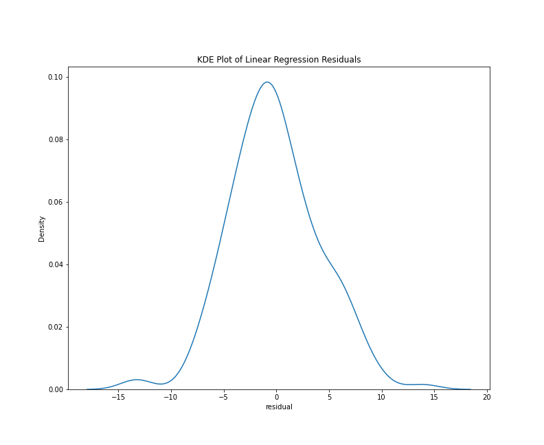
To look specifically at the distribution of the residuals, we can use a histogram or a kernel density estimate (KDE) plot. With the Seaborn library, either plots requires only a few lines of code:
%matplotlib inline
import seaborn as sns

# histogram
sns.histplot(data=results_df['residual'])

# kde plot
sns.kdeplot(data=results_df['residual'])
This chunk of code imports the Seaborn library and generates both plots using only the residuals column of the results_df DataFrame. Note that I’ve written the above chunk with the assumption that you’ll be working in a Jupyter Notebook. In this context, the cell magic %matplotlib inline will make the graph appear as notebook output. The results should look something like this:
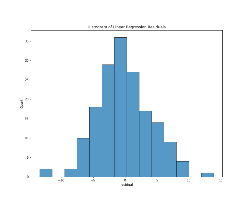
Histogram of residuals
KDE plot of residuals
From either visualization, we can see that the center values (residuals close to zero) are the most frequent. Our model doesn’t appear to be systematically predicting dates that are too low or too high since a residual close to zero is our mean, and the bars of our histogram (and lines of the kde plot) slope steadily downward, which tells us that the larger prediction errors occur with less frequency. Lastly, both plots are generally symmetrical, which means that negative and positive residuals appear to be relatively common. Using a statistical metric called a Shapiro-Wilk test, we can quantify how well this distribution fits the expectations of normality, but a visual evaluation such as the one above is often sufficient.
Multicollinearity: Collinearity describes a situation in which an independent variable in a model affects another independent variable, or when the pair have a joint effect on the variable being predicted. For example, if one were using various weather indicators–temperature, barometric pressure, precipitation, cloud coverage, wind speeds, etc.–to predict flight delays, it’s plausible if not likely that some of those weather indicators would be correlated with each other, or even have causal relationships. When collinearity occurs between more than two factors, it is termed multicollinearity.25 Multicollinearity is a concern in machine learning because it can distort a model’s measures of statistical significance and make variables appear more predictive or less predictive than they really are.26
Multicollinearity, as a result, can make it difficult to isolate the effects of each independent variable on the dependent variable.27 In the context of a linear regression, there may not be a “unique optimum solution” for the line of best fit, which means that the resulting regression coefficients probably aren’t stable.28 Several strategies can be employed to reduce multicollinearity, including removing redundant or highly correlated features; collecting more data; variable regularization; constrained least-squares estimates of the coefficients; and Bayesian methods of estimation in place of least squares where appropriate.29
One way to assess multicollinearity is to make a heat map of the correlations among independent variables (i.e., a correlation matrix). This approach can become dicey when working with term frequency data. In computational text analysis, where so many features are used, this approach is untenable. What’s more, there will almost certainly be some highly correlated term frequencies or TF-IDF scores among so many possibilities. Under these circumstances, Gentzkow, Kelly, and Taddy suggest that “the inevitable multicollinearity makes individual parameters difficult to interpret” but they add that “it is still a good exercise to look at the most important coefficients to see if they make intuitive sense in the context of a particular application.”30
It should also be noted that, with many uses of text mining, our study design doesn’t reflect our theory of causality. In some disciplines, it is typical if not mandatory that one would use a linear regression only when there is a possible causal relationship between the independent variables and the dependent variable. With the Diabetes Data, for example, we might test the hypothesis that having a higher BMI causes more extreme diabetes disease progression. In our case, we shouldn’t believe that a book review’s term frequencies or TF-IDF scores cause that book review to be from a different time period. If anything, we think the date of a review might help shape its term frequencies or TF-IDF scores, but this doesn’t make much sense if you really think about it. After all, how could a date (an abstract and human concept) cause anything? When we set up a model like this one, we’re actually imagining that some unknown factor or factors (historic events, shifting trends in desirable book topics, etc.) have some influence on what was reviewed or how reviews were written. Since such factors may have changed over time, a book review’s date becomes a proxy to analyze such change.
Homoscedasticity: Homoscedasticity, also called “homogeneity of variance,” describes a situation in which a model’s residuals are similar across the ranges of the independent and dependent variables.31 Homoscedasticity is necessary because it’s one of the core assumptions of a linear regression model. Heteroscedasticity or non-homogeneity of variance could signal an underlying bias to the error or an underlying pattern that better explains the relationship between the independent variable(s) and the dependent variable. This concept may sound complex, but it makes more sense if you think about what could happen if you try to squeeze a non-linear relationship into a linear model.
If a model’s predictions are accurate for the values in the middle range of the data but seem to perform worse on high and low values, this could be a sign that the underlying pattern is curvilinear. Like any straight line through any curve, the two might line up reasonably well for some small range of the curve but, eventually, the curved data would veer off and the line would maintain its course.
If a model’s predictions seem strong everywhere except the high values or the low values, you could have a relationship that flattens at some theoretical maximum or minimum value. The relationship between headlines about an epidemic and Google searches for the disease causing it could be very strong, to a point, and then Google searches could plateau after the headlines reach a certain saturation point. Alternatively, this kind of heteroscedasticity could be a sign of a positive correlation that peaks at some value and then starts to drop and become a negative correlation. For example, outdoor temperature could be a positive indicator of outdoor activity up to a certain threshold (maybe 78 degrees) and then become a negative indicator of outdoor activity beyond that threshold, with each degree increase making outdoor activity less likely.
This is not an exhaustive list of the signs of heteroscedasticity you might encounter but, in evaluating homoscedasticity, these are the kinds of patterns you should be looking for; that is, indications that the model makes good predictions in one or more pockets of the data and poor predictions elsewhere. One simple way to discover such heteroscedasticity is to make a scatter plot of the model’s performance on the test set, with the model’s predictions on one axis and the test values on other other axis. A straight line representing the plane where predicted and test values are equal can be added to this graph to make it easier to see patterns. Here is a block of Python code making such a plot for the book review predictions:
import matplotlib.pyplot as plt
plt.xlim(1906, 1925)
plt.ylim(1895, 1935)
plt.scatter(results_df['actual'], results_df['predicted'], alpha=.35)
plt.plot([1895, 1935], [1895, 1935], color='black')
plt.title("Plot of Linear Regression Test Values, Predicted vs. Actual")
plt.subplots_adjust(top=0.85)
plt.show()
In this block of code, we have imported pyplot as plt so it’s a bit easier to type. We set the limits of the x-axis to 1906 on the low end and 1925 on the high end because we know all of our labels fall between that range. In contrast, we set the limits of the y-axis to 1895 on the low end and 1935 on the high end because we know that some of our inaccurate predictions were as high as 1935 and as low and 1895. (These were the high and low values from running the summary() method.) The matplotlib scatter() method creates our scatter plot, and we use the actual and predicted columns of results_df for our x and y values respectively. We use the alpha property to make the scatter plot points 35% percent transparent.
In the next line of code, we add a black, straight line to the plot. This line begins at the position y=1895, x=1895 and represents an angle of ascent where x and y are always equal. If our scatter plot points overlap with this line, this means the predicted and labeled values are equal or close to equal. Each point’s vertical distance from the black line represents how different the prediction was from the test set label.
Finally, we add a title to the plot with the title() method and use subplots_adjust to create some extra space for the title at the top of the plot. If you copy and paste this code chunk, the results should look something like this:
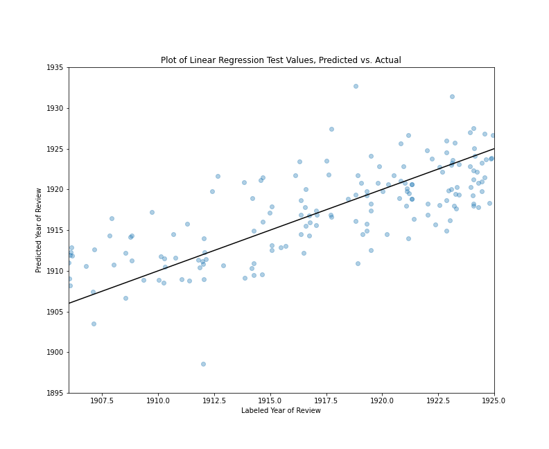
Plot of Linear Regression Test Values, Predicted vs. Actual
If you look closely at this image, you’ll notice a few things. First, there are several extreme values outside the 1906-1924 range (12 values equal to or greater than 1925 and three values equal to or less than 1906.) Focusing on the reviews published between 1906 and 1911, the predictions tend to have positive residuals, which means the model tends to predict that they are from later years. Looking at the reviews published between 1918 and 1926, the predictions tend to have negative residuals, which means the model tends to predict that they are from earlier years. Reviews published between 1912 and 1917 tends to have a more even mix of positive and negative residuals. That said, there are numerous values above and below the line in all ranges, and there is no sign of any large bias, but rather a model that tends to make predictions marginally closer to the middle range of the data, which helps explain our relatively low r² value. Overall, the majority of values are relatively close to the line where the residuals equal zero. (About 78% of the predictions have residuals between -5 and 5, and about 22% of the predictions are off by more than five years in one direction or the other.)
Some Brief Remarks on F-Statistics
Depending on the context and scholarly discipline, a metric called an F-Statistics can be a crucial aspect of assessing a linear regression model. With multiple linear regression, an F-test evaluates the statistical significance of the independent variables. Like many statistical tests of significance, it computes both a test statistic and a p-value. In this case, it tests against the null hypothesis that the independent variable coefficients are zero; or, put another way, that the predictor variables provide no real information about the value of the thing we are trying to predict. With any isolated sample of data, there is a possibility that the observed effect is just a coincidence so this statistical test, like others, attempt to use the sample size and the magnitude of the observed effect as factors in assessing how likely one might be to end up with this kind of sample if the true coefficients were zero. Generally speaking, if the model is not statistically significant (p-value less than 0.05), the r² score cannot be considered meaningful.32 In our case, using an F-Statistic as a performance metric wouldn’t be meaninigful because we have used F-Statistic p-values to select features.
Step 10: Examine Model Intercept and Coefficients
Now that we have assessed the performance of our model and validated the assumptions of linear regression, we can look at the intercept and coefficients. Remember, the intercept tells us what our Y value will be when X equals zero, and coefficients give us the slope or rise-over-run multiplier for each feature. In our lr model, the intercept can be accessed with the code lr.intercept_. Our intercept is about 1913.44 so, if we had a review with none of our selected features in it, the predicted date would be 1913.44.
However, for most (and hopefully all) of our predictions, we should have some non-zero TF-IDF scores for our features. For each feature, we generate our prediction by multiplying the TF-IDF value by its coefficient and then adding all the products together with the intercept. For example, if we had a book review with only two of our words in it, with the TF-IDF scores of 0.8 and 0.5 respectively, and coefficients of 25 and -18 respectively, our equation would look like this:
predicted_date = (0.8*25) + (0.5*-18) + 1913.44
which is equivalent to …
predicted_date = (20) + (-9) + 1913.44
and is also equivalent to …
predicted_date = 1924.44
The closer any given coefficient is to zero, the less influence that term will have on the final prediction. If any of our coefficients or TF-IDF values are exactly zero, that feature will have no influence in either direction. As a result, it can be illuminating to look at the kind of features with very high or low coefficients.
To accomplish this goal, we will make a DataFrame of terms and their coefficient scores. DataFrames are useful for these types of lists because they can be sorted and filtered easily, and they can be quickly exported into a variety of file formats, including CSV and HTML.
features = SelectKBest(f_regression, k=3500).fit(Z, date_labels)

selected = features.get_support()

features_df = pd.DataFrame()
features_df['term'] = v.feature_names_
features_df['selected'] = selected
features_df = features_df.loc[features_df['selected'] == True]
features_df['coef'] = lr.coef_

coefficients = features_df.sort_values(by='coef', ascending=False).reset_index(drop=True)
In this block of code, we begin by backing up to the feature selection stage and run a fit method instead of fit_transform so that we can line up the selected features with the names of the terms from our vocabulary. We can then use the get_support() method to return a list of True or False values for all 10,000 terms in our DictVectorizer instance. The True and False values here represent whether a given term was selected by the SelectKBest method. The output of get_support() is already in the same order as v.feature_names_, so we don’t need to do anything to align these two lists. Instead, we can create an empty pandas DataFrame, create a column of all 10,000 features names, and create a second column of all our True and False values. We can then use the loc() method to filter out all the features with False values. The resulting DataFrame has 3,500 rows, and the original order has been preserved, so this list is in the same order has the coefficient values in lr.coef_. We create a new column in our DataFrame for these coefficients and, finally, we sort the entire DataFrame by coefficient values, with the largest coefficient on top. After these steps are complete, we can browse the top 25 terms and coefficients with one line of code:
coefficients.iloc[0:25]
If you have followed the steps above, your top 25 coefficient output should look like this:
| index | term | selected | coef |
|---|---|---|---|
| 0 | today | TRUE | 48.73025541 |
| 1 | hut | TRUE | 37.95476112 |
| 2 | action | TRUE | 32.7580998 |
| 3 | expansion | TRUE | 32.22799018 |
| 4 | di | TRUE | 26.94660532 |
| 5 | paragraphs | TRUE | 26.59646481 |
| 6 | recounted | TRUE | 25.73118544 |
| 7 | deemed | TRUE | 25.58949141 |
| 8 | paragraph | TRUE | 25.4695864 |
| 9 | victorian | TRUE | 25.43889262 |
| 10 | eighteenth | TRUE | 24.96393149 |
| 11 | bachelor | TRUE | 24.69907017 |
| 12 | feeling | TRUE | 24.28307742 |
| 13 | garibaldi | TRUE | 24.18361705 |
| 14 | interpreter | TRUE | 24.04869859 |
| 15 | continued | TRUE | 24.03201786 |
| 16 | hot | TRUE | 23.64065207 |
| 17 | output | TRUE | 23.53388803 |
| 18 | living | TRUE | 23.38540528 |
| 19 | emma | TRUE | 23.30372737 |
| 20 | renewed | TRUE | 23.28669294 |
| 21 | hence | TRUE | 23.10776443 |
| 22 | hoy | TRUE | 23.01967989 |
| 23 | par | TRUE | 23.01131685 |
| 24 | review | TRUE | 22.92900629 |
When it comes to interpreting these top scoring coefficients, it is important to bear in mind that term lists like these will stir possibilities in the mind of the reader, but the patterns causing these terms to become good predictors may not be the patterns you are noticing, and they might be the result of interpretative noise rather than signal.
From this list, for example, we might wonder if emma is associated with more recently published book reviews because Jane Austen’s Emma enjoyed a resurgence, or perhaps the name Emma was just becoming more popular over time. However, if we look more closely at our corpus, we can discover that at least one of our reviews refers to English spiritualist Emma Hardinge Britten, one is a reference to Emma Watson from Jane Austen’s The Watsons, and one is a review of a book about Queen Wilhelmina, whose mother was Emma of Waldeck and Pyrmont. With single-word coefficients, a mix of various fictional characters, book reviewers, authors, and other names mentioned in review could suggest a trend that doesn’t exist.
To add to our list of caveats, let’s remember that our original feature selection strategy first isolated the top 10,000 words in the corpus by frequency, and then culled that list to 3,500 terms using p-values from F-tests on TF-IDF transformed term scores. What’s more, a high degree of multicollinearity probably means that the specific rankings of coefficients are not meaningful.
Regression coefficients with this kind of analysis, then, are best viewed as the starting point for further research rather than the end of a trail. On the other hand, the fact that words like review, paragraph, paragraphs, and victorian are associated with later reviews raises some interesting questions that one might pursue. Did reviews become more self-referential over time? Was there an increase in books on the Victorian Age as the era became more distant?
In turn, we can look more closely at terms most associated with earlier book reviews. Remember, coefficients at or near zero are basically unimportant to the value, but coefficients at either extreme–positive or negative–are exerting the most influence on our predictions. Positive coefficient scores will tend to make the predicted value larger (i.e. a later date) and negative coefficient scores will tend to make the predicted value smaller (i.e. an earlier date). Just as we did with the top 25 coefficients, we can view the 25 lowest coefficient values with a single iloc statement:
coefficients.iloc[-25:]
If you’re following along, the output of this line of code should look like this:
| index | term | selected | coef |
|---|---|---|---|
| 3475 | mitchell | TRUE | -23.7954173 |
| 3476 | unpublished | TRUE | -23.8369814 |
| 3477 | imported | TRUE | -23.88409368 |
| 3478 | careless | TRUE | -23.93616947 |
| 3479 | strange | TRUE | -24.34135893 |
| 3480 | condemnation | TRUE | -24.43852897 |
| 3481 | destroy | TRUE | -24.75801894 |
| 3482 | addressed | TRUE | -24.84150245 |
| 3483 | strong | TRUE | -24.87008756 |
| 3484 | hunted | TRUE | -24.971894 |
| 3485 | presumably | TRUE | -25.1690956 |
| 3486 | delayed | TRUE | -25.64993146 |
| 3487 | estimated | TRUE | -25.76258457 |
| 3488 | unnecessary | TRUE | -26.71165398 |
| 3489 | reckless | TRUE | -27.0190841 |
| 3490 | painter | TRUE | -27.38461758 |
| 3491 | questioned | TRUE | -27.4071934 |
| 3492 | uncommon | TRUE | -27.9644468 |
| 3493 | cloth | TRUE | -28.06872431 |
| 3494 | salon | TRUE | -28.37312216 |
| 3495 | enhance | TRUE | -31.65955902 |
| 3496 | establishing | TRUE | -31.78036166 |
| 3497 | capt | TRUE | -31.82279355 |
| 3498 | discussion | TRUE | -32.60202105 |
| 3499 | appreciation | TRUE | -34.41473242 |
Note that, for this DataFrame, the lowest coefficients (and therefore mostnimformative to the model) are at the bottom of the list, meaning that terms like appreciation, discussion, and capt are more suggestive of an earlier publication date than enhance or salon. When it comes to interpreting these term coefficients, all the caveats from above are applicable. Nevertheless, again we see some terms that raise questions. Was the word unpublished associated with reviews of earlier years because unpublished books were more likely to be reviewed? Does the word appreciation refer to the genre known as ‘an appreciation’ and, if so, were these more common at the turn of the century? Does the presence of the term uncommon in some reviews suggest the declining use of uncommon as a compliment meaning ‘remarkably great’ or ‘exceptional in kind or quality’, especially when describing a person’s moral character?33 Each of these questions is one of many threads we might pull.
Now move on to Logistic Regression analysis with scikit-learn.
End Notes
-
Atack, Jeremy, Fred Bateman, Michael Haines, and Robert A. Margo. “Did railroads induce or follow economic growth?: Urbanization and population growth in the American Midwest, 1850–1860.” Social Science History 34, no. 2 (2010): 171-197. ↩
-
Cosmo, Nicola Di, et al. “Environmental Stress and Steppe Nomads: Rethinking the History of the Uyghur Empire (744–840) with Paleoclimate Data.” Journal of Interdisciplinary History 48, no. 4 (2018): 439-463, https://muse.jhu.edu/article/687538. ↩
-
Underwood, Ted. “The Life Cycles of Genres.” Journal of Cultural Analytics 2, no. 2 (May 23, 2016), https://doi.org/10.22148/16.005. ↩
-
Broscheid, A. (2011), Comparing Circuits: Are Some U.S. Courts of Appeals More Liberal or Conservative Than Others?. Law & Society Review, 45: 171-194. ↩
-
Lavin, Matthew. “Gender Dynamics and Critical Reception: A Study of Early 20th-Century Book Reviews from The New York Times.” Journal of Cultural Analytics, 5, no. 1 (January 30, 2020), https://doi.org/10.22148/001c.11831. Note that, as of January 2021, the New York Times has redesigned its APIs, and the
nyt_ids listed inmetadata.csvandmeta_cluster.csvno longer map to ids in the API. ↩ -
See Diabetes Data https://www4.stat.ncsu.edu/~boos/var.select/diabetes.html, The Scikit-Learn Development Team. Linear Regression Example, https://scikit-learn.org/stable/auto_examples/linear_model/plot_ols.html, and Bradley Efron. Trevor Hastie. Iain Johnstone. Robert Tibshirani. “Least angle regression.” Annals of Statistics 32 (2) April 2004: 407-499, https://doi.org/10.1214/009053604000000067. ↩
-
The Scikit-Learn Development Team. 7.1 Toy datasets, https://scikit-learn.org/stable/datasets/toy_dataset.html. ↩
-
University of Southern California Libraries. Research Guides: Independent and Dependent Variables, https://libguides.usc.edu/writingguide/variables. ↩
-
Ibid. ↩
-
The University of Texas at Austin. Statistics Online Support: Variable Types, http://sites.utexas.edu/sos/variables/. ↩
-
Jarausch, Konrad H., and Kenneth A. Hardy. Quantitative Methods for Historians: A Guide to Research, Data, and Statistics. 1991. UNC Press Books, 2016: 122. ↩
-
Bruce, Peter, Andrew Bruce, and Peter Gedeck. Practical Statistics for Data Scientists: 50+ Essential Concepts Using R and Python. O’Reilly Media, Inc., 2020: 148. ↩
-
Jarausch and Hardy, 122. ↩
-
See The Pandas Development Team, Merge, join, concatenate and compare, https://pandas.pydata.org/pandas-docs/stable/user_guide/merging.html for differences among merge, join, concatenate, and compare operations. ↩
-
See also The Pandas Development Team, pandas.concat, https://pandas.pydata.org/pandas-docs/stable/reference/api/pandas.concat.html. ↩
-
See Matthew J. Lavin, “Analyzing Documents with TF-IDF,” Programming Historian 8 (2019), https://doi.org/10.46430/phen0082. ↩
-
See The Scikit-Learn Development Team, sklearn.model_selection.train_test_split, https://scikit-learn.org/stable/modules/generated/sklearn.model_selection.train_test_split.html. ↩
-
See SciPy, Sparse matrices (scipy.sparse), https://docs.scipy.org/doc/scipy/reference/sparse.html for documentation on sparse matrices and NumPy, Data types, https://numpy.org/doc/stable/user/basics.types.html for documentation on NumPy’s
float64class, and The Pandas Development Team, pandas.Series, https://pandas.pydata.org/pandas-docs/stable/reference/api/pandas.Series.html for documentation on pandas’Seriesclass. ↩ -
See The Scikit-Learn Development Team, Metrics and scoring: quantifying the quality of predictions https://scikit-learn.org/stable/modules/model_evaluation.html#r2-score and sklearn.metrics.r2_score, https://scikit-learn.org/stable/modules/generated/sklearn.metrics.r2_score.html. ↩
-
Note that the scikit-learn
r2()function may return a slightly different value than ther_square_scratchfunction, as there are differences in precision between NumPy’s mathematical operations (used by scikit-learn) and standard Python (used by me). ↩ -
The Scikit-Learn Development Team, sklearn.metrics.r2_score, https://scikit-learn.org/stable/modules/generated/sklearn.metrics.r2_score.html. ↩
-
Drost, Ellen A. “Validity and Reliability in Social Science Research” Education Research and Perspectives 38.1 (2011): 105-123. 114. https://www3.nd.edu/~ggoertz/sgameth/Drost2011.pdf ↩
-
Ibid., 114. ↩
-
Ibid., 106, 114-120. Statistical conclusion validity is concerned with “major threats” to validity such as “low statistical power, violation of assumptions, reliability of measures, reliability of treatment, random irrelevancies in the experimental setting, and random heterogeneity of respondents” (115). Internal validity “speaks to the validity of the research itself” (115). Construct validity “refers to how well you translated or transformed a concept, idea, or behaviour – that is a construct – into a functioning and operating reality, the operationalisation” (116). External validity relates to generalizing “to other persons, settings, and times” with different concerns for generalizing “to well-explained target populations” versus generalizing “across populations” (120). ↩
-
Nisbet, Robert, John Elder, and Gary Miner. Handbook of Statistical Analysis and Data Mining Applications. Academic Press, 2009: 8. ↩
-
Schroeder, Larry D., David L. Sjoquist, and Paula E. Stephan. Understanding Regression Analysis: An Introductory Guide. SAGE Publications, 2016: 72. ↩
-
Ibid. ↩
-
Nisbet et. al., 74. ↩
-
Fox, John. Regression Diagnostics: An Introduction. SAGE, 1991: 252-255. ↩
-
Gentzkow, Matthew, Bryan Kelly, and Matt Taddy. “Text as Data.” Journal of Economic Literature 57, no. 3 (September 2019): 535–74. https://doi.org/10.1257/jel.20181020. ↩
-
See Feinstein, Charles H. and Mark Thomas, Making History Count: A Primer in Quantitative Methods for Historians. Cambridge University Press, 2002: 309-310. ↩
-
Ibid., 269-272. ↩
-
Oxford University Press. “uncommon, adj. (and adv.)”. OED Online. 2022. Oxford University Press. https://www.oed.com/view/Entry/210577. ↩