
Contents
- Introduction
- Lesson Goals
- Prerequisites
- Packages for Temporal Network analysis
- Obtaining Your Data
- Static Visualizations
- Beyond the Hairball: Dynamic Network Metrics
- Conclusion
- Further reading
- References
Introduction
If you are reading this tutorial, you might already have some experience modeling humanities data as a network. Perhaps you are a historian of religion researching Quaker correspondence networks, in which the nodes represent writers and recipients of letters, and the edges of a network represent epistolary exchanges. Or perhaps you are a historian of art studying a network made up of print designers and engravers, with connections derived from their collaborations on prints. You have probably visualized your static network, and analyzed it, but you may still feel that something is missing or not quite right. Perhaps the network looks larger and more robust than it felt to you as you were piecing it together from your archival sources, or perhaps the centrality measurements of your nodes don’t make much sense when you think about the actual historical circumstances in which they existed.
The reality is that most historical networks change over time. At certain points they may grow, or shrink, or dissolve completely. Actors or objects enter and exit these networks over the course of their existence. People or things may occupy highly central roles for a brief period of time – perhaps a day, a year, or a decade – but they rarely begin or end their existence within a network in such positions. Wouldn’t it be great if you could reflect these changes and developments in your visualization and analysis of a network?
Temporal Network Analysis, also known as Temporal Social Network Analysis (TSNA), or Dynamic Network Analysis (DNA), might be just what you’re looking for.
Temporal Network Analysis is still a pretty new approach in fields outside epidemiology and social network analysis. This tutorial introduces methods for visualizing and analyzing temporal networks using several libraries written for the statistical programming language R. With the rate at which network analysis is developing, there will soon be more user friendly ways to produce similar visualizations and analyses, as well as entirely new metrics of interest. For these reasons, this tutorial focuses as much on the principles behind creating, visualizing, and analyzing temporal networks (the “why”) as it does on the particular technical means by which we achieve these goals (the “how”). It also highlights some of the unhappy oversimplifications that historians may have to make when preparing their data for temporal network analysis, an area where our discipline may actually suggest new directions for temporal network analysis research.
One of the most basic forms of historical argument is to identify, describe, and analyze changes in a phenomenon or set of phenomena as they occur over a period of time. The premise of this tutorial is that when historians study networks, we should, insofar as it is possible, also be acknowledging and investigating how networks change over time.
Lesson Goals
In this tutorial you will learn:
-
The types of data necessary to model a temporal network
-
How to visualize a temporal network using the NDTV package in R
-
How to quantify and visualize some important network-level and node-level metrics that describe temporal networks using the TSNA package in R
Prerequisites
This tutorial assumes that you have:
-
a basic familiarity with static network visualization and analysis, which you can get from excellent tutorials on the Programming Historian such as From Hermeneutics to Data to Networks: Data Extraction and Network Visualization of Historical Sources and Exploring and Analyzing Network Data with Python
-
RStudio with R version 3.0 or higher
-
A basic understanding of how R can be used to modify data. You may want to review the excellent tutorial on R Basics with Tabular Data.
Packages for Temporal Network analysis
As you follow along with the tutorial, I recommend entering your code into a new R script, which you can save and edit as you work. You can run the current line or selection from this script using a keyboard shortcut (Ctrl+Enter on Windows and Linux, Command+Enter on a Mac).
In this tutorial we’ll make use of two packages for temporal network analysis. The first, and most important of these, is the tsna package. Short for Tools for Temporal Social Network Analysis, tsna extends the tools of the sna package for for modeling and analyzing longitudinal (a fancy for temporal) networks.
The second package, ndtv, was built to visualize temporal networks. Short for Network Dynamic Temporal Visualizations, ndtv renders temporal network data as movies, interactive animations, or other representations of changing relational structures and attributes.
Both of these packages extend and depend on the networkDynamic package, which provides a robust data structure for storing and manipulating temporal network data. It will be automatically installed when you install one of the other two packages, so don’t worry about installing it individually. Mac users take note: to properly install these packages, you may need to install the Xcode command line developer tools if you haven’t already.
Use the install.packages() function as so:
install.packages("sna")
install.packages("tsna")
install.packages("ndtv")
To make sure these packages are installed and loaded when you run your R script, use the library() function at the top of your script:
library(sna)
library(tsna)
library(ndtv)
Obtaining Your Data
Starting Static
Let’s say you already have a static network based on an archive of epistolary exchanges or artistic collaborations or enrollment in nineteenth century culinary school courses. Whatever the content of your static network is, we can think of its core data as consisting of two parts:
-
a node list, which contains every node (or vertex – terms that I will use interchangeably throughout this tutorial)
-
an edge list, which contains every edge between the nodes1
In order to keep this tutorial from getting too abstract, I’ll follow a concrete example from start to finish. This sample data describes collaborations between French Gothic illuminated manuscript workshops between 1260 and 1320.2 The node list for this data is just a big list of workshops. The names of these workshops aren’t too important. In a few cases a colophon (a bit of text at the end of a manuscript briefly describing the circumstances of its production) mentions the name of the illuminator. Most of the time, however, they are assigned by modern scholars based on the city or region where a workshop was active, or a famous manuscript that it produced.
All of the R libraries in this tutorial assume that your network is unimodal – that is, that all of the nodes are the same type of thing, and all of the edges are too. As Scott Weingart has pointed out, historians frequently begin with multimodal or bimodal data. If you want to produce meaningful quantitative measurements of your network using most available tools, you will have to convert (or “project”) a bimodal network into unimodal data. The sample data for this tutorial is no exception. It started out as list of workshops and the manuscripts to which they contributed. First, I modeled this data as a bimodal network consisting of workshops and manuscripts. Then I projected that bimodal network into a unimodal network, in which each node represents an illuminator or workshop.3 Each edge was produced from a manuscript or group of manuscripts to which two or more workshops contributed. For this reason, sometimes one manuscript can appear as multiple edges, and one edge can represent multiple manuscripts.
The difference between a static network and a temporal one is the amount of information contained in the node and edge lists. In order to convert this static network into a temporal one, you need to add temporal information to these two lists. Basically, we need to supply a span of time that represents the period in which each edge and each node exists.
Edge Lists
An undirected edge list must contain three columns of data: a unique identifier for the edge, a source node (one of the workshops involved), and a target node (another workshop involved) for each edge. Something like this:
| edge.id | tail | head |
|---|---|---|
| 1 | 1 | 12 |
| 2 | 2 | 5 |
| 3 | 2 | 17 |
| . | . | . |
| 142 | 97 | 73 |
In addition to these three pieces of information, a temporal edge list must contain at the very minimum two additional pieces of information: when a link comes into existence, also known as the onset of the edge, and when the edge disappears, or the terminus. The NDTV and TSNA libraries that we are using throughout this tutorial will expect your data to include an onset, terminus, tail, head, and edge id. Depending on how you conceptualize your network, the onset and terminus might be relatively close together, representing the time span of a single event that connects two nodes, or quite far apart, representing the beginning and end of a series of events that represent a relationship. For our manuscript workshops, the temporal edge list looks like this:
| onset | terminus | tail | head | onset.censored | terminus.censored | duration | edge.id |
|---|---|---|---|---|---|---|---|
| 1300.0 | 1301.0 | 10 | 11 | FALSE | FALSE | 1 | 1 |
| 1300.0 | 1301.0 | 10 | 12 | FALSE | FALSE | 1 | 2 |
| 1320.0 | 1321.0 | 10 | 30 | FALSE | FALSE | 1 | 3 |
| . | . | . | . | . | . | . | . |
| 1319.0 | 1320.0 | 99 | 100 | FALSE | FALSE | 1 | 108 |
The first collaboration in the list took place between workshops 10 and 11 between 1300 and 1301, and lasted one year (we don’t really know how long it took these two workshops to produce this manuscript together, this is an approximation), and so on. You might be scratching your head about the onset.censored and terminus.censored columns here. In temporal network analysis, censoring is a way of ignoring the start or end of a given edge or node. This ability to ignore the onset or terminus can be useful for modeling specific types of temporal networks, creating cumulative visualizations, or debugging your code, among other things, but for this tutorial we won’t be censoring anything.
Node Lists
In most static network analysis, a node list is just a simple list of all of the things that are connected. It is a simple list of the identification numbers for each node.
| node.id |
|---|
| 1 |
| 2 |
| 3 |
| . |
| 106 |
In a temporal network, however, actors and objects enter and exit the network over time. Our workshops of illuminators might be churning out beautiful books for two, five, or even thirty two and a half years. In order to reflect the emergence and dispersal of these workshops, we need a onset (starting point), terminus (end point), and duration for each of them. The R packages that we are using will expect that data to look like this:
| onset | terminus | vertex.id | onset.censored | terminus.censored | duration |
|---|---|---|---|---|---|
| 1280.0 | 1311.0 | 1 | FALSE | FALSE | 31 |
| 1288.5 | 1311.0 | 2 | FALSE | FALSE | 22.5 |
| 1257.5 | 1290.0 | 3 | FALSE | FALSE | 32.5 |
| . | . | . | . | . | . |
| 1267.0 | 1277.0 | 106 | FALSE | FALSE | 10.0 |
Here, the second workshop becomes active around 1288, and ceases to collaborate around the year 1311, giving them a “life span” of about 22.5 years. Because we don’t have archival records that document when each workshop was formed or dispersed, all three of these numbers are approximations based on the dates associated with their earliest and latest collaborative manuscripts.
Making the Hard Choices: Translating Historical Data into TNA Data
Modeling medieval manuscript production as a temporal network involves a lot of approximations. In this respect, it’s actually pretty typical of the kinds of choices that historians have to make when modeling historical events or processes as dynamic networks. Scholars must make a series of choices to mold even relatively straightforward historical data into a form that temporal network analysis tools can take as input.
If you are studying a correspondence network, you will need to decide whether the onset and terminus should represent the beginning and end of a series of exchanges between two people, or the beginning and end of a single exchange. If you are interested in individual letters, the onset could theoretically represent the moment a letter was begun, completed, or sent, while the terminus could represent the moment it was received or read. You may only have information about the date on which a letter was written, which would have to serve as both the onset and terminus.
As historians, we can only be as specific and consistent as our sources allow. A temporal network may more closely reflect the historical processes revealed in your sources than a static network, but in the big picture both are imperfect models. You will have to make considered choices about how to collapse some of the complexity and uncertainty inherent in your historical data. As you make these choices, you probably want keep notes about your decisions and reasoning to use in a methodology section, appendix, or footnote when presenting your conclusions.
Illuminated medieval manuscripts are about as messy as historical data gets. In a few cases the manuscripts are dateable to a single year by a colophon (a short note at the beginning or end of the text about the production of the manuscript). Art historians who have dedicated their entire careers to the study of these manuscripts may only feel certain enough to date these manuscripts to decade (for example, the 1290s) or even a span of several decades (ca. 1275-1300). For the purposes of this tutorial I created temporal data by averaging each of these time ranges and using that as the onset of each collaboration, and set the terminus of each collaboration for one year after the onset. This is not an ideal solution, but neither is it a totally arbitrary or unjustifiable choice.4
Static Visualizations
Now that we have a sense of where this temporal network data comes from and how it is structured, we can start to visualize and analyze it. First lets load up our network as a static edge list, which I’ll call PHStaticEdges with its associated vertex attributes, here called PHVertexAttributes. Download the static edgelist
and load it into R using the read.csv() call. Instead of remembering the path to the file, you can open a finder window that will let you visually navigate to the file using the file.choose() function:
# Import Static Network Data
PHStaticEdges <- read.csv(file.choose())
Then use the same function to load the vertex attributes into R.
PHVertexAttributes <- read.csv(
  file.choose(),
  stringsAsFactors = FALSE
)
Now that we’ve got our basic data into R, we can take a look at the network:
# Make and visualize our static network
thenetwork <- network(
  PHStaticEdges,
  vertex.attr = PHVertexAttributes,
  vertex.attrnames = c("vertex.id", "name", "region"),
  directed = FALSE,
  bipartite = FALSE,
  multiple = FALSE
)
plot(thenetwork)
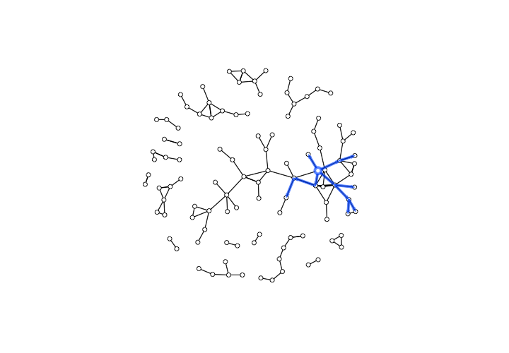
This should produce something like the following image – a tangle of nodes and edges that shows every workshop and collaboration from the sixty year period captured by our manuscript data:
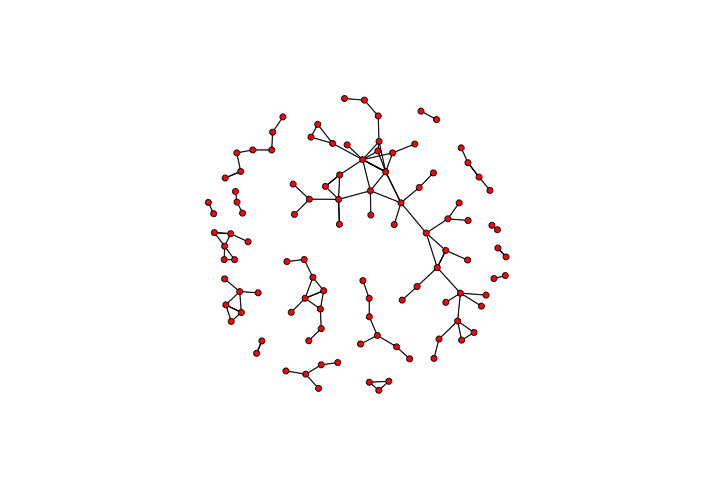
A static visualization of the network
Now let’s make our network dynamic. First, we have to import the temporal data associated with the dynamic edges and dynamic nodes.
# Import Temporal Network Data
PHDynamicNodes <- read.csv(file.choose())
PHDynamicEdges <- read.csv(file.choose())
Once we have imported this temporal data, we can add it to the static network we created above to form a dynamic network, using the networkDynamic() function:
# Make the temporal network
dynamicCollabs <- networkDynamic(
  thenetwork,
  edge.spells = PHDynamicEdges,
  vertex.spells = PHDynamicNodes
)
The networkDynamic() function takes as its first input the static network that we created above, and appends the temporal data for the vertices and nodes. It’s probably a good idea to check the dynamic network to make sure everything looks right using the network.dynamic.check() function.
# Check the temporal network
network.dynamic.check(dynamicCollabs)
If all went well, this will return as series of checks, all of which have the value TRUE.
Now that we have created a dynamic network, we can plot it to see how it looks!
# Plot network dynamic object as a static image
plot(dynamicCollabs)
This produces… something that looks disappointingly like the plot of our static network above.
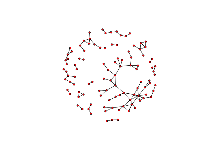
An anticlimactic visualization of the dynamic network
That’s because the plot() function produces a static image of the entire dynamic network. In order to see the actual temporal transformations within the network, we need to use a different visualization that breaks this network up into successive temporal slices. One way to do this is to use the filmstrip() function.
# Plot our dynamic network as a filmstrip
filmstrip(dynamicCollabs, displaylabels = FALSE)
Now we’re getting somewhere! This gives us a view of the network as it develops over time, taking snapshots at a few key moments over the course of its timespan.
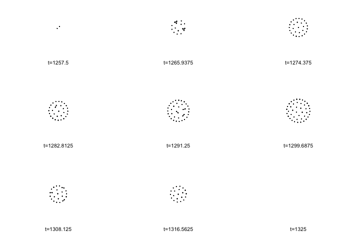
A filmstrip visualization of the dynamic network
Because collaborations between workshops are pretty rare, relatively speaking, this filmstrip view is too sparse to give us a good sense of how networks of collaborations emerge and change over time. To really see these changes, we’ll use an animation that shows a sliding interval of the sixty year period, and aggregates all of the collaborations within that interval.
Getting Animated
Although the historical phenomenon that we are modeling is continuous, most approaches to visualizing and analyzing temporal networks convert this continuous dynamic network into a series of many static networks, known as network slices, which represent the accumulated state of the network over a given span of time – 10 years, or 1 year, or 1 day. These slices can be connected together sequentially, like frames in a film.
Making an animation like this is a little complicated, so the NDTV package actually breaks up the math-y calculations behind the animation from the rendering of the animation itself. First, it computes the animation given a set of parameters that tell it when to start, stop, how much to incrementally advance between frames, and how much time we want each interval to aggregate. Depending on how large your network is, this function may take a long time to run.
# Calculate how to plot an animated version of the dynamic network
compute.animation(
  dynamicCollabs,
  animation.mode = "kamadakawai",
  slice.par = list(
    start = 1260,
    end = 1300,
    interval = 1,
    aggregate.dur = 20,
    rule = "any"
  )
)
Let’s break these settings down. There are a few different ways to it to compute the layout for our animation, so we have chosen a force-directed algorithm known as Kamada Kawai.5 We set the start and end times to the years 1260 and 1320, and the interval between animation frames at 1 year. Because the collaborations between workshops are infrequent and of relatively short durations (at least in our approximations), we aggregated the edges shown in each frame over a sizable chunk of time, in this case 20 years.
Once NDTV has computed the animation, it can generate a webpage with a rendering of this animation using the render.d3movie() function. As with the compute.animation() function above, this step can take a long time to finish processing depending on the size of the network.
# Render the animation and open it in a web brower
render.d3movie(
  dynamicCollabs,
  displaylabels = FALSE,
  # This slice function makes the labels work
  vertex.tooltip = function(slice) {
    paste(
      "<b>Name:</b>", (slice %v% "name"),
      "<br>",
      "<b>Region:</b>", (slice %v% "region")
    )
  }
)
This should generate a website with an interactive visualization of your temporal network and open it in your default browser. The RStudio console might show a bunch of warnings, but those just specify that if multiple values were present for vertex attributes, the render.d3movie() function used the earliest attribute for each vertex. If all went well, it looks like this:
The default labels are simply the identification number for each vertex, so we have turned those off. The vertex.tooltip parameter of this function might look a little scary, but basically it supplies each frame or “slice” of the animation with the correct tooltip information so we can see the name and region of each vertex if we click on it.
Beyond the Hairball: Dynamic Network Metrics
This animation works splendidly for our network of manuscript workshops because it’s small and collaborations at any given moment are pretty sparse. To compare different moments, however, quantifiable metrics for the network or for individual nodes may be more useful than animated visualizations.
We might want to know when collaborations between workshops appear over the duration of the data.
# Plot formation of edges over time
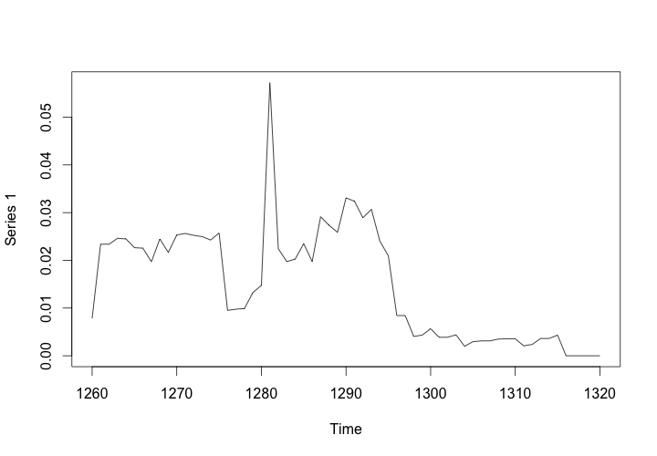
plot(tEdgeFormation(dynamicCollabs, time.interval = .25))
The graph should look like this:
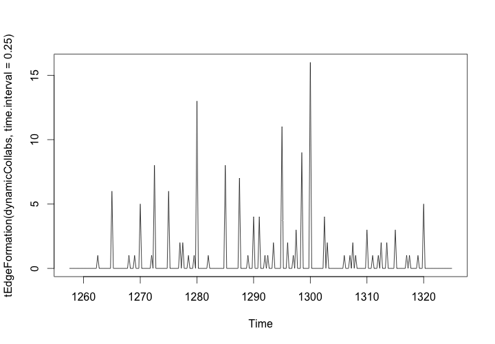
Edge Formation in the Workshop Network, 1260-1320
Our animation might give us an intuitive sense of that most edges are formed somewhere between 1280 and 1300, but this plot of the edge formation provides more concrete insights. By setting the interval of samples to every 6 months (0.5 years), we can see exactly when and how many collaborations occurred between workshops.
Changing Centrality
While not everything you can do with static network analysis is currently possible with the R packages for temporal network analysis, most of the common measurements of network properties are possible. Just like you can analyze centrality at the node level or network level in static network analysis, you can analyze how centrality changes over time with temporal network analysis. Rather than looking at the centrality of a workshop or illuminator over the sixty year period of our data, it might make sense to look at how the network level centralization changes year by year, or if your data is sparse like the manuscript data, within a twenty year rolling window of time.
# Calculate and graph the rolling betweenness centralization of the network
dynamicBetweenness <- tSnaStats(
  dynamicCollabs,
  snafun = "centralization",
  start = 1260,
  end = 1320,
  time.interval = 1,
  aggregate.dur = 20,
  FUN = "betweenness"
)
plot(dynamicBetweenness)
This will produce a graph of the rolling aggregated centralization of the network, showing how the betweenness centralization of the collaborative manuscript network peaks around the year 1280, and drops off around 1300.
Betweenness Centralization of the Workshop Network, 1260-1320
It is also possible to calculate and graph node-level metrics as they change over time using the tSnaStats() function, but this is very computationally intensive and will produce errors if nodes are appearing and disappearing from the network.
Thinking Temporally: Forward Reachable Sets
Adding a chronological component to static network measurements might be enough to convince you that temporal network analysis is worth the extra effort for your project. But temporal network analysis also allows us to analyze properties that only occur in temporal networks.
In a temporal network, because nodes and edges are popping in and out of existence all the time, it can be useful to know not only how many nodes can be reached from a given node at any specific time, but also how many nodes were or will be connected to a given node over the course of the network’s existence. These past and future groups are known as backward reachable sets and forward reachable sets, respectively.
The size of these sets adds important nuance to measurements of centrality – depending on whether a workshop came to occupy a central position in the network near the beginning or end of the period we’re observing, the actual impact it could have had on the larger community is completely different. It can be useful to think of this in epidemiological terms: someone who is infected with a disease relatively early in an epidemic could have a much bigger impact on its spread than someone who is infected relatively late.
For the purpose of analyzing our illuminated network workshops, we can ask which workshops could have had the largest impact on trends in manuscript production as a consequence of their own collaborations and the collaborations of the illuminators and workshops who collaborated with them, and so on. This group of all of the workshops and illuminators that they touched both directly and indirectly is known as a the forward reachable set of a node.
To calculate the size of the forward reachable sets of each node, we can use the tReach() function on our entire network. This function defaults to calculating the size of the forward reachable set of a given node, but to calculate the backward reachable set we simply specify direction = "bkwd" instead.
# Calculate and store the sizes of
# forward and backward reachable sets for each node
fwd_reach <- tReach(dynamicCollabs)
bkwd_reach <- tReach(dynamicCollabs, direction = "bkwd")
plot(fwd_reach, bkwd_reach)
This produces a graph of the sizes of the forward and backward reachable sets for each workshop or illuminator. From this graph, we can get a sense of who was in a position to have the biggest impact on the network based on their forward reach, and who was well connected to their predecessors based on their collaborations.
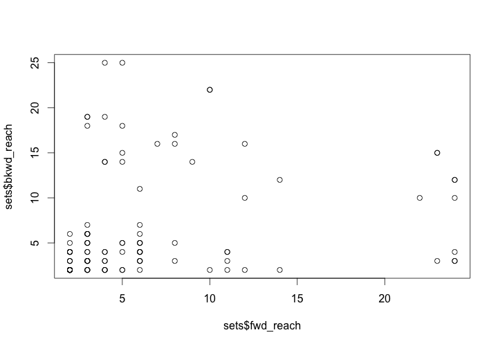
Size of forward and backward reachable sets for workshops/illuminators
We can also visualize these sets using the tPath() function to find the path that connects a given node to its forward or backward reachable set, and the plotPaths() function to graph it over a representation of the entire network. In the example below, we’ll choose a single workshop – that of the Hospitaller Master, selected by his vertex id number 3 – and visualize its forward reachable set.
# Calculate and plot the forward reachable paths
# of node number 3 (the Hospitaller Master)
HospitallerFwdPath <- tPath(
  dynamicCollabs,
  v = 3,
  direction = "fwd"
)
plotPaths(
  dynamicCollabs,
  HospitallerFwdPath,
  displaylabels = FALSE,
  vertex.col = "white"
)
This produces a visualization of the forward reach of the Hospitaller Master and his workshop based on the chronology of their collaborations.
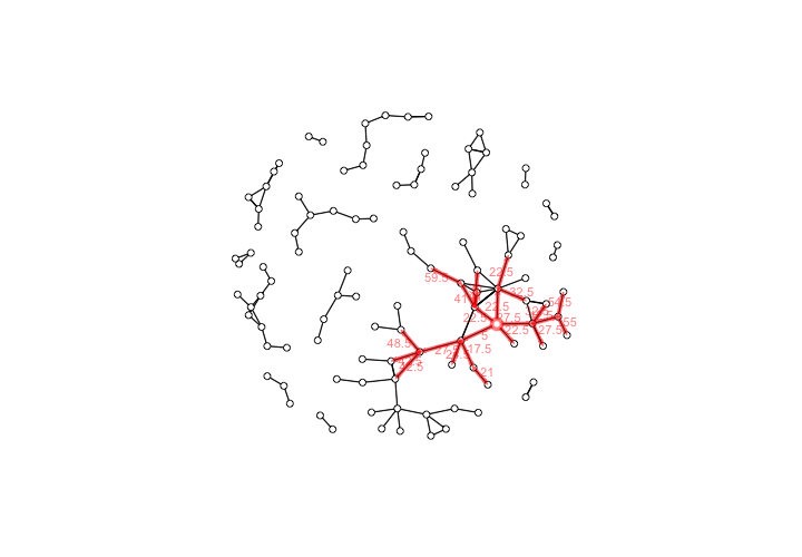
The forward reachable path of the Hospitaller Master, with elapsed time labels for edges
We can see that the Hospitaller Master was favorably positioned to have a sizable impact on the future of manuscript illumination in the region of Paris through his collaborative work. This potential for impact was due not only to his position within the network, but also to the chronology of the network’s development,
If the numeric labels that show the elapsed time of each collaboration bug you, you can make them transparent by adding edge.label.col = rgb(0,0,0,0), to the plotPaths() function call.
The forward reachable paths of the Hospitaller Master, without elapsed time labels for edges
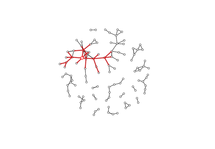
If, on the other hand, we are interested in the network of collaborations between workshops that set the stage for the emergence of the Hospitaller Master, we can look at his backward reachable set. Using tpath( again, we’ll use direction = "bkwd", and type = "latest.depart" to find the paths formed by earlier collaborative manuscripts. To visually distinguish this from his forward reach, we’ll use the path.col property to make the paths that trace his backward reach blue instead of red.
# Calculate and plot the backward reachable paths
# of node number 3 (the Hospitaller Master)
HospitallerBkwdPath <- tPath(
  dynamicCollabs,
  v = 3,
  direction = "bkwd",
  type = 'latest.depart'
)
plotPaths(
  dynamicCollabs,
  HospitallerBkwdPath,
  path.col = rgb(0, 97, 255, max=255, alpha=166),
  displaylabels = FALSE,
  edge.label.col = rgb(0,0,0,0),
  vertex.col = "white"
)
The result should be something like this:
The backward reachable paths of the Hospitaller Master
We might note that the Hospitaller Master’s backward reachable set was a group at the heart of the Parisian workshop community. Because this workshop was actively participating in collaborative productions from around 1260 to 1290, during the first half of the period under observation, it may not be entirely surprising that their forward reach is larger than their backward reach. Given the Hospitaller Master’s high centrality score, however, both of these sets may be smaller than expected.
Like the temporally inflected network metrics above, these forward and backward paths provide a counterpoint to static network metrics. In the case of medieval French illuminators, we might note that some workshops with relatively high centralities have small forward reachable sets but very large backward reachable sets. These illuminators were actively collaborating with other workshops during the last third of the period in question. This insight can help us contextualize any conclusions that we draw from their centrality.
If we had already observed certain features within the manuscripts produced by the Hospitaller Master and his collaborators, these sets might help us formulate and answer new questions about whether he was the source of innovative ideas or techniques, or played an important role in disseminating them. As always, it’s important to keep in mind that network metrics like measurements of centralization and reach represent potential for the transmission of ideas and concepts rather than transmission as such.6
Conclusion
Let’s take a step back and reflect on what we’ve learned. At this point, we have a sense of how temporal network data is structured and what kinds of decisions go into producing it. We’ve learned how to make both animated and static visualizations that show change in a network over time. We know how static network metrics like reach take on different properties in the context of temporal networks. We can graph the size of the forward and backward reach of each node, and visualize the paths through which these sets are constituted.
If there is one thing that I hope you will take away from this tutorial, it is the idea that adding temporal data to nodes and edges transforms a general social science tool into a powerful method for historical argument. Comparing network structures and metrics from one timeslice to another gives them historical significance that can be difficult, if not impossible, to discern in conventional static social network analysis.
This tutorial introduced only a few of the many tools and techniques made possible by temporal network analysis. One especially exciting area of this field is in dynamic simulations that model the transmission of something, for example a disease or an idea, among individuals within a given temporal network. If that sounds interesting, take a look at the EpiModel package or other tools created by epidemiologists to model diffusion within dynamic networks.
Depending on the historical data that you’re working with, temporal network analysis may offer important insights into how the properties of nodes, edges, and the overall network change over time. Whether or not you decide to make the leap to temporal network analysis, it is helpful to remember that networks of all kinds are complex historical phenomena that emerge, develop, transform beyond recognition, and disappear over the course of time.
Further reading
Maybe you made it through this tutorial but you are still more comfortable with a Graphical User Interface than a programming environment like RStudio. There are a few Gephi tutorials that introduce some of the same basic concepts:
-
Creating a simple dynamic network by Clément Levallois
-
Converting a network with dates into a dynamic network by Clément Levallois
-
Ken Cherven has a good overview of Dynamic Network Analysis with Gephi in his book Mastering Gephi Network Visualization (2015)
If you are hungry for more temporal network analysis with R, this tutorial by Skye Bender-deMoll explains additional functions and features of the packages used here. It served as my own guide to learning about temporal network analysis and formed the inspiration for the tutorial above.
You can also dive deeper into the documentation to learn more about the networkDynamic package, the TSNA package, and the NDTV package.
Finally, if Python is your preferred scripting language, you may want to look into DyNetx and NetworkX.
References
-
This same data can also be represented in other formats (an adjacency matrix, for example, or an adjacency list) but for the purpose of transforming static networks into dynamic ones, it can be easier to conceptualize and manipulate network data with node and edge lists. ↩
-
This data forms the core of an ongoing project that I’m working on with my colleague Maeve Doyle, who has helped shape and refine my thinking about temporal network analysis. It comes from a magnificent multivolume catalog of French Gothic Manuscripts written by Alison Stones. Stones, Alison. 2013. Gothic manuscripts: 1260-1320. London: Harvey Miller Publishers. ↩
-
Because you need to preserve temporal data associated with each edge, projecting a bimodal network into a unimodal one for temporal analysis is a little more complicated than static projection of a bimodal network. ↩
-
There are ways to figure out just how much variation in different network metrics will be lost as a consequence of this decision, although they are a bit complex to get into here. ↩
-
I am grateful to Rachel Starry for this reference, as well as her comments on a preliminary draft of this tutorial. Kamada, T., and S. Kawai. 1989. “An Algorithm for Drawing General Undirected Graphs.” Information Processing Letters 31.1: 7-15. ↩
-
I recommend Marten Düring’s excellent essay “How Reliable are Centrality Measures for Data Collected from Fragmentary and Heterogeneous Historical Sources? A Case Study,” which neatly demonstrates that historical actors who occupied central positions in social networks had the potential to use their connections or their control over the connections of others in unique ways, but they did not always have the motivation to do so. Düring, Marten. “How Reliable Are Centrality Measures for Data Collected from Fragmentary and Heterogeneous Historical Sources? A Case Study.” In The Connected Past. Challenges to Network Studies in Archaeology and History, edited by Tom Brughmans, Anna Collar, and Fiona Coward, 85–102. Oxford: Oxford Publishing, 2016. ↩