Contents
- Introduction
- About the case study
- Developing a coding scheme
- Visualize network data in Palladio
- The added value of network visualizations
- Other network visualization tools to consider
Introduction
Network visualizations can help humanities scholars reveal hidden and complex patterns and structures in textual sources. This tutorial explains how to extract network data (people, institutions, places, etc) from historical sources through the use of non-technical methods developed in Qualitative Data Analysis (QDA) and Social Network Analysis (SNA), and how to visualize this data with the platform-independent and particularly easy-to-use Palladio.
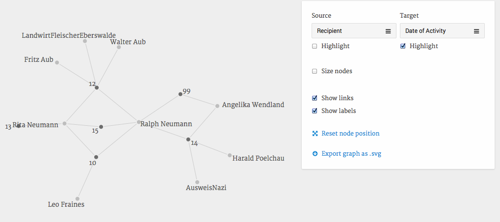
Figure 1: A network visualization in Palladio and what you will be able to create by the end of this tutorial.
The graph above shows an excerpt from the network of Ralph Neumann, particularly his connections to people who helped him and his sister during their life in the underground in Berlin 1943-1945. You could easily modify the graph and ask: Who helped in which way? Who helped when? Who is connected to whom?
Generally, network analysis provides the tools to explore highly complex constellations of relations between entities. Think of your friends: You will find it very easy to map out who are close and who don’t get along well. Now imagine you had to explain these various relationships to somebody who does not know any of your friends. Or you wanted to include the relationships between your friends’ friends. In situations like this language and our capacity to comprehend social structures quickly reach their limits. Graph visualizations can be means to effectively communicate and explore such complex constellations. Generally you can think of Social Network Analysis as a means to transform complexity from a problem to an object of research. Often, nodes in a network represent humans connected to other humans by all imaginable types of social relations. But pretty much anything can be understood as a node: A film, a place, a job title, a point in time, a venue. Similarly, the concept of a tie (also called edge) between nodes is just as flexible: two theaters could be connected by a film shown in both of them, or by co-ownership, geographical proximity, or being in business in the same year. All this depends on your research interests and how you express them in form of nodes and relations in a network.
This tutorial can not replace any of the many existing generic network analysis handbooks, such as John Scott’s Social Network Analysis. For a great general introduction to the field and all its pitfalls for humanists I recommend Scott Weingart’s blog post series “Networks Demystified” as well as Claire Lemercier’s paper “Formal network methods in history: why and how?”. You may also want to explore the bibliography and event calendar over at Historical Network Research to get a sense of how historians have made use of networks in their research.
This tutorial will focus on data extraction from unstructured text and shows one way to visualize it using Palladio. It is purposefully designed to be as simple and robust as possible. For the limited scope of this tutorial it will suffice to say that an actor refers to the persons, institutions, etc. which are the object of study and which are connected by relations. Within the context of a network visualization or computation (also called graph), we call them nodes and we call the connections ties. In all cases it is important to remember that nodes and ties are drastically simplified models used to represent the complexities of past events, and in themselves do not always suffice to generate insight. But it is likely that the graph will highlight interesting aspects, challenge your hypothesis and/or lead you to generate new ones. Network diagrams become meaningful when they are part of a dialogue with data and other sources of information.
Many network analysis projects in the social sciences rely on pre-existing data sources or data that was created for the purpose of network analysis. Examples include email logs, questionnaires or trade relations which make it relatively easy to identify who is connected to whom and how. It is considerably more difficult to extract network data from unstructured text. This forces us to somehow marry the complexities of hermeneutics with the rigor of formal data analysis. The term “friend” might serve as an example: Depending on the context it can signify anything from an insult to an expression of love. Context knowledge and analysis of the text will help you identify what it stands for in any given case. A formal category system should represent the different meanings inasmuch detail as necessary for your purposes.
In other words, the challenge is to systematize text interpretation. Networks created from pre-existing data sets need to be considered within the context in which they were created (e.g. wording of questions in a questionnaire and selected target groups). Networks created from unstructured text pose challenges on top of this: interpretations are highly individual and depend on viewpoints and context knowledge.
About the case study
The case study I use for this tutorial is a first-person narrative of Ralph Neumann, a Jewish survivor of the Holocaust. You can find the text online. The coding scheme which I will introduce below is a simplified version of the one I developed during my PhD project on covert support networks during the Second World War. My research was driven by three questions: To what extent can social relationships help explain why ordinary people took the risks associated with helping? How did such relationships enable people to provide these acts of help given that only very limited resources were available to them? How did social relationships help Jewish refugees to survive in the underground?
In this project network visualisations helped me to discover hitherto forgotten yet highly important contact brokers, highlight the overall significance of Jewish refugees as contact brokers and generally to navigate through a total of some 5,000 acts of help which connected some 1,400 people between 1942 and 1945.
Developing a coding scheme
In visualizing network relationships, one of the first and most difficult challenges is to decide who should be part of the network and which relations between the selected actors are to be coded. It will probably take some time to figure this out and will likely be an iterative process since you will need to balance your research interests and hypotheses with the availability of information in your texts and represent both in a rigid and necessarily simplifying coding scheme.
The main questions during this process are: Which aspects of relationships between two actors are relevant? Who is part of the network? Who is not? Which attributes matter? What do you aim to find?
I found the following answers to these:
What defines a relationship between two actors?
Any action which directly contributed to the survival of persecuted persons in hiding. This included e.g. non-Jewish communists but excluded bystanders who chose not to denunciate refugees or mere acquaintances between actors (for lack of sufficient coverage in the sources). Actors were coded as either providers or recipients of an act of help independently of their status as refugees. There is no simple and robust way to handle ambiguities and doubt at the moment. I therefore chose to collect verifiable data only.
Who is part of the network? Who is not?
Anyone who is mentioned as a helper, involved in helping activities, involved in activities which aimed to suppress helping behaviour. In fact, some helping activities turned out to be unconnected to my case studies but in other cases this approach revealed hitherto unexpected cross-connections between networks.
Which types of relationships do you observe?
Rough categorizations of: Form of help, intensity of relationships, duration of help, time of help, time of first meeting (both coded in 6-months steps).
Which attributes are relevant?
Mainly racial status according to National Socialist legislation.
What do you aim to find?
A deeper understanding of who helps whom how, and discovery of patterns in the data that correspond to network theory. A highly productive interaction between my sources and the visualized data made me stick with this.
Note that coding schemes in general are not able to represent the full complexity of sources in all their subtleties and ambivalence. The purpose of the coding scheme is to develop a model of the relationships you are interested in. As such, the types of relations and the attributes are abstracted and categorized renditions of the complexities conveyed in the text(s). This also means that in many cases network data and visualizations will only make sense once reunited with their original context, in my case the primary sources from which I extracted it.
The translation of text interpretation into data collection has its roots in sociological Qualitative Data Analysis. It is important that you and others can retrace your steps and understand how you define your relations. It is very helpful to define them abstractly and to provide examples from your sources to further illustrate your choices. Any data you produce can only be as clear and coherent as your coding practices. Clarity and coherence increase during the iterative process of creating coding schemes and by testing it on a variety of different sources until it fits.
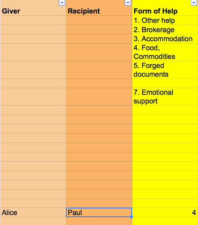
Figure 2: A first stab at the coding scheme
Figure 2 shows a snapshot with sample data of the coding scheme I used during my project. In this case Alice helps Paul. We can express this as a relation between the actors “Alice” and “Paul” which share a relation of the category “Form of Help”. Within this category we find the subcategory “4. Food, Commodities” which further describes their relation.
All major network visualization tools let you specify whether a network is directed like this one or undirected. In directed networks, relations describe an exchange from one actor to another, in our case this is “help”. By convention, the active nodes are mentioned first (in this case Alice) in the dataset. In a visualization of a directed network, you will see arrows going from one actor to another. Relations can also be reciprocal, for example when Alice helps Bob and Bob helps Alice.
Quite often, however, it doesn’t make sense to work with directionality, for example when two actors are simply part of the same organization. In this case the network should be undirected and would be represented by a simple line between the two actors.
I wanted to know how often actors gave help and how often they received it. I was particularly interested in the degree of Jewish self-help, which is why a directed network approach and the role of “Giver” and “Recipient” make sense. The third column in the coding scheme is optional and further describes the kind of relationship between Alice and Paul. As a category I chose “Form of Help” which reflects the most common ways in which support was given.
The categories and subcategories emerged during a long process of coding different types of texts and different types of support networks. During this process I learned, for example, which relevant forms of help are rarely described and therefore not traceable, such as the provision of support-related information. Expect having to adapt your coding scheme frequently in the beginning and brace yourself for re-coding your data a few times until it consistenly corresponds with your sources and interests.
As it stands, the coding scheme conveys the information that Alice provided food or other commodities for Paul, as indicated by the value 4 which corresponds to the subcategory “4. Food, Commodities” in the category “Form of Help”. Human relationships are however significantly more complex than this and characterized by different and ever-changing layers of relations. To an extent, we can represent some of this complexity by collecting multiplex relationships. Consider this sample sentence: “In September 1944 Paul stayed at his friend Alice’s place; they had met around Easter the year before.”
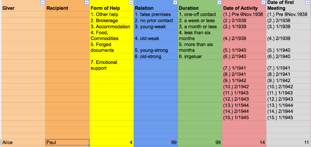
Figure 3: A representation of the sample sentence
The coding scheme in Figure 3 describes the relationships between helpers and recipients of help in greater detail. “Relation” for example gives a rough categorization of how well two actors knew each other, “Duration” captures how long an act of help lasted, “Date of Activity” indicates when an act of help occurred and “Date of first Meeting” should be self explanatory. The value “99” here specifies “unknown” since the sample sentence does not describe the intensity of the relationship between Alice and Paul in greater detail. Note that this scheme focuses exclusively on collecting acts of help, not on capturing the development of relationships between people (which were not covered in my sources). Explicit choices like this define the value of the data during analysis.
It is also possible to collect information on the actors in the network; so-called attribute data uses pretty much the same format. Figure 4 shows sample data for Alice and Paul.
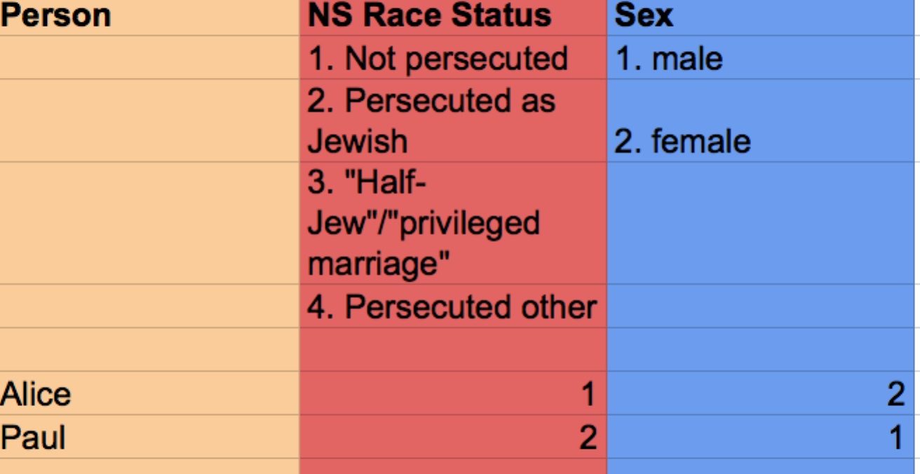
Figure 4: Sample attribute data
If we read the information now stored in the coding scheme we learn that Alice provided accommodation for Paul (“Form of Help”: 4), that we do not know how close they were (“Relation”: 99) or how long he stayed (“Duration”: 99). We do know however that this took place some time in the second half of 1944 (“Date of Activity”: 14) and that they had met for the first time in the first half of 1943 (“Date of first Meeting”: 11). The date of first meeting can be inferred from the words “around Easter the year before”. If in doubt, I always chose to enter “99” representing “unknown”.
But what if Alice had also helped Paul with emotional support (another subcategory of “Form of Help”) while he was staying with her? To acknowledge this, I coded one row which describes the provision of accommodation and a second below which describes the provision of emotional support. Note that not all network visualization tools will allow you to represent parallel edges and will either ignore the second act of help which occurred or try to merge the two relations. Both NodeXL and Palladio can handle this however and it is rumoured that a future release of Gephi will as well. If you encounter this problem and if none of the two tools are an option for you, I would recommend to set up a relational database and work with specific queries for each visualization.
The process of designing such a coding scheme forces you to become explicit about your assumptions, interests and the materials at your disposal, something valuable beyond data analysis. Another side effect of extracting network data from text is that you will get to know your sources very well: Sentences following the model of “Person A is connected to Persons B, C and D through relation type X at time Y” will probably be rare. Instead it will take close reading, deep context knowledge and interpretation to find out who is connected to whom in which way. This means that coding data in this way, will raise many questions and will force you to study your sources more deeply and more rigorously than if you had worked through them the “traditional” way.
Visualize network data in Palladio
Once you have come up with a coding scheme and encoded your sources you are ready to visualize the network relationships. First make sure that all empty cells are filled with either a number representing a type of tie or with “99” for “unknown”. Create a new copy of your file (Save as..) and delete the codes for the different categories so that your sheet looks something like Figure 5.
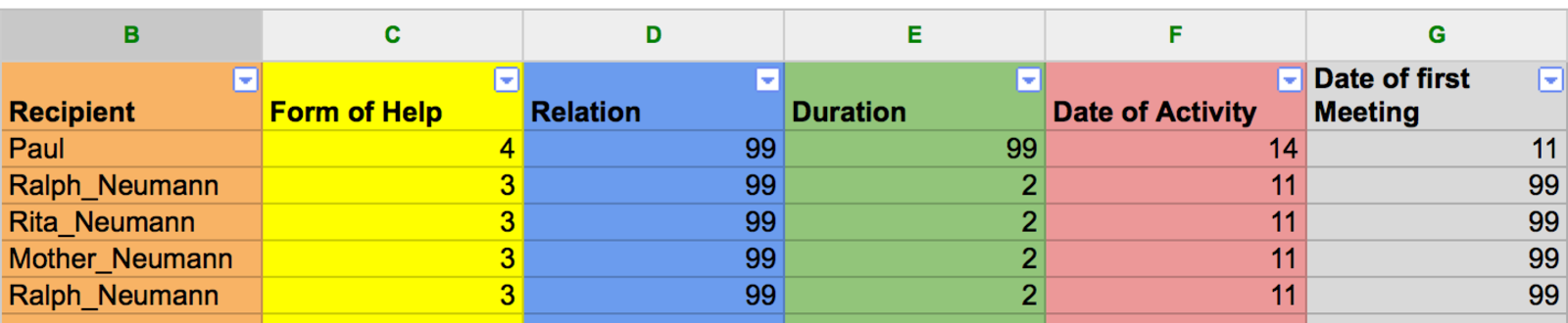
Figure 5: Sample attribute data ready to be exported for visualization or computation.
All spreadsheet editors let you export tables as either .csv (comma-separated values) or as .txt files. These files can be imported into all of the commonly used network visualization tools (see the list at the end of the tutorial). For your first steps however I suggest that you try out Palladio, a very easy-to-use data visualization tool in active development by Stanford University. It runs in browsers and is therefore platform-independent. Please note that Palladio, although quite versatile, is designed more for quick visualizations than sophisticated network analysis.
The following steps will explain how to visualize network data in Palladio but I also recommend that you take a look at their own training materials and explore their sample data. Here however I use a slightly modified sample dataset based on the coding scheme data table 1 - relations, data table 2 - attribute table, presented earlier (you can also download it and use it to explore other tools).
Step by Step:
1. Palladio. Go to http://hdlab.stanford.edu/palladio/.
2. Start. On their website click the “Start” button.
3. Load attribute data. From your data sheet, copy the sample data table 2 - attribute table, and paste it in the white section of the page, now click “Load”.
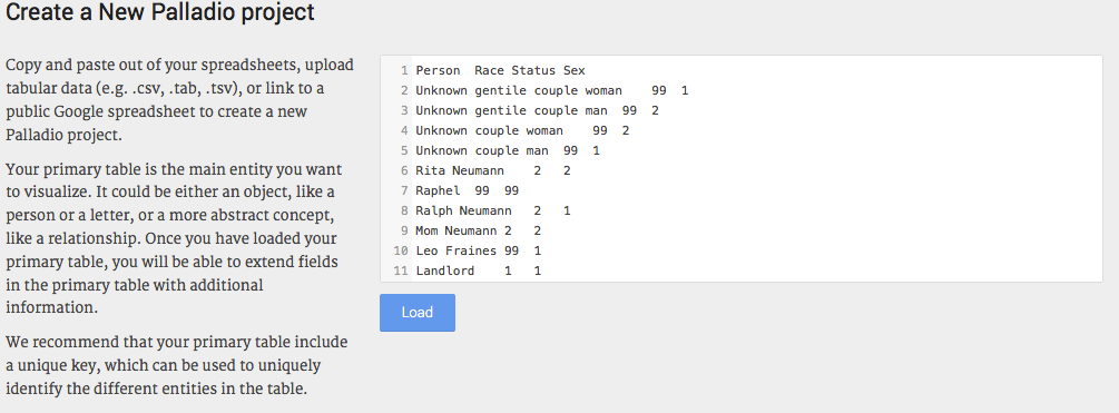
Figure 6: Loading attribute data into Palladio.
4. Edit attributes. Change the title of the table to something more meaningful, such as “People”. Now you see the columns “Person”, “Race Status” and “Sex” which correspond to the columns in the sample data. Next you need to make sure that Palladio understands that there are actions associated with the people you just entered in the database.
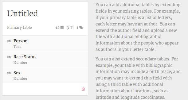
Figure 7: View of attribute data in Palladio.
5. Load relational data. To do this, click on “Person” and “Add a new table”. Now paste all the data table 1 - relations, in the appropriate field. Palladio expects unique identifiers to link the relational information to the actor attribute information. Make sure this lines up well and that you avoid any irritating characters such as “/”. Palladio will prompt you with error messages if you do. Click “Load data”, close the overlay window and go back to the main data overview. You should see something like this:
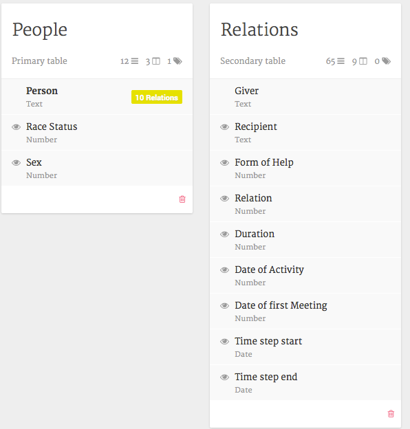
Figure 8: Loading relational data.
6. Link attributes and relations. Next, we need to explicitly link the two tables we created. In our case, peoples’ first- and last names work as IDs so we need to connect them. To do this click on the corresponding occurrences in the new table. In the sample files these are “Giver” and “Recipient”. Click on “Extension” (at the bottom) and select “People”, the table which contains all the people attribute information. Do the same for “Recipient”.
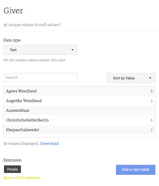
Figure 9: Linking People to Relations.
7. Identify temporal data. Palladio has nice time visualization features. You can use it if you have start and end points for each relation. The sample data contains two columns with suitable data. Click on “Time Step Start” and select the data type “Year or Date”. Do the same for “Time Step End” (Figure 10). The Palladio team recommends that your data is in the YYYY-MM-DD format, but my more abstract time steps worked well. If you were to load geographical coordinates (not covered by this tutorial but here: Palladio Simple Map Scenario) you would select the “Coordinates” data type.
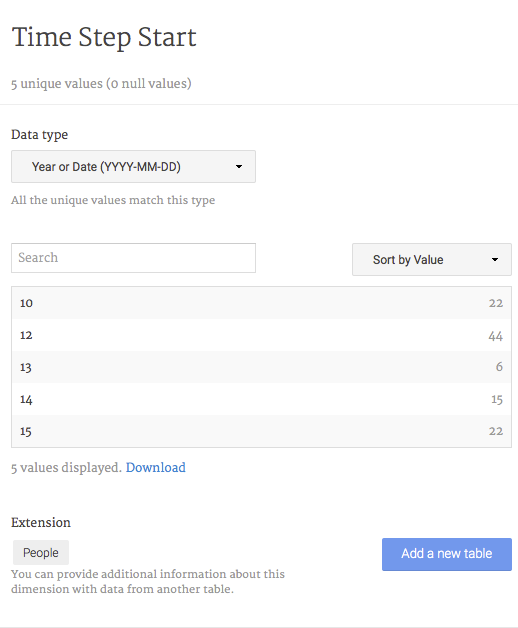
Figure 10: Changing the data type to ‘Year or Date’
8. Open the Graph tool. You are now done with loading the data. Click “Graph” to load the visualization interface (Figure 11).

Figure 11: Load the Graph tool
9. Specify source and target nodes. First off Palladio asks you to specify the “Source” and “Target” nodes in the network (Figure 12). Let’s start with “Givers” and “Recipients”. You will now see the graph and can begin to study it in greater detail.
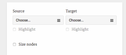
Figure 12: Select “Giver” as Source and “Recipient” as Target.
10. Highlight nodes. Continue by ticking the “Highlight” boxes. This will give you an immediate sense of who acted as a provider of help, who merely received help and which actors were both givers and recipients of help.
11. Facet filter. Next up, try the faceted filter (Figure 13). You will recognize the columns which describe the different acts of help. Start by selecting “3” in the “Form of Help” column. This will reduce the graph to only provisions of accommodation. Next, select values from the “Date of Activity” column to further narrow down your query. This will show you who provided accommodation and how this changes over time. Re-select all values in a column by clicking on the check box next to the column name. Take your time to explore the dataset – how does it change over time? When you are done, make sure to delete the Facet filter using the small red trashcan.
Network visualizations can be incredibly suggestive. Remember that whatever you see is a different representation of your data coding (and the choices you made along the way) and that there will be errors you might have to fix. Either of the graphs I worked with would have looked differently had I chosen different time steps or included people who merely knew each other but did not engage in helping behavior.
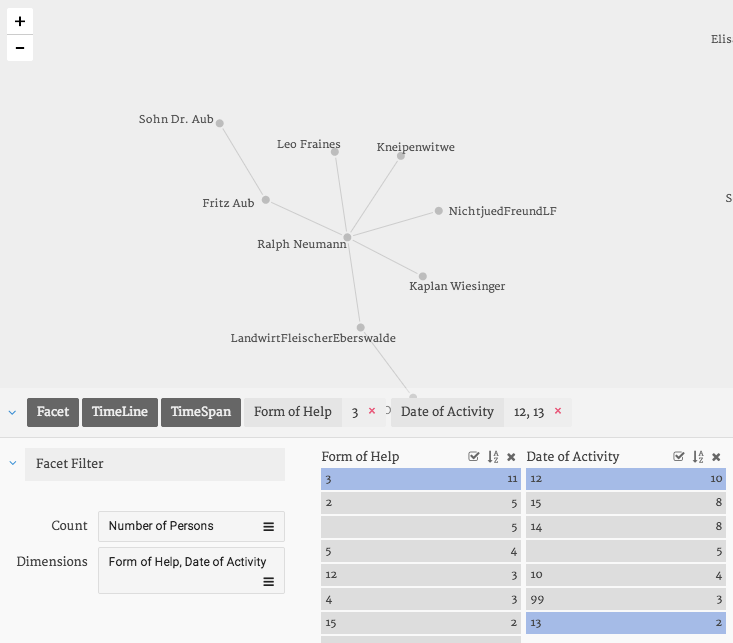
Figure 13: The Facet filter in Palladio.
12. Bipartite network visualization. Now this is nice. But there is something else which makes Palladio a great tool to start out with network visualization: It makes it very easy to produce bipartite, or 2-mode networks. What you have seen until now is a so-called unipartite or 1-mode network: It represents relations between source and target nodes of one type (for example “people”) through one or more types of relations, Figures 13 and 14 are examples of this type of graph.
Network analysis however gives you a lot of freedom to rethink what source and targets are. Bipartite networks have two different types of nodes, an example could be to select “people” as the first node type and “point in time” as the second. Figure 15 shows a bipartite network and reveals which recipients of help were present in the network at the same time. Compare this graph to Figure 16 which shows which givers of help were present at the same time. This points at a high rate of fluctuation among helpers, an observation which holds true for all of the networks I studied. While humans are very good at processing people-to-people networks, we find it harder to process these more abstract networks. Give it a try and experiment with different bipartite networks: Click again on “Target” but this time select “Form of Help” or “Sex” or any other category.
Note that if you wanted to see “Giver” and “Recipients” as one node type and “Date of Activity” as the second, you would need to create one column with all the persons and a second with the points in time during which they were present in your spreadsheet editor and import this data into Palladio. Also, at this stage Palladio does not yet let you represent attribute data for example by coloring the nodes, but all other tools have this functionality.
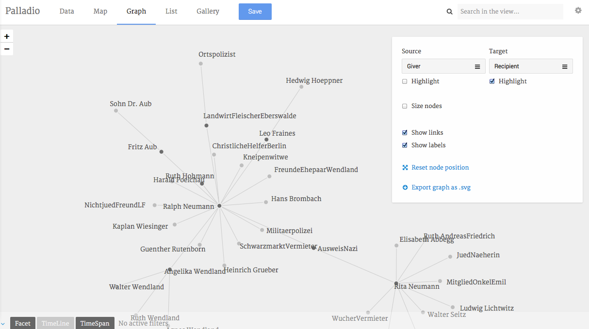
Figure 14: Visualization of a unipartite network: Givers and Recipients of help.
Figure 15: Visualization of a bipartite network: Recipients and Date of Activity.
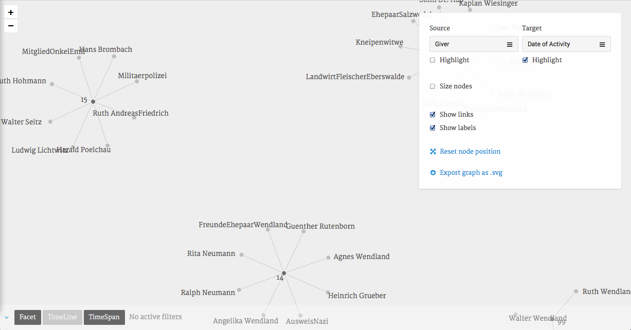
Figure 16: Visualization of a bipartite network: Givers and Date of Activity
13. Timeline. The Timeline feature provides a relatively easy way to visualize changes in your network. Figure 17 shows the distribution of men and women in the network over time. The first column on the y-axis corresponds to the “Dates” field and represents the different time steps. The bars represent the “Sex” attribute: Unknown, numbers of women and men are represented by the height of the segments in a bar (ranging from light grey to black). Hover over them to see what is what. The lower bar segment corresponds to the “Height shows” field and here represents the total number of persons which changes between time step 13 and 14.
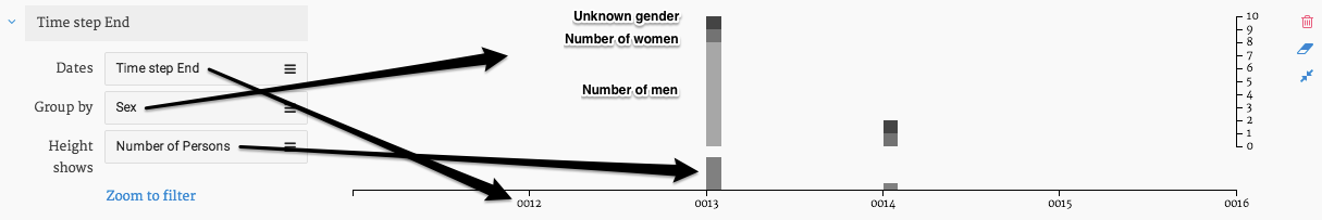
Figure 17: Gender distribution in the network over time.
14. Time Span. Even more interesting is the Time Span view which updates the network visualization dynamically. Click on “Time Span”. Figure 17 illustrates what you should see now. Use the mouse to highlight a section between the time steps which will then be highlighted in grey. You can now drag the highlighted section across the timeline and see how the graph changes from time step to time step.
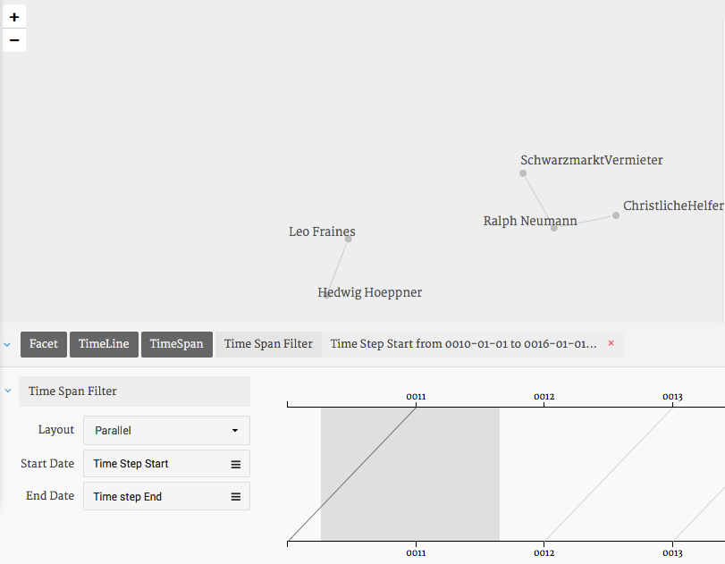
Figure 17: Timeline. isualization of Time Steps.
15. Node size. Palladio lets you size your nodes based on actor attributes. Note that this does not make sense for the sample data given that numerical values represent categories. Node sizes can however be useful if you were to represent the sum of a person’s acts of help, which in this case would correspond to his or her Out-Degree, the number of outgoing relations for a node.
16. Export your visualizations. Palladio lets you export your network as .svg files, a vector-based image format. Use your browser of choice to open them.
17. Lists, Maps and Galleries. You will have noticed that Palladio has a variety of additional visualization formats: Lists, Maps, and Galleries. All of which are as intuitive and well-designed as the Graph section. Galleries let you specify certain attributes of your actors and present them in a card-view. By adding latitude/longitude values to your actor attributes you will get an instant sense of where your network happens. Take a look at their own sample files to explore this.
The added value of network visualizations
Careful extraction of network data from text is time consuming and exhausting since it requires full concentration at every step along the way. I regularly asked myself whether it was worth it–and in the end whether or not I could have made the same observations without the support of network visualizations. The answer is yes, I might have come to the same main conclusions without coding all this data and yes, it was worth it. Entering the relational data soon becomes fast and painless in the process of close reading.
In my experience, question-driven close reading and interpretation on one side and data coding and visualization on the other are not at all separate processes but intertwined and they can complement each other very effectively. Play is not generally considered to be something very academic, but especially with this type of data it is a valuable investment of your time: You don’t just play with your data, you rearrange and thereby constantly rethink what you know about your topic and what you can know about your topic.
Each tie I coded represents a story of how somebody helped somebody else. Network visualizations helped me understand how these ca. 5,000 stories and 1,400 individuals relate to each other. They often confirmed what I knew but regularly also surprised me and raised interesting questions. For example, it led me to identify Walter Heymann as the person whose contact brokerage started off two major support networks and subsequently enabled them to save hundreds of people. Descriptions of his contacts to leading actors in both networks were scattered across different documents which I had worked on during different phases of the project. The visualization aggregated all these relations and revealed these connections. Further investigation then showed that it was in fact him who brought all of them together.
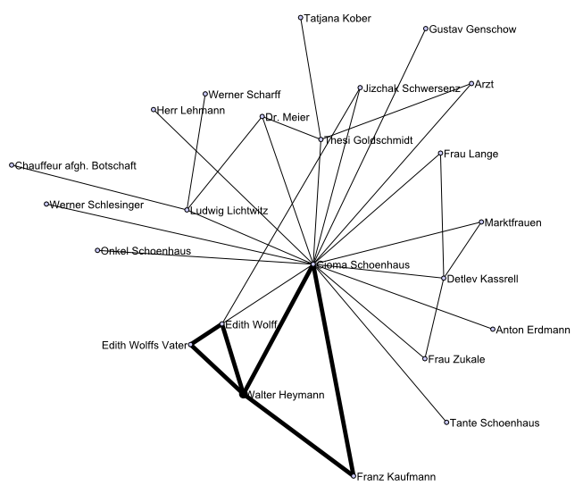
Figure 19: Walter Heymann brokered contacts which led to the emergence of two major support networks.
On other occasions, visualizations revealed the existence of long reaching contact chains across different social classes which helped refugees create trusted ties with strangers, they also showed unexpected gaps between actors I expected to be connected, led me to identify clusters in overlapping lists of names, observe phases of activity and inactivity, helped me spot people who bridged different groups and overall led me to emphasize the contact brokerage of Jewish victims of persecution as a major, hitherto overlooked factor in the emergence of covert networks.
Visualisations are of course not “proof” of anything but tools to help understand complex relations; their interpretation is based on a good understanding of the underlying data and how it was visualized. Selected network visualizations can also accompany text and help your readers better understand the complex relationships you discuss, much like the maps you sometimes find on the inside covers of old books.
A few practical points:
- Collect and store data in one spreadsheet and use a copy for visualizations
- Make sure you understand the basic rationale behind any centrality and layout algorithms you choose as they will affect your view on your data. Wikipedia is usually a good source for comprehensive information on them.
- Don’t hesitate to revise and start over if you sense that your coding scheme does not work out as expected. It will definitely be worth it.
Finally, any of the visualizations you can create with the small sample dataset I provide for this tutorial requires context knowledge to be really meaningful. The only way for you to find out whether this method makes sense for your research is to start coding your own data and to use your own context knowledge to make sense of your visualizations.
Good luck!
Other network visualization tools to consider
Nodegoat – similar to Palladio in that it makes data collection, mapping and graph visualizations easy. Allows easy setup of relational databases and lets users store data on their servers. Tutorial available here.
NodeXL – capable to perform many tasks common in SNA, easy-to-use, open source but requires Windows and MS Office 2007 or newer. Tutorial 1, Tutorial 2.
Gephi – open source, platform independent. The best known and most versatile visualization tool available but expect a steep learning curve. The developers announce support for parallel edges in version 1.0. Tutorials: by Clement Levallois and Sebastien Heymann.
VennMaker – is platform-independent and can be tested for free. VennMaker inverts the process of data collection: Users start with a customizable canvas and draw self-defined nodes and relations on it. The tool collects the corresponding data in the background.
The most commonly used tools for more mathematical analyses are UCINET (licensed, tutorials available on their website) and Pajek (free) for which a great handbook exists. Both were developed for Windows but run well elsewhere using Wine.
For Python users the very well documented package Networkx is a great starting point; other packages exist for other programming languages.