Contents
Google Maps
Google My Maps and Google Earth provide an easy way to start creating digital maps. With a Google Account you can create and edit personal maps by clicking on My Places.
In My Maps you can choose between several different base maps (including the standard satellite, terrain, or standard maps) and add points, lines and polygons. It is also possible to import data from a spreadsheet, if you have columns with geographical information (i.e. longitudes and latitudes or place names). This automates a formerly complex task known as geocoding. Not only is this one of the easiest ways to begin plotting your historical data on a map, but it also has the power of Google’s search engine. As you read about unfamiliar places in historical documents, journal articles or books, you can search for them using Google Maps. It is then possible to mark numerous locations and explore how they relate to each other geographically. Your personal maps are saved by Google (in their cloud), meaning you can access them from any computer with an internet connection. You can keep them private or embed them in your website or blog. Finally, you can export your points, lines, and polygons as KML files and open them in Google Earth or Quantum GIS.
Getting Started
- Open your favorite browser
- Go to Google’s MyMaps Engine Lite
- Log in to your Google Account if you aren’t already logged in (follow the basic instructions to create an account if necessary)
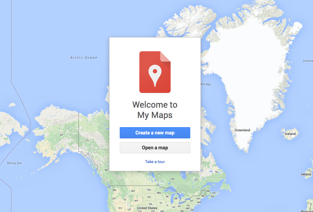
Figure 1
- Click on the question mark at bottom right and click Take a Tour for an introduction to how My Maps works
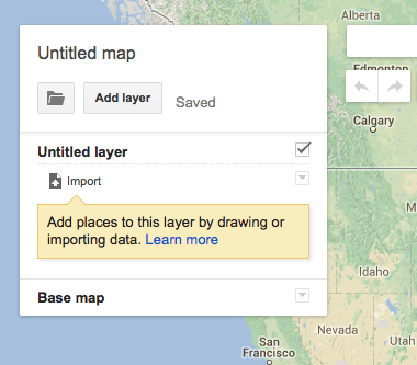
Figure 2
- At the upper left corner, a menu box appears, titled ‘Untitled Map’. By clicking on the title you can rename as ‘My test map’ or a title of your choice.
- Next, you can use the search bar. Try searching the location of your current research project. You can then click on the location and add it to your map by clicking ‘add to map’. This is the simplest method of adding points to your new map. Try searching for some historical place names that no longer exist (Ontario’s Berlin or Constantinople). You will find mixed results, where Google often identifies the correct location, but also offers up incorrect alternatives. This is important to keep in mind when creating spreadsheet, as it is normally better to use the modern place names and avoid risking that Google with choose the wrong Constantinople.
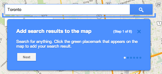
Figure 3
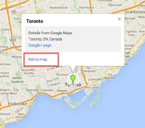
Figure 4
- Next, you can Import a Dataset. Click the Import button under the untitled layer.
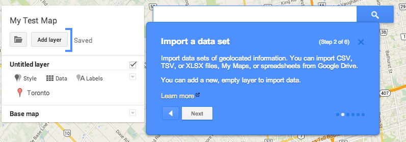
Figure 5
- A new window will pop up and give you the option of importing a CSV (comma separated value), XLXS (Microsoft Excel) file, KML (Google’s spatial file formate) or GPX (common GPS file formate). These are two common spreadsheet formats; CSV is simple and universal, XLXS is the MS Excel format. You can also work with a Google spreadsheet from your Drive account.
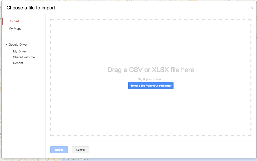
Figure 6
- Download this sample data and located it on your computer: UK Global Fat Supply CSV file. If you open the file in Excel or another spreadsheet program, you’ll find a simple two column dataset with a list of different kinds of fats and the associated list of places. This data was created using British import tables from 1896.
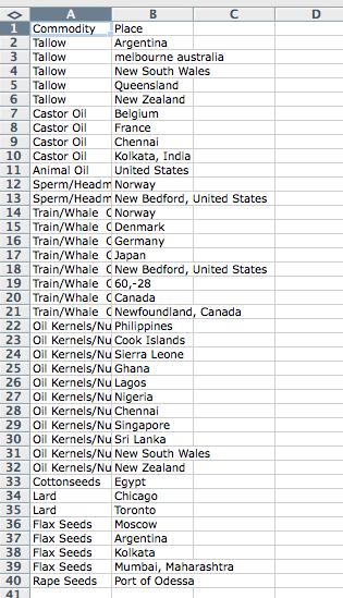
Figure 7
- Drag the file into the box provided by Google Maps.
- You will then be promted to choose which column Google should use to identify a the location. Choose Place.
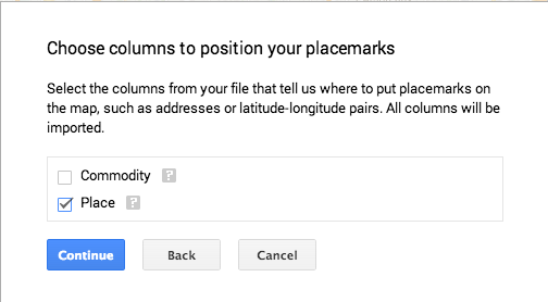
Figure 8
- You will then be promoted again to choose which column should be used for the label. Choose ‘Commodity’.
- You should now have a global map of the major exporters of fat to Britain during the mid-1890s.
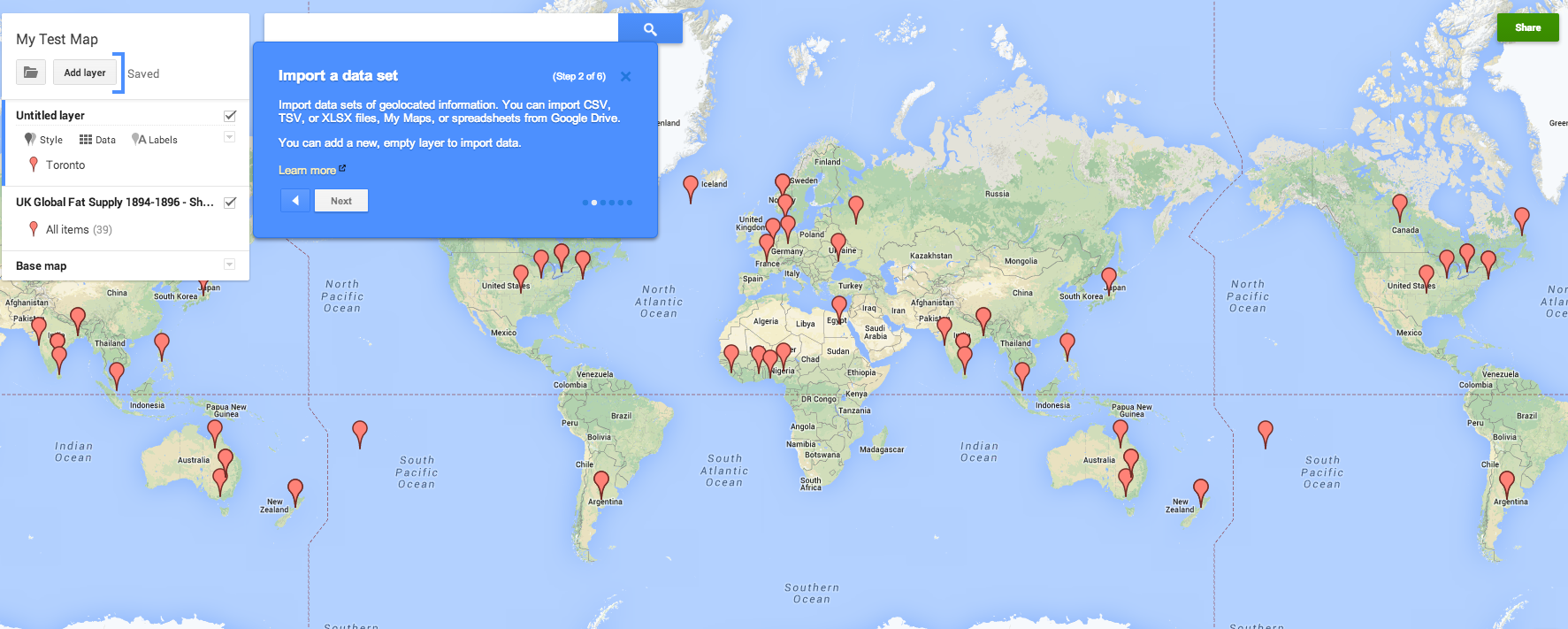
Figure 9: Click to see full-size image
- You can now explore the data in more detail and change the Style to distinguish between the different types of fats.
- Click on the UK Global Fats Layer, then click on Style and finally click on Uniform Style and change it to Style by Data Column: Commodities. On the left hand side, the legend will show the amount of occurrences of each style in brackets, e.g. ‘Flax Seeds (4)’.
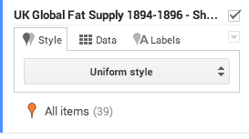
Figure 10
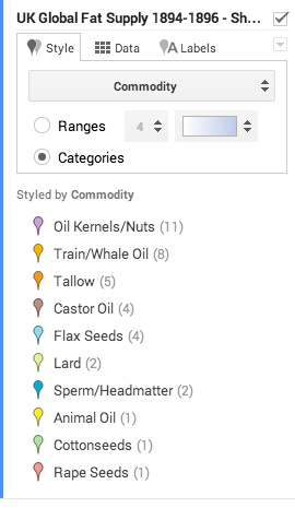
Figure 11
- Continue to play with the options.
- This feature provides a powerful tool to display historical datasets. It does have limitations, however, as Google Maps will only import the first 100 rows of a spreadsheet. At this point it only allows you to include three datasets in a map, so a maximum of 300 features.
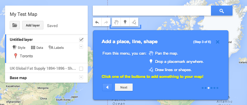
Figure 12
Creating Vector Layers
You can also create new map layers (known more formally as vector layers). Vector layers are one of the main components of digital mapping (including GIS). They are simply points, lines, or polygons used to represent geographic features. Points can be used to identify and label key locations, lines are often used for streets or railroads, and polygons allow you to represent area (fields, buildings, city wards, etc). They work the same in Google Maps as they do in GIS. The big limitation is that you can only add limited information into the database tables associated with the points, lines, or polygons. This is a problem as you scale up your digital mapping research, but it is not a problem when you are starting out. In Google Maps you can add a label, a text description, and links to a website or photo. More information about creating historical vectors in a full GIS is available in Creating New Vector Layers in QGIS 2.0.
- To add a layer, you can either click on the layer that has been created for you in the menu box, with the name ‘Untitled Layer’. Click on ‘Untitled Layer’ and rename it ‘Layer 1′. Or you can create another layer: click on the ‘Add layer’ button. This will add a new ‘Untitled Layer’ which you can name as ‘Layer 2′. It should look like this:
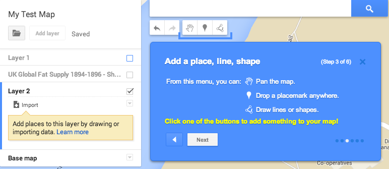
Figure 13
- Note that to the right of Layer there is a checkbox – unchecking this box turns off (i.e. it doesn’t appear on the map) a layer and its information. Uncheck the UK Global Fats layer and click on Layer 1.
- Before adding vector layers we should consider which base map to use. At the bottom of the menu window, there is a line that says ‘base map’. A base map is a map** depicting background reference information such as roads, borders, landforms, etc. on top of which layers containing different types of spatial information can be placed. Google’s Maps allows you to choose from a variety of base maps, depending on the kind of map you want to create. Satellite imagery is becoming a standard form of base map, but it is information-rich and may detract from the other map features you are trying to highlight. Some simple alternatives include ‘light landmass’, or even ‘light political’ if you require political boundaries.
-
Click on the arrow to the right of ‘Base map’ in the window; a submenu appears allowing you to choose different types of base maps. Choose ‘Satellite’.
- Start by adding some Placemarks (the Google equivalent of a point). Click on the add Markers button underneath the search bar near the top of the window. Click on the spot on the map where you want the Placemark to appear.

Figure 14
- A box will pop up and give you the opportunity to label the Placemark and add a description into the text box. We added Charlottetown and included that it was founded in 1765 in the description box.
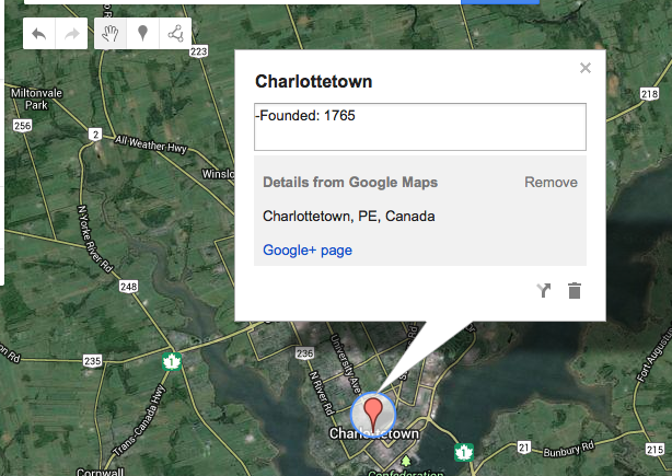
Figure 15
-
Add a few more points, including labels and descriptions.
-
You will notice that your Placemark now appears under Layer 1 on the left of the screen in your menu window. There is a place to change icon shape and icon colour if you click on the symbol just to the right of the Placemark name. Also, directly under the title Layer 1 there are menus titled Style, Data, and Labels. The Style menu controls different aspects of the Layer’s appearance, while Data shows you the data you added in the description box for your Placemark. Labels menu allows you to control whether the name or description of your Placemark appears besides it on the actual map.
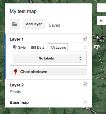
Figure 16
- Now we will add some lines and shapes (called polygons in GIS software). Adding lines and polygons is a very similar process. We will draw some lines in a new layer (different types of points, lines, and shapes should be in separate layers).
- Select Layer 2 in your menu box (you will know which layer you have selected because of the blue outline on the left of the box).
- Click the ‘add line or shape’ icon box directly to the right of the Markers symbol:

Figure 17
-
Pick a road and click with your mouse along it, tracing the route for a while. Hit “enter” when you want to finish the line.
- Again you can add a label (i.e. name a road) and description information.
- You can also change the colour and width of the line. To do this, find the road you have drawn in Layer 2 in the menu box, and click to the right of the name of the road.
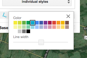
Figure 18
- To create a polygon (a shape) you can connect the dots of the line to create an enclosed formation. To do this, start drawing and finish by clicking on the first point in your line. You can create simple shapes, such as a farmer’s field, or much more complex shapes, such as the outline of a city (see examples below). Feel free to experiment with creating lines and polygons.
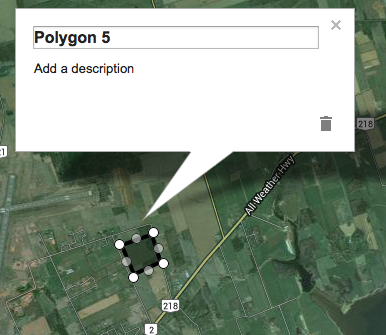
Figure 19
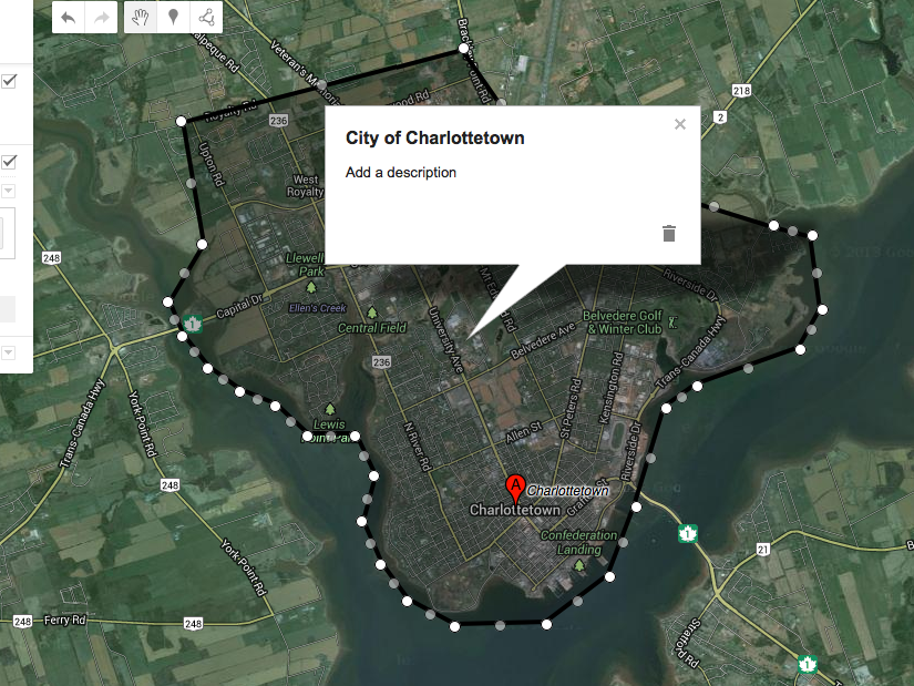
Figure 20
- Like placemarks and lines, you can change the name and description of a polygon. You can also change the colour and line width by clicking on the icon to the right of your polygon name in the menu box. Here you can also change the transparency, which is discussed immediately below.
- Note that the area bounded (i.e. inside) a polygon is shaded the same colour as the polygon outline. You can change the opaqueness of this shading by changing the ‘transparency’ which alters the extent to which you can clearly see the background image (your base map). -
Share your custom map
- The best way to share the map online is by using the Share button in the menu. This provides a link which can be share in an email or through social media like G+, Facebook, or Twitter.
- Another way to share a dynamic version of your map is to embed it in a blog or website using the “embed on my website” option dropdown menu to the right of the save button. Selecting this option provides an inline frame or <iframe> tag that you can then insert into an HTML site. You can modify the height and width of the frame by changing the numbers in quotation marks.
- Note: there is currently no way to set the default scale or legend options of the embedded map, but if you need to eliminate the legend from the map that appears on your HTML site you can do so by reducing the width if the <iframe> to 580 or less.
- You can also export the data as a KML file using the same dropdown menu. It will give you the option to export the whole map or to select one layer in particular. Try exporting the UK Global Fats layer as a KML layer. You’ll be able to import this data into other programs, including Google Earth and Quantum GIS. This is an important feature, as it means you can start working with digital maps using Google Map and still export your work into a GIS database in the future.
- You can stop the lesson here if you think this free Google Map service provides all the tools you need for your research topic. Or you can keep going and learn about Google Earth and in lesson 2, Quantum GIS.
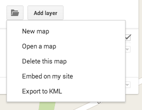
Figure 21
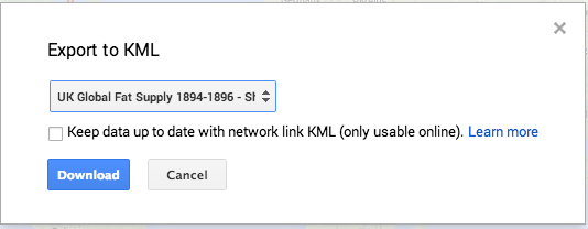
Figure 22
Google Earth
Google Earth works in much the same way as Google Maps Engine Lite, but has additional features. For example, it provides 3-D maps and access to data from numerous third party sources, including collections of historical maps. Google Maps doesn’t require you to install software and your maps are saved in the cloud. Google Earth requires software installation and is not cloud-based, though maps you create can be exported.
- Install Google Earth: https://www.google.com/intl/eng/earth/versions/#earth-pro
- Open the program and familiarize yourself with the digital globe. Use the menu to add and remove layers of information. This is very similar to how more advanced GIS programs work. You can add and remove different kinds of geographical information including Political Boundaries (polygons), Roads (lines), and Places (points). See the red arrows in the following image for the location of these layers.
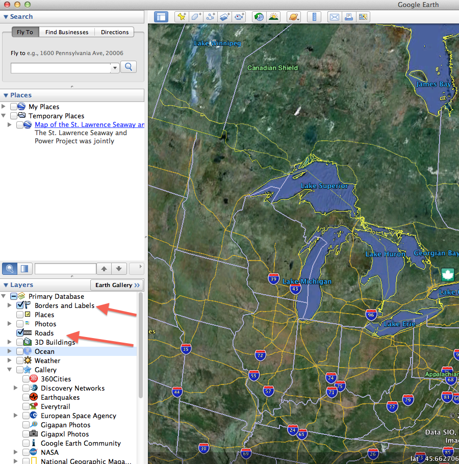
Figure 23: Click to see full-size image
- Note that under the ‘Layer’ heading on the lower left side of the window margin, Google provides a number of ready-to-go layers that can be turned on by selecting the corresponding checkbox.
Figure 24
- Google Earth also contains some scanned historical maps and aerial photographs (in GIS these types of maps, which are made up of pixels, are known as raster data). Under Gallery you can find and click Rumsey Historical Maps. This will add icons all over the globe (with a concentration in the United States) of scanned maps that have been georeferenced (stretched and pinned to match a location) onto the digital globe. This previews a key methodology in historical GIS. (You can also find historical map layers and other HGIS layers in the Earth Gallery). Take some time to explore a number of historical maps. See if there are any maps included in the Rumsey Collection that might be useful for your research or teaching. (You can find many more digitized, but not georeferenced maps at www.davidrumsey.com.)
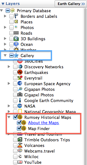
Figure 25
- You might need to zoom in to see all of the Map icons. Can you find the World Globe from 1812?
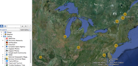
Figure 26
- Once you click on an icon an information panel pops up. Click on the map thumbnail to see the map tacked onto the digital globe. We will learn to properly georeference maps in Georeferencing in QGIS 2.0.
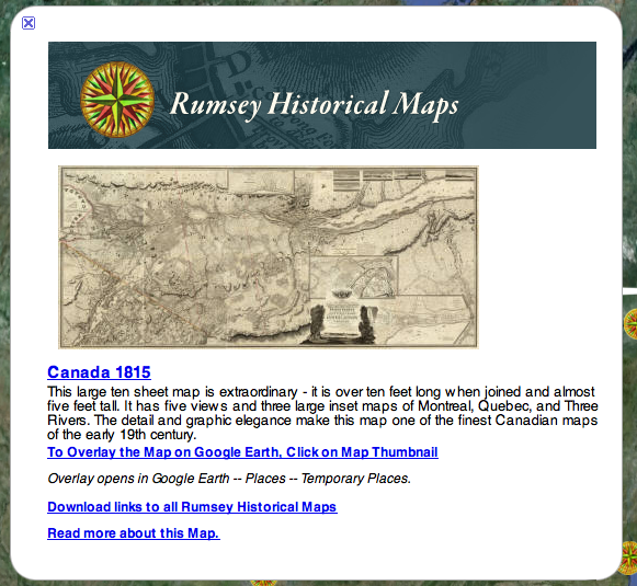
Figure 27
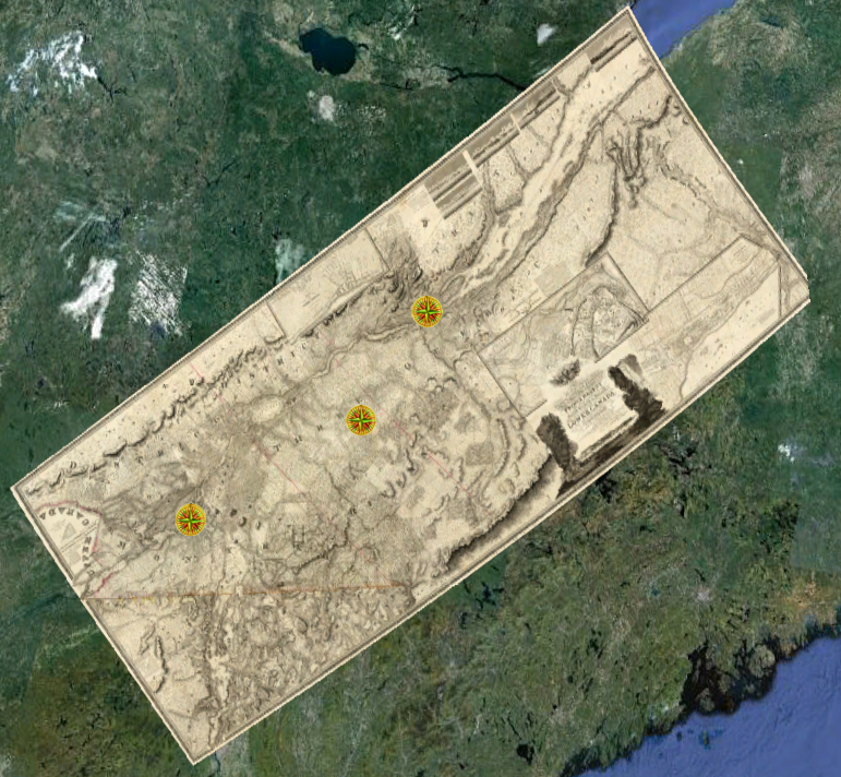
Figure 28: Click to see full-size image
KML: Keyhole Markup Language files
- Google developed a file format to save and share map data: KML. This stands for Keyhole Markup Language, and it is a highly portable type of file (i.e. a KML can be used with different types of GIS software) that can store many different types of GIS data, including vector data.
- Maps and images you create in Google Maps and Google Earth can be saved as KML files This means you can save work done in Google Maps or Google Earth. With KML files you can transfer data between these two platforms and bring your map data into Quantum GIS or ArcGIS.
- For example, you can import the data you created in Google Maps Engine Lite. If you created a map in the exercise above, it can be found by clicking “Open Map” on the Maps Engine Lite home page. Click on the folder icon on the left hand side of the legend beneath the map title and click “export to KML”. (You can also download and explore Dan Macfarlane’s Seaway map for this part of the exercise).
Bringing your KML file into Google Earth
- Download the KML file from Google Maps Engine Lite (as described above).
- Double click on the KML file in your Download folder.
- Find the data in the Temporary Folder in Google Earth.
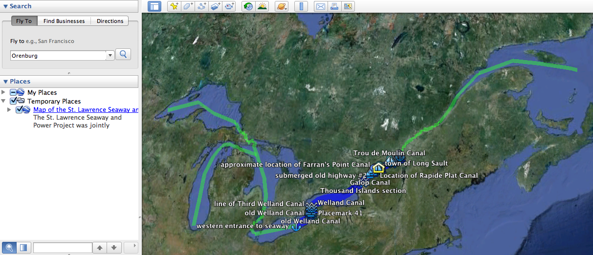
Figure 29: Click to see full-size image
- You can now explore these map features in 3D, or you can add new lines, points and polygons using the various icons along the top left of your Google Earth window (see image below). This works in essentially the same way as it did for Google Maps, although there is more functionality and options. In Dan’s Seaway map, the old canals and current Seaway route were traced in different line colours and widths using the line feature (this was made possible by overlaying historical maps, which is described below), while various features were marked off with appropriate Placemarks. For those so inclined, there is also the option of recording a tour that could be useful for presentations or teaching purposes (when the “record a tour” icon is selected, recording options will show up on the bottom left of the window).
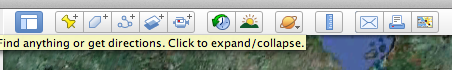
Figure 30
- Try adding a new feature to Dan’s Seaway data. We’ve created a polygon (in GIS terminology a polygon is a closed shape of any type – a circle, hexagon, and square are all examples) of Lake St. Clair in the next image. Find Lake St. Clair (east of Detroit) and try adding a polygon.
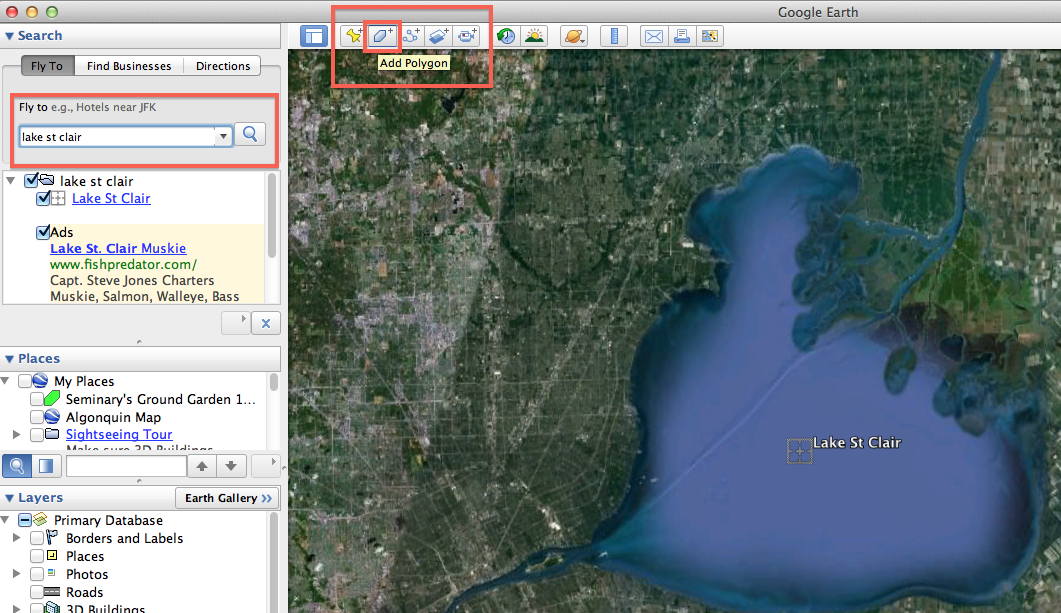
Figure 31: Click to see full-size image
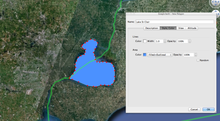
Figure 32
- Label the new feature Lake St. Clair. You can then drag the new feature onto Dan’s Seaway data and add it to the collection. You can then save this expanded version of the Seaway map as a KML to share via email, upload into Google Maps, or to export this data into QGIS. Find the save option by right-clicking on the Seaway collection and choose Save Place As or Email.
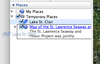
Figure 33
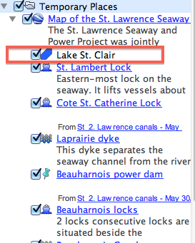
Figure 34
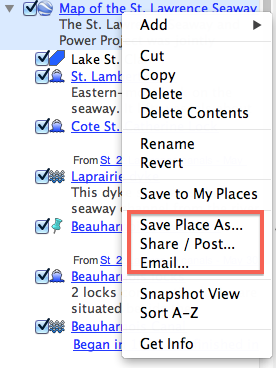
Figure 35
Adding Scanned Historical Maps
Within Google Earth, you can upload a digital copy of a historical map. This could be a map that has been scanned, or an image obtained that is already in a digital format (for tips on finding historical maps online see: Mobile Mapping and Historical GIS in the Field). The main purpose for uploading a digital map, from a historical perspective, is to place it over top of a Google Earth image in the browser. This is known as an overlay. Performing an overlay allows for useful comparisons of change over time.
- Start by identifying the images you want to use: the image within Google Earth, and the map you want to overlay with. For the map you want to overlay, the file can be in JPEG or TIFF format, but not PDF.
- Within Google Earth, identify the area of the map you want to overlay. Note that you can go back in time (i.e. look at older satellite photos) by clicking on the ‘Show historical imagery’ icon on the top toolbar. and then adjusting the time-scale slider that will appear.

Figure 36
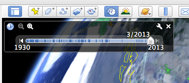
Figure 37
- Once you have identified the images you plan to use, click on the ‘Add Image Overlay’ icon on the top toolbar.\

Figure 38
- A new window will appear. Begin by giving it a different title if you wish (the default is ‘Untitled Image Overlay’).
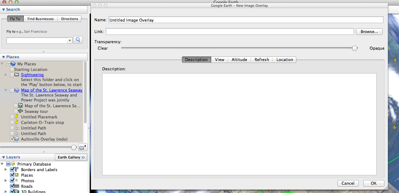
Figure 39: Click to see full-size image
- To the right of the Link field, click the Browse button to select from your files the map you wish to be the overlaying image.
- Move the New Image Overlay window out of the way (don’t close it or click “Cancel” or “OK”) so that you can see the Google Earth browser. The map you uploaded will now appear over top of the Google Earth satellite image in the Google Earth browser.
- There are fluorescent green markers in the middle and at the edges of the uploaded map. These can be used to stretch, shrink, and move the map so that it aligns properly with the satellite image. This is a simple form of georeferencing (see Georeferencing in QGIS 2.0). The image below shows the above steps using an old map of the town of Aultsville overlaid on top of Google satellite imagery from 2008 in which the remains of the town’s roads and building foundations in the St. Lawrence River are visible (Aultsville was one of the Lost Villages flooded out by the St. Lawrence Seaway and Power Project).
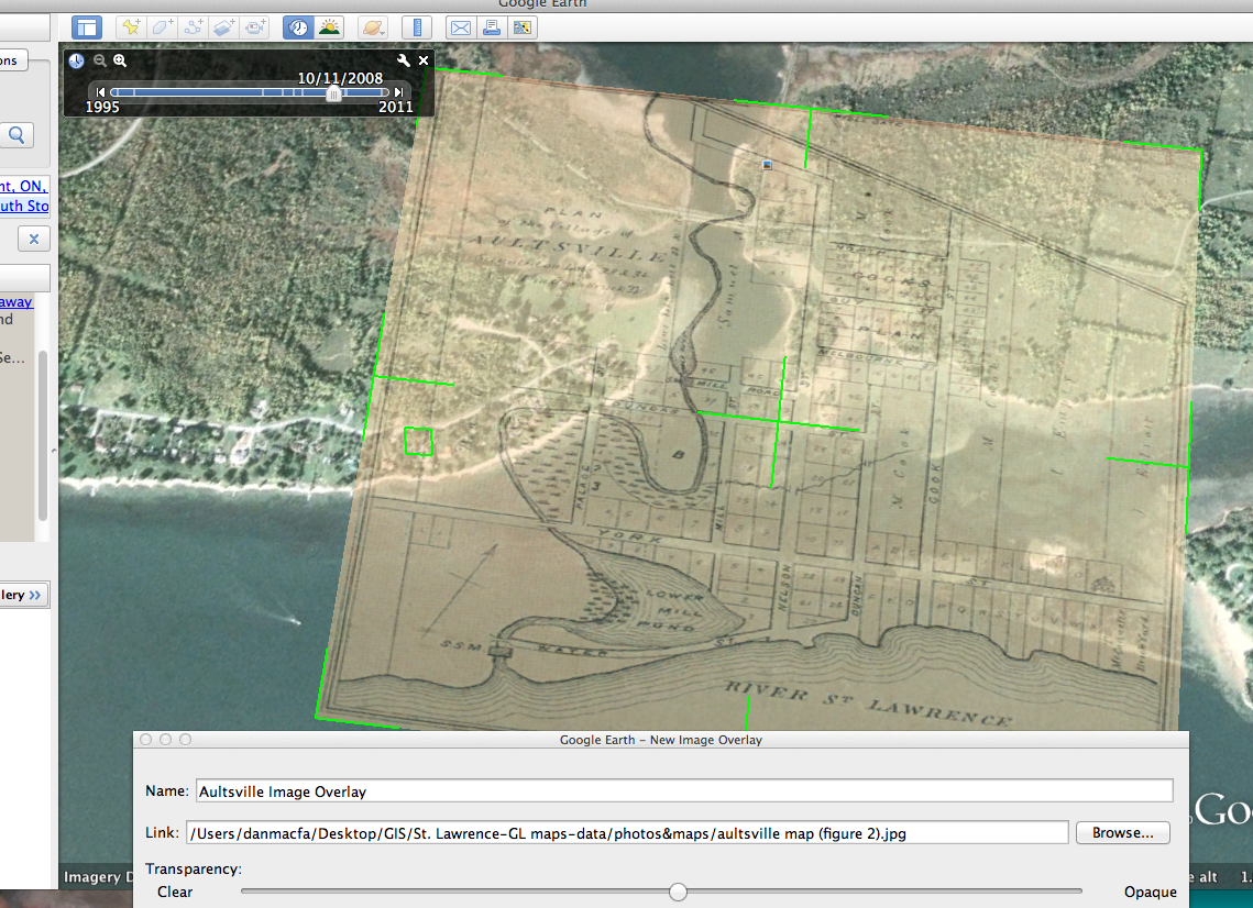
Figure 40: Click to see full-size image
- Back in the New Image Overlay window, note that there are a range of options (Description, View, Altitude, Refresh, Location) that you can select. At this point, you likely don’t need to worry about these, although you may wish to add information under the Description tab.
- Once you are satisfied with your overlay, in the New Image Overlay window click on OK in the bottom right corner.
- You will want to save your work. Under File on your computer’s menu bar, you have two options. You can save a copy of the image (File -> Save -> Save Image…) you have created to your computer in jpg format, and you can also save the overlay within Google Earth so that it can be accessed in the future (File -> Save -> Save My Places). The latter is saved as a KML file.
- To share KML files simply locate the file you saved to your computer and upload it to your website, social media site, or send it as an email attachment.
You have learned how to use Google Maps and Earth. Make sure you save your work!
This lesson is part of the Geospatial Historian.