Contents
- Introduction
- Pre-requisites
- Lesson Goals
- Getting Started
- The Data
- Reading the Data
- Merging Census Data
- Merging External Data
- Geocoding
- Visualizing
- Visualizing Data Relationships
- Conclusion
- Other Models and Visualizations
Introduction
One primary focus of historical scholarship is explaining the complex relationships that influence change in the past. More often then not, patterns of change are understood and dependent on geographic understandings—or variations over space. The Great Migration, early development of the European economy, and the development of the American West are just a few topics that are both historical and geographic in nature. Combining knowledge of both space and time can provide a fuller understanding of events and transformations. This is even more evident when we are able to discern characteristics about the people/populations who are part of historical transformations/events.
One way this can be done is through an array of maps and visualizations that provide snapshots of geographic realities. Historians have long used maps spread over time to explain historical transformations such as economic developments and migration patterns. With the onset of digital technologies, more complex maps have developed, and scholars have integrated more complex information into maps alongside new geographic visualizations. 1
The availability of historical Geographic Information Systems has expanded this further by providing scholars opportunities to analyze more data points using digital and statistical tools such as R. With these new tools, scholars can study a multitude of population characteristics that can be visualized and analyzed across variable regions and time periods. Essentially, this has allowed researchers to configure geographic data around their areas of inquiry, accelerating the growth of “spatial history.” With this data, scholars can inquire not only about how historical change relates to place, but also how it relates to a multitude of population characteristics, testing theories and questions in rapid fashion. Was there a possible link between railroad development and change in gender makeup of surrounding populations? Were there other relationships? What does this say about the development of these regions? We are limited only by the available data and the questions we choose to ask. These techniques offer scholars the opportunity to test assumptions and build understandings that may not be readily understood in traditional research or mapping techniques.
This tutorial will introduce scholars to some of these techniques for processing geospatial data, focusing on how geospatial data can be analyzed statistically as well as visualized. We will be comparing spatial regions and leveraging the variability of populations across defined spatial regions such as counties. This variability can provide insights into a broad range of social movements. Moreover, it can be used to assess significant variations in regions using some basic statistical models. Using these methods, we assume that there is a level of continuity or homogeneity within the defined regions. 2 We can leverage these understandings to assess historical events and movements. For example, if a large proportion of members of a particular group come from a group of counties, the characteristics of these counties can provide insight into the nature of that movement; 3 or if a set of events happen in particular counties, we can ask if there is something particular about these counties that could be linked to the event. In some cases, analysis can also reveal hidden realities about social movements or events based on their geographic nature. For example, if we step through characteristics of an area near a spatial event, we could discover an unknown characteristic we never realized correlated with the particular event, leading to new research possibilities. You can hopefully discover trends that may be surprising or some that we find are not as strong as has been assumed.
Specifically, this tutorial is going to use a membership list–with addresses–from a para-religious organization in America (PTL Ministries) and downloadable geographic data to assess population characteristics that could provide insights into an organization that is often characterized as more rural and less wealthy, alongside a host of other characteristics. The tutorial will then visualize and analyze this data to assess possible insights. This process will provide the basic tools and understandings that will allow scholars to assess other events and organizations that have geographic data. From this, you should be able to discover or challenge understandings of historical events using geospatial analysis.
Pre-requisites
The work for this lesson will be done in R and R Studio, an open source statistical package used by data scientists, statisticians and other researchers. We are using R, because it is a widely-used open source tool that will allow us to both visualize and analyze our data using a multitude of methods that can be expanded upon quite easily. Some background knowledge of the software and statistics will be helpful. For introductions to R, I recommend the r-basics tutorial and the more comprehensive Computational Historical Thinking as starting points. There are many other services such as this MOOC and DataCamp that can introduce beginners to R’s broader functionality. UCLA also has a nice introduction.4 While this tutorial will attempt to step through the entire process in R, basic knowledge of R is needed. The tutorial also assumes users will have some knowledge about the event you are observing which you will use later as a means to test and contest assumptions.
Lesson Goals
- Provide basic knowledge on how to use geographic data to analyze historical movements, especially movements where we have datasets or lists that are geographic in nature
- Demonstrate how to merge geographic points or membership lists with geospatial data for further analysis
- Demonstrate how to visualize this data geographically for analysis using choropleths
- Highlight some statistical visualizations and models that can provide further insights
Getting Started
This tutorial will assume that you have set up R and R studio or R studio for Mac. Once setup, you should open up the program. I recommend creating a new project and setting up a working directory where you will store all of your information.
The first steps in R will be to load the necessary libraries that will allow R to perform the geographic functions used for this type of analysis:
install.packages("sf") # helps us work with spatial data
## for os specific requirments and directions see https://github.com/r-spatial/sf
install.packages("tmap") #helps create simple choropleths
install.packages("plotly") #helps create scatterplots
library(sf)
library(tmap)
library(plotly)
The Data
We are using two sources of data in this tutorial: our list of address from the organization, and the downloaded geospatial data that contains the demographic and geographic data that will aid our analysis. We are going to begin with geospatial data. This data is formatted as a shapefile. Shapefiles are data files that represent geographic regions and can also contain characteristics about that region. The U.S. census contains a bevy of information in shapefile format.
But, in order to get this information from historic censuses we are going to use data from the National Historical Geographic Information System (NHGIS) which is managed by the Minnesota Population Center at the University of Minnesota. NHGIS is a warehouse of historical census data covering the span of U.S. history. In order to use their services, you must first register and create an account. Once completed you can use their datafinder to select the geographic level, time period, and the data that interests you. This lesson provides detailed instructions on how to use their services to extract county-level census information, but the current lesson will provide the downloaded data.
If you are looking nationally prior to 1990, the county-level data is often your best bet as more precise geographic levels had not been standardized. For some regions and cities, however, there are more precise levels and in some cases smaller than zip codes. For this tutorial, we will use county level data from a time-appropriate decennial census. In general, it is best to use the smallest geographic region possible, but for historical research that often ends up being at the county level. In general, larger population centers have more detailed historical data, but rural areas were not completely covered until the 1990 census. For a more detailed description of the census regions and an interactive map see NHGIS’s discussion.
Reading the Data
We start by loading in the selected data. The data for this tutorial can be dowloaded here. Once downloaded place all the files in a folder labeled data inside your working directory in R. We are going to create a variable and read in our data from our variable directory to it. Once run, the County_Aggregate_Data variable will contain the data and geographic information that we will analyze:
County_Aggregate_Data <- st_read("./data/County1990ussm/")
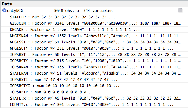
We should now have a data object loaded with attached data:
If you are only interested in looking at particular states, I recommend filtering the results to speed up processing and data analysis. To accomplish this, use the following commands:
County_Aggregate_Data <- County_Aggregate_Data[which(County_Aggregate_Data$STATENAM %in% c("North Carolina","South Carolina")),]
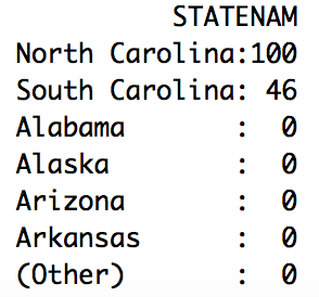
Following this command, I usually take a look at the distribution of the data using the summary command to ensure I am looking at the newly filtered data:
summary(County_Aggregate_Data)
This will return a bunch of summary data but most importantly it is showing that I have data only for the states I am filtering on:
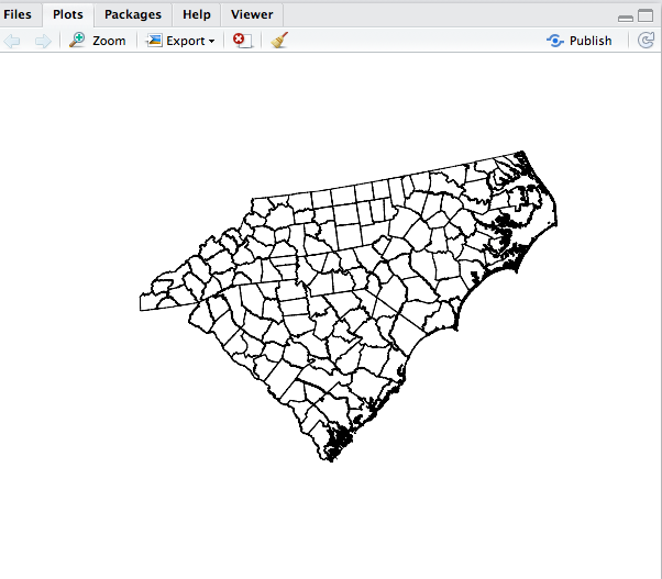
Optionally, you can also plot the results to view a map of the data that you have downloaded. This could take some time, especially if you are not filtering the data. As above, this helps confirm that you are looking at the right geographic areas as only the filtered areas should be drawn. Below we will use R’s basic graphing function to do this:
plot(County_Aggregate_Data$geometry,axes=TRUE)
Merging Census Data
Currently, our County_Aggregate_Data variable has the necessary geographic boundaries for our analysis (as the above plot highlighted), but not the demographic information that will allow us to assess characteristics of our membership list. Although the demographic data came along with the geographic data, it needs to be merged into our County_Aggregate_Data variable which is a SpatialDataFrame. The next step is to begin merging County_Aggregate_Data with NHGIS table data in the downloaded data directory.
Let’s read in the NHGIS data and merge it on the common field. The by.x and by.y parameters indicate what fields the data is being joined on:
Census_Data <- read.csv("./data/County1990_Data/nhgis0027_ts_nominal_county.csv", as.is=TRUE)
County_Aggregate_Data <- merge(County_Aggregate_Data,Census_Data,by.x="GISJOIN", by.y="GISJOIN")
The number of variables in County_Aggregate_Data should now increase as all of table data is brought into this one object. We now have one large SpatialDataFrame that has all of the geographic and statistical data we downloaded. We could stop and analyze this data as it undoubtedly contains many insights but it is only the raw census data and not yet connected to the historical event or data we are analyzing.
Merging External Data
The next step is to merge our list with our SpatialDataFrame so we can perform our analysis. While we are using a membership list, it can be any list that is geographic in nature. For example, you may have a list of events that happened during a particular time period; or a list of places an individual chooses to visit. This type of data will come in two basic formats. The first is information such as locations, address, or incident locations–which will be converted to geographic coordinates. The second will be a table that lists the same information alongside the county (or geographic region) where it occurred. We can handle either.
Geocoding
In the first case we have raw addresses of the members of our organization which will necessitate some additional steps. The address will need be transformed into geographical points in a process called geocoding. This will create geographic points–from addresses–that can be linked to spatial regions in our downloaded census data so that we can analyze it to help us discover trends related to geographic location of these addresses. R can do some of this work but if you have a large number of addresses, you will need to use an external service because the free services R uses (such as google) will cap how many address you can geocode in a day. One popular outside service is hosted by Texas A&M Geocoding Services and can handle large batches at a reasonable price. In the end, our address will be transformed into a list of latitudes and longitudes. This is the data R needs.
If you have less than 2,500 addresses this can be handled in R using Google’s geocoder. In R, you must first gather the address from whatever dataset you have, and then transform it. In our example, the data has already been geocoded, but below is an example of the commands used when processing a list of address and turning them into a list of geographic coordinates:
Addresses <- data$Address
Member_Coordinates <- geocode(Addresses)
In our example, we already have a list of geographic coordinates. But we still need to merge it with our SpatialDataFrame (County_Aggregate_Data) so we can analyze it in relation to the census and geographic data we have downloaded. First, we either get the externally geocoded data or the newly geocoded data. Since our data has been geocoded, we will use the first command below to pull in that data.
geocoded_addresses <- read.csv("./data/GeocodedAddresses.csv", as.is=TRUE)
#or
geocoded_addresses <- Member_Coordinates  ##if you have just geocoded these address
We now need to remove the records with empty data that represent addresses that could not be geocoded:
#Now remove empty data or rows that failed to geocode
geocoded_addresses <- geocoded_addresses[!is.na(geocoded_addresses$Latitude) & !is.na(geocoded_addresses$Longitude),]
Then we convert the data into a SpatialDataFrame so that can be merged5 with County_Aggregate_Data which contains previously imported data. We can see the process below:
#Now create the dataframe with geographic information for the merge
points <- st_as_sf(geocoded_addresses, coords= c("Longitude","Latitude"),crs = 4326, agr = "constant")
Before we do the actual merge, we should ensure both objects are using the same coordinate systems otherwise the points and counties will not match up throwing everything off. To do that we transform our census data to our current system.
County_Aggregate_Data <- st_transform(County_Aggregate_Data, st_crs(points))
Then I like to glimpse at the distribution of the point data within the census. We do this for a couple of reasons: first to verify that the merge will function correctly; secondly, to begin to look at the data distribution. We should see a list of numbers where each list represents the points that intersected with a particular county. Many of the insights we gain will come from this distribution. If counties with particular characteristics show a higher distribution, that can provide insights into our membership. We will be looking at this more in depth as we proceed, but we are beginning to see some information here:
st_intersects(County_Aggregate_Data,points) # show which counties each point falls into
We can also place the data points on top of our map for a quick visual of our data again using plot and some parameters for better visualization:
plot(County_Aggregate_Data$geometry,axes=TRUE)
plot(points[which(points$State %in% c("NC","SC")),]$geometry,col = "green", pch=20,cex=.5, axes=TRUE,add=TRUE)
Now we do the merge. This merge is a bit different than the earlier merge because we are going to create a new field that represents the number of ‘hits’ within a county. Essentially, the CountMembers variable will now represent the number of members in a particular county which will, like the distribution data above, allow us to begin to get insights from the data. We are using the above st_intersects alongside R’s sapply to compute this value. In essence, we are transforming our lists into count data so we can visualize and analyze the data:
County_Aggregate_Data$CountMembers <- sapply(st_intersects(County_Aggregate_Data,points), function(z) if (length(z)==0) NA_integer_ else length(z))
Now we have a large dataframe called County_Aggregate_Data which has our count data and our census data by county. CountMembers now contains the count of members for their respective counties. But we may also want to merge data that is not a geographic point but rather a count of events/members and associated counties. Essentially, this data that is already tallied for the geographic regions we are interested in. This data should come from roughly the same timeframe as the spatial data for accuracy. In our example, we have a list of churches by denomination, which will hopefully give us additional insight into our data as we can assess if counties with a high number of churches of particular denomination also tend to be high in membership to our organization. To do this, merge we need to load the list:
religion <- read.csv("./data/Religion/Churches.csv", as.is=TRUE)
Depending on the state of the data you may need to do some data transformations in order to merge it back with the DataFrame. For complex transformations, see tutorials in R on working with data such as Data Wrangling and Management in R tutorial data transforms. In essence, you need to have a common field in both datasets to merge upon. Often this is a geographic id for the county and state represented by GEOID. It could also be the unique FIPS Code given by the US Census. Below I am using state and county GEOID. In this example, we are converting one data frame’s common fields to numeric so that they match the variable type of the other dataframe:
religion$STATEFP <- religion$STATE
religion$COUNTYFP <-religion$COUNTY
County_Aggregate_Data$STATEFP <- as.numeric(as.character(County_Aggregate_Data$STATEFP))
County_Aggregate_Data$COUNTYFP <- as.numeric(as.character(County_Aggregate_Data$COUNTYFP))
We then merge the data with the SpatialDataFrame, merging where state and counties ids match. This method is similar to the merge method used on the earlier merge, but we are now merging on multiple fields. To handle this situation, we are using a different format:
County_Aggregate_Data<- merge(County_Aggregate_Data,religion,by=c("STATEFP","COUNTYFP"))
This will bring in all additional fields into our SpatialDataFrame.
Now we have a large SpatialDataFrame called County_Aggregate_Data which has our geocoded count data, our external count data and our census data by county. It is now time to begin to look at the data distribution and assess if everything appears correct and is in a format that will allow for some visualization and data analysis. We have some inherent complexity to our data because it is considered “count data.” As such, we should be cognizant that our data is not measuring individuals directly but rather relationships between counties. We are attempting to discover if counties with certain traits lead to higher membership in our datasets. These realities can help us gather some assumptions on the individuals in these regions.
Visualizing
Because we are analyzing geospatial data, it is often best to begin with geographic visuals. There are many options here, but I find it easiest to start with the qtm function from the TMAP library which creates choropleth maps simply. We could also use [GGPlot2](http://strimas.com/r/tidy-sf/) which which should be installed using the development version.
Now, we are going to prepare the map and look at some census data. First on our list should be membership numbers relative to population (relative membership distribution). One of the most commonly used and clearest ways to display this information is by number of members per 10,000 people. We will then do the math to create a relative population variable(number of members per 10,000 people). We do this because we have to ensure we are taking into account the variability of populations within the census regions that we are analyzing otherwise we will get misleading visualization in densely populated counties that represent general population trends rather than variable relationships. If we did not take this step, we would undoubtedly see a map that highlights urban areas rather than areas where membership is strongest.
To begin looking at this data, we need to find the variable in our SpatialDataframe that represents population. In the downloaded census data folders, there is a codebook that will reveal what fields represent what data. After looking through the codebook, I discovered AV0AA1990 is the total Census population as of 1990. Below, I take this variable and transform it into a variable that adjusts for population fluctuations(number of members per 10,000 people):
County_Aggregate_Data$RelativeTotal= ((County_Aggregate_Data$AV0AA1990/10000)/County_Aggregate_Data$CountMembers )
Now we will create the map. TMAP allows for the quick creation of thematic maps or more specifically choropleths. We can also vary text size based on another census variable. Here I am using the count of people living in rural areas (A57AA1980), making the text larger in more rural counties. Now I can start to assess visually if counties with higher distributions of membership also tend to be more rural as has been described. As the data shows, the membership is not clearly biased towards rural counties exclusively, giving us our first insight:
qtm(shp = County_Aggregate_Data, fill = "RelativeTotal",text="NHGISNAM",text.size="A57AA1980")
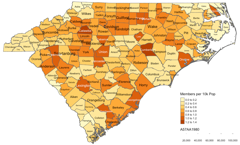
Feel free to experiment with the choropleth. In particular, try switching out the text.size variable to see if you can discover patterns that might appear to be linked to membership. Can you detect any trends between choropleth colors and text size? The income variable would be another test that could be run to see if counties with larger representation are wealthier. These visualizations, of course, are also be useful as a means to present information.
You can also look and the unadjusted distribution which shows the raw distribution of members(without adjusting for local population distribution) as I did below6:
qtm(shp = County_Aggregate_Data, fill = "CountMembers",text="NHGISNAM",text.size="A57AA1980")
Visualizing Data Relationships
While choropleths and their many variations are an extremely helpful way to visualize the geospatial data, there are other methods that help visualize the data. One helpful method is the scatterplot which provides a visual means to show relationships between two variables. In particular, it is useful to assess if there are correlations between our event data and other characteristics as defined by the census data. For example, do we see a correlation between counties with low average income and membership. If so, that might indicate something about the nature of the movement or organization. We could look at a multitude of factors along these lines and our census data and codebook has many. While correlations do not alone prove causality, they provide basic insight. When doing these comparisons, we have to again ensure we are taking into account the variability of populations within the census regions we are analyzing otherwise we will get misleading correlation in densely populated counties. To do this we need to convert any population number into numbers per 10,000 people.
If, for example, we wanted to use B18AA1990 which is the persons-white variable we would convert it to relative number:
WhitePer10K <- ((County_Aggregate_Data$B18AA1990/County_Aggregate_Data$TOTPOP)*10000)
Other total data should take regional size into account as well. For example, if we wanted to look at churches of a particular denomination, we would need to convert that as well because larger counties would inherently be more likely to have churches of any particular denomination, presenting misleading correlations. To look at AOG.C which is Assemblies of God churches we would:
Assemblies_Of_God_ChurchesPer10K <- ((County_Aggregate_Data$AOG.C/County_Aggregate_Data$CHTOTAL)*10000)
We could then plot this variable with the membership variable to inspect for correlations.
plot(Assemblies_Of_God_ChurchesPer10K,County_Aggregate_Data$BD5AA1990)
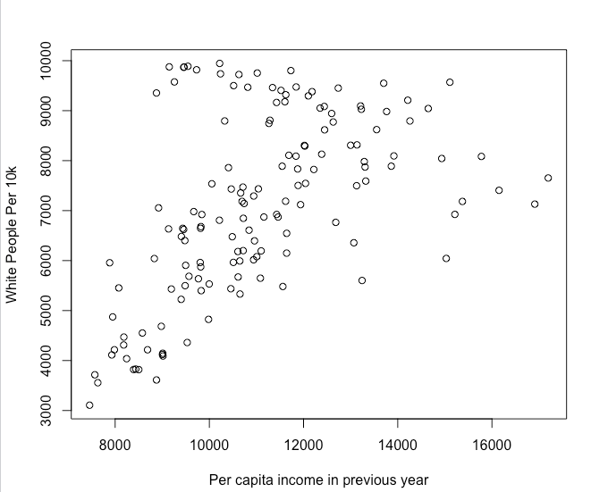
This previous command will result in a notable but small correlation, which makes sense since the para-church organization was affiliated with the Assemblies of God denomination. Most often, we are going to be comparing data points to our historical data, but we can also inspect for other relationships in the general census data that can provide basic information about the investigative areas. For example, here is scatterplot of race and per capita income in the Carolinas:
plot(WhitePer10K,County_Aggregate_Data$BD5AA1990)
Below we see the results of the above code. We see what is described as a strong positive correlation, which is typical in the United States as there are strong correlations between race and income. As the percentage of white people increases, the per-capita income rises accordingly. The dots on plot represent the graphed points of these two values. We can measure that statistically, but we can also see it visually.
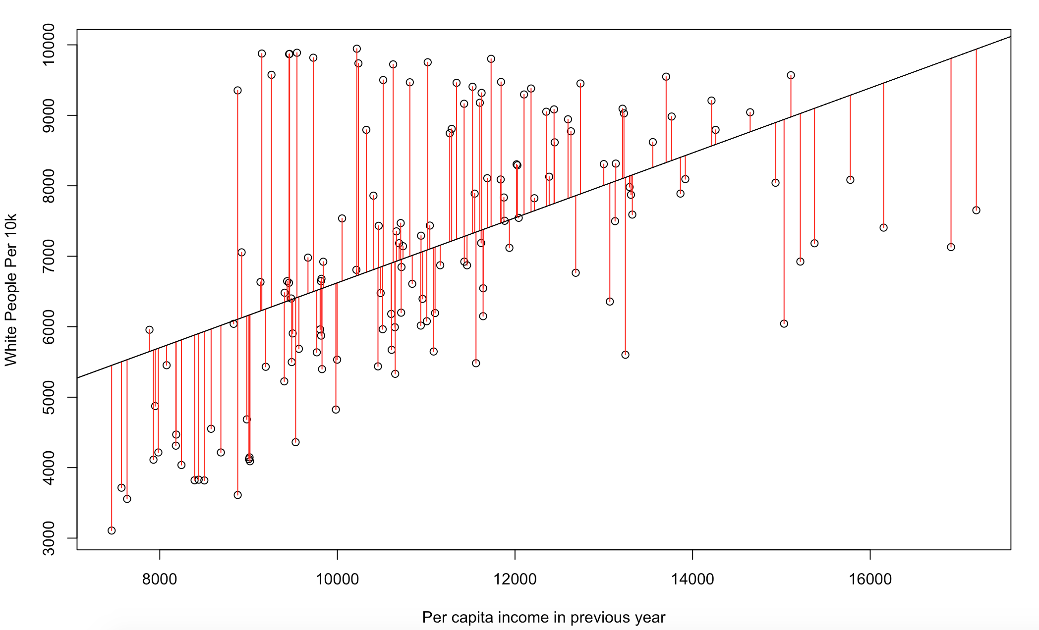
We can see this more precisely by adding a line of best fit to the plot which represents an estimated values based on the data presented. I also added red lines representing the distance from this line known as residuals. In essence, this showing us that we see a correlation between these two variables and it can be modeled with some accuracy.
x <- WhitePer10K
y <- County_Aggregate_Data$BD5AA1990
mod1 <- lm(x ~ y)
plot(x ~ y,xlab="Per capita income in previous year",ylab="White People Per 10k")
summary(mod1)
abline(mod1)
res <- signif(residuals(mod1), 5)
pre <- predict(mod1) # plot distances between points and the regression line
segments(y, x, y, pre, col="red")
Here we see it:
Below, let’s set up a variable to try to take a look at some of the variables to look for possible correlations. Below we are going to create a variable that measures the distribution of denominational churches in a county, which will allow us measure if our membership is correlated with a particular denomination:
Assemblies_Of_God_Churches_Per10K <- ((County_Aggregate_Data$AOG.C/County_Aggregate_Data$CHTOTAL)*10000)
MembersPer10K <- as.integer(((County_Aggregate_Data$CountMembers/County_Aggregate_Data$TOTPOP)*100000))
Now we will create a plot which show a small but significant correlation which makes sense since our organization is affiliated with this denomination. You can measure this statistically as well by using the lm function which we will not cover:
plot(MembersPer10K,Assemblies_Of_God_Churches_Per10K)
We did a regular plot of the data but it is better to account for the fact that this is count data. Correlations and scatterplots are great ways to assess relationships, but they can be problematic with count data as it is often not linear or normally distributed and scatter plots work best when both of these conditions are true. And historical data is often counts of people or occurrences. Because of this, I recommend taking a look at the distribution of the count data to asses relationships. For that I am going to use a histogram which is commonly used to represent distributions of data:
hist(County_Aggregate_Data$CountMembers,breaks = 15)
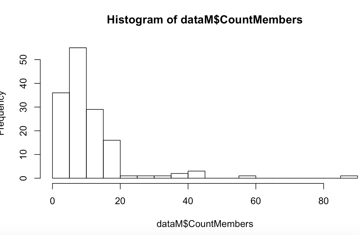
OK, there are a significant number of low values which is typical of this type of information and some counties that are much higher than others.7
A somewhat simple way to handle this is to perform a logarithmic transformation on a variable of the scatter plot to inspect for possible non-linear relationships. We add 1 to the values8 because log(0) is undefined. You could use .5 as some people do as well. Below we will analyze if there is a relationship between membership numbers and the count of churches in the counties observed using a log transformation. This can sometimes bring out correlations in count data that may have not been obvious using a non-adjusted scatterplot:
plot(MembersPer10K, log(Assemblies_Of_God_Churches_Per10K+1))
Conclusion
Through this process, we have gathered and transformed geospatial data into a useable form. We have also created some visuals from this data, analyzing trends in the membership list of our organization. This tutorial should provide you with a basic template on how to take historical data and begin using geospatial analysis to analyze phenomenons such as the one we covered. In our case, the results illustrated that membership was not highly correlated with people who live in rural counties, suggesting that early characterizations of this movement as rural may not be entirely true, while we can see a slight relationship between the Assemblies of God and membership. This is just the beginning of the possible means of inquiry. If we were to continue investigating, we could now start creating choropleths and scatter plots with other variables, looking for trends. As you get more advanced, you can utilize some more advanced methods that can improve analysis as well.
Other Models and Visualizations
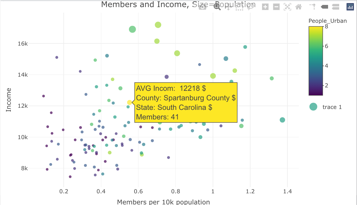
There are many other models and visualizations available that can bring insight but they also add some complexity which demand further statistical understandings. For example, You can also create more complex scatterplots that can provide further insights. Plot.ly offers interactive scatter plots that can be customized and shared.9. While statistical modeling usually focuses on a particular model’s predictive insight, well-fit models also provide insight into the data they represent. In particular, the Poisson regression is frequently used to create models of count data which is how population data is often represented. Geographically Weighted Regressions also have particular advantages with this type of data. But assessing fit has some complexity. Decision trees could also be useful for historical data because they give an understandable graphical representation of the the leading factors that caused inclusion in a group or list. Principal component analysis, correspondence analysis and other clustering methods can also be helpful, especially when there is limited knowledge or insight into the event being analyzed yet there is an abundance of data associated with the event. I recommend background reading or discussions with a data scientist or statistician when exploring some of these modeling options as understanding the configuration and parameters of the individual models is essential to ensuring the results are trustworthy and significant.
library(plotly)

var = County_Aggregate_Data$A57AA1990
bins = unique(quantile(var, seq(0,1,length.out=8)))
interv = findInterval(var, bins)
County_Aggregate_Data$People_Urban <-interv

p <- plot_ly(County_Aggregate_Data, type = "scatter", mode = "markers") %>%
    add_trace(x = ~(AV0AA1990/10000)/CountMembers,
              y = ~BD5AA1990,
              size = ~AV0AA1990,
              color = ~People_Urban,
              text = ~paste("AVG Incom: ",BD5AA1990 ,
                            '$<br>County:', COUNTY.y,
                            '$<br>State:', STATENAM,
                            '$<br>Members:', CountMembers),
              hoverinfo = "text") %>%
    layout(title = 'Members and Income, Size=Population',
           xaxis = list(title = 'Members per 10k population'),
           yaxis = list(title = 'Income'),
           hoverlabel = list(font = list(size = 16)))

p
-
For a broader discussion on the role of geographic information and GIS in the humanities see Placing History: How Maps, Spatial Data, and GIS Are Changing Historical Scholarship (Esri Press, 2008) and Harris, Trevor M., John Corrigan, and David J. Bodenhamer, The Spatial Humanities: GIS and the Future of Humanities Scholarship (Bloomington: Indiana University Press, 2010). ↩
-
For a discussion on the benefits and drawbacks on this methodology and its assumptions see, Spatializing health research. Some states like Kentucky have a larger number of counties (120) which often encompass entire cities which often leads to more homogeneity within those regions. In contrast, a state like Massachusetts has only 14 counties which can lead to more variability with the county geographies leading to more questionable results in some cases. ↩
-
This is often leveraged in the field of public health. See for example, Spatial Analysis and Correlates of County-Level Diabetes Prevalence. Other fields such as criminal justice also rely on similar analytics although criminal justice tends to look at smaller census areas within regions. See, for example,
https://www.ncjrs.gov/pdffiles1/nij/grants/204432.pdf↩ -
For an overview of R as it relates to the humanities with a chapter geospatial data also see Arnold Taylor and Lauren Tilton, Humanities Data in R (Cham: Springer, 2015). They also have a geospatial chapter that uses the sp library. ↩
-
We are setting Coordinate Reference System(CRS) to EPSG 4326 which is the most common mapping system used int the U.S. It is used by Google which is the origins of our data. EPSG 3857 is also used by google. For more on CRS see Coordinate Reference Systems & Spatial Projections. Also see coordinate systems reference in R. ↩
-
The variable
A57AA1980should be converted to a relative population variable so it is accounting for how rural a county is rather than how many people live in the county. This wlll be covered later but it should also take place here as well. It could be converted to a percentage via:County_Aggregate_Data$Percent_Rural = (cntyNCG$A57AA1980/cntyNCG$AV0AA1990). ↩ -
Count data typically has large numbers of zero values which can add some complexity that will not be covered here. There are more complex ways to minimize this using more complex regression models. See, for example Regression Models with Count Data. For general description of what normal distributions, which work well without modification look like see normal distributions ↩
-
There are different strategies to dealing with this type of data. See for example, The Excess-zero Problem in Soil Animal Count Data or Data Transformations. ↩
-
These plots are a bit more complex and requires an extra library, but they have some advantages. They work well with complex datasets because they have the ability to model more than two relationships by altering the color or size of the data points(we did this earlier on the choropleths by altering font size). Moreover, they are interactive which allows you to explore extra information about data points after the plot is created without wrecking the visual makeup of the plot. Here is an example that looks at the relationship between income and membership but also adds urban status to the visual using color. I am also adjusting point size based on population so I can take a look at more populated areas alongside the other data: ↩