
Contents
- Pre-requisites
- What is Correspondence Analysis?
- Canadian Parliamentary Committees
- Setting Up R for CA
- The Data
- Correspondence Analysis of the Canadian Parliamentary Committees 2006 & 2016.
- Interpreting the Correspondence Analysis
- Did Trudeau Expand the Agenda for Women’s Equality in Parliament?
- Analysis
- Conclusion
- Appendix: The Mathematics Behind Correspondence Analysis
- Endnotes
Correspondence analysis (CA) produces a two or three dimensional plot based on relationships among two or more categories of data. These categories could be “members and clubs,” “words and books” or “countries and trade agreements.” For example, one club member could correspond to another club member based on the shared clubs that they belong to. Members who attend the same clubs probably have more in common than those who attend different clubs. In the same vein, clubs that share members are also likely to have more in common than clubs with different members.
Discerning these significant correspondences can be very difficult to do when there are many elements in each of your categories (for example, if you have hundreds of members spread across dozens of clubs.) CA measures the strongest correspondences across a dataset, projecting them into a multidimensional space that can be visualized and interpreted. Usually, the top two dimensions are shown at one time, although it is possible to show three dimensions in a 3D display.1
Because CA visualizes relationships between elements of your data as distances on a plot, one can often discover broad patterns based on what elements in one category appear near elements in the other. Thus, CA can be a good first step to filter through the main patterns of a large data set. It is a powerful tool to understand historical information inside digital collections particularly.
After reading this tutorial, you should:
- Know what CA is and what it is used for.
- Know how to run CA using R’s FactoMineR library.
- Accurately describe the results of a CA.
Pre-requisites
This tutorial is for intermediate programming historians. It assumes you have basic understanding of R and some basic statistical knowledge.
Taryn Dewar’s tutorial on R Basics with Tabular Data has information on how to set up and configure R. Taylor Arnold and Lauren Tilton’s tutorial on Basic Text Processing in R could be helpful as a warm-up, also.
Since CA is a kind of social network analysis, it would not hurt to look at Marten Düring’s From Hermeneutics to Data to Networks: Data Extraction and Network Visualization of Historical Sources which also has some useful information on structuring data for network analysis.
What is Correspondence Analysis?
Correspondence analysis (CA), also called “multi-dimensional scaling” or “bivariate network analysis” lets you observe the inter-relationship of two groups in a two-way graph plot. For example, it was famously used by French sociologist Pierre Bourdieu to show how social categories like occupation influence political opinion.2 It is especially powerful as a tool for finding patterns in large datasets.
CA works on any kind of categorical data (datasets that have been grouped into categories). Let’s start with a simple example. If you wanted to understand the role that international free trade agreements had on the interconnection of G8 nations, you could create a table for countries and the free trade relationships they held at a particular time.
A small selection of trade agreements (in Blue) including the European Economic Area (EEA), Canada-EU Trade Agreement (CETA), North American Free Trade Agreement (NAFTA), Trans Pacific Partnership (TPP) and the Association of Southeast Asian Nations (ASEAN) corresponds to G8 countries. The countries (colored red) cluster geographically, with Pacific-oriented countries on the right, European countries on the left and North American countries in the centre. Canada and the U.S., as predicted, are together. Germany, Italy, France and the U.K. all belong to the same two agreements (CETA & EEA) so they all fall on the exact same point.
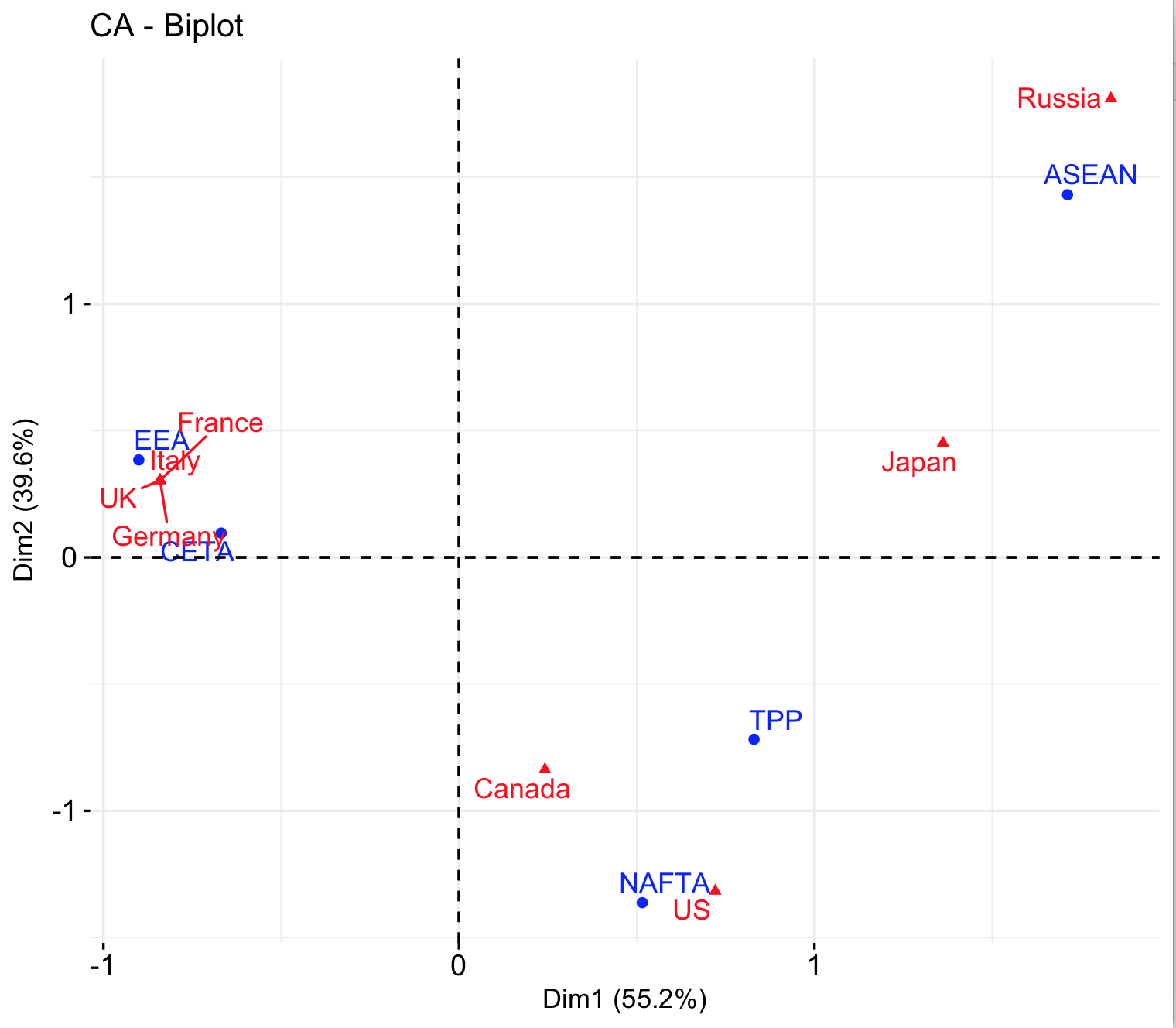
Correspondence analysis of selected G8 Countries and their trade agreements
On the other hand, while Russia and the U.S. are somewhat close on the horizontal axis, they are on opposite poles of the vertical axis. Russia only shares a trade agreement with one other country (Japan), and the US with two (Japan and Canada). In a CA graph, units with few relationships will find themselves on the outskirts, while those with many relationships will be closer to the centre. The relative connection or lack of connection of a datapoint is quantified as inertia in CA. Relative lack of connection produces higher inertia.
A more substantial point about Russia and the US is that Russia is a Pacific country that does not belong to the TPP. Observing this relationship, a historian may wonder if this occurs because of a strained trade relationship between Russia and the US compared to other G8 countries, or general attitudes toward trade agreements for these countries.3
With more data, CA can uncover more subtle distinctions among groups within a particular category. In this tutorial, we will look at Canadian political life – specifically, how political representatives are organized into committees during one government versus another. Similar to trade agreements, we would expect committees that have similar members to be closer together. Further, committees that have few representatives in common will be find themselves on the outskirts of the graph.
Canadian Parliamentary Committees
In the Canadian Parliamentary system, citizens elect representatives called Members of Parliament, or MPs, to the House of Commons. MPs are responsible for voting on and proposing changes to legislation in Canada. Parliamentary Committees (CPCs) consist of MPs who inform the House about important details of policy in a topic area. Examples of such committees include the CPCs on Finance, Justice and Health.
We will use abbreviations for the parliamentary committees because the names can get long, making them hard to read on a plot. You can use this table as a reference guide for the abbreviations and their respective committee names:
| Abbreviation | Committee Name |
|---|---|
| INAN | Indigenous and Northern Affairs |
| HUMA | Human Resources, Skills and Social Development and the Status of Persons with Disabilities |
| FINA | Finance |
| FAAE | Foreign Affairs and International Development |
| ETHI | Access to Information, Privacy and Ethics |
| ENVI | Environment and Sustainable Development |
| CHPC | Canadian Heritage |
| CIMM | Citizenship and Immigration |
| ACVA | Veterans Affairs |
| HESA | Health |
| TRAN | Transport, Infrastructure and Communities |
| FOPO | Fisheries and Oceans |
| RNNR | Natural Resources |
| FEWO | Status of Women |
| ESPE | Pay Equity |
| IWFA | Violence against Indigenous Women |
| BILI | Library of Parliament |
| AGRI | Agriculture and Agri-food |
| JUST | Justice and Human Rights |
As a historian, I suspect that MPs are organized according to committee topics differently from government to government. For example, the committees formed during Stephen Harper’s Conservative government’s first cabinet may be differently organized than Justin Trudeau’s Liberal initial cabinet. A number of reasons exist for this suspicion. First, CPCs are formed by party leadership and committee decisions need coordination among members of the House. In other words, political parties will use CPCs as tools to score political points, and governments must ensure the right people are members of the right committees to protect their political agendas. Second, the two governments have different political focus. Harper’s Conservative government focussed more on issues of economic development, while Trudeau’s Liberals first major decisions emphasized social equality. In short, there may be some calculated decisions about who goes into what committee, providing evidence about government attitudes towards or against certain topics.
Setting Up R for CA
To do a CA, we will need a library that will do linear algebra for us. For the more mathematics inclined, there is an appendix with some of the details about how this is done. In R, there are a number of options for CA, but we will use the FactoMineR library4 a library focussed on “multivariate exploratory data analysis.” FactoMineR can be used to conduct all kinds of different multivariate analysis including hierarchical clusters, factor analysis and so on.
But first, here is how to install and call the libraries, then pop them into an R object for wrangling.
##  These commands only need to be done the first time you conduct an analysis.
##  FactoMineR is also a pretty large library, so it may take some time to load.

install.packages("FactoMineR") # includes a module for conducting CA
install.packages("factoextra") # library to prettify our CA graphs

# import the libraries:
library(FactoMineR)
library(factoextra)

# set.seed(189981) # optional for reproduction.

# read the csv files

harper_df <- read.csv("http://programminghistorian.org/assets/correspondence-analysis-in-R/HarperCPC.csv", stringsAsFactors = FALSE)
The Data
The data for this tutorial can be found archived in Zenodo if you would like to see the raw data. It has been conveniently included in tabular format as well (note: you do not need to manually download these files. We will use R to download them directly):
1) Harper’s CPCs 2) Trudeau’s CPCs
A sample of the data for the first session of Stephen Harper’s government. The rows represent committees and the columns are specific members. If a member belongs to a committee, the cell will have a 1; if not, it will have a 0.
harper_df
     C Bennett D Wilks DV Kesteren G Rickford J Crowder K Block K Seeback
FAAE         0       0           1          0         0       0         0
FEWO         0       0           0          0         0       0         0
FINA         0       0           1          0         0       0         0
HESA         0       1           0          0         0       1         0
INAN         1       0           0          1         1       0         1
IWFA         1       0           0          1         1       1         0
JUST         0       1           0          0         0       0         1

     L Davies N Ashton R Goguen R Saganash S Ambler S Truppe
FAAE        0        0        0          1        0        0
FEWO        0        1        0          0        1        1
FINA        0        0        0          0        0        0
HESA        1        0        0          0        0        0
INAN        0        0        0          0        1        0
IWFA        1        1        1          1        1        1
JUST        0        0        1          0        0        0
Structured another way (through an R table) we can show that committees have many MPs and some MPs are members of multiple committees. For example, Liberal MP Carolyn Bennett was a member of “INAN” (Indigenous and Northern Affairs) and “IWFA” (Violence against Indigenous Women) and HESA (Parliamentary Committee on Health) included both D Wilks and K Block. In general, the committees have between nine and twelve members. Some MPs are members of only one committee while others may belong to multiple committees.
Correspondence Analysis of the Canadian Parliamentary Committees 2006 & 2016.
Our data frame harper_df consists of full committee names and MP names but some of the committee names (e.g., “Human Resources, Skills and Social Development and the Status of Persons with Disabilities”) are too long to show well on a graph. Let’s use the abbreviations instead.
harper_table <- table(harper_df$abbr, harper_df$membership)
The table command makes a cross-tabular dataset out of two categories in the data frame. Since the columns are individual MPs and rows are committees. Each cell contains a 0 or a 1 based on whether a connection exists. If we looked at actual attendance at each meeting we could also include weighted values (eg. 5 for an MP attending a committee meeting 5 times). As a rule of thumb, use weighted values when quantities matter (when people invest money, for example), and use 0s and 1s when they do not.
Unfortunately, we have one more problem. A large number of MPs are members of only 1 committee. That will cause those MPs to overlap when we create the graph, making it less readable. Let’s require MPs to belong to at least 2 committees before we run FactoMineR’s CA command.
harper_table <- harper_table[,colSums(harper_table) > 1]
CA_harper <- CA(harper_table)
plot(CA_harper)
The colSums command adds up the values for each column in the table. rowSums could be used to add up the rows if that was necessary (it is not for us, because all the committees have more than one MP).
The CA command plots the results for the top two dimensions and stores the data summary in a variable called CA_harper. For the most part, CA does most of the work for us. As discussed, more details about the mathematics behind CA are provided in the appendix.
You should get a graph that looks something like this:
Correspondence analysis of Parliamentary Committees for 1st Session of Harper Government
Let’s wrangle the Trudeau government data in the exact same way.
trudeau_df <- read.csv("http://programminghistorian.org/assets/correspondence-analysis-in-R/TrudeauCPC.csv", stringsAsFactors = FALSE)
trudeau_table <- table(trudeau_df$abbr, trudeau_df$membership)
trudeau_table <- trudeau_table[,colSums(trudeau_table) > 1]
CA_trudeau <- CA(trudeau_table)
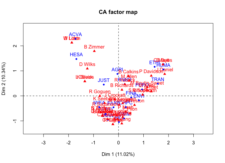
plot(CA_trudeau)
Correspondence analysis of Parliamentary Committees for 1st Session of Justin Trudeau Government
Oh dear. Our data labels are not very readable right now. Even with the switch to abbreviations, the labels are overlapping. The factoextra5 library has a repel feature that helps show things more clearly.
fviz_ca_biplot(CA_harper, repel = TRUE)
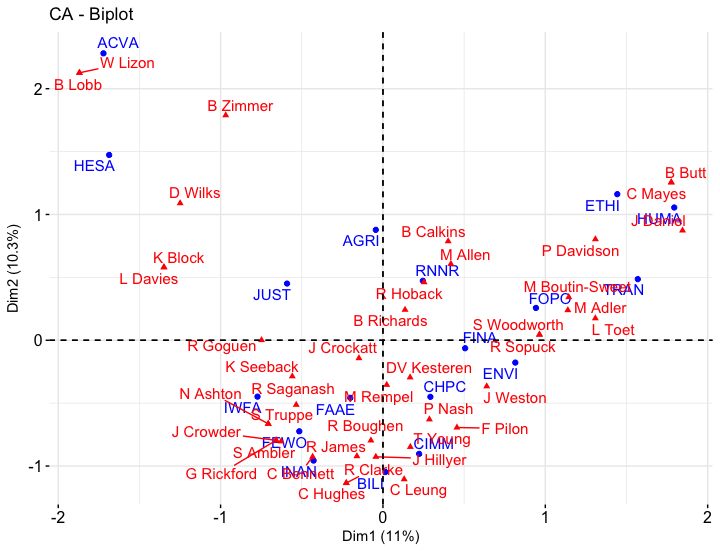
Correspondence analysis of Parliamentary Committees for 1st Session of Harper Government
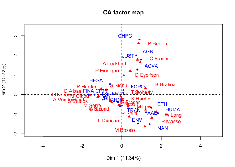
fviz_ca_biplot(CA_trudeau, repel = TRUE)
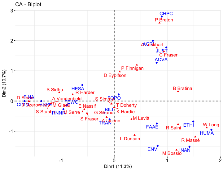
Correspondence analysis of Parliamentary Committees for 1st Session of Justin Trudeau Government
Instead of overlapping, the labels now use arrows to show their location where appropriate.
Interpreting the Correspondence Analysis
The data plots look nicer, but how well can we trust the validity of this data? Our first hint is to look at the dimensions. In the Harper data, only eleven and ten percent explanatory value[^explanatory] appear on the horizontal and vertical axis respectively for a total of 21 percent! That does not sound promising for our analysis. Remembering that the total number of dimensions is equal to the number of rows or columns (whichever is smaller), this could be concerning. When such low values occur, this usually means the data points are quite evenly distributed, and that MPs are evenly distributed on CPCs is a fairly well established convention of parliament.
Another way to look at the data is through inertia 6 values. More details about inertia can be found in the appendix, but on the graph, data points far away from the origin have greater inertia. High inertia points suggest outliers – actors or events that have fewer connections than the ones near the centre. Low inertia values suggest data points that have more in common with the group as a whole. As an analysis tool, it can be useful for finding renegade actors or subgroups in the dataset. If all the points have high inertia, it could be an indicator of high diversity or fragmentation for the networks. Low overall inertia could be an indicator of greater cohesiveness or general convergence. What it means will depend on the dataset. For our graphs, no datapoint ventures too far beyond 2 steps from the mean. Again, this is an indicator that the relationships are relatively evenly distributed.
Let’s look at the data more closely:
summary(CA_harper)
gives us
HARPER

The chi square of independence between the two variables is equal to 655.6636
(p-value =  0.7420958 ).

Eigenvalues
                       Dim.1   Dim.2   Dim.3   Dim.4   Dim.5   Dim.6
Variance               0.831   0.779   0.748   0.711   0.666   0.622
% of var. 11.024  10.342   9.922   9.440   8.839   8.252
Cumulative % of var. 11.024  21.366  31.288  40.729  49.568  57.820

                       Dim.7   Dim.8   Dim.9  Dim.10  Dim.11  Dim.12
Variance               0.541   0.498   0.463   0.346   0.305   0.263
% of var. 7.174   6.604   6.138   4.591   4.041   3.488
Cumulative % of var. 64.995  71.599  77.736  82.328  86.368  89.856

                      Dim.13  Dim.14  Dim.15  Dim.16  Dim.17
Variance               0.240   0.195   0.136   0.105   0.088
% of var. 3.180   2.591   1.807   1.396   1.170
Cumulative % of var. 93.036  95.627  97.434  98.830 100.000
The Eigenvalues heading of the summary presents metrics on the newly computed dimensions, listing the percentage of variance contained within each. Unfortunately, the percentage of variance found in the top two dimensions is very low. Even if we were able to visualize 7 or 8 dimensions of the data, we would only capture a cumulative percentage of about 70 percent. The chi square test of independence tells us that we cannot reject the hypothesis that our two categories (CPCs and MPs) are independent. The p-value7 is 0.74, well above the 0.05 commonly used as a cut-off for rejecting a null hypothesis. A lower p-value would occur, for example, if all or most of the MPs were members of one or two committees. Incidentally, the Trudeau sample’s chi squared p-value is lower at 0.54, but still not sufficiently low to reject the hypothesis of mutually independent categories.
As discussed, this result is not too surprising. We expect MPs to be relatively evenly distributed across committees. If we elected to weight our measures based on the attendance of MPs at each committee meeting or their desire from 1-100 to be a member of each committee, we might see different results (for instance, it might be more common for MPs to attend finance meetings regularly compared to other meetings).
Has CA failed us? Well, not really. This just means that we cannot just throw data into an algorithm and expect to answer real history questions. But we are not just programmers but Programming Historians. Let’s put on our history caps and see if we can refine our research!
Did Trudeau Expand the Agenda for Women’s Equality in Parliament?
One of the early political moves Justin Trudeau made was to ensure that Canada would have a cabinet with 50% women. Arguably, the purpose of this announcement was to profess an agenda of gender equality. The Trudeau government also created a new Parliamentary Committee on equal pay for women in its first session. In addition, the Trudeau government introduced a motion to have an inquiry on Missing and Murdered Indigenous Women, replacing the mandate for Harper’s parliamentary committee for Violence Against Indigenous Women.
If Trudeau did intend to take Women’s equality seriously, we might expect that the more members of the Status of Women committee would be connected to larger portfolios such as Justice, Finance, Health and Foreign Affairs compared to Harper’s government. Since Harper’s regime did not have an equal pay CPC, we will include the CPC for “Violence Against Indigenous Women.”
#include only the desired committees
# HESA: Health, JUST: Justice, FEWO: Status of Women,
# INAN: Indigenous and Northern Affairs, FINA: Finance
# FAAE: Foreign Affairs and International Trade
# IWFA: Violence against Indigenous Women

harper_df2 <- harper_df[which(harper_df$abbr %in%
    c("HESA", "JUST", "FEWO", "INAN", "FINA", "FAAE", "IWFA")),]
harper_table2 <- table(harper_df2$abbr, harper_df2$membership)

# remove the singles again
harper_table2 <- harper_table2[, colSums(harper_table2) > 1]
CA_Harper2 <- CA(harper_table2)
plot(CA_Harper2)
This produces the following graph:
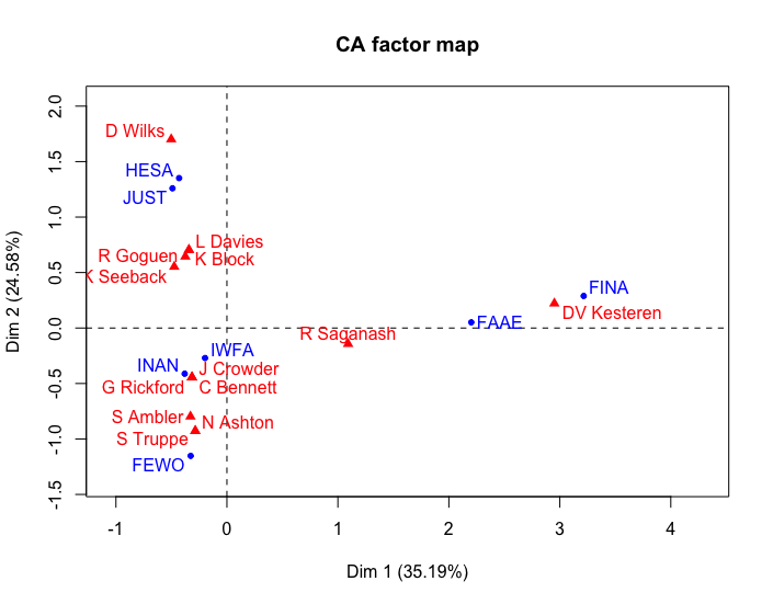
Correspondence analysis of selected Parliamentary Committees for 1st Session of Stephen Harper Government
The chi squared p-value for this result moves only slightly towards zero, to 0.71. We still cannot draw any quantitative conclusions about a clear relationship between CPCs and MPs. For our data, this is not too important a result. Maybe if we polled the MPs about what CPC was the most productive or important, we may find lower p-values. The inertia on the horizontal axis has about doubled, suggesting that FINA (Finance) is an outlier on the graph compared to the other portfolios.
The meaning of a CA depends on a qualitative interpretation of the plot. Looking at the elements in the Harper graph, for instance, we might say that economic concerns fall to the right of the y-axis and social concerns fall to the left. So one of the “reasons” for choosing MPs for membership in committees in Harper’s government appears to be to distinguish between social and economic concerns.
However, when we run the same analysis with the Trudeau government …
trudeau_df2 <- trudeau_df[which(trudeau_df$abbr %in%
    c("HESA", "JUST", "FEWO", "INAN", "FINA", "FAAE", "ESPE")),]
trudeau_table2 <- table(trudeau_df2$abbr, trudeau_df2$membership)
trudeau_table2 <- trudeau_table2[, colSums(trudeau_table2) > 1] # remove the singles again
CA_trudeau2 <- CA(trudeau_table2)
plot(CA_trudeau2)
we get …
Error in eigen(crossprod(X, X), symmetric = TRUE) :
infinite or missing values in 'x'
“Infinite or missing values” suggests that there is no cross-relationship among some of the committees. Looking at trudeau_table2, we see:
     A Vandenbeld D Albas M Gladu R Harder S Sidhu
ESPE            1       1       1        0       1
FAAE            0       0       0        0       0
FEWO            1       0       1        1       0
FINA            0       1       0        0       0
HESA            0       0       0        1       1
INAN            0       0       0        0       0
JUST            0       0       0        0       0
No cross-membership for Foreign Affairs, Indigenous and Northern Affairs or Justice! Well, that is a result in and of itself. We can conclude generally that the agendas for the two governments are quite different, and that there was a different approach used to organize MPs into committees.
For a Canadian historian, the result makes some sense given that Violence against Indigenous Women is much more likely to be connected to Indigenous and Northern Affairs, and the Justice Department (the story of Violence Against Indigenous Women is tied to a number of high profile criminal cases in Canada) than Equal Pay would. As discussed before, analysing a CA requires an amount of interpretation to become meaningful.
Perhaps we can observe some different committees instead. By taking out “JUST”, “INAN” and “FAAE” and replacing it with “CIMM” (Immigration), “ETHI” (Ethics and Access to Information) and “HUMA” (Human Resources) we can finally get a picture of the structure of parliamentary committees in this context.
trudeau_df3 <- trudeau_df[which(trudeau_df$abbr %in%
    c("HESA", "CIMM", "FEWO", "ETHI", "FINA", "HUMA", "ESPE")),]
trudeau_table3 <- table(trudeau_df3$abbr, trudeau_df3$membership)
trudeau_table3 <- trudeau_table3[, colSums(trudeau_table3) > 1] # remove the singles again
CA_trudeau3 <- CA(trudeau_table3)
plot(CA_trudeau3)
Correspondence analysis of selected Parliamentary Committees for 1st Session of Justin Trudeau Government
In general, the inertia on the horizontal axis is less than that for Harper’s government, but the separation has HUMA (Human Resources) and ETHI (Ethics) against the other portfolios on the right. The delineation between social and economic issues is not as evident as it was for Harper, suggesting a different philosophy for selection. That said, there are fewer MPs sharing the positions as well. That may be another mystery for further exploration. Nonetheless, the CA process provides us with a solid overview of the relationships occurring within the committees upon a quick glance, with very few commands.
Analysis
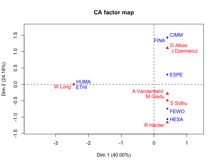
As in most interpretive research, we do not get a straight-forward answer to our question about power for women in parliamentary governments. In the Harper case, we see a division on the horizontal axis between social issues like Health & Justice and economic issues like Finance and Foreign Affairs, accounting for 35% of the variance. From the visualisation, we can guess that Finance (FINA) and Foreign Affairs (FAAE) have one common member and that Foreign Affairs (FAAE) has a common member with Violence Against Indigenous Women (IWFA). This result is possibly a concern because Stephen Harper’s most publicized agendas tended to focus on economic concerns such as trade and fiscal restraint. The separation of the committees implies that Harper’s philosophy for governance separated economic from social concerns and that Women’s rights was primarily a social concern. The Status of Women portfolio (FEWO) itself is separated from the rest of the portfolios, finding itself connected to the other portfolios only through common MPs with the Violence against Indigenous Women (IWFA) and Indigenous and Northern Affairs (INAN) committees.
The Trudeau government graph shows no cross-connections of Status of Women to Justice, Foreign Affairs and Indigenous Peoples, but stronger connections to Finance, Citizenship, Human Resources and Ethics. Women’s Rights is connected to Finance and Immigration through the Equal Pay portfolio.
Arguably, the Harper government’s regime aligned Women’s Rights to social portfolios such as Justice and Health, while Trudeau raised the Status of Women profile to some degree by including the Equal Pay committee. The connection between committees focussed on Women’s Rights and strong portfolios like Health, Finance and Citizen and Immigration in the Trudeau government is worthy of more detailed analysis. Status of Women in this context appears to hold a more central (closer to the origin) position than the Status of Women committee in Harper’s government. That said, the number of data points in this case are still fairly small to draw a definitive conclusion. Perhaps other sources of evidence could be visualised in a similar way to confirm or deny this point.
The previously held agenda between women and indigenous peoples has been displaced in the Trudeau case. As discussed earlier, the National Inquiry into Missing and Murdered Indigenous Women and Girls displaced the mandate for the Violence Against Indigenous Women committee that existed during Harper’s tenure. The history of this transition is complex, but political pressure was applied to the Harper government to create the National Inquiry into Missing and Murdered Indigenous Women following the trial of Robert Pickton and reports of insufficient police investigations for missing indigenous women. Harper refused to conduct an inquiry citing that the CPC was the better approach.8 Trudeau made it an election promise to include the inquiry, thus displacing the committee. To a degree, Harper appears to have given violence against Indigenous Women a fairly central role in Parliamentary Committee planning. This evidence is a counterpoint to criticisms that Harper did not take the issue of Missing and Murdered Indigenous Women seriously.
The differences between the two relationships raise important questions about the role of the Status of Women in political discourse and its interconnections among racial identity, public finance, health and social justice to be explored perhaps in more detailed qualitative work. It also raises important questions about a focus on gender in general (as per the Status of Women portfolio) or more specifically as it applies to a marginalized group (Missing and Murdered Indigenous Women). A policy paper related to the benefits of an Inquiry versus Parliamentary Committee discussion seems reasonable after examining this evidence. Perhaps there is an argument that the exchange of IWFA for ESPE is a glass ceiling of sorts, artificially placing a quota on women’s issues while established portfolios remain untouched. As an exploratory tool, CA helps us identify such themes from empirical observation rather than relying on theory or personal bias.
Conclusion
Now that this tutorial is complete, you should have some sense of what CA is and how it can be used to answer exploratory questions about data. We used the FactoMineR CA command to create the analysis and plot the results in two dimensions. When the labels ran into each other, we applied the factoextra library’s viz_ca_biplot command to display the data in a more readable format.
We also learned how to interpret a CA and how to detect potential analytical pitfalls, including cases where the relationships among categories are too evenly distributed and have low explanatory value. In this case, we refined our research question and data to provide a more meaningful picture of what happened.
In general, the benefit of this analysis is to provide a quick overview of two-category dataset as a pathfinder to more substantive historical issues. The use of members and meetings or events in all areas of life (business, not-for-profit, municipal meetings, twitter hashtags etc.) is a common approach to such analysis. Social groups and their preferences is another common use for CA. In each case, the visualisation offers a map with which to observe a snapshot of social, cultural and political life.
Next steps may include adding further categorical dimensions to our analysis, such as incorporating political party, age or gender. When you do CA with more than two categories, it is called Multiple Correspondence Analysis or MCA. While the Mathematics for MCA is more complicated, the end results are quite similar to CA.
Hopefully, you can now apply these methods to your own data, helping you to uncover questions and hypotheses that enrich your historical research. Good luck!
Appendix: The Mathematics Behind Correspondence Analysis
Since the mathematics of CA will be interesting to some and not to others, I have collected it in this Appendix. The section also contains a little more detail about some other topics such as inertia, dimensions and singular value decomposition (SVD).
In order to make it easier to understand, we will begin with just a few committees. FEWO (Status of Women), HESA (Health), INAN (Indigenous and Northern Affairs), IWFA (Violence Against Indigenous Women) and JUST (Justice).
           C Bennett D Wilks G Rickford J Crowder K Block K Seeback L Davies N Ashton
FEWO         0       0          0         0       0         0        0        1
HESA         0       1          0         0       1         0        1        0
INAN         1       0          1         1       0         1        0        0
IWFA         1       0          1         1       1         0        1        1
JUST         0       1          0         0       0         1        0        0

            R Goguen S Ambler S Truppe
FEWO        0         1        1
HESA        0         0        0
INAN        0         1        0
IWFA        1         1        1
JUST        1         0        0
CA is done on a “normalized” dataset9 which is created by dividing the value of each cell by the square root of the product of the column and row totals, or cell \(\frac{1}{\sqrt{column total \times row total}}\). For example, the cell for FEWO and S Ambler is \(\frac{1}{\sqrt{3 \times 3}}\) or 0.333.
The normalised table looks like:
         C Bennett D Wilks G Rickford J Crowder K Block K Seeback L Davies N Ashton
FEWO     0.000   0.000      0.000     0.000   0.000     0.000    0.000    0.408
HESA     0.000   0.408      0.000     0.000   0.408     0.000    0.408    0.000
INAN     0.316   0.000      0.316     0.316   0.000     0.316    0.000    0.000
IWFA     0.235   0.000      0.235     0.235   0.235     0.000    0.235    0.235
JUST     0.000   0.408      0.000     0.000   0.000     0.408    0.000    0.000

        R Goguen S Ambler S Truppe
FEWO    0.000    0.333    0.408
HESA    0.000    0.000    0.000
INAN    0.000    0.258    0.000
IWFA    0.235    0.192    0.235
JUST    0.408    0.000    0.000
The normalisation process does something interesting. Those who are members of multiple committees and/or who belong to committees with many members will tend to have normalisation scores that are lower, suggesting that they are more central to the network. These members will be put closer to the centre of the matrix. For example, the cell belonging to S Ambler and IWFA has the lowest score of 0.192 because S Ambler is a member of three committees and the IWFA committee has nine members in the graph represented.
The next stage is to find the singular value decomposition of this normalised data. This involves fairly complex linear algebra that will not be covered here, but you can learn more from these Singular Value Decomposition lecture notes or in more detail from this pdf file on SVD. I will try to summarize what happens in lay terms.
- Two new matrices are created that show “dimension” scores for the rows (committees) and the columns (MPs) based on eigenvectors.
- The number of dimensions is equal to the size of the columns or rows minus 1, which ever is smaller. In this case, there are five committees compared to the MPs eleven, so the number of dimensions is 4.
- One more matrix shows the singular values (eigenvalues), which can be used to show the influence of each dimension in the analysis.
- One of a number of “treatments” are applied to the data to make it easier to plot. The most common is the “standard coordinates” approach, which compares each normalised score positively or negatively to the mean score.
Using standard coordinates, our data tables show the following:
Columns (MPs):

Dim 1        Dim 2      Dim 3       Dim 4
C Bennett  -0.4061946 -0.495800254  0.6100171  0.07717508
D Wilks     1.5874119  0.147804035 -0.4190637 -0.34058221
G Rickford -0.4061946 -0.495800254  0.6100171  0.07717508
J Crowder  -0.4061946 -0.495800254  0.6100171  0.07717508
K Block     0.6536800  0.897240970  0.5665289  0.04755678
K Seeback   0.5275373 -1.245237189 -0.3755754 -0.31096392
L Davies    0.6536800  0.897240970  0.5665289  0.04755678
N Ashton   -0.8554566  0.631040866 -0.6518568  0.02489229
R Goguen    0.6039463 -0.464503802 -0.6602408  0.73424971
S Ambler   -0.7311723 -0.004817303 -0.1363437 -0.30608465
S Truppe   -0.8554566  0.631040866 -0.6518568  0.02489229

$inertia
[1] 0.06859903 0.24637681 0.06859903 0.06859903 0.13526570 0.17971014 0.13526570
[8] 0.13526570 0.13526570 0.08438003 0.13526570

Rows (Committees):

Dim 1      Dim 2      Dim 3       Dim 4
FEWO -1.0603194  0.6399308 -0.8842978 -0.30271466
HESA  1.2568696  0.9885976  0.4384432 -0.28992174
INAN -0.3705046 -0.8359969  0.4856563 -0.27320374
IWFA -0.2531830  0.1866016  0.1766091  0.31676507
JUST  1.1805065 -0.7950050 -0.8933999  0.09768076

$inertia
[1] 0.31400966 0.36956522 0.24927536 0.09017713 0.36956522
Each score for a “dimension” can be used as a coordinate in a graph plot. Given that we cannot visualize in four dimensions, CA outputs usually focus on the first two or three dimensions to produce a graph (for example, HESA will be plotted on [1.245, 0.989] or [1.245, 0.989, 0.438] on a 3D graph).
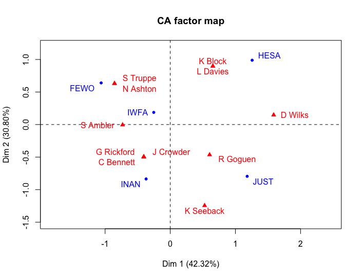
Correspondence analysis of selected Parliamentary Committees for 1st Session of the Stephen Harper Government, 2006
Inertia scores are a way of showing variance in the data. Health and Justice, having the smallest membership has a high inertia score, while the most popular committee IWFA has small inertia. Thus, inertia is a way of quantifying points’ distance from the centre of the graph.
Another important score is visible on the CA graph - the percentage of explanatory value for each dimension. This means the horizontal axis explains 42.32 percent of the variance in the graph, while the vertical axis explains almost 31 percent. What these axes mean must be interpreted based on the graph. For instance, we might say that the left hand side represents issues concerning social identity and those on the right are more regulatory. Further historical analysis of the minutes of these committees could in turn offer greater understanding about what these members participation meant at the time.
Endnotes
-
CA has a history branching from a number of disciplines, and thus the terminology can be confusing. For simplicity, categories refers to the types of data being compared (e.g. members and clubs) while each item within those categories (eg. “The Tennis Club” or “John McEnroe”) will be an element inside that category. The quantitative location of the elements (x and y coordinates) are data points. ↩
-
Brigitte Le Roux and Henry Rouanet, Multiple Correspondence Analysis (Los Angeles: SAGE Publications, 2010), pg. 3; ↩
-
I would not mean to suggest that this analysis is in any way conclusive about US-Russia trade ties. The point is that because Russia is not part of the TPP in this agreement, it separates from the US. On the other hand, if membership to the TPP could be proven to represent strained ties between US-Russia, it would show up on the CA graph. ↩
-
Sebastien Le, Julie Josse, Francois Husson (2008). FactoMineR: An R Package for Multivariate Analysis. Journal of Statistical Software, 25(1), 1-18. 10.18637/jss.v025.i01 ↩
-
Alboukadel Kassambara and Fabian Mundt (2017). factoextra: Extract and Visualize the Results of Multivariate Data Analyses. R package version 1.0.4. https://CRAN.R-project.org/package=factoextra ↩
-
In general, inertia in statistics refers to the variation or “spread” of a dataset. It is analogous to standard deviation in distribution data. ↩
-
In statistics, a p-value, short for probability value, is an indicator of how likely an outcome would have occurred under random circumstances. A low p-value would suggest a low probability that the result would have occurred at random and thus provides some evidence that a null hypothesis (in this case, that the MPs and CPCs are independent categories) is unlikely. ↩
-
See Laura Kane (April 3, 2017), “Missing and murdered women’s inquiry not reaching out to families, say advocates.” CBC News Indigenous. http://www.cbc.ca/news/indigenous/mmiw-inquiry-not-reaching-out-to-families-says-advocates-1.4053694 ↩
-
Katherine Faust (2005) “Using Correspondence Analysis for Joint Displays of Affiliation Network” in Models and Methods in Social Network Analysis eds. Peter J. Carrington, John Scott and Stanley Wasserman. ↩