
Contents
- Introduction
- The Data
- Loading Data
- Creating a Model
- Investigating the Results of our Model
- Concluding Reflections on Humanities, Classification, and Computer Vision
- Further Reading and Resources
- Endnotes
Introduction
This is the second part of a two-part lesson. This lesson seeks to build on the concepts introduced in Part 1 of this lesson.
Lesson aims
In this part, we will go deeper into the topic by:
- Outlining the importance of understanding the data being used to train a model and some possible ways to assess this.
- Developing an understanding of how different metrics tell you different stories about how your model is performing.
- Introducing data augmentation as one tool for reducing the amount of training data you need for training a machine learning model.
- Exploring how we can identify where a model is performing poorly.
A particular focus of this lesson will be on how the fuzziness of concepts can translate —or fail to translate— into machine learning models. Using machine learning for research tasks will involve mapping messy and complex categories and concepts onto a set of labels that can be used to train machine learning models. This process can cause challenges, some of which we’ll touch on during this lesson.
Lesson Set-Up
We assume you have already completed Part 1, which includes setup instructions. You can find the notebook accompanying this lesson here. Please see Part 1 of the lesson for more information on setting up if you need.
The Deep Learning Pipeline
In Part 1, we introduced the process of creating an image classifier model and looked at some of the key steps in the deep learning pipeline. In this lesson, we will review and reinforce key concepts from Part 1 and then further identify steps for creating a deep-learning model, from exploring the data to training the model.
As a reminder, we can think of the process of creating a deep learning model as a pipeline of related steps. In this lesson we will move through this pipeline step by step:
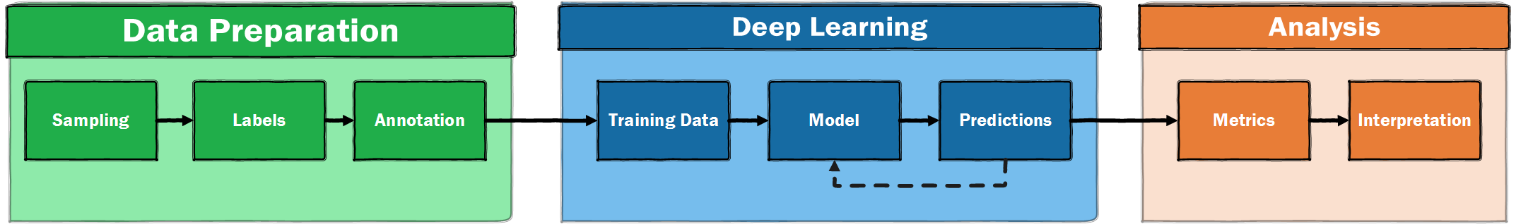
Figure 1. A high-level illustration of a supervised machine learning pipeline
The Data
We will again work with the Newspaper Navigator dataset. However, this time the images will be those predicted as photos. These photos are sampled from 1895 to 1920. For a fuller overview of the ‘arcaeology’ of this dataset, see Benjamin Lee’s discussion.1
Wrangling Data with Errors
It is important to understand the data you are working with as a historian applying deep learning. Since the data from Newspaper Navigator is predicted by a machine learning model, it will contain errors. The project page for Newspaper Navigator prominently shares an “Average Precision” metric for each category:
| Category | Average Precision | # in Validation Set |
|---|---|---|
| Photograph | 61.6% | 879 |
| Illustration | 30.9% | 206 |
| Map | 69.5% | 34 |
| Comic/Cartoon | 65.6% | 211 |
| Editorial Cartoon | 63.0% | 54 |
| Headline | 74.3% | 5,689 |
| Advertisement | 78.7% | 2,858 |
| Combined | 63.4% | 9,931 |
We’ll look more closely at metrics later in this lesson. For now, we can note that the errors will include visual material which has been missed by the model, as well as images which have been given an incorrect category, i.e., a photograph classified as an illustration. For average precision, the higher the number, the better the score. The average precision score varies across image type with some classes of image performing better than others. The question of what is ‘good enough’ will depend on intended use. Working with errors is usually a requirement of working with machine learning, since most models will produce some errors. It is helpful that the performance of the model is shared in the GitHub repository. This is something we will also want to do when we share data or research findings generated via machine learning methods.
Classifying and Labelling models
So far, we have looked at using computer vision to create a model classifying images into one of two categories (‘illustrated’ or ‘text only’). Whilst we can create a model which classifies images into one of a larger number of categories, an alternative approach is to use a model which assigns labels to the images. Using this approach, an image can be associated with a single label, multiple labels, or no labels. For the dataset we are now working with (images from ‘newspaper navigator’ which were predicted to be photos), images have had labels applied rather than classified. These label annotations were created by one of the lesson authors. You can find this dataset on Zenodo.
Depending on how you want to apply computer vision, a model which does classification by assigning labels might be more suitable. The data you are working with will also partially determine whether it is possible to assign images to a single category or not. Classifying adverts into two categories of ‘illustrated’ or ‘not illustrated’ was relatively easy. There were some ‘edge cases’, for example, adverts which contained manicules, which could be considered as a form of typography and therefore not an illustration. However, it would also not be unreasonable to argue that the manicules play a different intended —or actual— role in communicating information compared to other typography, and therefore should be classed as an illustration. Even in this relatively simple classification example, we are beginning to see the potential limitations of classifying images.
Models that assign labels instead of performing classifications offer some advantages in this regard since these pre-established labels can operate independently of each other. When using a classification model, an image will always be ‘pushed’ into one (and only one) of the possible categories (for example an advert with an illustration or without). In contrast, a model which applies labels can assign label \(a\) without precluding the option of also assigning label \(b\). A model which assigns labels may also choose ‘I don’t know’ or ‘none of the above’, by not assigning any labels. There are also potential disadvantages to models that apply labels. One of these is that the process of annotating can be more time consuming. The complexity and speed at which you can annotate data could be an important consideration if you are going to be labelling your own data, as might often be the case in a humanities setting where readymade datasets will be less available.
We can use an analogy to illustrate the difference between these two approaches. Let’s say you were sorting through some old family photographs. You might “classify” the photos into one (and only one) of two photo albums, depending on whether they are black-and-white or colour. This would be comparable to using a classification model since each photo will go into exactly one of these two albums - a photo cannot be both simultaneously colour and black-and-white, and it cannot be neither colour nor black-and-white.
You may also want to make it easier to find photos of particular people in your family. You could do this by assigning labels to each photo, indicating or “tagging” the family members who appear in the photo. In this case, a photo may have one label (a photo of your sister), more than one label (a photo of your sister and aunt), or it may have no labels (a photograph of a landscape taken on a holiday). This would be analogous to our multi-label classification model.
The choice between using a model which performs classification or a model which assigns labels should be considered in relation to the role your model has. You can find a more detailed discussion of the differences in these approaches in this blog post. It is important to remember that a model makes predictions before deciding what action (if any) to make based on those predictions.
Looking More Closely at the Data
We should understand our data before trying to use it for deep learning. We’ll start by loading the data into a pandas DataFrame. pandas is a Python library which is useful for working with tabular data, such as the type of data you may work with using a spreadsheet software such as Excel. Since this isn’t a tutorial on pandas, don’t worry if you don’t follow all of the pandas code in the section below. If you do want to learn more about pandas, you might want to look at the ‘Visualizing Data with Bokeh and Pandas’ Programming Historian lesson. Some suggested resources are also included at the end of this lesson.
The aim here is to use pandas to take a look at some of the features of this dataset. This step of trying to understand the data with which you will be working before training a model is often referred to as ‘exploratory data analysis’ (EDA).
First we import the pandas library. By convention pandas is usually imported as pd.
import pandas as pd
We will also import Matplotlib. We will tell Matplotlib to use a different style using the style.use method. This choice is largely a style preference with some people finding the seaborn style easier to read.
%matplotlib inline
import matplotlib.pyplot as plt
plt.style.use('seaborn-v0_8')
Now let’s take a look at the dataframe.
df = pd.read_csv('photo_data/multi_label.csv', na_filter=False)
Remember, when working in a Jupyter notebook, we don’t need to use print to display variables which are on the last line of our code block.
df
| file | label | |
|---|---|---|
| 0 | vi_yes_ver01_data_sn84025841_00175032307_18970... | human|landscape |
| 1 | dlc_frontier_ver01_data_sn84026749_00280764346... | human |
| 2 | wa_dogwood_ver01_data_sn88085187_00211108150_1... | human |
| 3 | hihouml_cardinal_ver01_data_sn83025121_0029455... | human |
| 4 | ct_cedar_ver01_data_sn84020358_00271744456_190... | human |
| ... | ... | ... |
| 1997 | ak_jellymoss_ver01_data_sn84020657_0027952701A... | human|human-structure |
| 1998 | njr_cinnamon_ver03_data_sn85035720_00279529571... | human |
| 1999 | dlc_liberia_ver01_data_sn83030214_00175041394_... | human |
| 2000 | uuml_dantley_ver01_data_sn85058130_206534618_1... | human |
| 2001 | dlc_egypt_ver01_data_sn83030214_00175042027_19... | human |
By default, we’ll see a sample of the DataFrame. We can already learn a few things about our data. First, we have 2002 rows. This is the maximum size of our potential training plus validation datasets, since each row represents an image. We can also see three columns: the first is a pandas Index, the second is the path to the image files, the third is the labels.
It is useful to explore the properties of a dataset before using it to train a model. If you have created the training labels for the dataset, you will likely already have a sense of the structure of the data but it is still useful to empirically validate this. We can start by looking at the label values. In pandas, we can do this with the value_counts() method on a Pandas Series (i.e., a column) to get the counts for each value in that column.
df['label'].value_counts()
    human                                     1363
    human-structure                            164
                                               117
    human|human-structure                      106
    human-structure|landscape                   48
    landscape                                   40
    human|landscape                             40
    animal                                      26
    human|animal|landscape                      26
    human|human-structure|landscape             20
    human|animal                                19
    human|animal|human-structure                16
    animal|human-structure                       8
    animal|landscape                             4
    animal|human-structure|landscape             3
    human|animal|human-structure|landscape       2
    Name: label, dtype: int64
This is a good start, but we can see that because the labels for each image are stored in the same column with a | (pipe separator), we don’t get the proper number of label counts. Instead, we see a combinations of labels. Human is often a single label, and human/human-structure are often together. Since our images can have zero, one, or multiple labels, what we really want is to see how often each individual label appears.
First, lets export the label column from the Pandas DataFrame to a Python list. We can do this by indexing the Pandas column for labels and then using the to_list() pandas method to convert the Pandas column to a list.
Once we’ve done this, we can take a slice from this list to display a few examples.
# create a variable `labels` to store the list
labels = df['label'].to_list()
# take a slice of this list to display
labels[:6]
['human|landscape', 'human', 'human', 'human', 'human', 'human']
Although we have the labels in a list, there are still items, such as 'human|animal|human-structure', which include multiple labels. We need to split on the | pipe separator to access each label. There are various ways of doing this. We’ll tackle this using a list comprehension. If you haven’t come across a list comprehension before, it is similar to a for loop, but can be used to directly create or modify a Python list. We’ll create a new variable split_labels to store the new list.
# for each label in the list split on "|"
split_labels = [label.split("|") for label in labels]
Let’s see what this looks like now by taking a slice of the list.
split_labels[:4]
[['human', 'landscape'], ['human'], ['human'], ['human']]
We now have all of the labels split out into individual parts. However, because the Python split method returns a list, we have a list of lists. We could tackle this in a number of ways. Below, we use another list comprehension to flatten the list of lists into a new list.
labels = [label for sublist in split_labels for label in sublist]
labels[:4]
['human', 'landscape', 'human', 'human']
We now have a single list of individual labels.
Counting the labels
To get the frequencies of these labels, we can use the Counter class from the Python Collections module:
from collections import Counter
label_freqs = Counter(labels)
Counter returns a Python dictionary with the labels as keys and the frequency counts as values. We can look at the values for each label:
label_freqs
    Counter({'human': 1592,
             'landscape': 183,
             'human-structure': 367,
             '': 117,
             'animal': 104})
You’ll notice one of the Counter keys is an empty string ''. This represents images where no label has been assigned, i.e., none of our desired labels appear in the image.
We can also see how many total labels we have in this dataset by accessing the values attribute of our dictionary, using values() and using sum to count the total:
sum(label_freqs.values())
2363
We can see we have 2363 labels in total across our 2002 images. (Remember that some images may have multiple labels, for example, animal|human-structure, whilst other labels will have no labels).
Although we have a sense of the labels already, visualising the labels may help us understand their distribution more easily. We can quickly plot these values using the matplotlib Python library to create a bar chart.
import matplotlib.pyplot as plt

plt.bar(
    label_freqs.keys(),  #pass in our labels
    list(map(lambda x: x / sum(label_freqs.values()), label_freqs.values())),  # normalised values
)
# add a title to the plot
plt.title("Label frequencies")
# add a y axis label
plt.ylabel("Percentage of total labels")
plt.show()  # show the plot
Figure 2. Relative frequency of labels
The above plot could be improved by checking whether the imbalance in the labels also correlates to other features of the image, such as the date of publication. We would likely want to do this if we were intending to use it for a publication. However, it can be useful to create basic visualisations as a way of exploring the data’s content or debugging problems - for these purposes it doesn’t make sense to spend too much time creating the perfect visualisation.
This plot shows the balance between different labels, including some photos which have no labels (the bar above with no label). This dataset poses a few new challenges for us. We might be concerned that the model will become much better at predicting humans in comparison to the other labels since there are many more examples for the model to learn from. There are various things we could do to address this. We could try and make our labels more balanced by removing some of the images with human labels, or we could aim to add more labels for those that occur less frequently. However, doing this could have unintended impacts on our model. If our model is trained on a distribution of labels which doesn’t match the data set, we may get a worse performance on future, unseen data. Accordingly, it is more effective to train a model and understand how it is performing before making decisions about how to modify your training data.
Another challenge is how to evaluate the success of this model. In other words, which metric should we use?
Choosing a Metric
In our previous ad classification dataset, accuracy was used as a measure. Accuracy can be shown as:
Accuracy is an intuitive metric, since it shows the proportion of correct predictions compared to the total number of predictions. For this reason it is often a useful first metric to consider. However, there are limitations to using accuracy. In our previous dataset we had just two classes, with a balance between labels2: 50% adverts with images and 50% adverts with no image. In this example, we could reasonably say that if you predicted randomly, you would have an accuracy of around 50%. However, if the dataset is not evenly balanced between labels, this is no longer true.
As an extreme example, take a hypothetical dataset with a 100 data points, with label \(A\) for 99 and label \(B\) for 1. For this dataset, always predicting label \(A\) would result in an accuracy of 99% (\(99/100/\)). The accuracy metric in this example is not very useful since our model isn’t at all good at predicting label \(B\), yet we still get an accuracy of 99%, which sounds very good. Depending on the labels you are interested in, it is possible that they will be relatively ‘rare’ in your dataset, in which case accuracy may not be a helpful metric. Fortunately, there are other metrics which can help overcome this potential limitation.
F-Beta
The key issue we identified with accuracy as a metric was that it could hide how well a model is performing for imbalanced datasets. In particular, it doesn’t provide information on two things we might care about: precision and recall. F-Beta is a metric which allows us to balance between a model which has good precision and recall.
Precision is the ratio of correct positive predictions to the total number of positive predictions, which can be shown as:
\[Precision = \frac{\text{True Positives}}{\text{True Positives + False Positives}}\]As you may have noticed, the precision metric is a measure of how precise a model is in identifying labels, i.e., this metric ‘penalises’ making extra wrong guesses (false positives).
Recall is the ratio of correct positive predictions to the total number of positive examples in the dataset, which can be shown as:
\[recall = \frac{\text{True Positives}}{\text{True Positives + False Negatives}}\]The recall metric measures how much a model misses, i.e., it ‘penalises’ missing labels (false negatives).
How much we care about each of these depends on our data and the intended function of the model. We can see how in some settings we may care more about recall than precision and having these two measures available allows us to favor one or the other. For example, if we are building a machine learning model to identify images for human inspection we might favour a high level of recall as any incorrectly indentified image can be discounted later but images which are omitted would be an issue. On the other hand, if we are using machine learning to automate some activity we might prefer a higher level of precision, since mistakes will propagate downstream to later stages of our analysis.
If we care about some compromise between the two, we could use F-Beta measure (sometimes shown as \(F\beta\)). The F-Beta score is the weighted harmonic mean of precision and recall. The best possible F-beta score is 1, the worst 0. The Beta part of F-Beta is an allowance which can be used to give more weight to precision or recall. A Beta value of <1 will give more weight to precision, whilst a >1 will give more weight to recall. An even weighting of these two is often used, i.e., a Beta of 1. This score can also be referred to as the “F-score” or “F-measure”. This is the measure we will use for our new dataset.
Remember, metrics don’t directly impact the training process. The metric gives the human training the model feedback on how well it is doing, but it isn’t used by the model to update the model weights.
Loading Data
Now that we have a better understanding of the data, we can move to the next step: looking at how we can prepare data in a form that a deep learning model (in this case a computer vision model) can understand, with images and labels put into batches.

Figure 3. The deep learning training loop
The fastai library provides a number of useful APIs for loading data. These APIs move from a ‘high level’ API, which provides useful ‘factory methods’ to ‘mid-level’ and ‘low-level’ APIs, which offer more flexibility in how data is loaded. We’ll use the ‘high level’ API for now to keep things straightforward.
First, we should load in the fastai vision modules.
from fastai.vision.all import *
For our last dataset, we loaded our data from a csv file using the .from_csv() method. Since we now have our data loaded into a pandas DataFrame we’ll instead use this DataFrame to load our data. We can remind ourselves of the column names by accessing the columns attribute of a DataFrame:
df.columns
Index(['file', 'label'], dtype='object')
The code for loading from a DataFrame is fairly similar to the method we used before. There are a few additional things we need to specify to load this data. The code is commented to show what each line does but some key things to point out are:
bs(batch size). As we saw earlier, most deep learning models take data one batch at a time.bsis used to define how many data points (in our case images) should go into a batch. 32 is a good starting point, but if you are using large images or have a GPU with less memory, you may need to reduce the number to 16 or 8. If you have a GPU with a lot of memory you may be able to increasebsto a higher number.label_delim(label delimiter). Since we have multiple labels in the label column, we need to tell fastai how to split those labels, in this case on the|symbol.valid_pct(validation percentage). This is the amount (as a percentage of the total) that we want to use as validation data. In this case we use 30%, but the amount of data you hold out as validation data will depend on the size of your dataset, the distribution of your labels and other considerations. An amount between 20-30% is often used. You can find a more extensive discussion from fastai on how (and why) to create a good validation set.
photo_data = ImageDataLoaders.from_df(
    df,  # the dataframe where our labels and image file paths are stored
    folder="photo_data/images",  # the path to the directory holding the images
    bs=32,  # the batch size (number of images + labels)
    label_delim="|",  # the deliminator between each label in our label column
    item_tfms=Resize(224),  # resize each image to 224x224
    valid_pct=0.3,  # use 30% of the data as validation data
    seed=42  # set a seed to make results more reproducible
)
fastai DataLoaders
We have created a new variable using a method from ImageDataLoaders - let’s see what this is.
photo_data
<fastai.data.core.DataLoaders at 0x7fb360ffcd50>
The ImageDataLoaders.from_df method produces something called DataLoaders. DataLoaders are how fastai prepares our input data and labels to a form that can be used as input for a computer vision model. It’s beyond the scope of this lesson to fully explore everything this method does ‘under the hood’, but we will have a look at a few of the most important things it does in this section.
Viewing our Loaded Data
In Part 1, we saw an example of show_batch. This method allows you to preview some of your data and labels. We can pass figsize to control how large our displayed images are.
photo_data.show_batch(figsize=(15,15))
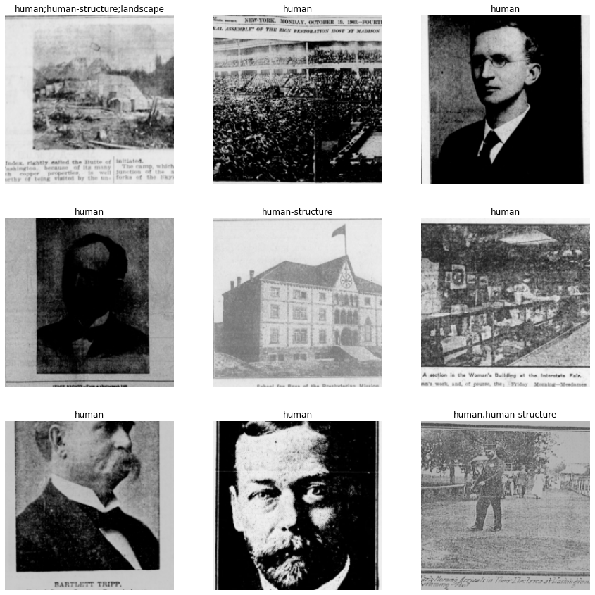
Figure 4. The output of ‘show_batch’
You will see above that the labels are separated by a ;. This means fastai has understood that the | symbol indicates different labels for each image.
Inspecting Model Inputs
Our model takes labels and data as inputs. To help us better understand the deep learning pipeline, we can inspect these in more detail. We can access the vocab attribute of our data to see which labels our data contains.
photo_data.vocab
['animal', 'human', 'human-structure', 'landscape']
This example uses four labels. We may also have some images which are unlabelled. Since the model has the ability to apply each label individually, the model can ‘choose’ to not apply any labels for a particular image. For example, if we have an image containing a picture of a vase of flowers, we would expect the model to not apply any labels in this situation.
As mentioned previously, deep learning models use the underlying numerical representation of images rather than ‘seeing’ images in the same way as a human. We also saw in the outline of the training process that model training usually happens in batches. When photo_data was created above, bs=32 was specified. We can access a single batch in fastai using one_batch(). We’ll use this to inspect what the model gets as input.
Since our data is made up of two parts (the input images and the labels), one_batch() will return two things. We will store these in two variables: x and y.
x, y = photo_data.one_batch()
We can start by checking what ‘type’ x and y are by using the Python type function.
type(x), type(y)
(fastai.torch_core.TensorImage, fastai.torch_core.TensorMultiCategory)
These types will likely not be ones you have seen before since these are specific to fastai, but we can see that x is a TensorImage and y is TensorMultiCategory. “Tensor” is an ‘n-dimensional array’; in this case one for storing images, and one for storing multiple labels. We can explore these in more detail to inspect what both of these Tensors look like. To start, we can take a look at the length of both x and y:
len(x), len(y)
(32, 32)
Remember that when we loaded our data, we defined a batch size of 32, so this length represents all of the items in one batch. Let’s take a look at a single example from that batch. We can use standard Python indexing to the access the first element of x.
x[0]
    tensor([[[0.7020, 0.7412, 0.7765,  ..., 0.6706, 0.6902, 0.7137],
             [0.7333, 0.7294, 0.7451,  ..., 0.3137, 0.3255, 0.3569],
             [0.4706, 0.4000, 0.3686,  ..., 0.0902, 0.1098, 0.1137],
             ...,
             [0.0275, 0.0510, 0.0314,  ..., 0.1176, 0.1373, 0.1255],
             [0.0118, 0.0118, 0.0118,  ..., 0.5529, 0.5373, 0.4824],
             [0.2863, 0.3255, 0.3333,  ..., 0.5490, 0.4078, 0.3647]],

            [[0.7020, 0.7412, 0.7765,  ..., 0.6706, 0.6902, 0.7137],
             [0.7333, 0.7294, 0.7451,  ..., 0.3137, 0.3255, 0.3569],
             [0.4706, 0.4000, 0.3686,  ..., 0.0902, 0.1098, 0.1137],
             ...,
             [0.0275, 0.0510, 0.0314,  ..., 0.1176, 0.1373, 0.1255],
             [0.0118, 0.0118, 0.0118,  ..., 0.5529, 0.5373, 0.4824],
             [0.2863, 0.3255, 0.3333,  ..., 0.5490, 0.4078, 0.3647]]],
           device='cuda:0')
Although it is not immediately clear from looking at this output, this is the first image in our batch in the format in which it will be passed to the model. Since this output isn’t very meaningful for us to interpret, let’s access the shape attribute:
x[0].shape
torch.Size([3, 224, 224])
This output is hopefully more meaningful. The first dimension 3 refers to the number of channels in our image (since the image is an RGB image). The other dimensions 224 are the size we specified when we loaded our data item_tfms=Resize(224).
Now we have inspected x, the input images, we’ll take a look at the y, which holds the labels. Again, we can index into the first y:
y[0]
tensor([0., 0., 0., 0.], device='cuda:0')
We can see that the first y is also a tensor, however, this label tensor looks different from our image example. In this case, we can easily count the number of elements manually but to be sure let’s access the shape attribute:
y[0].shape
torch.Size([4])
We see that we have four elements in our first y. These are ‘one hot encoded’ versions of our labels. ‘One hot encoding’ is a way of expressing labels where 0 is no label and 1 is a label, so in this case we have no labels in the vocab present in the label tensor for the first image.
Now we can finally take a look at the first batch as a whole:
x.shape, y.shape
(torch.Size([32, 3, 224, 224]), torch.Size([32, 4]))
This can be useful to verify that data looks as you would expect as well as a simple way of ‘poking’ around to see how data has been prepared for the model. Now that we have a better understanding of what our data looks like, we’ll examine some potential ways to maximize our fairly modest dataset.
Image Augmentations
Image augmentations are a type of data augmentation and represent one of the methods we can use to try to reduce the amount of training data required and prevent overfitting our model. As a reminder, overfitting occurs when the model gets very good at predicting the training data but doesn’t generalise well to the validation data. Image augmentations are methods of artificially creating more training data. They work by transforming images with known labels in various ways, for example rotating an image. To the model, this image ‘looks’ different but you were able to generate this additional example without having to annotate more data. Looking at an example will help illustrate some of these augmentations.
tfms = setup_aug_tfms([Rotate(max_deg=90, p=0.75), Zoom(), Flip()])
photo_data = ImageDataLoaders.from_df(
    df,  # dataframe containing paths to images and labels
    folder="photo_data/images",  # folder where images are stored
    bs=32,  # batch size
    label_delim="|",  # the deliminator for multiple labels
    item_tfms=Resize(224),  # resize images to a standard size
    batch_tfms=[*tfms],  # pass in our transforms
    valid_pct=0.3,  # 30% of data used for validation
    seed=42,  # set a seed,
)
In this example, we keep everything the same as before, except we now add a function setup_aug_tfms to create image transformations. We pass this into the batch_tfms parameter in the ImageDataLoader. In the previous part of this lesson, we saw item_tfms in our advert data loading example. What is the difference between these two transforms?
item_tfms, as the name suggests, are applied to each item before they are assembled into a batch, whereas batch_tfms are instead applied to batches of images - in our case 32 images at a time. The reason we should use batch_tfms when possible, is that they happen on the GPU and as a result are much faster. However, if you don’t have a GPU available, they still work.
Now that we have passed some augmentations to our data, we should take a look at what the data looks like. Since we are now concerned with the transformations in particular, it will be easier to compare if we look at the same image. We can do this by passing the unique=True flag to show_batch().
photo_data.show_batch(unique=True, figsize=(10,10))
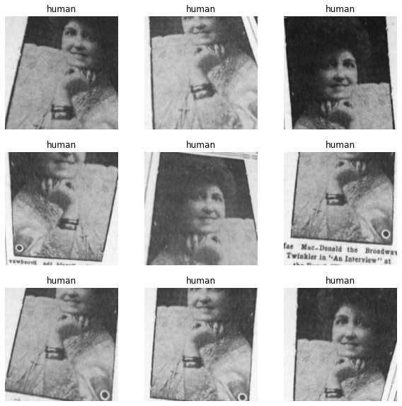
Figure 5. An example batch with image augmentations
We can see that the same image has been manipulated in a variety of ways, including zooms and rotations. Why would we want to do this?
We can see the transformed images all look a little bit different but also that they have the same label. Image transforms or augmentations are useful because they allow us to artificially increase the size of our training data. For the model, the transformed images all represent new training examples - but we didn’t have to actually label all of these different examples.
The catch is that we usually want to try and use transformations that are actually likely to represent real variations in the types of data our model work with. The default transformations may not match with the actual variation seen in new data, which might harm the performance of our model. For example, one standard transform is to mimic variations in lighting in an image. This may work well where input data consists of photographs taken ‘in the wild’, but our images have largely been produced by digitising microfilm, and therefore the types of variations will be different to those seen in ‘everyday photography’. We want to be aware of this, and will often want to modify or create our own transformations to match our data.
Creating a Model
Now that we have loaded data, including applying some augmentations to the images, we are ready to create our model, i.e., moving to our training loop.
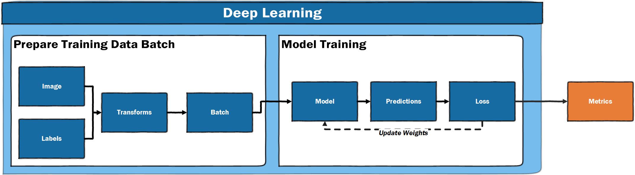
Figure 6. The deep learning training loop
We have already seen this at a high level, and most things will remain the same as in our previous advert example.
We again use vision_learner to create a model, pass our data in, and specify an existing model architecture we want to use.
This time we use a “DenseNet” model architecture instead of the “ResNet” model, which was used in our previous example. This is done to show how easily we can experiment with different model architectures supported by fastai. Although “ResNets” are a good starting point, you should feel free to experiment with other model architectures which may perform better with less data or be optimised to run with lower computer resource.
We again pass in some metrics. We use F1ScoreMulti since we want to use F1 as a metric on a dataset with multiple labels. We also pass in accuracy_multi; a multi-label version of accuracy. We include this to illustrate how different metrics can give very different scores for the performance of our model.
learn = vision_learner(photo_data, densenet121, metrics=[F1ScoreMulti(), accuracy_multi])
Now that we have created our model and stored it in the variable learn, we can turn to a nice feature of Jupyter notebooks, which allows us to easily access documentation about a library.
?learn
In a notebook, placing ? in front of a library, method or variable will return the Docstring. This can be a useful way of accessing documentation. In this example, you will see that a learner groups our model, our data dls and a “loss function”. Helpfully, fastai will often infer a suitable loss_func based on the data it is passed.
Training the Model
The fastai learner contains some powerful functionalities to help train your model. One of these is the learning rate finder. A learning rate determines how aggressively we update our model after each batch. If the learning rate is too low, the model will only improve slowly. If the learning rate is too high, the loss of the model will go up, i.e., the model will get worse rather than better. fastai includes a method lr_find which helps with this process. Running this method will start a progress bar before showing a plot.
learn.lr_find()
SuggestedLRs(lr_min=0.012022644281387329, lr_steep=0.04786301031708717)
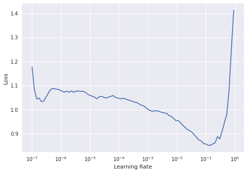
Figure 7. The output plot of lr_find
lr_find helps find a suitable learning rate by training on a “mini batch” and slowly increasing the learning rate until the loss starts to worsen/deepen. We can see in this graph that on the y-axis we have the loss and on the x-axis Learning Rate. The loss moves down as the learning rate increases, up to a point, before it shoots up around \({10}^{-1}\).
We want to pick a point where the loss is going down steeply, since this should be a learning rate which will allow our model to update quickly whilst avoiding the point where the loss shoots up. In this case, we’ll pick 2e-2. For a fuller explanation of how the loss is used to update a model we recommend the YouTube video by Grant Sanderson.
Picking a good learning rate is one of the important variables that you should try and control in the training pipeline. A useful exercise is to try out a range of different learning rates with the same model and data to see how it impacts the training of the model.
Fitting the Model
We are now ready to train our model. We previously used the fine_tune method, but we can also use other methods to train our model. In this example we will use a method called fit_one_cycle. This method implements an approach to training described in a research paper that was found to improve how quickly a model trains. The fastai library implements many best practices in this way to make them easy to use. For now, we’ll train the model for 5 epochs using a learning rate of 2e-2.
learn.fit_one_cycle(5, lr_max=2e-2)
| epoch | train_loss | valid_loss | f1_score | accuracy_multi | time |
|---|---|---|---|---|---|
| 0 | 0.609265 | 0.378603 | 0.435054 | 0.883750 | 00:35 |
| 1 | 0.451798 | 0.582571 | 0.507082 | 0.793333 | 00:31 |
| 2 | 0.360973 | 0.271914 | 0.447796 | 0.908333 | 00:32 |
| 3 | 0.298650 | 0.201173 | 0.593643 | 0.913750 | 00:31 |
| 4 | 0.247258 | 0.194849 | 0.628454 | 0.922500 | 00:32 |
Most of this output is similar to what we got when training our model in Part 1, but one noticeable difference is that this time we only get one set of outputs rather than the two we had in the first example. This is because we are no longer unfreezing the model during the training step and are only training the last layers of the model. The other layers of the model are using the weights learned from training on ImageNet, so we don’t see a progress bar for these layers.
Another difference is that we now have two different metrics: f1_score and accuracy_multi. The potential limitations of accuracy are made clearer in this example. If we took accuracy as our measure here, we could mistakenly think our model is doing much better than is reflected by the F1-Score.
We also get an output for train_loss and valid_loss. As we have seen, a deep learning model has some way of calculating how wrong it is using a loss function. The ‘train’ and ‘valid’ refer to the loss for the training and validation data. It can be useful to see the loss for both of these to see whether our model performs differently in comparison to the validation data. Although the loss values can be tricky to directly interpret, we can use the change of these values to see if our model is improving (where we would expect to see loss going down). We can also access the recorder attribute of our learner to plot_loss. This will give us a visual sense of how the training and validation loss change as the model is trained.
learn.recorder.plot_loss()
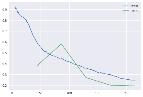
Figure 8. The output plot of plot_loss
Compared to our previous model, we are not getting a very good score. Let’s see if “unfreezing” the model (updating the lower layers of the model) helps improve the performance.
Saving Progress
Since training a deep learning model takes time and resources, it is prudent to save progress as we train our model, especially since it is possible to overfit a model or do something else which makes it perform more poorly than in previous epochs. To save the model, we can use the save method and pass in a string value to name this save point, allowing us to return to this point if we mess something up later on.
learn.save('stage_1')
Path('models/stage_1.pth')
Unfreezing the Model
Now that our progress has been saved, we can see if training the model’s lower layers improves the model performance. We can unfreeze a model by using the unfreeze method on our learner.
learn.unfreeze()
Applying this method means that the lower layers of the model will now be updated during training. It is advised to run lr_find again when a model has been unfrozen since the appropriate learning rate will usually be different.
learn.lr_find()
SuggestedLRs(lr_min=0.00010000000474974513, lr_steep=6.309573450380412e-07)
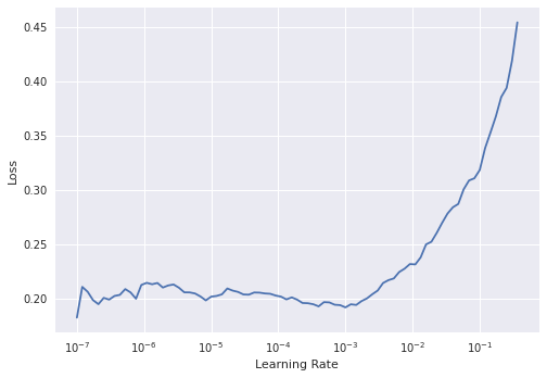
Figure 9. The output plot of lr_find
The learning rate plot looks different this time with loss plateauing before shooting up. Interpreting lr_find plots is not always straightforward, especially for a model that has been unfroze. Usually the best learning rate for a unfrozen model will be smaller than one used for the frozen model at the start of training.
The fastai library provides support for ‘differential learning rates’, which can be applied to various layers of our model. When looking at transfer learning in the previous part of this lesson, we saw that the lower layers of a network often learn ‘fundamental’ visual features, whilst later layers are more task specific. As a result, we may not want to update our model with a single learning rate, since we want the lower layers of the model to be updated more slowly than the end layers. A simple way of using different learning rates is to use the Python slice function. In this case, we’ll try and pick a learning rate range where the model hasn’t shot up yet.
We saw above how we can save a model that we have already trained - another way to do this is to use a ‘callback’. Callbacks are sometimes used in programming to modify or change the behavior of some code. fastai includes a callback SaveModelCallback which, as the name suggests, will save the model. By default, it will save the best performing model during your training loop and load it at the end. We can also pass in the thing we want fastai to monitor to see things are improving.3 In this example, we’ll pass in f1_score, since this is the metric we are trying to improve.
Let’s now train the model for a few more epochs:
learn.fit_one_cycle(4, lr_max=slice(6e-6, 4e-4), cbs=[SaveModelCallback(monitor='f1_score')])
| epoch | train_loss | valid_loss | f1_score | accuracy_multi | time |
|---|---|---|---|---|---|
| 0 | 0.207510 | 0.192335 | 0.630850 | 0.922083 | 00:39 |
| 1 | 0.195537 | 0.196641 | 0.614777 | 0.917083 | 00:38 |
| 2 | 0.186646 | 0.197698 | 0.615550 | 0.920417 | 00:38 |
| 3 | 0.190506 | 0.197446 | 0.620416 | 0.920833 | 00:39 |
Better model found at epoch 0 with f1_score value: 0.6308501468079952.
Investigating the Results of our Model
Looking back at the diagram above, we can see that we usually set up our model to provide some metrics for statistical performance. In this section, we’ll provide some hints on how to inspect this information in more detail.
Our model is not yet performing to full efficiency, but we shouldn’t give up at this point. In the last section of our training loop, we will explore the results of our model.
So far, we have used the metrics printed out during the training loop. We may, however, want to directly work with the predictions from the model to give us more control over metrics. This allows us to see the level of certainty behind each prediction. Here, we will call get_preds. This is a method that runs our model in ‘inference’ mode, i.e., to make new predictions. We can also use this method to run predictions on new data.
By default, get_preds will return the results of our model on our validation data. We also get back the correct labels. We’ll store these values in y_pred and y_true. Again, notice that we use the commonplace x and y notations for data (x) and labels (y). In this case, since we are working with two types of labels, we’ll store them as predicted and true, i.e., one is our predicted value, whilst the other is the correct label.
y_pred, y_true = learn.get_preds()
We can explore some properties of both of these variables to get a better sense of what they are:
len(y_pred), len(y_true)
(600, 600)
Both y_pred and y_true have a length of 600. This is the validation part of our dataset, so this is what we’d expect since that is 30% of our total dataset size (there were 2002 rows in our DataFrame). Let’s index into one example of y_pred:
y_pred[0]
tensor([0.0628, 0.2345, 0.9663, 0.2955])
We have four values representing each of the potential labels in our dataset. Each value reflects a probability for a particular label. For a classification problem where there are clear categories, having a single class prediction is a useful feature of a model. However, if we have a set of labels or data which contain more ambiguity, then having the possibility to ‘tune’ the threshold of probability at which we assign a label could be helpful. For example, we might only use predictions for a label if a model is >80% certain of a possible label. There is also the possibility of trying to work directly with the predicted probabilities rather than converting them to labels.
Exploring our Predictions Using Scikit-learn
Now that we have a set of predictions and actual labels, we could directly explore these using other tools. In this example we’ll use scikit-learn, a Python library for machine learning. In particular we will use the metrics module to look at our results.
from sklearn.metrics import precision_score, recall_score, accuracy_score, f1_score
These imported metrics should look familiar from the earlier in the lesson where metrics were discussed. These metrics are functions to which we can pass in our predictions and true labels.
We also pass in an average, which determines how our labels are averaged, to give us more control over how the F1 score is calculated. In this case we use ‘macro’ as the average, which tells the function to “calculate metrics for each label, and find their unweighted mean”.
f1_score(y_true, y_pred>0.50, average='macro')
0.6308501468079952
Although it could be useful to calculate different scores for our total dataset, it would be useful to have more granularity over how our model is performing. For this, we can use classification_report from scikit-learn.
from sklearn.metrics import classification_report
print(classification_report(y_true, y_pred>0.50, target_names=photo_data.vocab, zero_division=1))
| precision | recall | f1-score | support | |
|---|---|---|---|---|
| animal | 0.56 | 0.16 | 0.25 | 31 |
| human | 0.92 | 0.92 | 0.92 | 481 |
| human-structure | 0.70 | 0.63 | 0.67 | 104 |
| landscape | 0.71 | 0.59 | 0.65 | 51 |
| micro avg | 0.87 | 0.82 | 0.84 | 667 |
| macro avg | 0.72 | 0.58 | 0.62 | 667 |
| weighted avg | 0.85 | 0.82 | 0.83 | 667 |
| samples avg | 0.89 | 0.87 | 0.84 | 667 |
We can now see a much more detailed picture of how our model is doing; we have ‘precision’, ‘recall’ and ‘f1-score’ broken down per label. We also have something called ‘support’ which refers to the number of examples of this label in the dataset.
We can see from these results that some labels are performing better than others. The model does particularly well on the ‘human’ labels, and particularly badly on the ‘animal’ labels. If we look at the support for each of these, we can see there are many more examples to learn from for the ‘human’ label (481), compared to the ‘animal’ label (31). This may explain some of the difference in performance of the model, but it is also important to consider the labels themselves, particularly in the context of working with humanities data and associated questions.
The Visual Characteristics of our Labels
For most people, it will be clear what the concept ‘animal’ refers to. There may be differences in the specific interpretation of the concept, but it will be possible for most people to see an image of something and say whether it is an animal or not.
However, although it is clear what we mean by animal, this concept includes things with very different visual characteristics. In this dataset, it includes horses, dogs, cats, and pigs, all of which look quite different from one another. So when we ask a model to predict a label for ‘animal’, we are asking it to predict a range of visually distinct things. This is not to say that a computer vision model couldn’t be trained to recognize ‘animals’ by seeing examples of different specific types of animals, however in our particular dataset, this might be more difficult for a model to learn given the number and variety of examples it has to learn from.
When using computer vision as a tool for humanities research, it is important to consider how the concepts we wish to work with are represented visually in our dataset. In comparison to ‘animal’ label, which was mostly easy for the human annotator of this dataset to identify, the ‘landscape’ label was more difficult for the annotator to interpret. This was largely because the concept which this label was trying to capture wasn’t well defined at the start of the annotation process. Did it refer to depictions of specific types of natural scene, or did it refer to a particular framing or style of photography? Are seascapes a type of landscape, or something different altogether?
Although it is not possible to say that this difficulty in labeling in the original dataset directly translated into the model performing poorly, it points to the need to more tightly define what is and isn’t meant by a label or to choose a new label that more closely relates to the concept you are trying to predict. The implications and complexities of label choices and categories, particularly in a humanities context, are explored more fully in our conclusion below.
The Feedback Loop in a Deep Learning Pipeline
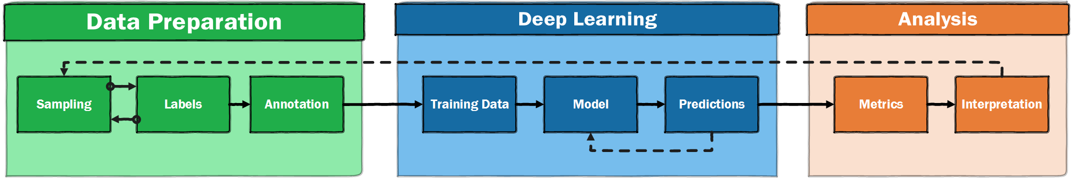
Figure 10. A more realistic illustration of a supervised machine learning pipeline
When we introduced a deep learning pipeline, it was shown as a very linear process. However, it is likely to be much more iterative. This will be particularly true if new annotations are created, since choices will need to be made about what labels are chosen and whether these labels are intended to be used to classify images. The process of annotating new data will expose you more deeply to the source material, which may flag that some labels are poorly defined and don’t sufficiently capture the visual properties that you are trying to capture. It may also flag that some of your labels appear rarely, making it more challenging to train a model to predict these labels.4
Concluding Reflections on Humanities, Classification, and Computer Vision
This two-part lesson has focused on the application of computer vision techniques in the humanities. We have gone through the necessary steps of training a computer vision model: data collection, data inspection, loading data, image augmentations, creating a model, training a model, investigating the results and exploring the predictions. For students and scholars in the humanities, who are used to asking fundamental questions about meaning, all of this might have come across as rather technical. Acknowledging that the application of computer vision models conjures up all sorts of methodological, theoretical and even ontological questions, we end this lesson with a critical reflection on the techniques themselves and their relation to our (academic) interest as humanists.
We could approach such a reflection from a number of different theoretical angles. Scholars like Kate Crawford5 (and some of the authors of this lesson6) have applied concepts from Science and Technology Studies (STS) and Media Archeology to critically engage with some of the central assumptions of computer vision. In this final section, we take a slightly different route by using the work of French philosopher, Michel Foucault, to reflect on the role of classification, abstraction and scale in the computer vision models. To us, this shows that humanities scholars cannot only benefit from the application of machine learning but also contribute to the development of culturally responsive machine learning.
A fan of the Argentinian writer Jorge Luise Borges, Foucault starts the preface of his book The Order of Things (1966) with an excerpt from one of his essays The Analytical Language of John Wilkins (1964): ‘This passage quotes a ‘certain Chinese encyclopedia’ in which is it is written that ‘animals are divided into: (a) belonging the Emperor, (b) embalmed, (c) tame, (d), sucking pigs, (e) sirens, (f) fabulous, (g) stray dogs, (h) included in the present classification, (i) frenzied, (j) innumerable, (k) drawn with a very fine camelhair brush, (l) et cetera, (m) having just broken the water pitcher, (n) that from a long way off look like flies.’ Being a great (and confident) philosopher, Foucault ‘apprehended in one great leap’ that all systems of knowledge are limited and limit thinking (and started to write his book).
Borges’ essay indeed makes clear the systems of knowledge and, as a result, classification often appear rational or natural but, upon closer or more fundamental inspection, the cracks in their internal logic become visible. Applied to this lesson, we might wonder why we only use the categories human, animal, structure and landscape? Are these categories truly of the same kind? Are they exhaustive of all the categories on this level in our taxonomy? As we already noted, it might be hard for annotators to classify an image as containing a landscape. Furthermore, we could ask where this landscape is located on the image. In contrast to the category ‘human’, which constitutes a clearly delineable part of the image, where does a landscape start and stop? The same goes for all sorts of categories that are frequently used in computer vision research. How we see the world might not always be visible. While ‘human’ might seem like a clear category, is the same true for ‘man’ and ‘woman’? How about the category of ‘ethnicity’ (still used by border agents all over the world)? As Kate Crawford and Trevor Paglen note in their online essay Excavating AI: ‘[…] images in and of themselves have, at best, a very unstable relationship to the things they seem to represent, one that can be sculpted by whoever has the power to say what a particular image means.’ Because computer vision techniques provide us with the opportunity or power to classify images (‘say what they mean’) on a large scale, the problem of classification should be central concern for anyone seeking to apply them.
We can use another short story of Borges, this time not used by Foucault but by the Italian semiotician Umberto Eco, to introduce another problem in the application of computer vision techniques. In On Exactitude in Science (1935), Borges quotes a fictional seventeenth century book as saying: ‘In that Empire, the Art of Cartography attained such perfection that the map of a single Province occupied the entirety of a City, and the map of the Empire, the entirety of a Province.’ Since the cultural turn, many humanists have an uneasy relationship with abstraction, quantification and statistical analysis. However, as the discussion of F-scores has shown, these are vital aspects in the application of computer vision techniques to historical material: both in setting up the analysis as well as in the analysis itself. As a result, the utility and appropriateness of a specific level of abstraction should be a critical consideration for this kind of research. In classifying large collections of images, we necessarily reduce their complexities: we no longer see them fully. We should only surrender this full view if the abstraction tells us something new and important about the collection of images.
We hope that we have shown that the application of computer vision techniques in the humanities not only benefits humanists but, being trained to take (historical) difference, complexity and contingency into account, humanists in turn could support the development of these techniques, by helping to determine the optimal scale and best categories of the legend of the map of computer vision.
Further Reading and Resources
You have come to the end of this two-part lesson introducing deep learning-based computer vision methods. This section will briefly review some of the topics we have covered and suggest a few resources that may help you explore this topic further.
Part 1 of this two-part lesson started with an example showing how computer vision methods could classify advert images into two categories. Even this relatively simple task of putting images into a few categories can be a powerful tool for both research applications and the data management activities surrounding research. Part 1 went on to discuss - at a high level - how the deep learning model ‘learns’ from data, as well as discussing the potential benefits of using transfer-learning.
Part two covered more of the steps involved in a deep learning pipeline. These steps included: initial exploration of the training data and the labels, a discussion of the most appropriate metric to evaluate how well our model is performing, and a closer look at how images are represented inside the deep learning model. An evaluation of our model’s results showed that some of our labels performed better than others, showing the importance of thinking carefully about your data and treating the ‘pipeline’ as an iterative process.
The below section suggests some useful sources for further learning. A fuller list is available on the GitHub repository accompanying this lesson.
Resources
-
fast.ai has a range of resources including free online courses covering deep learning, natural language processing, and ethics, a book, and a discussion forum. These courses have the aim of making deep learning accessible, but do dive into important details. The ‘top down’ approach to learning in these lessons was inspired by the approach taken in the fastai courses.
-
The Hundred-Page Machine Learning Book, Andriy Burkov (2019), provides a concise overview of important topics across both ‘traditional’ and deep learning based approaches to machine learning.
-
There are a range of initiatives related to the use of machine learning in libraries, or with cultural heritage materials. This includes:
- ai4lam “an international, participatory community focused on advancing the use of artificial intelligence in, for and by libraries, archives and museums”,
- Machine Learning + Libraries: A Report on the State of the Field, Ryan Cordell (2020), a report commissioned by the Library of Congress Labs,
- Responsible Operations: Data Science, Machine Learning, and AI in Libraries. Padilla, Thomas. 2019. OCLC Research. https://doi.org/10.25333/xk7z-9g97.
Endnotes
-
Lee, Benjamin. ‘Compounded Mediation: A Data Archaeology of the Newspaper Navigator Dataset’, 1 September 2020. https://hcommons.org/deposits/item/hc:32415/. ↩
-
This balanced data was generated by upsampling the minority class, normally you probably wouldn’t want to start with this approach but it was done here to make the first example easier to understand. ↩
-
A particularly useful callback is ‘early stopping’. As the name suggests, this callback ‘terminates training when monitored quantity stops improving.’. ↩
-
If you are trying to find a particular type of image which rarely appears in your corpus it may be better to tackle this as an ‘image retrieval’ problem, more specifically ‘content based image retrieval’. ↩
-
Crawford, Kate. Atlas of AI: Power, Politics, and the Planetary Costs of Artificial Intelligence, 2021. ↩
-
Smits, Thomas, and Melvin Wevers. ‘The Agency of Computer Vision Models as Optical Instruments’. Visual Communication, 19 March 2021, https://doi.org/10.1177/1470357221992097. ↩