Contents
- Introduction
- Set Up
- Collecting Data
- Setting up the map
- Customizing the Map
- Analysis
- Summary and Next Steps
Introduction
The mapping software this lesson demonstrates grew out of a need to create a program that was easy to use and designed for the smaller and less uniform geospatial datasets used by historians. While working on a book manuscript on female abolitionists and early feminism in Britain and the United States, the question arose of how to determine the extent of transnational connections in women’s antislavery work. We were interested not only in the number of letters that crossed the Atlantic, but also the specific locations the letters were sent from and to and how those international connections changed over time.
To solve this problem, we decided to plot the correspondence of Boston-area abolitionist women on a map and do network analysis of women’s correspondence, starting with a single woman’s letters as a test project. When we set out to map nineteenth-century abolitionist Maria Weston Chapman’s correspondence, there was already an easy way to do network analysis, but we struggled to find software to do the mapping portion of the project.1 To remedy this, we wrote a simple JavaScript mapping tool based on Leaflet which allowed us to display correspondence networks on a browser-based map. This lesson explains not only how to write your own script (or adapt the one we wrote) for your own project, but also explores why creating your own tool is sometimes more effective than using commercially available software to analyze historical data.
Originally, when we set out to study Chapman’s correspondence with digital tools, we intended to use PostGIS and Gephi to examine the geographic connections and to analyze the network itself. While cleaning the data, it quickly became clear that PostGIS was not going to be the ideal tool for the geospatial analysis as it required re-loading all the data into the software every time a change was made. Chapman’s correspondence data, obtained from the Boston Public Library’s Antislavery Collection available from the Internet Archive and the Digital Public Library of America (DPLA), required extensive cleaning to standardize and complete dates, names and locations.
Many of the mistakes, misspellings, and incorrect data points only became noticeable after the data was run through the software and a map generated, but having to reload all of the data from scratch was not a sustainable option. So we began drafting the code for the JavaScript map, which allowed us to easily run the visualization on our local system using a local web server to catch problems and errors as we worked. The script we ended up writing also allows the map to be interactive, making it a more useful tool for research and discovery than a static visualization. Being able to easily update the map was also important as the Boston Public Library was not finished digitizing their antislavery collection at the time of writing, and we hoped to expand the dataset to include the correspondence of other abolitionists if our test was successful. Creating our own tool allowed us the flexibility to adapt our project to the constraints of the data.
After we began working on this project, several other options for building online interactive maps became available, most notably Carto and Palladio (a Stanford University project). Neither of these products were available when we began and they both have some limitations that may be problematic for some scholars. Carto only allows you to keep your data private if you pay for a subscription. Palladio, which creates a map very similar to the one we built, only allows you to share your maps via screenshots, so other people cannot easily use your interactive map. Running your own script via a local or web server is the easiest and most straightforward way to control your data and the look of your map without purchasing a subscription to an online service. But if you do decide to use Carto, Palladio, or another online mapping service, this lesson can still be useful to you as you collect and clean your data and analyze the resulting map.
Lesson Goals
- Propose a rationale for using simple code to make an interactive map.
- Explain the process of parsing, cleaning and formatting data for maps.
- Explore the analytical possibilities of mapping correspondence.
Note: This lesson requires using the command line (or Command Prompt). If you have never used a command line interface before, you might want to read other Programming Historian lessons on the command line or PowerShell, depending on your operating system. You can use the built-in command line tool in your operating system for all of the tasks in this lesson.
Set Up
Before you begin, download the ZIP file for this lesson and double click on it to “unzip.” Inside you will find all the folders and files you will need to get a correspondence map working.
The css folder contains the code that explains how parts of the map look. The js folder contains the actual code that drives the map and its interactive functions. The basic map script contains a timeline function which allows you to “play” the data, generating the map one data point at a time so you can watch the correspondence network grow. The same feature allows you to filter your data by date, and display only a certain range of dates on the map. The jquery and leaflet folders in each of these locations are third party tools that add functionality to the map. Leaflet helps create the map and jQuery makes it easy to add interactive elements like the time line. The other files are as follows:
controls.jscontains functions that handle the time line slider and filters.data.jscontains functions that load and handle the initial formatting of the CSV file.map.jscontains all the code which loads and displays the map layers, including filtering the layers in response to the controls.sidebar.jscontains the code which displays detailed letter information in the sidebar when a line or point is clicked.letters-sample.csvis a sample data set that has already been cleaned and the coordinates entered so you can quickly set up and use the map.
The Customizing the Map section explain how each of these scripts work together to create the interactive map.
Collecting Data
In order to do geospatial analysis on correspondence, you need several pieces of data about each letter. At the bare minimum, you need the sender, the recipient, the date, the sender’s address, and the recipient’s address. However, historians often have a lot more information about each piece of correspondence, including summaries of the content, keywords, and links to the letter in an online repository. Writing your own script allows you to display or access the other information about the letter within the interactive visualization as well as be able to display subsets of the data to help with your analysis.
There are several ways to collect or compile data about correspondence. Many historians often have large databases listing correspondence details from their research or have entered research data into Endnote or Zotero, and archival finding aids and digitized archival collections often contain much of the information needed for doing a geospatial analysis. To obtain the basic information about Maria Weston Chapman’s correspondence, we parsed the data from an API and then hand entered the missing information.2
Several APIs contain the metadata for the Boston Public Library’s antislavery collection, including the Internet Archive (where the metadata closely mirrors the data on the original index cards created in the 1880s when the collection was compiled and indexed) and Digital Public Library of America.3 A separate lesson on The Programming Historian shows how to mine data from the antislavery collection on the Internet Archive. We chose to use the DPLA’s API instead.
Either way, if you choose to parse some or all of your data from an API, it is important to look at how the data is structured within the API and think about how that will affect the amount of data cleaning and hand-compiling you will be required to do to get enough data to generate a map of the correspondence set. The more detailed the address information in the raw metadata is, the less work you will have to do to get accurate and complete maps of the correspondence. Even with the standardized data from the DPLA, this project required extensive hand-compiling and cleaning before mapping could begin.
If you are using your own data, you will need to rename your column headers to match those in the sample data included in the project files, or you can edit the script, which is explained under Customizing the Map.
Cleaning Data and Identifying Coordinates
If you are using the sample data provided in the lesson folder, you can skip over this step and simply rename the letters-sample.csv file to letters.csv and start the next section as the data in the sample file has already been cleaned and the coordinates identified.
Once you have completed parsing your data, you will have a CSV file with the data you selected. Even if you are working with a relatively complete dataset, the data will need to be cleaned. Cleaning data means checking for accuracy, formatting, or adding missing data so that your visualization will be complete and without errors. There are a couple of very easy steps that will help identify errors and missing data in correspondence sets.
The first step that will help you find mistakes is to sort your entire data set by each field and check for variations of spelling and punctuation, and standardize each name and other recurring information throughout the entire table. If you are following along with the data we provided, we have already standardized the data and you shouldn’t find any variations in spelling, life dates or other information. If any fields in your data contain angle brackets, you will need to remove those brackets. Square brackets and parentheses do not pose the same problem.
For most pre-twentieth-century correspondence collections, you will likely have to do a lot of hand-compiling of the location data. This is a time-consuming task but is worth the effort. For Chapman’s correspondence, many of the letters did not have their original envelopes or address pages attached, or their date lines did not contain a location and the origin of the letter could only be determined by the content or by checking other letters written by the same person on consecutive days.
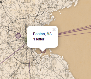
We also ran into a huge problem with mapping letters sent and received within the same city. Over one-third of the letters in Chapman’s correspondence were both sent and received in Boston, Massachusetts, and are therefore difficult to display with any meaning. We were not able to determine more specific addresses than the city for the majority of the intra-Boston letters. One solution to this is to pre-define different geographic points for letters sent and received within a specific city, which will at least allow you to display those letters on the map. We chose not to do this, as our project focused more on the international context of antislavery correspondence. Network analysis of the locations can help you to determine if this is going to be a significant problem with your dataset.
If you want to use the timeline function of the script, you will also need to check the date field and format the dates so they can be read by the script. You will also need to complete any partial dates. Data in the date column not formatted MM/DD/YYYY may be mis-read or skipped by the script. Also, if you are using Excel to edit your CSV file, make sure you do not set the cell type to date or your data will be reformatted to a string of numbers that are not recognized as a date by the script (Note: Excel does not recognize dates before 1900.)
Once you have identified all of the locations for the letters in your collection, you will need to convert the addresses to coordinates. The first step to this process is to create a master list of locations included in your dataset. To do this, copy the sent and received locations into single column in a new spreadsheet. Sort them alphabetically and then remove the duplicates (this is also a good way to find spelling or data entry errors if you had to hand-compile the locations). Use this new list to do your coordinate search.
There are many websites that allow you to search for coordinates, but most of them limit the number of searches you can request. If you need to search for several thousand locations, you may want to get an API key for the GPS search engine you decide to use, but for most correspondence sets, you will only end up looking up a few hundred locations even if you are mapping thousands of letters. We used GPS Visualizer, which allows you to search Google Maps, Bing, and Map Quest. Simply paste the list of addresses you made into the input section of GPS Visualizer (99 at a time unless you get an API key), select the type of data (raw list, 1 address per line), select your search engine, and set the field separator output to comma. Click run and wait for your results.
When the results appear in the second box on the screen, copy and paste them into the spreadsheet containing the list of addresses. Make sure you capture both pieces of each coordinate (latitude and longitude). Depending on the addresses in your dataset, you may find one of the search engines gives better results than the others. In our case, we found Bing to be the most accurate. You will need to double-check each location you find coordinates for to make sure they are correct by running them through the mapping script (we had several notable mistakes when a search returned coordinates for a street in Paris, France, in the middle of Africa, and an estate in the suburbs of London, England, in the American Midwest).
You may have to do some manual location lookup by searching a map and finding the point yourself if you have any nonstandard street addresses or house names. We had to do this with one letter addressed from the middle of the Atlantic Ocean. You can also use the Google Maps output button on the GPS Visualizer page to check your coordinates.
If your addresses are located in a city where street names have been changed or streets have been moved, you may also need to look up the modern street names or examine historic maps to determine the locations. As you work on determining locations, you will have to decide how important it is to your project to determine exact locations of historic addresses. If you are working on nineteenth- or twentieth-century American correspondence sets, resources like the Sanborn insurance maps may help identify some addresses or confirm block numbering or other city planning changes that may have occurred.
Once you have a master list of coordinates for each location, create two new columns in your CSV file (one for location sent and one for received) and enter the coordinates for each letter. We do not recommend just replacing the street address with the coordinates as that makes it more difficult to double check any locations that don’t look quite right on the map. The mapping script also relies on those locations to label the points on the map where letters were sent and received. It also makes it more difficult to do any statistical or network analysis of geographic locations if you decide later that doing that analysis is necessary.
Setting up the map
You can run the map on your website or on your computer using a local web server, depending on how you intend to use the project and the sensitivity of your data. Choose how you plan to run the map and follow the directions to set up the map script.
If you chose to use the sample data we provided, rename sample-letters.csv to letters.csv if you have not already done so. If you collected your own data, the file must be named letters.csv and put in the same directory as sample-letters.csv if you want to run the scripts on it.
Website
If you have a website with FTP access, the easiest thing to do is copy all the files into the repository to your web server in a folder called something like map. Upload your letters.csv file into the map folder as well. The map then should be available on your website at that folder (i.e., http://www.yourdomain.com/map).
Local web server
There are a number of ways to run a local web server. One of the easiest ways is to use NodeJS. NodeJS is program designed for running data-intensive scripts without overtaxing your computer. If you do not already have NodeJS installed, download the installer for your operating system and install NodeJS following the prompts.
After installing Node, you will need to install the project dependencies needed: jitsu and http-server. Jitsu makes deploying a script in Node easier and http-server is a simple virtual web server. These two dependencies allow you to run the map on your local computer without an internet connection and make starting and stopping the server very simple.
To install the dependencies and start the local web server, follow these steps:
- Open a command line and navigate to the folder where the project is located.
- Run
npm install -g jitsu4 - Run
jitsu install http-server - Run
node http-server/bin/http-server
There will now be a server running by default on port 8080. To visit the map open a browser and go to http://localhost:8080.
To stop the server press Ctrl-C. To start the server again, you don’t need to download it again, just run node http-server/bin/http-server.
Using the sample data, your map will look like this:
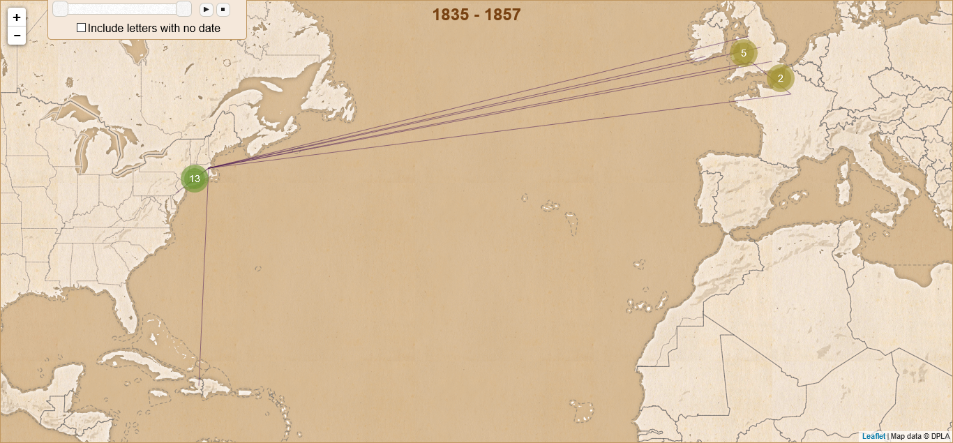
Sample Data Map
Customizing the Map
As mentioned previously, the map is divided into several files. If you wish to customize either the map’s appearance or data there are specific files you will need to change.
Customizing the map data
The map data is loaded in data.js. If you want to change the available columns of data or the column headers, this is where you will do it. This file does three things:
- Loads the data from a CSV file into an array.
- Converts the latitude and longitude into points and lines used by the map.
- Formats the date and calculates the minimum and maximum years.
Customizing the map appearance
Mapping software uses several layers of information to create a map. The first layer is a simple grid of latitude and longitude. The second layer contains the information that displays the map itself. These are called vector tiles. Vector tiles are the information on roads or other geographical features you want to appear on your map plus the actual images used to render the map. These can be modern features or historical ones, depending on the tile set you use to display your information.
For our project, we began with a basic set of map tiles from MapBox. MapBox provides a number of different tile sets so that you can customize your map’s appearance. You can use existing tiles or even design your own (what we ended up doing). The script is currently set up to use our custom map tiles, but you can edit the script to use other map tiles by changing the following section of map.js in the js folder to use your tiles. You are not limited to MapBox either; any tile server will work:
var tileURL = 'http://{s}.tiles.mapbox.com/v3/ttavenner.e7ef536d/{z}/{x}/{y}.png'
Customizing the pop-ups
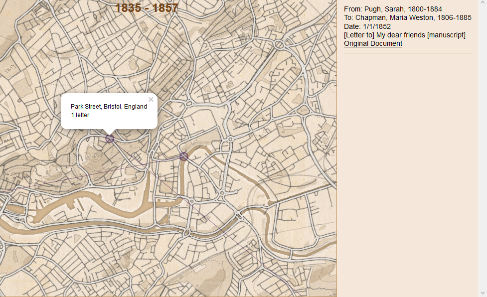
In addition to controlling the appearance of the map, the map.js file also controls what information is displayed in the pop-ups that appear when you click on a line or point.
Pop-Ups
To change the text displayed when you click a point, find the the section beginning with the comment //Generates pop-ups that appear when you click on a point and change the value of popUp.innerHTML as shown below.
  var popUp = document.createElement('p')
  popUp.innerHTML = p.name + "<br />" + p.count + " " + letter
  popUp.addEventListener('click', () => {sidebar.getLetters("place", p.name)})
Similarly, to change the text displayed when you click a line, change the value of popUp.innerHTML in the filterLines variable.
Customizing the sidebar
The sidebar displays more detailed information about a selection of letters when a pop-up is clicked. The code that controls the sidebar is naturally found in the sidebar.js file.
Sidebar
If you have included different columns in your CSV file and want to change the information displayed, this is where you make changes. Everything is handled by the getLetters function as shown below.
function getLetters(type, name) {
    var sentLocation = type == "place" ? name : name.split(" to ")[0]
    var receivedLocation = type == "place" ? name : name.split(" to ")[1]
    var text = ""

    if (type == "place") {
      text = data.rows.reduce((p, c) => {
        if (c.sentLocation == sentLocation || c.receivedLocation == receivedLocation) {

          return p + "<p class='letter'>" +
          "From: " + c.sender + "<br />" +
          "To: " + c.recipient + "<br />" +
          "Date: " + c.date + "<br />" +
          c.title + "<br />" +
          "<a href='" + c.link + "'>Original Document</a>" +
          "</p>"
        }
        else {
          return p
        }
      },"")
    }
Analysis
Although creating the map is a fun and educational experience in and of itself, it wasn’t our main goal. Using geospatial software to analyze correspondence allows us to think about space and geography in ways that challenge historiographical assumptions about interactions between groups in different countries, raises questions of how travel impacts an individual’s writing practices, and of how correspondence itself shapes our understanding of the past.
These questions are part of the reason that digital historians have been so heavily interested in digital mapping projects, as Stephen Robertson points out in his essay in Debates in Digital Humanities.5 Mapping allows us to examine larger collections of data to look for patterns of movement, connections between particular areas, and shifts in the the places and people individuals wrote to over time. This section will both explain how you can use the various functions of the map script we provided to analyze your data and give some preliminary results of our project.
Now that you have displayed your data on the map, you can adjust the various settings to use the interactive functions to analyze your data. By adjusting the date slider and player, you can examine how the correspondence network developed over time. If you click on each point on the map you can see the number of letters sent or received there and the list of letters will appear on the right side of the screen. The thickness of the lines connecting points also reflects the number of letters between those two places. You may decide after looking at your map that you need to add additional filters so you can analyze subsets of data (something we are continuing to work on).
To give you some idea of what you can discover about a historical figure or a group of individuals by mapping their correspondence, we will close this lesson with a short summary of our findings on our own project. By mapping Maria Weston Chapman’s correspondence we found that geography is very important to understanding antislavery women’s work. Antislavery women’s correspondents shifted as they moved from place to place, both on a local level and when they moved longer distances, as Chambers pointed out in her Weston Sisters.6
Those connections do not shift in the way you would think; Chapman was more likely to write to those who were geographically closer to her than she was to write to overseas correspondents. Chapman wrote and received more letters from her family and her Boston-area colleagues when she was in Boston than she did while in Paris. She wrote more often to British friends and colleagues while in Europe than to the other members of the Boston clique, with the exception of her sister Deborah Weston, who remained in Boston while she and sister Ann went abroad. As antislavery work became more international in the 1840s and 50s, Chapman’s inner circle shifted with her own geographic location.
The map also raises questions about how travel shaped Chapman’s activism. Her correspondence and engagement in antislavery activity increased rapidly after her return from Haiti, where she spent a winter nursing her husband, who was gravely ill with tuberculosis. Henry Chapman’s death and her own exposure to post-revolutionary Haiti seem to have spurred her to greater reform efforts after 1842. Her second overseas journey, a trip to Europe from 1848 to 1852, reshaped her connections with British abolitionists, many of whom she had been corresponding with since the early 1840s. Those letters became more frequent after her visit, and their contents also shifted. Chapman’s own interests changed as a result of her visits, and her own career as a writer and organizer overtook her interest in the annual National Antislavery Bazaar after 1848.
Summary and Next Steps
Now that you have an idea about what can be done with JavaScript as a programming language, you can modify the script we provided or create your own browser-based maps. These kinds of projects are great not only for doing academic historical analysis but also as tools for the classroom as well. Loading primary source sets into a map can give students new insight into how geography influenced historical actions and allow them to engage with materials in a new way. Students can also easily participate in building the datasets to drive the maps. An undergraduate student intern assisted us in compiling the data for Chapman’s correspondence.
-
Network analysis is often used in conjunction with geospatial analysis as it can provide analytical insight into the significance of locations and individuals and give a statistical confirmation of patterns seen in the visualizations created by geospatial analysis. For more information, see the Programming Historian lesson on creating network diagrams. ↩
-
A full discussion of APIs is beyond the scope of this lesson, however in general you may think of an API as a web address that returns raw data rather than HTML. It is designed to be machine-readable rather than human. If you are interested in the parser we used to interact with the DPLA API, visit our personal project repository on GitHub and look inside the
parserfolder. ↩ -
See Lee V. Chambers, The Weston Sisters: An American Abolitionist Family, (Chapel Hill, University of North Carolina Press, 2015), 175. The BPL began a transcription project at Digital Commonwealth in 2017, images of the collection are also available there and the images are searchable by place. ↩
-
If you are having permissions errors installing
npm, check the solutions on Stack Overflow. ↩ -
Stephen Robertson, “The Differences between Digital Humanities and Digital History,” Debates in the Digital Humanities, 2016. Matthew K. Gold and Lauren F. Klein, eds. (Minneapolis: University of Minnesota Press, 2016). Available Online: http://dhdebates.gc.cuny.edu/debates/text/76 ↩
-
Chambers, Weston Sisters, Chapter 6. ↩